
Beauty Website Design: Lessons from the Best in the Industry
The beauty industry is becoming increasingly digital. Consumers today turn to the internet for beauty tips, beauty product recommendations as well as beauty shopping. Therefore a beauty brand’s website is at the crux of its digital presence. And today we’re discussing beauty website design!
The gist is that when it comes to beauty websites, it’s not merely about the aesthetics. It is about the overall experience. An elegant and easy to navigate beauty website design not just makes a strong first impression but also fosters loyalty and helps a beauty brand stand out from competition.
Let’s explore some of the most beautiful websites of well known beauty brands to understand the art of beauty website design.
The Importance of Website Design in Building a Beauty Brand
An evident fact is that aesthetics is of paramount importance in the beauty industry. But that’s not all. There are several more reasons why website design is a significant part of branding particularly in the beauty industry. Here are a few:
- There’s often an emotional element when it comes to buying beauty products. Some buy them to boost their self-confidence and some to pamper themselves. Whatever the emotion, a beauty website’s design can serve as the starting point to establish this.
- According to Statista, about 38.4% of the total revenue in the beauty industry in 2025 is projected to come from online sales. A user-friendly website ensures seamless online shopping.
- There are a lot of brands catering to similar products. Amidst this, shopping decisions are made based on very specific requirements. Customers are clear about what they are looking for. For instance, about 45% of consumers looking for cruelty free products and those that a natural. What are such unique selling points of you brand? Your beauty website’s design, the aesthetics and content on the whole needs to communicate this factor that sets you apart and connects you with the right demographics.
- As you might already know, the beauty industry is one that’s heavily influenced by influencer content. Therefore, consumers frame opinions about your brand or even place it in high regard even before knowing about your brand. Your website can help preserve this reputation and ensure a smooth transition down the shopping funnel.
- A sleek and interactive beauty website also helps build a strong community which is pivotal in beauty branding.
How have some of the most popular beauty websites tapped into these benefits with captivating designs? Let’s find out.
6 Beauty Websites + Design Lessons to Take Away From Them
1. Kylie Cosmetics
Kylie Cosmetics, launched by Kylie Jenner, is a well-known beauty brand focusing on young women. If you are aiming for a minimalist modern aesthetic with your beauty website design, the Kylie Cosmetics website is a great source of inspiration.
So, what are some standout elements that make this one of the most well-designed beauty websites?
The website’s home page welcomes you with a glamorous hero image that announces the latest product launch or a featured collection. This lets beauty aficionados stay in the loop with what’s new.
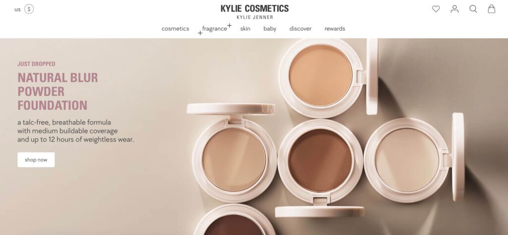
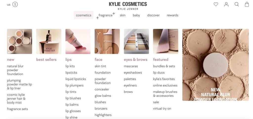
Secondly, the website boasts of a clear and easy interface with image-driven navigation. Like the dropdown menu featured in the image below. The images representing different product categories not only enhances the visual appeal but also makes maneuvering through the categories a breeze.
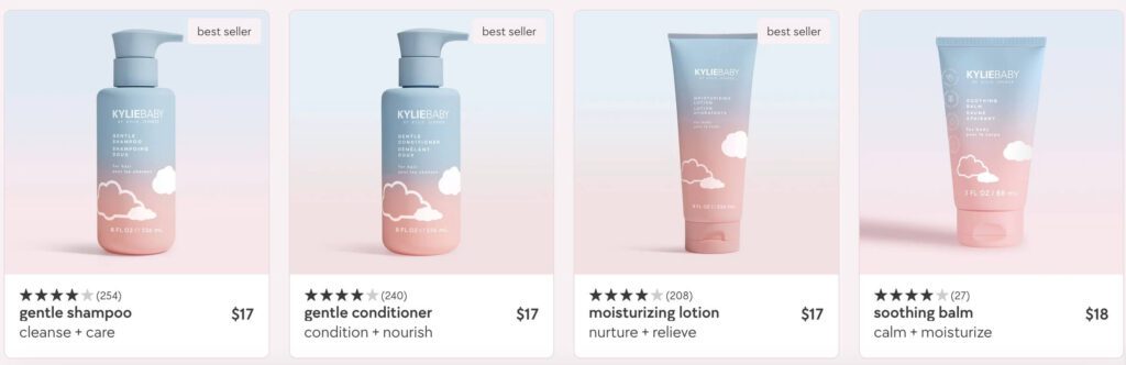
At first glance it’s evident that this beauty website design relies on high-quality images. But that’s not all, from the arrangement of these images to the website colors used, every element complements these stunning visuals. For instance, the product listings mostly feature background colors and gradients that align with the product packaging itself. This helps preserve the harmony of the page and creates an overall pleasing design.
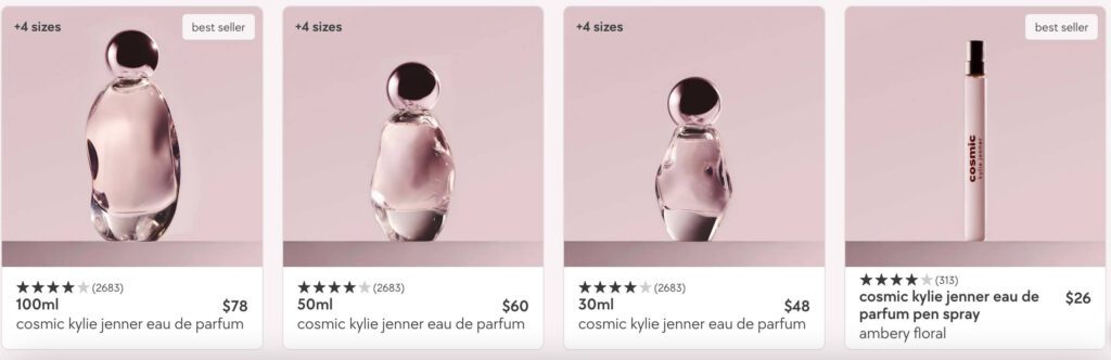
Finally, the website also uses custom 3D icons in relevant places to visually break down the information and thus make even the text-intensive informative pages easy to interact with.
On the whole, the aesthetics of the Kylie Cosmetics website appears pleasant and contemporary perfectly resonating with the target demographics. And aiding a smooth shopping experience in the process.
KIMP Tips:
A few quick takeaways from the Kylie Cosmetics website:
- Invest in high quality visuals.
- Use branded icons to complement your website aesthetics.
- Integrate images in the relevant places to establish hierarchy.
2. Glossier
The Glossier website is one of the most well-organized and clutter-free beauty websites you’ll find. Staying true to the clean and sleek packaging design and overall brand identity the website uses simple sans-serif fonts that are easy to read on product pages and menus alike.
The homepage instantly imprints the brand’s identity on the visitor’s mind by featuring a bold and beautiful version of the wordmark logo.
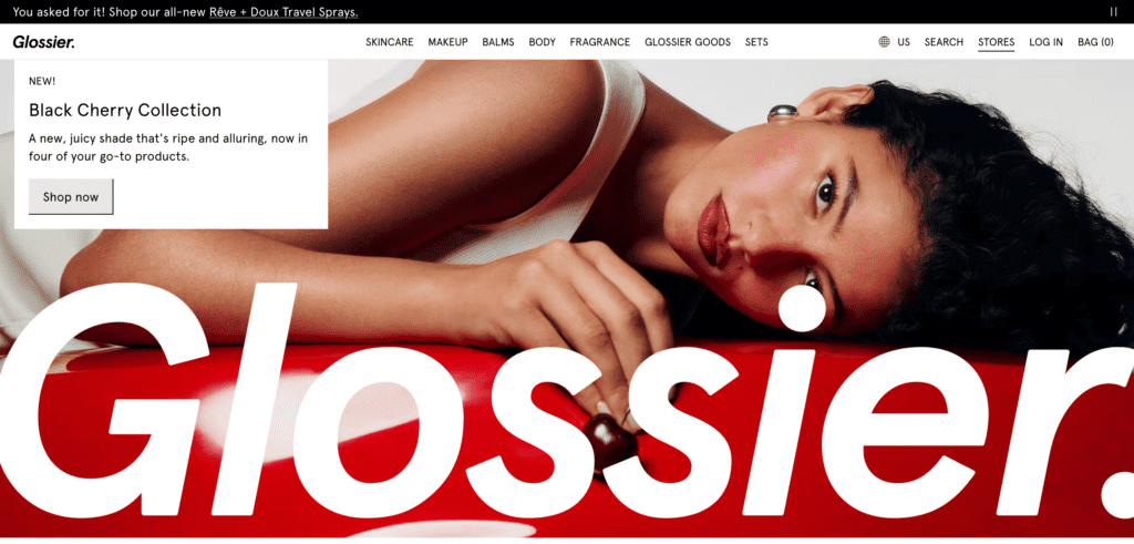
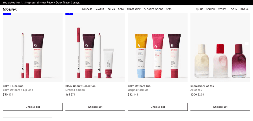
Moreover, if you notice the packaging design you’ll notice subtle pops of color but with white space dominating the design to maintain an overall minimalist appeal. The website also follows this approach and incorporates a simple layout with clear white backgrounds to let product listings stand out.
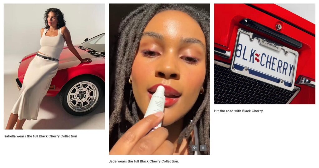
Finally, Glossier emphasizes the importance of real people and real results. Accordingly, they feature diverse models and customers on their website. You’ll also find genuine product reviews and other consumer content. This approach resonates with consumers who are seeking authentic and relatable beauty brands. This is how Glossier demonstrates the use of beauty website design to define what truly sets your brand apart in a crowded market.
KIMP Tips:
- Ensure that your website appears cohesive with your other brand designs like packaging.
- Identify the goal of your beauty website design and ensure that every single element reflects this goal.
- Prioritize readability and ease of use when designing your beauty website interface.
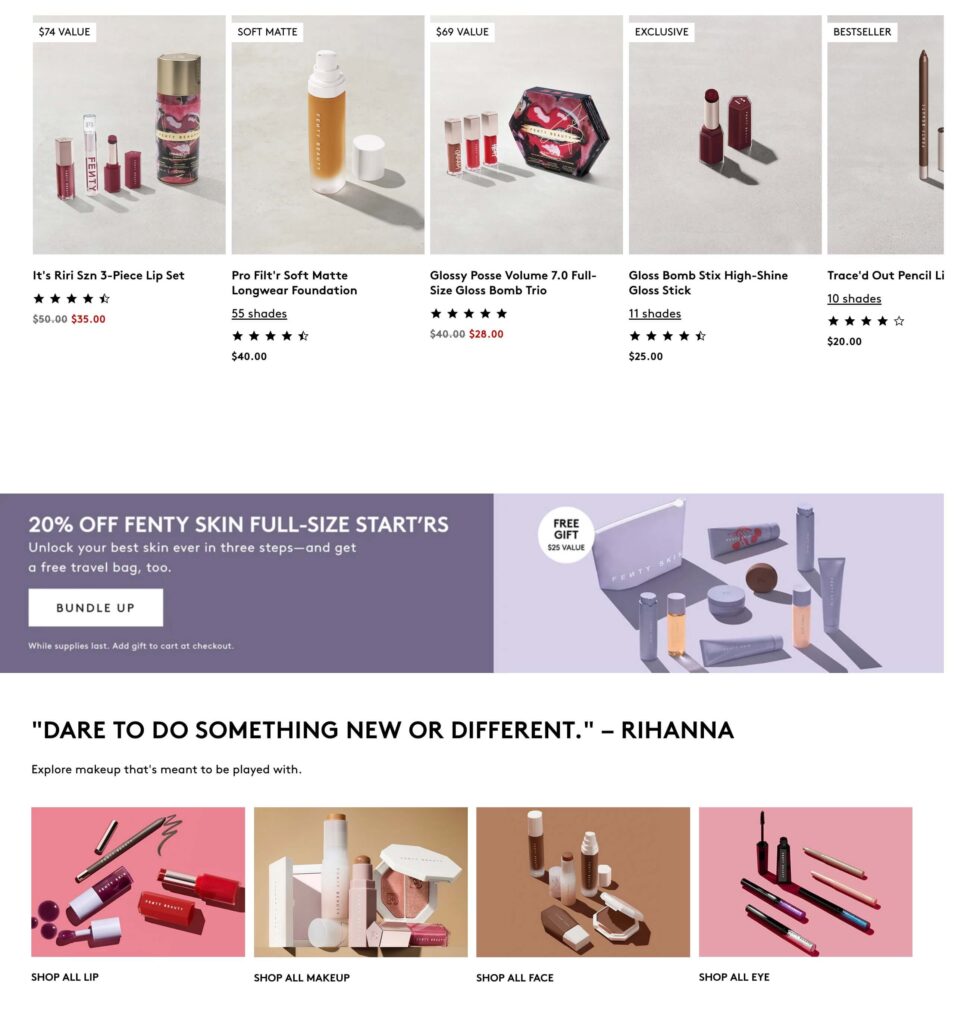
3. Fenty Beauty
Rihanna’s Fenty Beauty is another modern brand with an impressive website design. The website uses high-contrast imagery with strong pops of color creating a visually striking and attention-grabbing presentation. This is particularly effective in the beauty industry, where visual appeal is crucial.
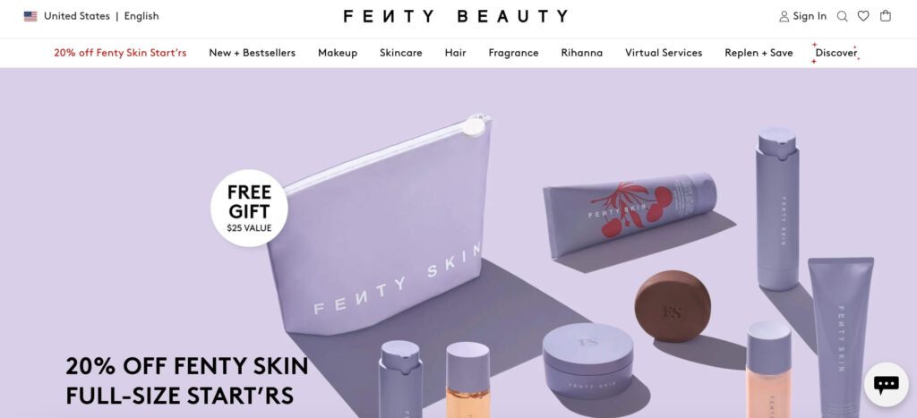
One of the most notable elements is the dynamic layout, with sections scrolling in a way that feels like a magazine, offering an engaging user experience. Besides there are subtle microinteractions that create an immersive experience.
Then there is the use of cohesive visuals. Notice the little details like the consistent alignment of shadows and lighting across all product listings. This adds a neat touch and creates a balanced look.
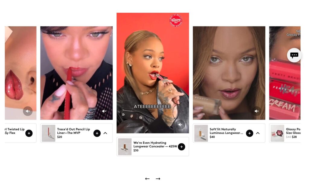
In addition to all these details, there is one other aspect to take away from the Fenty Beauty website. The brand features user-generated content and videos from socials. These are videos demonstrating users using Fenty Beauty products. This social proof helps boost credibility and build trust in new consumers.
KIMP Tips:
- Use micro-interactions for smoother maneuverability and a memorable and interactive experience.
- Ensure consistency in the visuals used – from colors to filters applied.
- Include social proof in the form of testimonials and customer stories to enhance the authenticity of your website.
4. Drunk Elephant
In the realm of beauty website design, Drunk Elephant stands out with playful and vibrant aesthetics. This is one of those beauty brands that rely heavily on their website with expectations of the site to act as the brand’s unified hub as well as the main shopping platform. Therefore, the design of the website excels in both form and function.
Additionally, the website also demonstrates that brands focused on natural ingredients do not always have to have simple and plain brand identities. Moreover, considering the brand’s focus on younger customers including pre-teens, the vibrant colors and the overall aesthetics of the website appear bright and peppy.
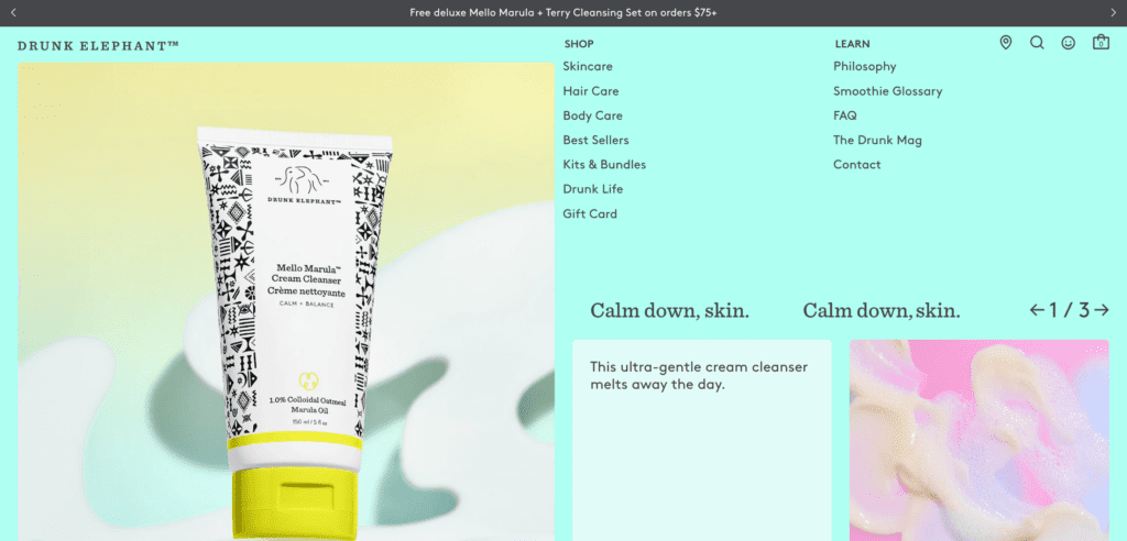
In addition to the essential elements like page covers and product listings, the website has marquee scrolling text and banners plastering the brand’s philosophy onto the page. These visual cues act as constant reminders of the brand’s philosophy and what makes the brand unique.
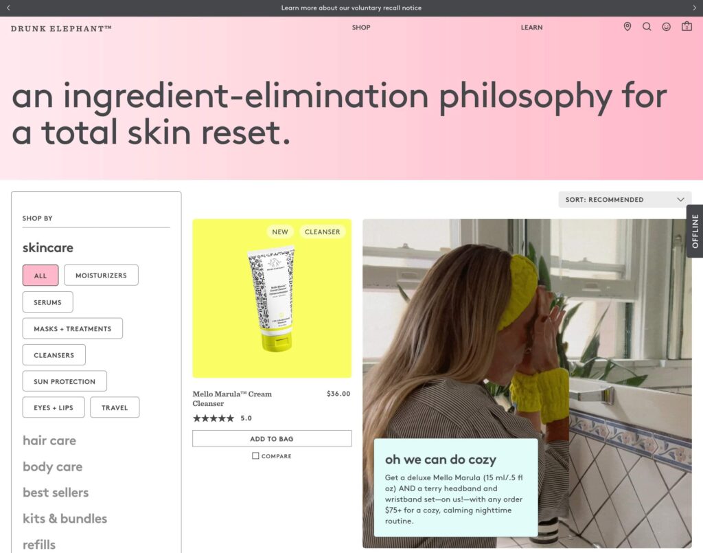
Finally, you’ll also notice that Drunk Elephant uses cover videos and animated loops instead of the conventional approach of cover images. This adds a touch of dynamism to the website and makes it more engaging.
KIMP Tips:
- Use a mix of static and animated elements on your website to ensure engagement without overwhelming your audience.
- As for your beauty website color scheme, choose something that resonates with your brand identity.
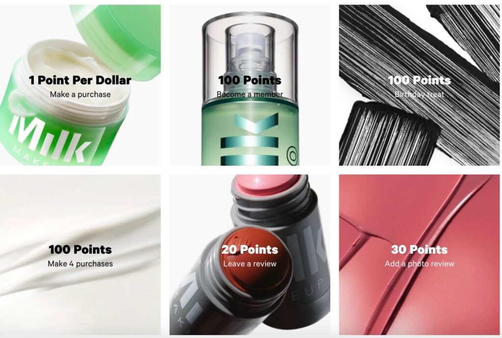
5. Milk Makeup
The Milk Makeup website and brand identity feel like an innovative and artistic approach to beauty. The slick website design seamlessly connects with the modern minimalist identity of Milk Makeup.
With the tall and narrow fonts and a memorable wordmark logo, the brand is known for its bold yet minimalistic aesthetic and the website is a reflection of this aesthetic.
Right from the homepage, all the sections on the website appear trend-forward and edgy with the use of bold graphics and contemporary color palettes. This includes big bold cover images featuring models of diverse ethnicities and colorful product displays.
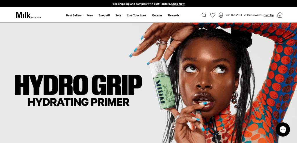
To ensure that the website is a visual delight and to make the most impact on visitors, the brand uses high quality product images throughout. You’ll see close-up product shots and the use of textures and finishes to give visitors a virtual feel of their products, which is a brilliant move!
KIMP Tips:
- All beauty websites use product photos. To truly stand out, identify the right angles, lightings and perspectives.
- When you have a wide assortment of products and diverse packaging colors displayed on your beauty website, choose simple and minimal color palettes for the background.
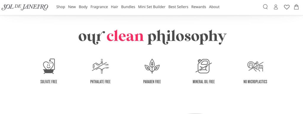
6. Sol de Janeiro
Sol de Janeiro is a Brazilian-inspired beauty brand known for is beachy vibes and charming colors. The website of this beauty brand accurately captures this vibe with the choice of beach-inspired colors and images.
Navigating through the pages and scrolling through the images on the website evokes the feeling of a sunny Brazilian beach. And featuring happy models in bikinis on beach settings amplifies this effect.
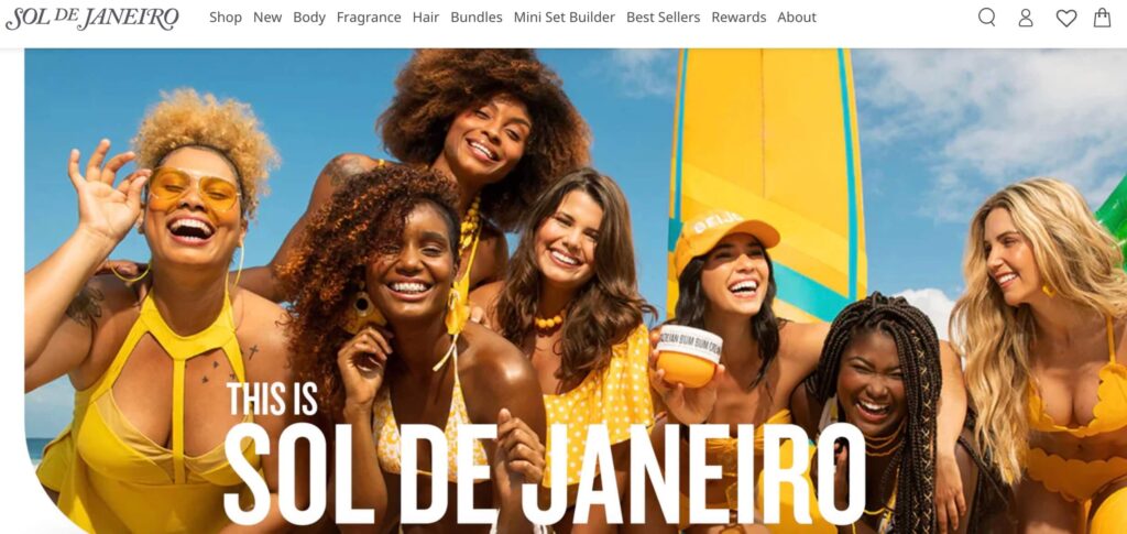
These visuals therefore highlight the need for choosing your beauty website design details carefully so as to use visual cues to evoke the right emotional response. In this case, the website makes you think of relaxing by the beach helping you visualize Sol de Janeiro products as the perfect choices for pampering yourself.
In addition to these details, as a fresh deviation from most modern beauty brands, you will spot the occasional use of serif fonts on the Sol de Janeiro website. This is particularly to emphasize the brand identity and tie back to the brand font used in the wordmark logo.
Authentic, bold, and unique, the Sol de Janeiro website aesthetics cut through the digital clutter and set the brand apart from their competitors.
KIMP Tips:
- Use prominent brand elements like your brand colors and fonts to reinforce your brand identity through your website. If your brand font has a strong character like that of the font used by Sol de Janeiro, use it sparingly but on elements meant to attract attention. Complement this with a simpler and more versatile font for readability.
- Ensure that the overall visual style of your beauty website design serves as a visual representation of what your brand looks and feels like.
Take Cues From These Popular Brands & Create Stunning Beauty Websites
A well-designed beauty website is not a luxury but a necessity. From captivating visuals and intuitive navigation to seamless e-commerce functionality and engaging brand storytelling, a thoughtfully designed beauty website plays a crucial role in attracting customers, building brand loyalty, and driving sales.
Therefore, investing in a team that can take care of your website design can be the best decision you can make. And if this design team can design not only your website but also the rest of your marketing and branding graphics, then you are assured of a visually cohesive representation of your brand on the digital realm.
Did you know that several unlimited design services like KIMP also offer website design as a part of their comprehensive design subscriptions?
Book a demo call to understand how this works!