
Design Fails: Lessons from the Biggest Mistakes in Design
Mistakes happen. But what truly matters is to learn from these mistakes. But in certain areas, like marketing, mistakes can be expensive. It’s not just about wasted budgets; it’s about hampered brand reputation. And let’s face it, you only get one chance to make a first impression. Hence design fails can be some of the priciest marketing blunders.
From poorly designed logos and awkward ads to confusing signs and head-scratching billboards, design disasters come in all shapes and sizes. And they’re never good for business. In fact, sometimes it is not even about the design – it’s about the context and relevance to the brand and the audience.
But here’s the silver lining: even big brands with big design fails have bounced back. So, today, we’re diving into the world of design fails from brands around the world. It’s not just about what went wrong, it’s about learning what not to do and finding inspiration in their comebacks.
So, let’s dive into the design fails that carry valuable lessons, shall we? But first, let’s understand why design mistakes are a big deal for brands.
Why Design Fails Are Detrimental to Brands
- Let’s talk about first impressions which seemingly occur in less than a tenth of a second. Reportedly about 72% of consumers are likely to recommend a brand to their network if the brand makes a strong first impression. Therefore, a bad design means a bad first impression meaning that you are bringing down the chances of winning your customer’s respect.
- Did you know that mistakes in crucial brand designs like logos can chase potential customers away? Data shows that nearly 60% of consumers will abandon a brand with poorly designed logo.
- Another such fact that proves the drawbacks of bad designs is that bad website designs can lead to about 38% of users leaving the site. Besides, people who leave the website due to bad experience are less likely to return as well.
- Not all design fails have to be about actual bad designs. Sometimes the designs are good on their own but it is the lack of consistency that earns them the label “design fail”. Because in such cases, the designs do not fit into the marketing strategy of the brand. And designs that fail their purpose are bad designs after all! In fact about 84% of consumers trust brands with consistent designs across touchpoints.
- A brand’s packaging design reportedly affects the purchase decision in around 72% of shoppers. Therefore poor packaging means that you are scaring customers away just when they are about to place their order and therefore risking issues liek cart abandonment or your product remaining on store shelves.
Summing up, bad design can lead to bad first impressions, impact the brand’s credibility and drive customers away to the competitors.
Design Fails: 10 Examples + What to Learn From Them
Logo Design Fails
1. 2012 Summer Olympics
If there is one logo you tend to repeatedly come across in most list of design fails it’s the 2012 Summer Olympics logo.
Chaotic, confusing, and unclear – the 2012 Summer Olympics logo received widespread criticism from fans and design critics.
- Some felt that the logo lacked elegance and professionalism which are crucial traits for a respected event with a global authority, like the Olympics.
- Whereas others did not instantly grab the “2012” reference in the logo.
- On the whole, the aesthetics of the logo did not go well with the audience.
KIMP Tips:
Now let’s talk about a few quick design tips to take away from this design fail:
- Ensure clarity in your logo design. Ambiguous imagery and visual cues confuse your audience and fail to make an impact on them.
- Stay away from forced interpretations of visual styles. Not all designs that look modern work in the digital era. It is about being relevant to your brand and its personality.
2. The University of Santa Catarina’s Oriental Studies
If you perceived this logo to be anything other than a Pagoda in front of a rising sun, we don’t blame you. The ambiguous design here earned the logo a bad reputation. No wonder, this logo tends to be among the top contenders when discussing design fails.
What truly went wrong here? The objective was genuine. The team wanted to use visual cues to tie back to Asian cultural themes with the incorporation of the rising sun symbol and the pagoda. On their own these symbols are totally relevant and meaningful too. However, the real problem stemmed from the way in which these symbols were combined.
This is one of those design fails that hit hard and remind you the need to conduct peer reviews and put your logo under the microscope to steer clear of unintended and negative associations in your design.
KIMP Tips:
- When combining symbols or visual elements, ensure that their individual meanings are not diluted.
- Ensure that the core message is clear.
- Stay away from cultural stereotypes and stick to a more straightforward delivery of your message.
3. Gap
“Gapgate” is a phenomenon that most marketers and designers are aware of. It is about the historic failure of the redesign of the Gap logo.
For a quick background, the popular clothing brand Gap chose to rebrand by redesigning their iconic logo in the year 2010. There was a drastic change in the design. Firstly, the chic serif font used earlier was replaced by a simple sans-serif font. Secondly, the iconic blue rectangle background was removed and replaced by a small blue rectangle behind the letter “P”.
The redesign here was to give the brand a fresh and modern look when the brand was facing some tough times. However, over the years Gap’s customers had gotten attached to the brand’s logo. And they were not impressed by the unannounced move. Besides, they were not able to emotionally connect with the new design either.
Hence, people started protesting the logo on social media and eventually, the brand switched back to its old design.
The Gap logo redesign debacle stands as a testament to the fact that audience sentiments are crucial considerations in brand designs. And that failing to pay attention to them can lead to major design fails.
KIMP Tips:
- Evaluate your audience’s likes and dislikes when designing a new logo or redesigning your existing one.
- If you think something is broken about your brand designs, then fix them without delay. But if something isn’t broken, better leave it untouched. Or if you do have to, consider subtle changes that do not make your design or brand identity unrecognizable.
Billboard Design Fails
4. Union Bank

The billboard design above was from Union Bank, which was once an American national bank later acquired by U.S. Bancorp. A quick glance at it and you might realize that the design does look neat and simple – exactly what is expected of billboard designs.
However, except for the logo, do you see any banking-related message in the design? Can you instantly tie the design back to the industry it belongs to? Probably not.
The design here exemplifies the fact that design blunders also pertain to a lack of relevance to the message. In other words, design fails can also be due to the lack of clarity in messaging.
KIMP Tips:
- The visual elements and copy in your design should all complement each other. Without the right copy, even the most appealing design fails.
- Use text and visuals to clearly establish your message. Do not make users work hard to grasp the message.
For more design tips, read our blog on billboard design mistakes.
Packaging Design Fails
5. Black & Gold
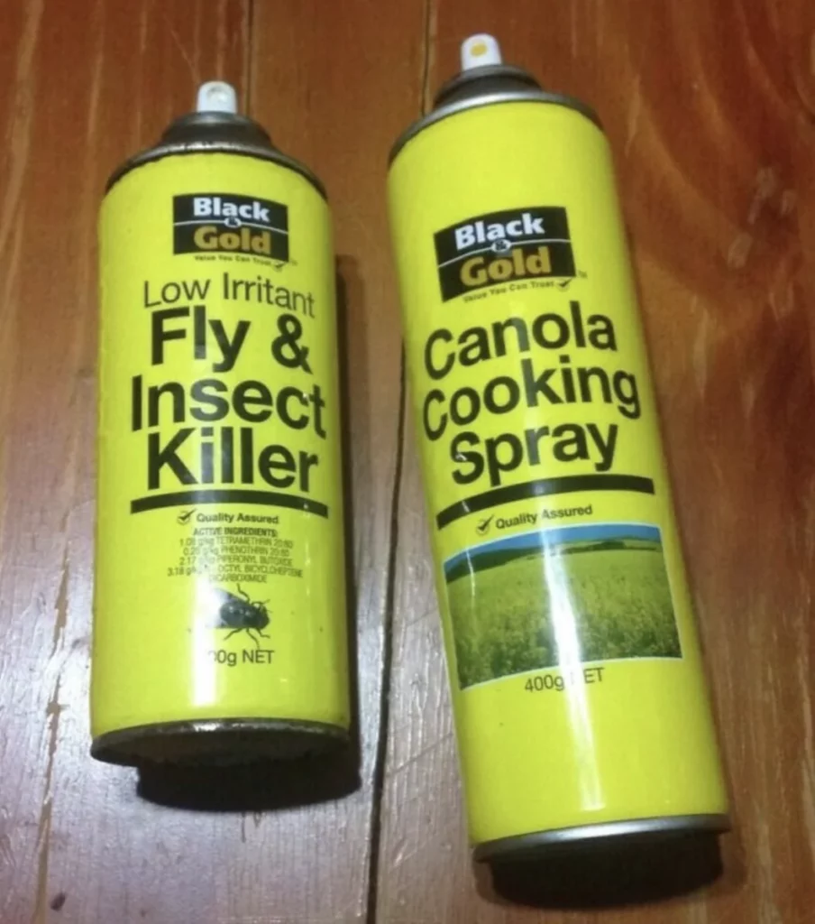
They say consistency is important in branding. However, there comes a time when you need to think about differentiation. Say when representing two product categories that are totally unrelated.
Therefore, you need a hint of differentiation in the right places and consistency across designs in other places.
In the design above, the Black & Gold brand has maintained visual consistency in their packaging design across product categories. While this is a good thing in most cases, in this case, it is the problem of a food item and a non-food item looking too similar. As a result, visual consistency here becomes a factor that misleads customers into picking the wrong product.
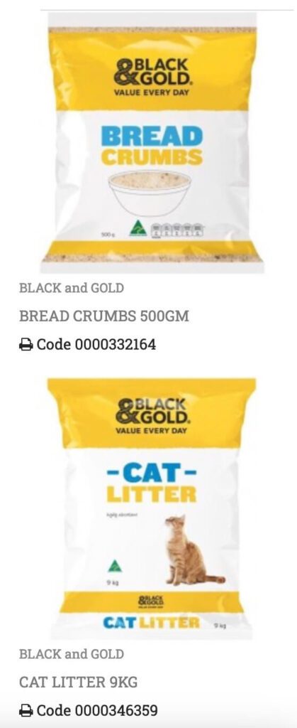
It’s not just about one or two product lines from this brand. Here’s another example. You do not want to get confused between cat litter and bread crumbs!
KIMP Tips:
- For product differentiation, introduce color coding – different colors for different product categories. This will help customers instantly recognize your brand and still differentiate between categories.
- Use clear visual cues in the form of illustrations or product photos on packaging labels to help customers be sure of what they are purchasing.
6. Calgon
Some of the biggest design fails in packaging occur when customers cannot easily find essential information about the product.
For example, what’s the product featured here – can you guess? Did the packaging design make it easy to understand that these are water softener tablets and not traditional detergent pods? The image itself does not make it clear nor is there any text on the packaging that clarifies this.
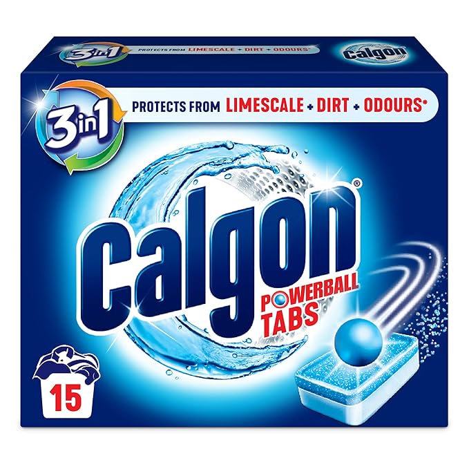
Blunders like these are the biggest kinds of design fails brands cannot afford to make. In this case, perhaps the brand has established a rapport with its audience and perhaps they immediately know what the product is. However, not all new customers will be able to comprehend this little detail without scrolling through the product description and checking out all the listing images and videos.
Remember that customers are not always willing to spend a lot of time in just deciphering the packaging design. Therefore, packaging design has to be simple and direct. Yes, you can get creative and add unique design elements to make your packaging stand out from the rest but the main message cannot be lost in this process.
7. Tropicana
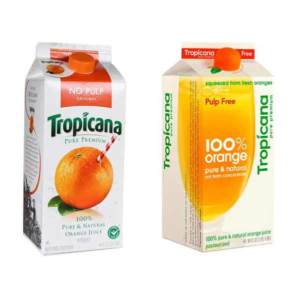
In 2009, Tropicana decided to give their brand and their beverage packaging design a makeover. While there are no major flaws in the new design as you can see in the image above, the brand faced backlash. Why? Because the packaging made the signature product unrecognizable.
In this case, it was not just the packaging redesign but the whole rebranding that went wrong. But packaging being the most crucial component of customer touchpoints, the refreshed Tropicana packaging is something several critics talk about when discussing design fails.
Reportedly, the rebranding here cost Tropicana about $30 million in sales decline. This is a clear example of the impact of design blunders on brands.
What’s the real reason behind this design fail? The new design removed iconic elements found in the brand’s packaging design such as the orange with a straw, which had become synonymous with Tropicana. This weakened the brand’s visual identity and made it less recognizable on store shelves. Therefore the brand switched back to their old design.
But the most important fact here is that the brand changed their packaging design again in 2024 but this time they applied all the lessons they learned from their previous rebranding misstep. And this time, despite featuring a clear and more modern packaging design, the iconic elements and the overall layout have been maintained to be close to the original design. This ensures that the product remains recognizable to its loyal customers.
KIMP Tips:
- Understand what design elements in your packaging resonate the most with your audience.
- Stay away from drastic overhauls when rebranding. Even when the reason is clear, it becomes difficult to convince customers that the change is valid.
Mascot Design Fails
8. Wenlock and Mandeville for 2012 Summer Olympics
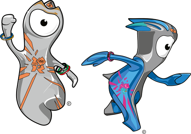
The mascot duo Wenlock and Mandeville introduced to represent the 2012 Summer Olympics received a lot of negative responses from fans and critics. Yes, the same 2012 Summer Olympics where the logo was criticized by many. The overall identity for the season failed to impress the audience.
Moreover, in this case, the squiggly figures did not appear professional enough to represent something respectable like the Olympic Games.
Furthermore, the mascots were abstract shapes that lacked solid emotional value. Remember, mascot design is about humanizing your brand – so mascots without emotional signifcance fail the purpose.
The fact that these mascot characters represented drops of steel and the story that was presented with it were considered to be obscure to audience.
On the whole, these mascots missed their mark.
KIMP Tips:
- When it comes to mascot design, the type is absolutely you choice. However, one thing is important – the mascot characterization should be such that it possesses a distinct and reliable personality.
- Do not just create a mascot and leave it there. Build a story around it, a story that ties your mascot back to your brand.
Other Design Fails
9. Business card design
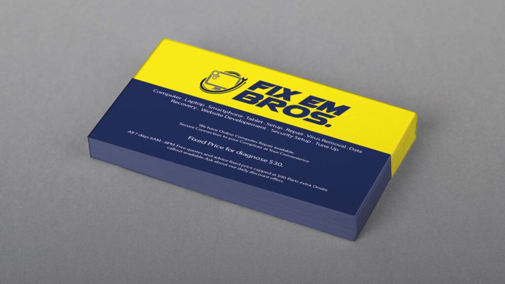
Initially, nothing looks wrong with this business card but can you read all the information in it? The wrong font size is one of the biggest blunders when designing business cards. After all, businesses strive to pack a lot of information within the small real estate of this business card and hence this happens.
However, too much information as well as small text sizes can both be big turn-offs to users. Remember that there is no option to “zoom” in and out on a printed design. So, choose your font size wisely.
To avoid this:
- Keep the information in your business card brief and engaging. Only include essential details.
- If you want to add multiple contact details like your website, phone number, and social media handles, use QR codes to consolidate the information. Additionally, this also helps blur the line between print and digital.
10. Poster design
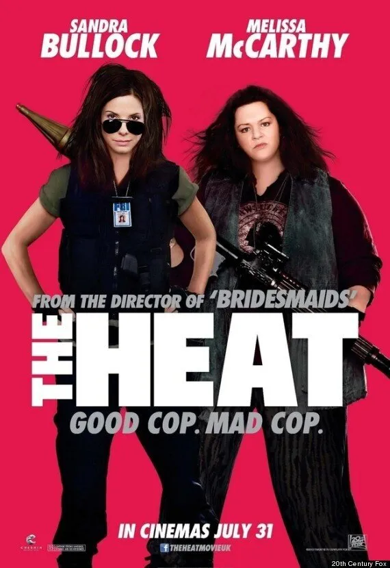
Great visual hierarchy, bold colors, minimal text and enough negative space to keep the audience focused on the actors – almost everything about this poster design is on point. However, there’s one little issue – the excessively edited photos of the actors featured.
The faces of both Sandra Bullock and Melissa McCarthy have been heavily edited in the poster with the latter being barely recognizable. This led to a lot of negative responses with people pointing out the unrealistic edits on the poster.
This design fail highlights that over-reliance on digital manipulation can create unrealistic expectations and alienate audiences. It’s essential to strike a balance between enhancing the image and preserving the authenticity of the image.
Remember this when designing your posters, billboards, and other designs for marketing.
Learn From These Design Fails & Tap Into the Power of Good Design, With KIMP!
As we’ve seen, even the biggest brands are not immune to design mistakes. These failures highlight the importance of thoughtful, strategic decisions in marketing and branding designs.
Avoiding design blunders like the ones we’ve discussed and creating impactful designs becomes far easier when you collaborate with a professional design team. The fresh perspectives the team brings to the table can help you steer clear of misinterpretations and ensure your branding resonates with your audience.
With an unlimited design service like KIMP, you gain access to a dedicated team of designers who can elevate your brand through consistent, high-quality designs. Whether you need logos, packaging, or marketing graphics, KIMP ensures your visuals not only stand out but also build trust and recognition for your brand.
Register now for a free 7-day trial!