
Create High-Converting Landing Page Forms: Design Tips & Tricks
Different types of landing pages have different roles to fulfil. But most of them are designed to do one main thing – capture leads. That’s where a landing page form comes in.
Landing page forms are more than just pages with boxes to fill out. They are powerful tools that help businesses gather useful information from visitors to eventually nurture them into customers.

With so much weight on it, a landing page form might seem like a challenge to tackle. Ask for too much information and you risk scaring users away. Ask for too little and you might miss out on key insights.
Then there’s the design itself – you need a good balance of layout, clarity and functionality. So with all these in consideration, how do you create landing page forms that don’t just look great but also meet their goals and boost conversions?
That’s what we aim to answer through this blog. We’re talking best practices to create high-converting landing page forms.
So, shall we get started?
- Tips to Design Landing Page Forms That Convert
- 1. Keep it simple
- 2. Make the value proposition clear
- 3. Leverage social proof
- 4. Consider multi-step forms
- 5. Add a strong CTA
- 6. Ensure that the landing page form is relevant to the context
- 7. Use relevant images or illustrations
- 8. Tap into interactive formats like GIFs & videos
- 9. Stay on brand
- 10. Optimize for mobile devices
- Design Captivating Landing Page Forms With KIMP
Tips to Design Landing Page Forms That Convert
Landing pages are crucial components in marketing. For instance, about 35% of marketers find them to be the most effective assets to collect newsletter subscribers. And that’s not possible without landing page forms. So, let’s crack the code of impactful landing page forms.
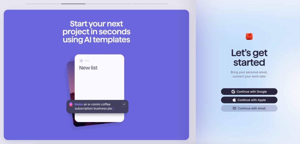
1. Keep it simple
With landing page forms, the idea is to convince users to go forward and not backward. A cluttered and complicated landing page form can confuse your users or chase them away. So, keep it simple.
To achieve this, only include fields that are absolutely essential at that stage. While you might require more information from customers to better personalize their experience, you should know what stage of the buyer’s journey this customer is at and what kind of information they will be willing to provide.
The example below is from the popular cloud-based software company Pipedrive. In this case, the form starts by asking only for an email address. This minimizes the effort required to engage thus removing potential barriers.
Similarly, identify what works for your objective and include only those fields in the landing page form.
2. Make the value proposition clear
The key to better conversions with landing page forms is to instantly help customers understand what’s in it for them. A strong value proposition answers the burning question many customers might have before filling out any form “What do I get out of it?”
Will they gain access to a free demo or be able to access a free downloadable guide? Or is it a promise of a new customer discount code? Add a clear and crisp copy that covers this.
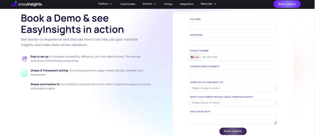
For example, the below image shows the landing page form used by a popular AI-based data insights company, EasyInsights. To the left is the information about the benefits and to the right the fields for user to fill in.
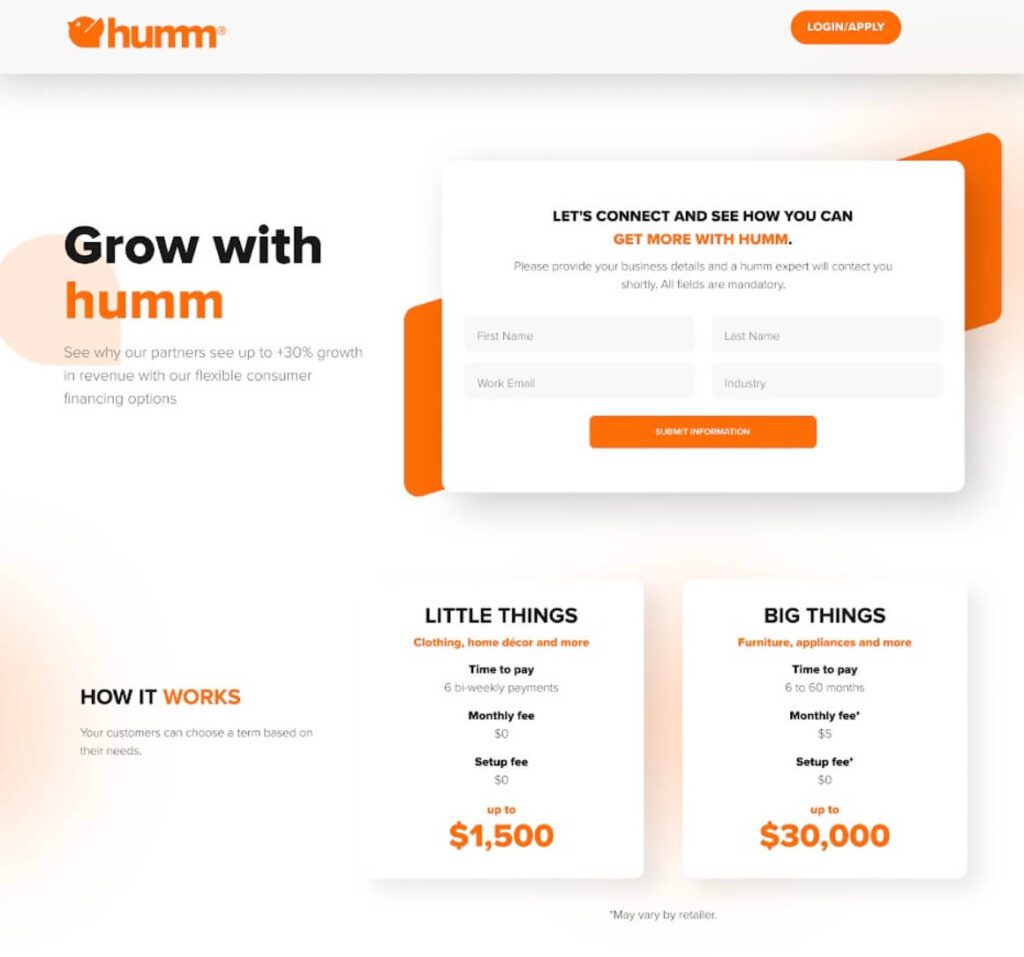
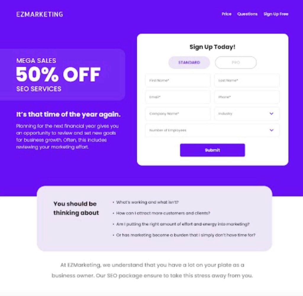
Here’s another example. In this case, it’s the 50% discount that’s highlighted in big bold text.
3. Leverage social proof
Every word you add and every field you include your landing page form can make break your customer relationship. Therefore, it is important to analyze and include all the essential details while trimming back on the option or additional ones.
One of the convincing piece of information that can help boost the conversion of your landing page forms will be social proof in the form of user reviews, etc.
To do this, select a few relevant and unique reviews and include images and text to deliver the message.
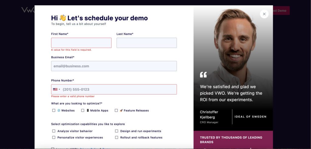
For example, here’s a landing page form used by VWO, a company that specializes in A/B testing among other services. It seamlessly integrates user reviews into the design. Therefore, once customers see the form, the review presented will eliminate any second thoughts they might have.
4. Consider multi-step forms
We spoke about keeping landing page forms as simple as possible. But sometimes you just need several details to proceed to the next step. In such cases, the answer lies in multe-step forms. The benefit here is that you are avoiding user fatigue and increasing the conversion rate.
Moreover, when you present a lot of fields all at once on the same screen it makes it more intimidating for customers. Whereas, when you segregate the details and break them down into multiple stages, you get customers invested in your form. Once they start filling it, they are more likely to complete it.
Here’s an example of a multi-step form used by Zendesk to capture information from users showing interest in their demo.
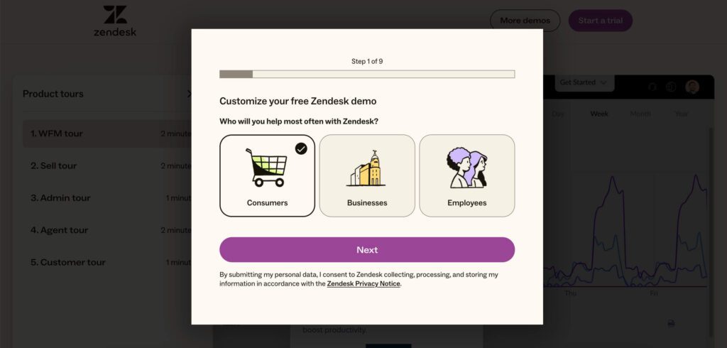
Besides, the form here also simplifies user experience by providing easily selectable options rather than asking for users to fill out the details manually.
KIMP Tip: In case of multi-step landing page forms, add a clear progress bar or a distinct visual cue that indicates how far the user has progressed and how much is left. Additionally, use text and visual cues to clearly communicate to customers that there is more to navigate to.
5. Add a strong CTA
Good landing page forms encourage immediate action, with confidence. This happens when there is a clear and impactful CTA (call-to-action). The CTA in this case should communicate what customers are doing and where they are going next.
To begin with, use clear and relevant action verbs that inspire confidence like “Get Started Now,” “Claim Your Free Trial,” “Book Your Demo” or “Register for a Free Demo”.
In addition to this, the text that precedes the form as well as the CTA should seamlessly be connected ensuring a clear hierarchy.
We’ll explain this with an example. The landing page form here is from a popular software company HaloPSA. Since the details are requested from customers looking for the free trial, the CTA button makes it crystal clear.
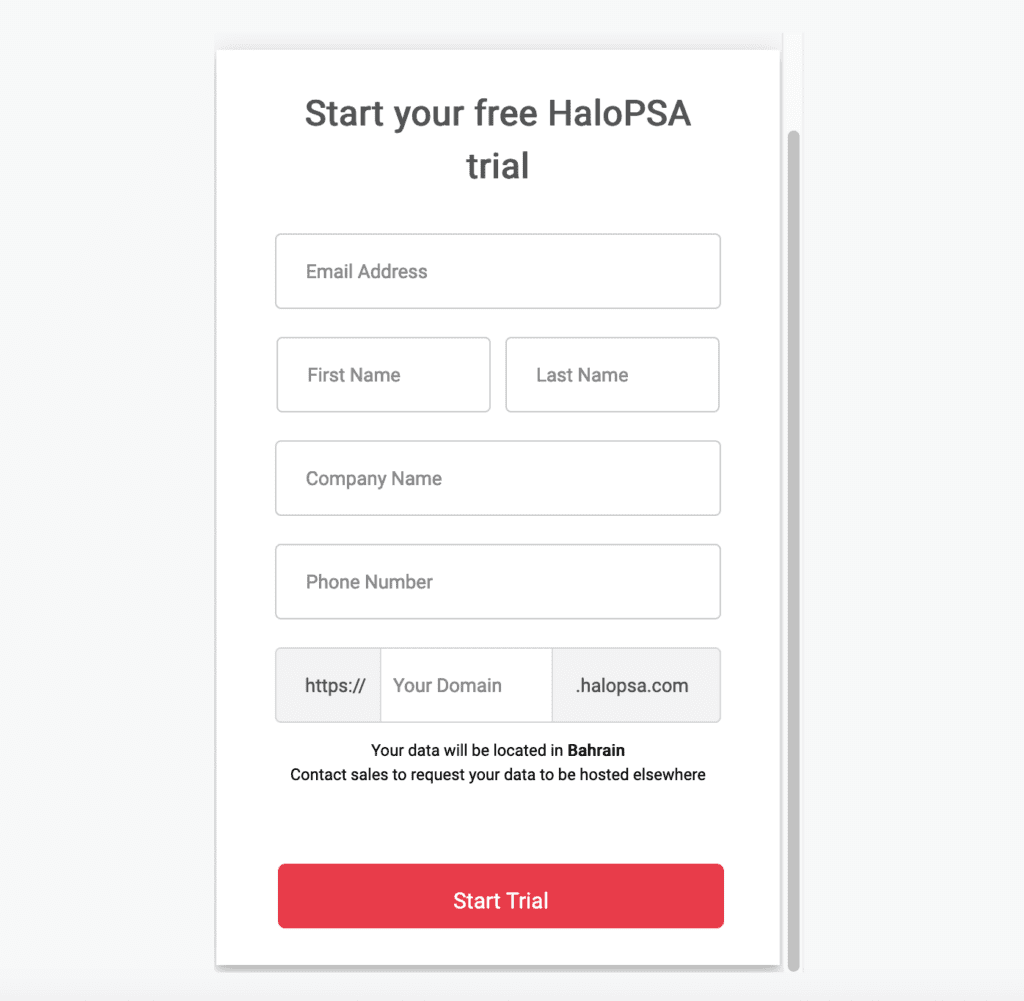
KIMP Tip: Make the CTA button stand out with a contrasting color and by using clear and bold typography.
For more tips on creating calls-to-action that drive action, check out our blog on CTAs.
6. Ensure that the landing page form is relevant to the context
Relevance is key to keeping users engaged when they reach your landing page form. Whether they’ve come from an ad, a social media post, or a search result, the landing page form must align with their expectations.
Consistency in messaging not only builds trust but also ensures users see the form as a natural continuation of the conversation that brought them there.
This is important because, when users click on an ad or a search result, they’ve already shown intent. But if the landing page form feels disconnected from the message they were responding to, it creates friction. Therefore, a relevant landing page form ensures the user’s journey feels seamless. And this in turn increases the likelihood of them completing the form.
For example, the landing page form here is from the popular Australian software company Atlassian. What makes this landing page form stand out is the text in it. This landing page form appears on clicking a Google Ad appearing on the search page when searching for “Zendesk”. Atlassian here is promoted as a better alternative to Zendesk in the ad and the landing page text aligns with this accurately.
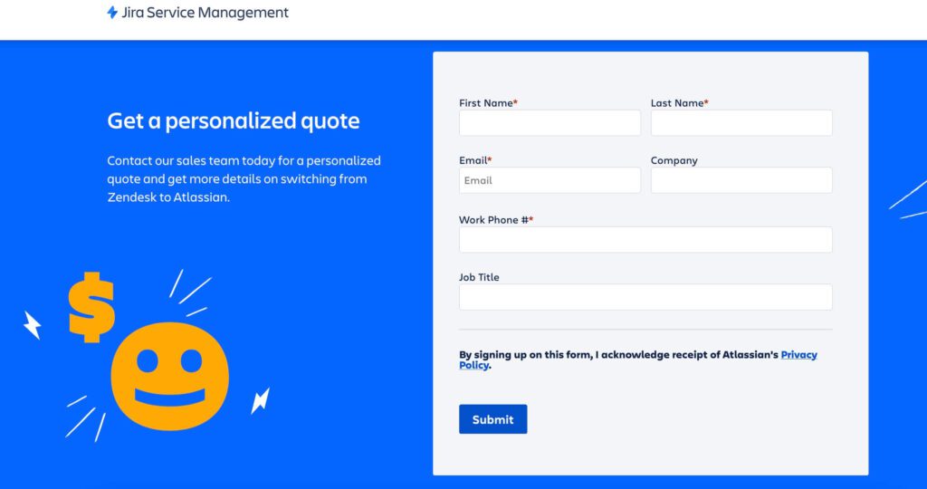
Similarly, pay attention to the context – the source that directs users to the landing page form in picture. From the information provided to the CTA, every little detail should resonate with this context for maximum impact.
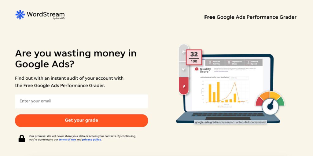
7. Use relevant images or illustrations
Do not underestimate the power of visual appeal when it comes to landing page forms. While informative text is important, an image to break down the monotony and to amplify the effect of the text can add much more value.
Moreover, a strategically chosen image attracts attention instantly and keeps customers engaged by reinforcing the form’s purpose.
Static visuals are easy additions to landing page forms and these can be in the form of:
- Product photos
- Service demo shots
- Illustrations
But yes, you still need to keep the design simple and clutter-free. So stick to relevant images only. And do not crowd the layout with too many images either.
For example, the below landing page form from the popular online advertising company WordStream includes a simple illustration that represents the service offered. This makes the page more visually engaging.
8. Tap into interactive formats like GIFs & videos
We spoke about the impact of adding engaging visual elements to landing page forms. While static images are good, you should also know that adding a video to a landing page can boost its conversion rate by a whopping 86%.
But yes, you also need your landing page forms to load quick and so compressed GIFs or even simple animated typography that draws attention to the core elements work.
For example, below is a snapshot of a landing page form used by a renowned to-do list app Superlist. The grid on the left incorporates an engaging GIF played in a loop demonstrating what the business is about.
Similarly, identify formats that engage users on a deeper level, convey complex ideas quickly, and create a more dynamic experience. Such visuals can make your landing page form more memorable.
KIMP Tip: Do not overuse interactive formats like combining a GIF, adding animated typography all together on the same page. You do not want to overwhelm your customers after all. Besides, too many animated elements can lead to an increase in the page loading time which hampers the user experience.
9. Stay on brand
Every single design that represents your brand shapes your brand identity. And your landing page forms are no exceptions. Therefore, ensure relevant use of brand colors and any relevant brand elements.
For example, here’s a landing page form from Salesforce. Observe the creative use of brand colors and the seamless incorporation of the brand mascot into the design.
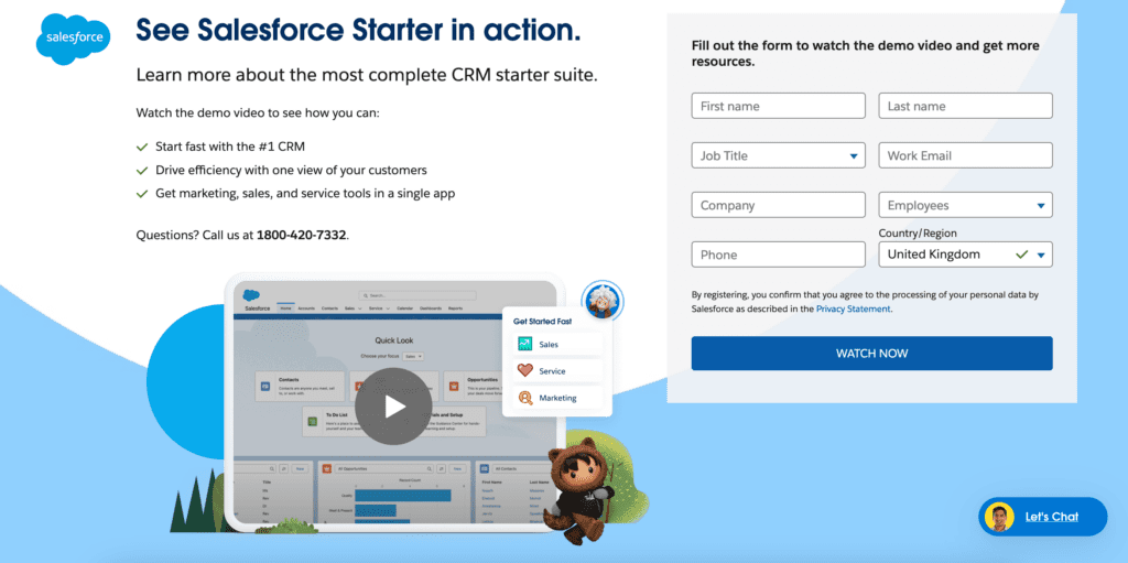
Similarly, integrate your brand colors into the landing page form design. This not only helps connect the form to your website but also to the source that brought users to that page. Overall, a cohesive presentation of your brand is what makes the most impact on your audience.
So, here are a few things to keep in mind:
- Include your brand logo in the landing page form.
- Use the same fonts as the ones used on your website.
- Ensure that the tone and voice of the copy in the landing page form also aligns with the rest of your marketing designs.
10. Optimize for mobile devices
Mobile optimization is a must-have in today’s digital landscape. Therefore, you need to think about optimizing for the small screens when designing your landing page forms.
In short, it’s about creating adaptive layouts that respond to different devices, ensuring a seamless experience on every screen size. Adaptive design doesn’t just resize; it customizes the layout to match the user’s device, delivering the most user-friendly experience possible.
For example, horizontal stacking of grids works well on larger screens like tablets and desktop computers whereas vertical stacking makes scrolling and comprehension of the information much more convenient to mobile users.
The landing page form featured here is from a popular conversational AI bot company Haptik. And this is the mobile landing page version which shows the information stacked vertically.
Also notice how the fields in the form appear after just a short text portion in the above example. Similarly, keep the text on your landing page form minimum to ensure that users do not have to tediously scroll a good distance to reach the form.

Design Captivating Landing Page Forms With KIMP
With so much going into landing page form design, are you struggling to keep up? Then leave it to the professionals. What if one simple design subscription can take care of all your marketing and branding design needs including web design at a flat monthly fee? That’s what KIMP subscriptions have to offer.
Register now for a free 7-day trial!