Enhancing Customer Experience Through Effective Graphic Design
You come across several brands on a daily basis. From the products you use to those you see on store shelves. From the billboards you encounter to those ads that pop up on your screen. Have you noticed how many of these encounters are visual? These visual cues do more than just grab your attention; they shape how you perceive the brand and kickstart your experience with it. That’s why today we’re discussing the role of graphic design in enhancing customer experience.

So, if you’re a business owner looking to make your brand stand out or increase loyalty among your existing customers, or a marketer aiming to boost your marketing strategy with eye-catching designs, you’re in the right place. Ready for some fresh perspectives? Let’s dive in!
- Customer Experience – The Gold Standard In Marketing
- Graphic Design & Customer Experience – A Match Made in Heaven
- The Art & Science of Designing for Enhanced Customer Experience
- 1. See the world through your customers’ eyes
- 2. Guide your audience’s gaze with a clear hierarchy
- 3. Design for all – accessibility matters
- 4. Keep it simple – do not overload your design
- 5. Engage your audience by leveraging visual storytelling
- 6. Design for a mobile-first world
- 7. Keep it cohesive for a positive customer experience
- Elevate Customer Experience Through Thoughtful Designs
Customer Experience – The Gold Standard In Marketing
The importance of customer experience in marketing cannot be overstated. Here are some compelling statistics to support this claim.
- Did you know that investing in customer experience can lead to a nearly 80% increase in your revenue?
- After all, consumers are reportedly ready to spend 16% more on brands that deliver them a better experience.
- Moreover, a whopping 90% of buyers consider customer experience to be as critical as the products/services they deliver.
- But it’s not just about the good that customer experience brings. It’s also about the detrimental effect of bad customer experience. Data shows that 63% of consumers tend to express their disappointment and negative word-of-mouth can be a big concern for businesses big and small.
- And about 49% of consumers who leave a brand often do so because of a bad customer experience.
Having established the significance of customer experience for brand growth, we’ll now delve into how graphic design can be leveraged to elevate this experience.
Graphic Design & Customer Experience – A Match Made in Heaven
According to Britannica, graphic design is “the art and profession of selecting and arranging visual elements—such as typography, images, symbols, and colours—to convey a message to an audience.”
Therefore, for a brand, graphic design is what helps communicate their ideas and nurture a strong relationship with their customers.
This can be through:
- Logo design that introduces the brand and creates a striking first impression.
- Website and app design that simplify a user’s journey and help them get to know your brand better.
- Product packaging which is often the first tangible encounter with your brand in the physical world.
- Social media graphics that engages them and evoke an emotional response.
- Advertising and marketing materials that slowly and steadily increase your reach and communicate your message effectively.
- Infographics and visual content that foster trust and credibility and strengthen your digital presence.
- Environmental and signage design that slowly and steadily impact customers’ perception of your brand and therefore affects their experience as well.
With this clear picture of how graphic design affects customer experience, let’s move on to discussing a few strategies to create designs that make an impact.
The Art & Science of Designing for Enhanced Customer Experience
1. See the world through your customers’ eyes
Design without empathy falls flat. It merely looks good but does not fulfill its purpose. Therefore, if you wish to use graphic design to boost customer experience, focus on understanding these customers whose experience you are shaping.
- Who are they?
- Where are they?
- What are the problems they are looking to solve?
- What are their questions?
- Do you know about their likes and dislikes?
Answering these questions results in designs that make customers feel like the design gets them, the brand gets them. Therefore, it builds trust and nurtures a healthy rapport.
For example, consider the ad designs from Airbnb. People looking to book their accommodation when traveling are looking for a safe and comfortable space where they feel like they belong. And Airbnb’s objective is to cater to such an audience. Therefore, their ads are mostly built on strong emotional values and relatable messages. From the visual cues to the copy, everything about their designs aligns with these.
2. Guide your audience’s gaze with a clear hierarchy
A clear visual hierarchy ensures that your customers can view and comprehend your message clearly and conveniently. Therefore, visual hierarchy is a must-have for a smooth customer experience.
Moreover, visual hierarchy ensures that all the essential details are easily accessible and therefore, customers who encounter your design do not leave confused or without the answers they came looking for.
In short, clarity and structure create a smooth experience that not only keeps the user engaged but also encourages them to take action, like making a purchase or signing up for a service.
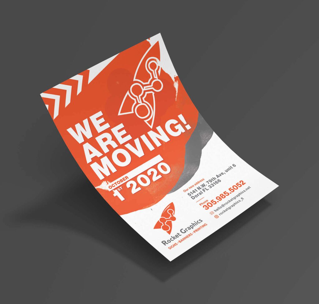
For example, take a look at the flyer design here. It uses typographical hierarchy and varies the font size effectively to draw your attention to the main message and then provide you with the important details, like the contact information.
So, you instantly know what the flyer is about and therefore you can immediately decide whether the message is relevant to you.

3. Design for all – accessibility matters
While it’s important to optimize your designs for your target audience, ensure that you understand the diversity in your target segment. If your brand makes a portion of the audience feel rejected, then you are creating a bad experience. For example, if your website is not very easy to interact with you end up chasing customers away.
Therefore, prioritize accessibility in your graphic design. Accessibility features contribute to a more positive, frictionless experience that shows you value and respect every individual who interacts with your brand.
In fact, prioritizing accessibility can often lead to higher customer satisfaction and loyalty, as customers appreciate brands that put inclusivity at the forefront. So much so that, about 83% of shoppers with accessibility needs stick to sites with accessible features and are ready to spend higher on such sites.
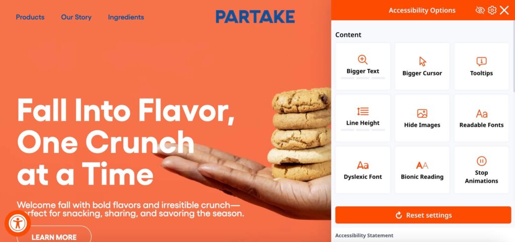
For example, the website of Partake Foods, known for their non-GMO, vegan cookies, displays a dedicated accessibility button at the bottom the page. Clicking that brings up a menu that lets users customize what’s visible on the screen. There’s even an option to switch to a font that’s easy for Dyslexic users.
An accessible website or app design like this one can create a memorable customer experience.
For more tips, check out our blog on creating accessible graphic designs.
4. Keep it simple – do not overload your design
For the sake of delivering a key message, do not overload your marketing designs with information. You do not want to overwhelm your audience. The idea is merely to entertain, educate or engage them.
So, what should you do? Identify a clear focus and present just enough information to back this up.
Additionally, avoid missteps like the paradox of choice where you offer too many options or too many branches in your sales funnel that your consumers get confused and leave rather than moving to the next step.
This includes limiting the number of CTAs in your emails and landing pages or the amount of contact information you provide on your business card.
For example, the below social media design keeps it simple. It presents the benefits of the product, the promoted message, a discount code, and the CTA to order the product.

When you do have multiple items to present, like on your website, organize them in easy-to-understand categories and add relevant filters to make it easy for the users to navigate through your content.
5. Engage your audience by leveraging visual storytelling
Several brands with aesthetic designs struggle to see conversions. This could be because the message is clear or because the message does not resonate with the intended audience. What can you do about this? Leverage visual storytelling.
Instead of creating designs that feel like a bland presentation of a few details, incorporate a story into it. A story that will instantly gain your audience’s attention and evoke all the intended emotions.
This could be by choosing the right formats for storytelling, like short-form videos. Or even by creating designs that have more to them than meets the eye. These are the kind of designs that people don’t just see and scroll away but process and remember.
Coca-Cola is one of the most popular brands known to intuitively integrate storytelling into their ads. Here’s one of their ads demonstrating their finesse in visual storytelling.
The ad features a silhouette of Elvis Presley and the copy, “They don’t make ‘em like they used to. We do.” The ad here implies how legends like Elvis Presley are irreplaceable therefore tying back to the core message of how Coca-Cola continues to be a timeless brand, just as legendary as the icons of popular culture.
By integrating such a powerful visual narrative, Coca-Cola creates not just a product ad, but an emotional experience.
6. Design for a mobile-first world
Close to 60% of the global web traffic comes from mobile devices. Hence, mobile optimization of your designs for the digital space is an essential step to ensure a smooth customer experience.
All your designs created for the digital space need to take into account the different demands of different screen sizes. Therefore, you need to create mobile-friendly designs. These could be your website, digital ads, or even social media posts – anything that engages your audience on a digital platform.
A mobile-friendly design is one that is optimized to provide a seamless experience for users on smartphones and tablets.
To achieve this, prioritize clarity, clear hierarchy, contrast, and other factors that influence how your design appears on a small screen like a smartphone. Furthermore, when it comes to app design, prioritize simple navigation and excellent contrast along with readable fonts.
In addition to this, here are a few more tips to remember:
- Eliminate clutter in your design.
- Avoid overloading your design with text, especially when using a busy background.
- Use text and color contrasts to make your key text stand out.
- Ace the art of designing CTA buttons that are easy to spot and interact with.
- Choose fonts that are easy to read on small screens and test and optimize the font sizes.
For more insights into this, check out our blog on designing for mobile marketing success.
7. Keep it cohesive for a positive customer experience
Inconsistencies in representing your brand can confuse your audience and dilute the impact of your marketing content. Therefore, even with the best-looking designs you do not make much of a difference if each of your designs looks different from the other. You need them to be visually cohesive.
Consistency is one of the most powerful principles in graphic design, especially when it comes to creating a strong and cohesive customer experience. From your logo to colors and fonts, tone of voice to the moods of your designs, every little detail can make or break your design consistency. These are the details that help ensure a consistent presentation of your brand across diverse touchpoints.
What can you do to ensure consistency in your designs?
- Create brand guidelines and adhere to them.
- Limit the number of fonts and color palettes you experiment with.
- Define a strong tone of voice to humanize your brand through your designs.
- Avoid changing your core branding designs often.
- While ensuring consistency, do not ignore platform specifics.
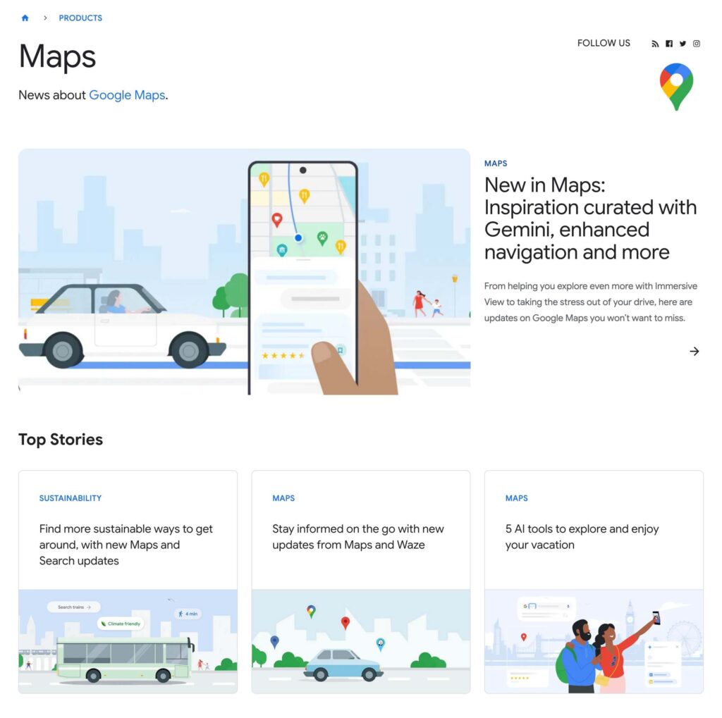
Google exemplifies the importance of design consistency through their consistent use of their iconic brand colors and custom illustrations. Across all platforms, whether it’s the Google homepage, their suite of apps like Gmail and Google Drive, or their blog page, Google maintains a uniform visual identity that is instantly recognizable.
Here’s a snapshot from their blog page – from the colors and the signature illustration style were you able to instantly recognize Google’s brand identity here? That’s the power of visual consistency.
Need help designing your brand guidelines for a consistent presentation of your brand? Get KIMP!
Elevate Customer Experience Through Thoughtful Designs
From understanding your audience to leveraging visual storytelling and ensuring accessibility, every design decision plays a critical role in creating a seamless and memorable customer experience.
But let’s face it ensuring all this takes skill, creativity, and a deep understanding of what resonates with your customers. That’s where expert designers come in. Partnering with professional designers ensures stunning visuals that consistently shape your brand’s image and deliver memorable customer experiences.
Ready to take your customer experience to the next level by enhancing your designs? Sign up for a KIMP subscription today.
Not sure if the subscription model is for you? Register now for a free 7-day trial!


