
The Power of Visual Cues: Transforming Marketing Designs for Maximum Impact
Every brand that invests in graphic design does so with clear goals: to grab attention, engage consistently, and drive conversions. However, many fall short of these objectives. The culprit? Often, it’s weak designs or unclear messaging. There’s a powerful way to avoid this pitfall: the careful and strategic integration of visual cues.

Visual cues or visual signals, in their various forms, are essential for ensuring that your marketing and branding designs not only look good but also function effectively, achieving their intended purpose. So, are you ready to maximize the impact of your designs and take them to the next level? Let’s explore a few strategies to make the best use of visual cues.
- Understanding Visual Cues
- Visual Cues Decoded: 8 Strategies to Transform Your Brand Designs
- 1. Use color psychology to paint perspectives
- 2. Typography speaks louder than words
- 3. Size & scale to create drama and balance
- 4. Shapes as silent storytellers
- 5. Textures to add depth to your design
- 6. Leading lines and other directional cues to point the way
- 7. Interactive visual cues to encourage action
- 8. Negative space to say more with less
- Transform Your Designs, Transform Your Brand
Understanding Visual Cues
So what are visual cues? Visual cues are the essential building blocks of effective visual communication. They can be perceived and categorized in various ways. Some consider them to be the tangible elements that represent a brand visually, like logos, color palettes, and other marketing visuals.
Another way to classify them is by their level of visibility: are they explicit or are they implicit? Additionally, we can categorize visual cues based on their function and how they strategically guide the viewer’s eye through the composition. Finally, based on how visuals are perceived and processed by the eyes they can also be classified as monocular cues (depth cues) and binocular cues (elements that rely on both eyes).
By exploring these different types of visual cues, we can understand how to leverage them effectively. And this understanding helps add subtle refinements to designs to maximize their impact and ensure they are perfectly suited to their intended application.
Visual Cues Decoded: 8 Strategies to Transform Your Brand Designs
1. Use color psychology to paint perspectives
Color is one of the most powerful and evident visual cues in any design intended for branding or marketing. From communicating the message clearly to making an emotional connection colors can have several roles to play.
So, a thorough understanding and application of color psychology can transform your brand designs. Does that sound hard to believe? Picture all the brands that come to your mind when you think of the color red. Or perhaps the premium and luxurious vibes that a combination of black and gold creates. That’s the power of colors in design. And that proves that colors are some of the strongest visual signals in any type of design.
In addition to the emotions each color communicates, you should also know about color harmonies to identify the right combinations. Finally, the use of contrast ensures that each color functions as intended without clashing with or negatively impacting the effect of another color in the design.
To delve deeper into the power of colors in design, check out our blog on color psychology.
2. Typography speaks louder than words
Another silent but strong visual cue that affects every aspect of your design including its tone and clarity is typography. The choice of font, size, spacing, and weight influences how a brand is perceived. They determine whether your brand feels luxurious, playful, or professional.
Choose fonts that reflect your brand’s personality.
- Ace the art of font combinations. Not all fonts that look great carry a similar visual appeal when combined with another font.
- Optimize the text in your design for readability. Not everything that looks good feels easy to read!
- Finally, it’s all about consistency. Picture this – a brand uses a sophisticated serif font in its logo, a playful script font on its social media posts and its digital ads are a bland sans-serif. Does that create a positive impression about the brand? Definitely not!
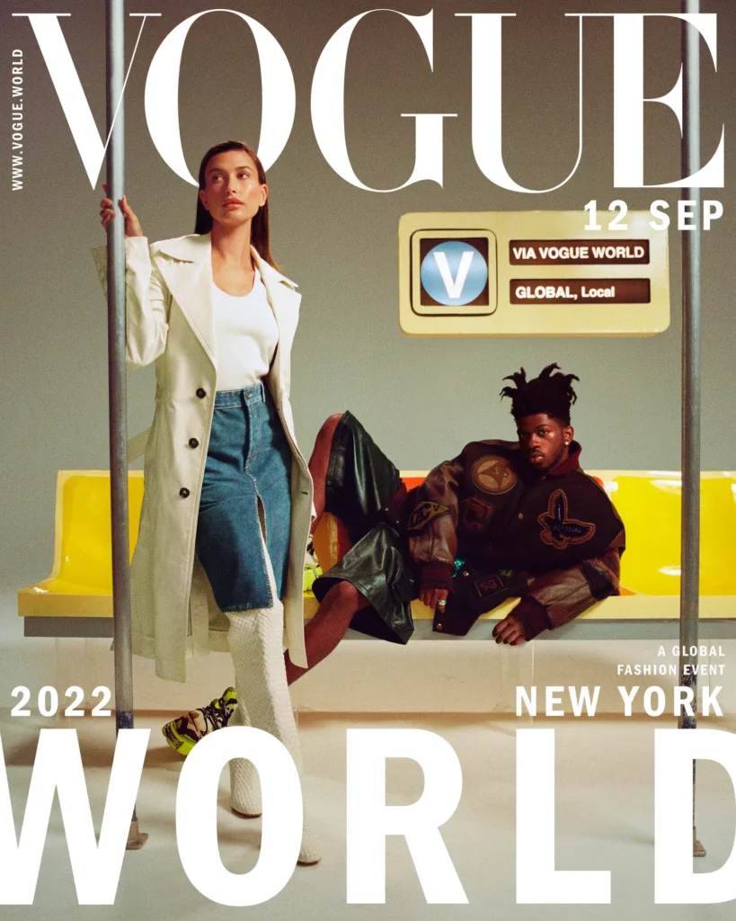
For instance, take brands like Vogue that have consistently used their signature fonts thus building recognizability over the years.
3. Size & scale to create drama and balance
The size or scale of various elements in your design with respect to the default frame and with respect to each other is one of the most impactful visual cues. Because with the right scale, you can create drama and with the right scale you can create visual balance in your design as well.
Additionally, this visual signal also has a key role to play in creating a visual hierarchy. For instance, in the below design, the bold “SALE” captures attention immediately and the other text variations ensure a smooth navigation through the design eventually leading to the “Shop Here” CTA.

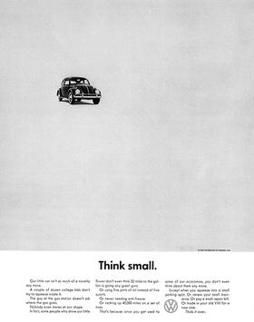
The iconic Think Small campaign from Volkswagen demonstrates how size can be used to grab attention. In this case, the visibly small print of the car within the frame aligned with the promotion of a “compact car”. Similarly, drastically scale up or scale down specific elements to draw attention to them.
Size also can be perceived as a monocular cue that can be used to establish the position of an object within the frame. Smaller objects are perceived to be far behind whereas larger ones appear closest. Use this to add depth to your design especially when creating custom illustrations.
4. Shapes as silent storytellers
Shapes in a design work very much like colors and fonts affecting the basic tone and emotions in a message. But they are more silent and often underused.
To avoid this and to create designs that connect on a deeper level, understand shape psychology.

Once you know the relevance and strengths of each shape, choose the right ones for your core branding elements like logo. In addition to this choose the right ones based on your brand’s personality as well. For instance, freeform organic shapes feel relevant to brands that are dynamic and target the young audience. Whereas, brands meant to represent luxury and sophistication and those targeting a mature audience might benefit from traditional geometric shapes.
5. Textures to add depth to your design
Textures are subtle visual cues that can be used in diverse ways to bring designs to life. For instance, textures come in handy when you have to infuse realism into your design.
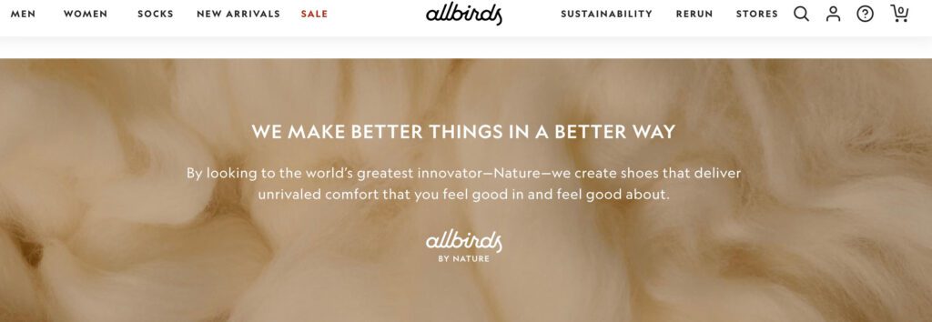
For instance, the image below is a snapshot of the Allbirds website. The brand is particularly known for their unique assortment of materials and hence a textured background like the one here works well.
Furthermore, based on the concept of monocular visual cues, textures can also be used to indicate the relative distance between objects in a design. Objects farther behind appear smoother whereas the ones closer display more detailed texture. This can be applied to illustrations and other designs to establish the scene.
Textures are known to add a tactile depth to designs and can hence make them stand out in a visually crowded space. You can use this trait to ensure that your visuals align with your brand’s visual personality. For instance, a luxury brand can incorporate luxurious textures like velvet or satin, while an adventurous brand might incorporate rough, rugged textures like wood or stone.
Finally, another creative use of textures will be to indicate subtle details like movement in a design. For example, the smoothed-out background here indicates that the jet is in flight. Without the texture here, this sense of movement would have been difficult to comprehend.

6. Leading lines and other directional cues to point the way
Leading lines are directional visual cues that direct a viewer’s attention in the intended direction. These can be added to a design as evident cues in the form of lines, curves, arrows or even pointing finger icons. They are elements added to indicate direction in design, to draw attention to a particular portion of the design.
For example, in the design below, the arrows direct your gaze toward the key points.
Evident directional cues like these can be particularly useful in information-dense designs like web pages, brochures, and posters. Amidst the bulk of information displayed on the page, a simple arrow can help draw the viewer’s attention to a CTA button or contact information or cues about where to proceed or what to do next.
In addition to these, there can also be implicit directional cues that help create a smooth flow in any design. From establishing a hierarchy to helping the viewer’s attention flow naturally through the design, these are useful visual cues to help the effective delivery of a message.
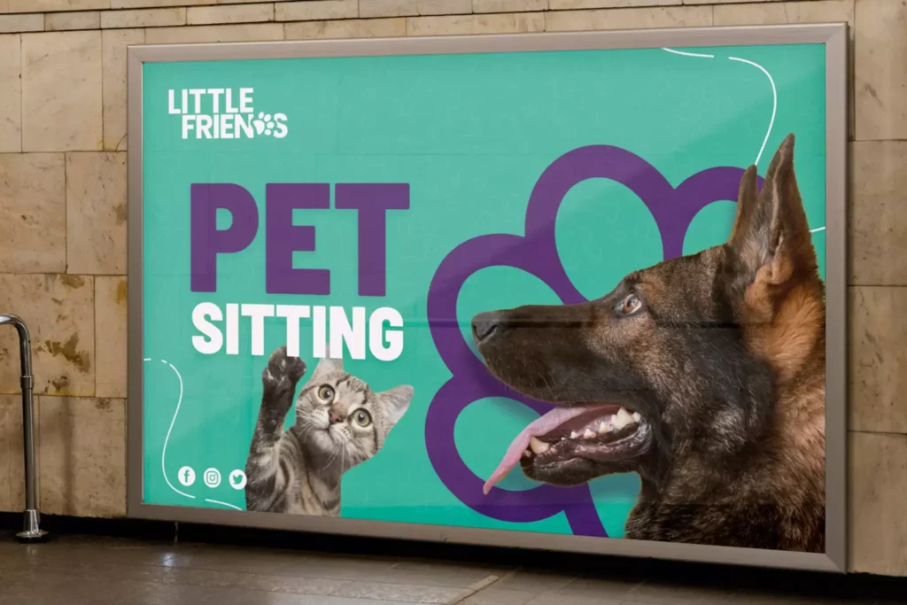
For instance, in the image below, the dog’s gaze and the kitten pointing upward together direct the viewer’s attention toward the brand’s name.
Similarly, the arrangement of elements, their alignments, negative spaces, and a host of other factors can be used to create subtle directional cues in a design.
7. Interactive visual cues to encourage action
Interactive elements like buttons and other controls are must-have visual cues in digital designs. These UI components act as direct engagement points, guiding users toward actions like signing up, making a purchase, or exploring content. Their design, color, size, placement, and micro-interactions, greatly influence user behavior and conversion rates. In other words, the effective use of these visual cues can influence the effectiveness of the design itself.
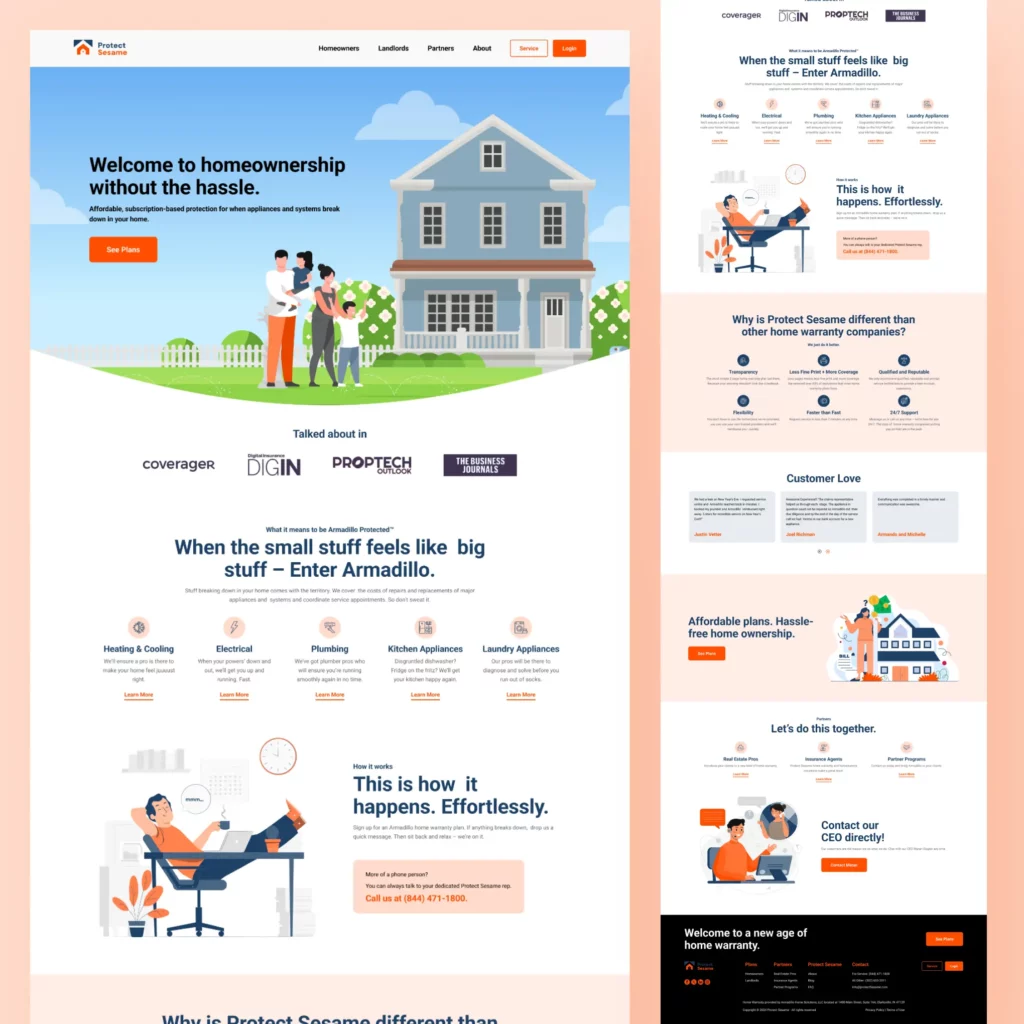
For example, on the web page below, can you instantly identify where the clickable areas are?
To make interactive controls like these work:
- Ensure that the buttons stand out from the background and are easily recognizable as clickable elements.
- Add clear labels to these buttons.
- Keep the button style uniform across your website, apps, and ads to reinforce brand identity.
- In addition to the aesthetics of these controls, ensure optimal placements both in the mobile and desktop versions. They should be positioned such that they are easily accessible.
- Don’t use too many buttons and clickable elements. This overwhelms users.
- To enhance engagement, avoid using generic labels and use labels optimized to your brand’s tone of voice.
8. Negative space to say more with less
Negative space is the intentional white space added to any design either between within or around visible elements in the design. This can be a powerful visual cue to help enhance readability or even to create visual balance.
In fact, in a busy design, negative space can help ground the design and ensure a clear presentation of the information. It can also be used to segregate sections within the design to create a more organized layout and make the message easier to consume and digest.
This is one of those visual cues whose significance becomes more pronounced when they are absent. If you think that any of your information-rich designs either with plenty of design elements or text do not receive the intended engagement, try tweaking them by adding negative space around the key elements. Provide some breathing room for the items in focus and see if this makes a difference.
In addition to the functional value of negative space, the smart use of negative space can form hidden symbols (e.g., the arrow in the FedEx logo) or create a sleek, minimalist aesthetic.
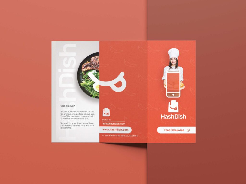
Notice how the use of negative space in the brochure design below preserves the visual intrigue while also drawing attention to the crucial portion of the design.
Transform Your Designs, Transform Your Brand
In conclusion, mastering the art of visual cues can elevate your brand’s impact on the digital and offline spaces. Every detail counts in creating designs that resonate and convert. Ready to take your designs to the next level? Sign up for a KIMP subscription.
Or experience the KIMP difference by registering now for a free 7-day trial!