
eBook Cover Designs: Essential Tips to Get Started
Great stories deserve great first impressions—and your eBook is no exception. In a digital world where readers scroll through content at lightning speed, your eBook’s cover is the one element that can stop them or send them swiping past without a second thought. So, your eBook cover design is not just a pretty picture; it’s the most powerful marketing asset your eBook has.

Whether you’re a business owner looking to boost engagement with compelling eBooks or an author stepping into the exciting realm of self-publishing, here’s the truth: your eBook cover is standing between you and your audience. Will it leave a lasting, memorable mark, or will it blend into the sea of forgettable online content? If you’re aiming for the former, (we know you are), this blog is for you.
This comprehensive design guide will dive into eBook cover design to help you elevate your game. So, without further ado, let’s dive into the world of great covers for eBooks.
- Why eBook Covers Are Your Secret Weapon in the Digital Market
- 10 Expert Tips to Create Scroll-Stopping eBook Cover Designs
- 1. Start simple – with a clutter-free layout
- 2. Guide the reader’s eye with a clear visual hierarchy
- 3. Choose proper contrast – for readability and aesthetics
- 4. Use negative space wisely and creatively
- 5. Set the right vibe with the right shapes
- 6. Brand it bold – clearly define your brand identity
- 7. Add textures to create depth that pops
- 8. Type it right – choose fonts that work
- 9. Visual consistency – connect the cover to the core
- 10. Opt for custom graphics over stock imagery
- Design Eye-Catching eBook Covers With KIMP
Why eBook Covers Are Your Secret Weapon in the Digital Market
First things first, publishing an eBook today is easier than ever before. Services like Amazon KDP have made self-publishing a breeze. Therefore, when you publish an eBook today, you are pitching yours against millions of them online. Amidst such a vast competition, your eBook cover design is the first thing that gets noticed. Naturally, it holds more significance than you think!
Your eBook cover design should:
- Set the tone of your book
- Instantly communicate what it is about
- And therefore appeal to the right readers
Now you might be wondering if eBook cover design differs from traditional print book cover design. While both serve the same fundamental purpose, there are key differences to consider.
For starters, print books have a physical presence. They have front and back covers and the spine to create an immersive experience and each with a different purpose. In contrast, eBooks are typically presented as front-cover-only images, especially in online stores. Therefore you only have that one core image to squeeze in all your crucial information.
Secondly, with physical book covers, additional elements like the texture and quality of print and the physical feel of the book in your hands can complement and amplify the impact of the design. However, for eBook cover designs, the encounter happens as a small thumbnail amidst several other such thumbnails. So yes, design can be a dealbreaker in this case!
Having discussed the essential details let’s now talk about the design tips we promised you!
10 Expert Tips to Create Scroll-Stopping eBook Cover Designs
1. Start simple – with a clutter-free layout
One of the most common mistakes most creatives make when designing eBook covers is trying to include too much information within a single page. A cluttered eBook cover overwhelms and confuses your readers possibly chasing them away, even if the design looks stunning!
So how should your eBook cover design be? Clutter-free and straightforward. Before we delve into this tip further, here’s a design that exemplifies the elegance of clutter-free eBook covers.
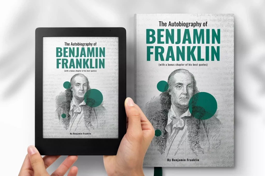
In this case, the centrally placed portrait of Benjamin Franklin is the focal point. It helps bring the design together and establishes harmony. Similarly, identify a focal point for your eBook cover and build your design around it including only those elements that are absolutely essential.
KIMP Tips:
- Avoid crowding the design with too many images.
- Keep the text minimal.
- Identify the key elements and present them in an organized fashion.
2. Guide the reader’s eye with a clear visual hierarchy
In simple words, visual hierarchy is all about arranging the elements in a design in such a way that the presentation effortlessly guides the viewers to the most important information first. Naturally, hierarchy determines whether the viewer grasps the main message. Therefore it is one of the most critical components of eBook cover design.
One of the easiest ways to do this is to adjust the size of various elements so that the key detail is the largest element in the design.
For instance, the design here uses font size variations to establish a hierarchy. Similarly, identify the right visual elements to define the hierarchy in your eBook cover design.
KIMP Tips:
- Place important information in prominent locations – like the center or at the top of the cover.
- Ensure that the image chosen for the cover does not overshadow the text but rather works harmoniously with it.
- Use contrast of colors and size to highlight the main text and differentiate supporting text.
- Adjusting the transparency of elements helps too.
3. Choose proper contrast – for readability and aesthetics
Has some flashy content online startled you? Or perhaps a website where the text almost blended into the background that you had to squint your eyes to make sense of what was in front of you? We’re sure you remember such experiences, not for the right reasons though! Don’t let your eBook cover become such an experience for your readers. Pay attention to contrast.
Contrast is one of the most underrated and yet one of the most influential aspects in any design, eBook covers in particular.
Firstly, good contrast between text and background ensures that your title and author’s name stand out and are legible, even in thumbnail form. The most common combinations are ligh text on dark backgrounds and dark text on light backgrounds. Such contrasts make the text in your design easy on the eyes. Here’s an example.
Secondly, consider the texture and patterns in your background. You do not want to place text over busy backgrounds.
KIMP Tips:
- While contrast is good, high contrast between certain colors can cause a lot of eye strain. Use online contrast checkers to understand whether the chosen colors look good against each other.
- Understand color harmonies and the color wheel to pick colors that complement each other and enhance the aesthetic appeal of your design.
4. Use negative space wisely and creatively
Negative space or white space is the intentional blank space in any design. This can be functional spaces like the line spaces between text or spaces added to draw attention to one particular element. Or they could be intentional aesthetic details like the cloud shapes cut out in the design below.

Using negative space efficiently helps improve the readability of your eBook cover and ensures that users are not distracted away from the main message. For instance, when you add a lot of negative space around the title, it instantly directs the viewer’s attention to it.
Additionally, negative spaces also have a calming effect on a design making it look sleek and minimalistic.
KIMP Tips:
- Use negative space wisely to create breathing room for your design elements and therefore ensure that they do not look cluttered.
- Get creative and use negative space to form shapes or silhouettes within existing elements. This helps add an extra layer of meaning to your design.
For more tips, head over to our blog on using negative space in design.
5. Set the right vibe with the right shapes
Shape psychology is an underrated gem in graphic design. Those shapes that you might be casually using in your design can greatly influence the tone or vibe of your design. How? Take a look at the design here. Does it look professional and serious? The geometric shapes used in the design have a huge role to play in setting this tone. So, choose the right shapes for your eBook cover design.
For instance, when you are trying to represent a sense of community or unity, circles feel like a natural choice. Whereas rectangles and squares look more stable and reliable, when you have you showcase your expertise in an industry.
On the other hand, organic shapes have a sense of irregularity and unpredictability which is why they infuse creativity into your design. They are great for representing something artistic or unconventional. So, understand the psychology of shapes when designing your eBook cover.
KIMP Tips:
- Use shapes to strategically evoke the right emotions with your eBook cover.
- Consider the underlying message and the overall tone of your book to pick the most relevant shapes for the cover.
6. Brand it bold – clearly define your brand identity
Ensure that your eBook cover design is a reflection of your brand identity. For businesses creating eBooks as a part of their marketing strategy, this feels simpler since they already have a strong brand to highlight.
For authors, building a brand is a crucial step. And then comes the process of tweaking your eBook covers to reflect this brand. We discussed how competitive the online publishing industry is. Therefore, standing out with a strong brand identity is more important than you think.
Branding your eBook cover is not just about slapping your brand logo onto the design. It is about carefully bringing together the relevant brand elements that make your eBook cover instantly recognizable.
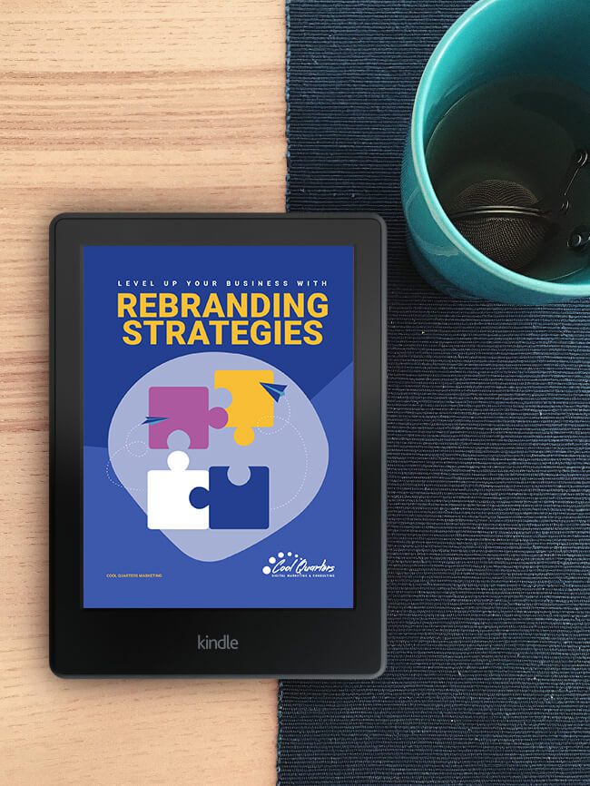
Brand colors can be your biggest strength when it comes to branding your eBook. Find a creative way to use these colors in your design. Here’s an example where the design takes cues from the brand’s logo colors.
But sometimes your brand colors might not be enough. For instance, if you have a monochromatic logo or a black-and-white logo the single brand color might not always be enough to capture the mood of your eBook. In such cases, draw inspiration from the content. Choose colors that align with the genre. Like moody blacks and reds for thrillers and calming blues or pastel colors for self-help books. Another great idea is to use colors that resonate well with your target audience.
In addition to brand colors, incorporate brand fonts or even a mascot, if you have one to represent your brand.
KIMP Tips:
- When choosing colors outside of your brand’s palette, choose those that complement your brand colors.
- Though brand fonts are crucial, prioritize readability for the main text.
7. Add textures to create depth that pops
eBooks might be convenient – no doubt. But ask an avid bibliophile, and they’ll tell you eBooks can’t quite replicate the joy of holding a physical book in hand. It’s a sensory experience that eBooks cannot match. But wait, there’s a way to meet in between—textures. By adding thoughtful texture to your eBook cover, you can bridge that physical-digital gap, giving readers a hint of the tangible even in a virtual world.
Moreover, textures can add depth and character to your design. They don’t just look good but help enhance the emotional appeal of your eBook cover design. Notice the calming and immersive effect of the foliage texture in the design below.
KIMP Tips:
- Be cautious about contrast when using textures. You do not want text and other essential elements in your design to be lost in the details of the texture you choose.
- Do not combine too many textures – you’ll end up overwhelming your readers.
8. Type it right – choose fonts that work
Your brand fonts are undoubtedly the number one option for eBook cover designs. However, they might not always be the most legible options. Besides, you also need the right font styles to suit the theme of your eBook and the visual style of your eBook cover design.
First and foremost, choose legible and scalable fonts for the eBook title and author’s name. The title should be the most prominent element, followed by the author’s name and any subtitles or taglines. Use size, weight, and color to differentiate between these elements and establish a clear hierarchy.
In addition to choosing the right fonts and font sizes, pay attention to the kerning (spacing between letters) and leading (spacing between lines) to ensure the text looks balanced and professional.
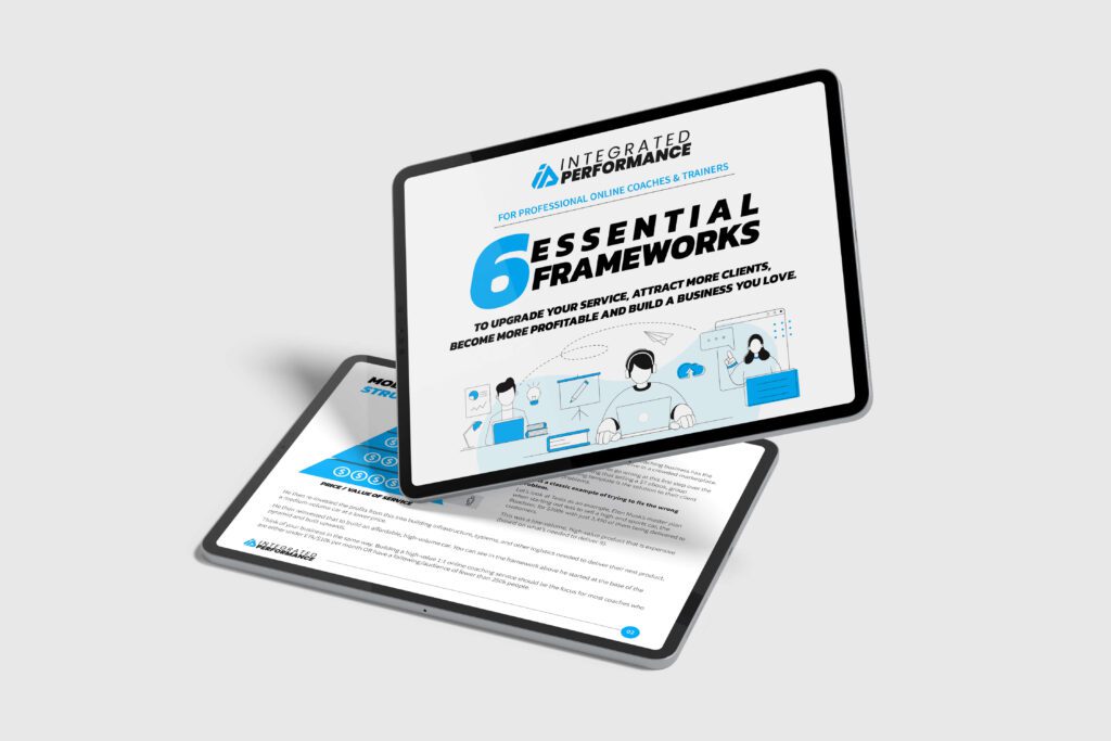
Finally, when combining fonts, avoid experimenting with too many font styles. This dilutes the vibe and confuses the readers. Instead, stick to a single font type and adjust the color or size to create a hierarchy. Here’s an example demonstrating this.

KIMP Tips:
- Avoid overly decorative fonts since they can affect readability, especially on a small thumbnail.
- Pick font pairs wisely. The chosen fonts should not contradict each other in their aesthetics or tones.
9. Visual consistency – connect the cover to the core
Remember, your eBook cover design isn’t a standalone graphic. It is a sample of what comes after that cover. So, you need to focus on visual consistency.
Imagine you come across an eBook that conveys a playful vibe on the cover and then the tone of the content that follows and any supporting visuals look and sound professional. Don’t you think you’ll feel confused? You do not want this effect on your readers.
Therefore, a good eBook cover design flows seamlessly from the cover to the very last page. It should be a foundation that ties together all the visuals, fonts, and other design elements within the eBook for a cohesive journey. That’s one way to build trust and keep readers immersed throughout.
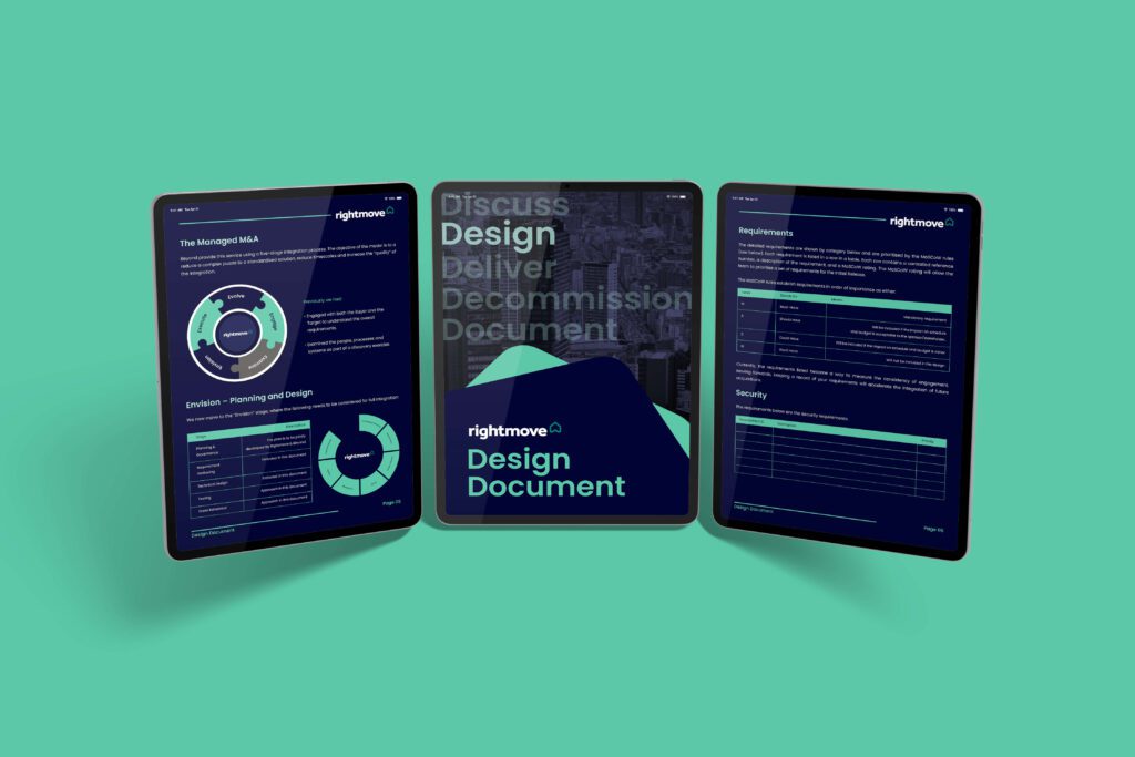
So, how do you achieve this? Create a cover design that acts as the perfect blueprint for your whole eBook. Choose colors, fonts, and visual styles that can easily be extended to the other pages.
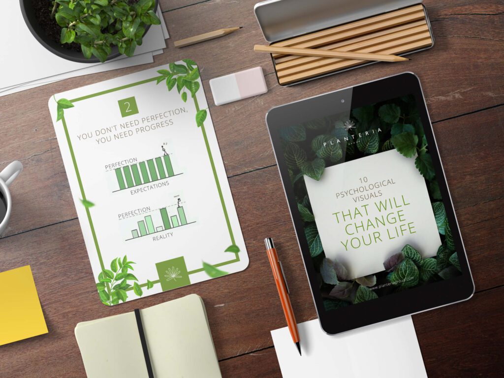
Here’s a design that shows the kind of impact a visually consistent eBook design has.
KIMP Tip:
- Plan ahead and sketch out your cover and interior style together.
- Test the flow by flipping through a digital proof—does it feel like one story?
10. Opt for custom graphics over stock imagery
Stock visuals are convenient and they save a lot of time when designing branding and marketing designs. However, when it comes to impactful designs like eBook covers where you only have one shot at making a first impression, you need something unique. Overused, clichéd stock visuals make your eBook cover look inauthentic.
Moreover, stock images look generic and may not fully capture the unique essence of your book. Not to forget, there’s the risk that other authors might use the same image, leading to duplicate covers.
To stand out, incorporate custom graphics. Even if you have to use stock assets, personalize them fully to suit your brand. From colors and fonts to the use of negative space, and the alignment of different elements, and any visual effects applied, everything on the cover should be tweaked to reflect your brand.
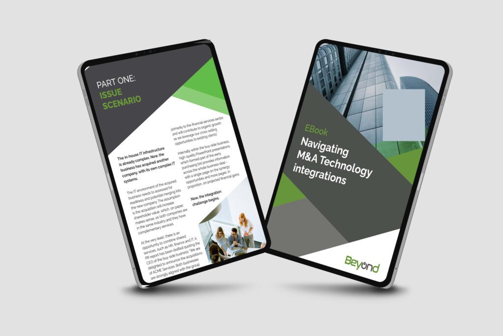
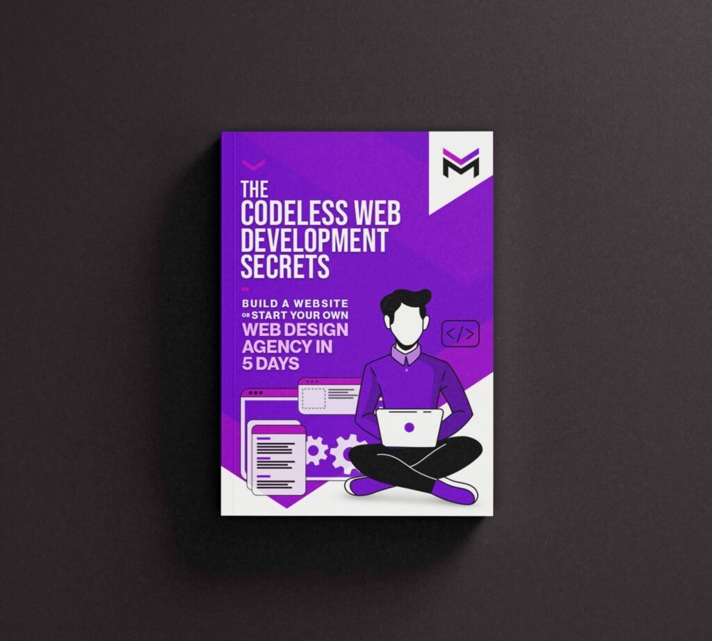
For instance, here’s an eBook cover that uses custom illustrations and colors to resonate with the brand’s visual identity.
KIMP Tips:
- Incorporate custom illustrations and icons into your eBook cover design instead of random stock elements that feel irrelevant.
- Even when you do not have access to custom illustrations and other custom graphics, use creative typographic effects and a dynamic background to create something unique.
Design Eye-Catching eBook Covers With KIMP
Your eBook deserves a strong cover. One that instantly grabs attention and builds trust. And here’s the thing – design does not have to be a struggle. If you are finding it tough to keep up with your ever-growing design requirements, then an unlimited design subscription is the answer you have been looking for. Why wrestle with tools and templates when you can have a dedicated team of designers in your corner?
A KIMP subscription gives you access to top-tier designs and a dedicated design team that takes care of all your graphic design needs, motion graphics, or both. Ready to elevate your eBook game? Sign up for a KIMP subscription. Better yet, start with our 7-day free trial!