
Creating Visual Flow: Using Leading Lines in Graphic Design
Creating designs is one thing. But crafting designs that instantly grab attention and resonate with your audience? That’s a whole different game! Once you master this art, your marketing designs do not feel like promotional advertisements any longer. They start feeling more like natural, non-intrusive conversations. A key element in achieving this smooth flow is the use of leading lines.

But what exactly are leading lines in design? How can you make the most of them when designing ads and branding graphics to represent your brand? Let’s explore the answers to these questions in this blog.
So, What Are Leading Lines?
In a design, you might have several individual elements coming together to deliver the intended message. In such a design if you create lines to direct the viewer’s attention to a specific point or direction, these lines are called leading lines.
Whether it’s a sleek product ad, a social media graphic, or even a brand logo, leading lines are often the subtle yet powerful force guiding your attention exactly where the designer wants it to go. In short, these are all about establishing one or more visual focal points in your design. It is what ensures that your design does not just look visually appealing but also communicates a clear message.
Leading lines have long been seen as critical aspects of art and photography. They have helped add an element of intrigue to the captured photograph or art and have been used to establish perspectives.
When you extrapolate this idea to your marketing graphics or branding designs you can achieve similar results when it comes to playing with perspectives and boosting the clarity of your message.
Types of leading lines in graphic design
Leading lines can be actual lines pointing in a specific direction. When using natural elements in your design, you can use roads, waves, rivers, and other entities to add physical lines to the design. Lines that draw a viewer’s focus toward a specific point.

Otherwise, the leading lines could be implied without actual visible lines drawn in the design. For instance, the arrow, the position of the rocket, and other elements in this design are all pointed in a diagonally upward direction. This is a good example of implied leading lines.

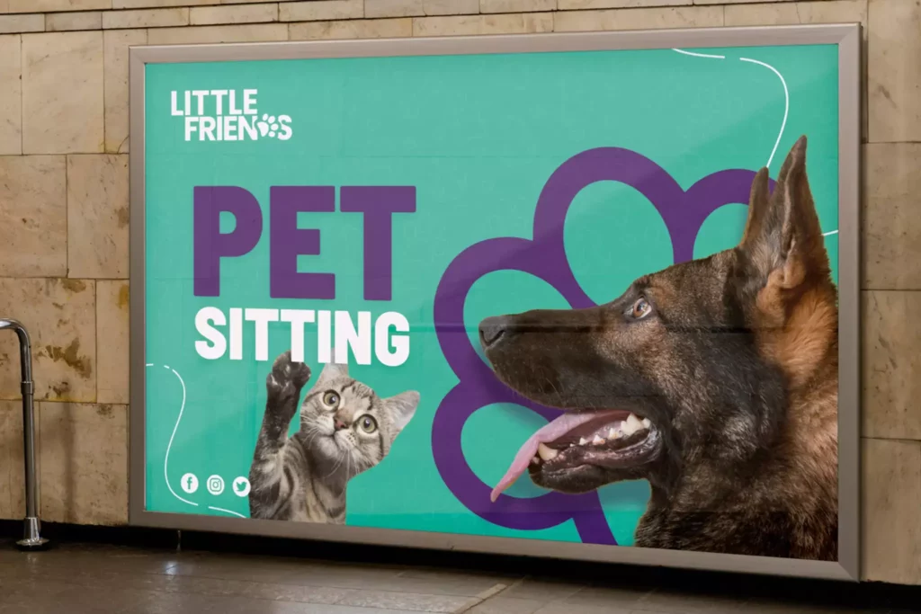
When featuring human or animal subjects in the design, there are even more subtle ways to add directional cues. From the gaze of the subject directed in the required direction to the subject pointing toward the element in focus, the options are endless. For instance, in the design here, the dog’s gaze and the cat pointing toward the service offered ensure that the message is loud and clear.
To understand the concept better and to effectively apply the idea to your designs as well, let’s talk about some of the benefits of leading lines in graphic design and how to make the most of them.
The Benefits of Leading Lines: How to Use Them to Enhance Your Designs
Make your core message stand out
Every ad design has the main message and supporting elements to build on this or amplify the significance of this message. But how do you ensure that the core message stands out? Leading lines can help.
For instance, in the design below, the fact that it is about the “Pre-Christmas Sale” announcement and the “20% OFF” are the main details that need to be communicated. Therefore, the bottles are strategically angled to subtly point toward the central message, creating a visual flow that pulls the viewer’s eyes toward the main text.

This design is a great example of how you can use objects in the composition as implied leading lines without crowding it with lines or arrows.
KIMP Tips:
- Similar to the design we discussed, use elements that are already part of the design like the featured products so as to create implied lines. This creates a more seamless visual flow without unwanted clutter.
- Additionally, keep the design visually balanced by using the negative space around the core message, allowing it to stand out.
- Keep the central text in focus crisp and easy to understand. Since all eyes are on this message, you need to be sure that it is easy for readers to grab the message effortlessly.
Boost visual storytelling
Leading lines can be used as effective tools to boost visual storytelling. This is because they can help guide the viewer through the narrative you’re trying to convey, making it easier to communicate a journey, progression, or even the relationship between elements in your design.
Here’s an ad to demonstrate how to achieve this. In this ad, Hamptons uses the imagery of mountain climbers to represent the customer’s journey toward buying or finding a home. The rope connecting the climbers acts as the leading line establishing the relationship between the firm and their customer.
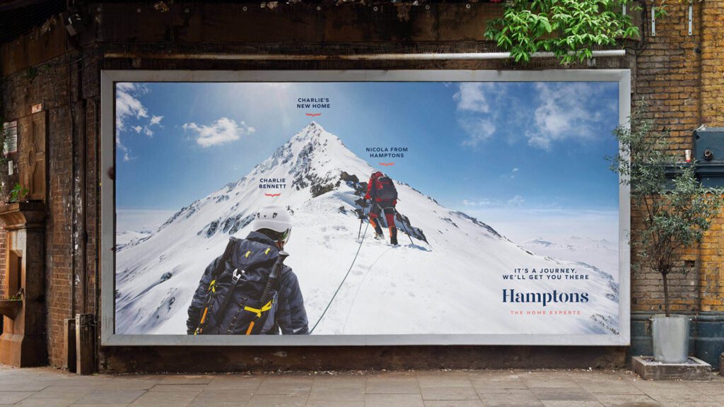
The edges of the mountain converging at the peak directs the viewer’s gaze toward the top, symbolizing success which in this case is the customer reaching the final goal (a new home).
The apt use of leading lines ensures a clear portrayal of the intended visual narrative in the design.
KIMP Tips:
- Similar to the design we discussed, use relevant leading lines to indicate the relationship between elements in your design and thus ensure precise delivery of your message.
- Identify metaphorical representations to create an element of intrigue instead of direct representations. For more ideas, check out our blog on visual metaphors.
Direct the viewer’s gaze toward the CTA
One of the most useful ways in which you can apply leading lines to your design is to direct the viewer’s attention toward the CTA (call-to-action). This ensures that the user moves ahead to the next step.
These could be “Buy Now” buttons or even a contact detail intended to encourage users to visit your website or social media page. When you want users to take a specific action, you should ensure that their eyes are naturally drawn to this action button.
For instance, observe the lines leading to the bottom left corner of the ad here. Since getting users to scan the QR code is the ultimate goal of this design, the curvy lines in the design here ensure that you do not miss this little detail.
KIMP Tips:
- Choose elements like arrows or lines in specific visual styles that align with the rest of the design. Like the curvy lines that subtly incorporate cultural elements in the design above.
- If there is a lot of text and you do not want to crowd the design with additional elements, consider aligning lines of text to imply the direction.
Create more engaging designs
Sometimes your design has all the essential details and yet it somehow fails to impress. This happens because there could be a lack of visual depth or the lack of an element of surprise, of visual intrigue. This is where leading lines can make a difference.
For example, observe the social media design here. The tall buildings soaring upward create subtle yet impactful leading lines.

In a way, they create a sense of scale and grandeur that makes the design more engaging and dynamic.
Other well-known examples will be the logos of Adidas and Nike. the upward movement in Nike’s Swoosh as well as the upward movement in the stripes of the Adidas logo create a sense of motion making the logo more interesting.
Without their subtle dynamism, the designs would not have been the same! Similarly, if you think your design should not be boring, use leading lines to boost interaction.
KIMP Tips:
- To create the leading lines that make your design more engaging, use imagery/alignment that feels natural and not forced. In this case, the building’s vertical structure feels relevant to the design.
- Ensure that the alignment of the text supports the intended movement without breaking the flow.
Define a smooth visual flow
Visual hierarchy is what ensures that users conveniently navigate through your design and reach the main message. In other words, visual hierarchy is about a smooth visual flow. This is important because a smooth visual flow ensures that the viewer’s eye moves naturally across the design, leading them from one element to the next without confusion or distraction.
To create a clear path through your design and thus establish this visual flow, you need a combination of design elements such as layout, alignment, and most importantly, leading lines.
Imagine the arrows and lines guiding a viewer through a flowchart, a process diagram, or any infographic for that matter. This is an example of using distinct lines to create a smoothly flowing design.
For example, in the logo design below, the seamlessly gliding line creates an organized flow and encourages viewers to read the brand name fully.
KIMP Tips:
- If the idea is to use leading lines to create a rhythmic flow and not shock or surprise the viewers or direct them to one specific point, then you need to keep your visual elements consistent in style and placement. This helps avoid jarring transitions and maintains a smooth flow.
- Despite the smooth flow, you need the right variations created using font colors, font size, and contrast to prioritize the text portions and how they are related.
Let’s now summarize our observations from all these examples and strategies to take away some do’s and don’ts for applying leading lines to branding and marketing graphics.
Best Practices: Do’s and Don’ts for Using Leading Lines in Design
Leading lines can therefore be powerful tools to transform your design. But yes, you need to use them accurately in order to boost user experience while also enhancing the aesthetics of your design. So, here are some do’s and don’ts to achieve this:
Do’s
- Do ensure that the leading lines are aligned with the key message. You do not want them to distract viewers away from what really matters. When they miss the crucial detail, they might not take the next step intended.
- Do experiment with variety when it comes to defining your leading lines. Diagonal lines, converging lines or diverging ones can all clearly depict direction or flow in your design.
- Do use leading lines to add depth to your design. Instead of appearing flat and boring, your designs appear more engaging thanks to the sense of motion that leading lines bring to them.
- Do experiment with different shapes and curves to keep your design interesting. While straight lines get the job done, curvy and wavy lines create a dynamic twist.
- Do ensure that the leading lines in your design resonate with the rest of the composition. You do not want them to break the flow or contradict the mood or theme that the rest of the design creates. They should subtly direct attention in the intended direction or to the intended point without overpowering the other elements in your design.
Don’ts
- Don’t crowd your design with too many leading lines. You do not want a cluttered design.
- Don’t use abrupt transitions or direction changes in your leading lines. If the visible line elements you add in your design end abruptly or do not seem to end at a focal point, it can make your design ambiguous and confusing.
- Don’t ignore the context of your design. From comparing between tangible leading lines to implied ones to the shapes and orientations of these lines, every decision should be based on the context of the design.
Master the Art of Leading Lines With Designs by KIMP
In short, incorporating leading lines effectively can transform your designs and ensure that your message is clearly communicated. Therefore, mastering the art of leading lines means that you can boost the effectiveness of your design and boost conversions too.
Ready to take your designs to the next level? Why not partner with a professional design team that has aced the art of applying design principles like leading lines and other crucial factors that take your design from “meh” to “wow”? Sign up now for a KIMP subscription and work with a designated design team for all your marketing and branding graphics.
Register for a free 7-day trial!