
The Secret Sauce of YouTube Thumbnails: Lessons From 8 Popular Channels
When you visit a store, what do you notice first? It’s ambiance perhaps? You might be subconsciously forming opinions based on the store’s aesthetics. Applying this concept to YouTube channels, what factors shape a viewer’s initial impressions? While the cover page and profile picture are important, thumbnails often play a silent but crucial role. YouTube thumbnails often act like digital storefronts for your channel.
Well-designed YouTube thumbnails don’t just make your channel look good but also convince users to click “play” and engage with your content. These attention grabbers can also instantly communicate the value you aim to create through your videos. They can influence whether a viewer decides to explore your channel further or simply moves on to the next option.
But how do you create YouTube thumbnails that stand out from the crowd? Let’s draw inspiration from the strategies employed by successful YouTube channels.
Why YouTube Thumbnails Matter
- With more than 2.5 billion monthly active users, YouTube is the second most used social media platform after Facebook. So, yes, this is a crowded space. Therefore, YouTube thumbnails can act as scroll-stoppers grabbing attention and making your video stand out from the endless scroll.
- With 66% of marketers planning to leverage YouTube, thumbnails become your silent salesperson. They attract the right crowd to your channel.
- According to a study by Social Media Examiner, about 66% of marketers plan to boost the use of YouTube in their marketing strategies.
- While the desktop version and TV app of YouTube are still popular, almost 90% of the views on YouTube come from mobile devices and smartphones. Therefore, you need catchy thumbnails that instantly attract attention on small screens.
- Every minute creators upload about 500 hours of video content on YouTube. Amidst this, a well-designed thumbnail cuts through the noise, piquing curiosity and making viewers choose your video over countless others.
- A Think With Google survey reveals that 90% of people discover new brands on YouTube. YouTube thumbnails act as the gateway, offering a glimpse into your content and motivating viewers to learn more about your brand and what you offer.
In addition to these evident benefits, YouTube thumbnails can also be valuable assets in branding a YouTube channel. To make sure that your YouTube channel reaps all these benefits and to design YouTube thumbnails that stop the scroll, let’s take cues from well-known YouTube channels with awe-inspiring thumbnails.
8 Channels Crushing the Thumbnail Game on YouTube
1. HubSpot
HubSpot, a leading inbound marketing software company, leverages YouTube to educate and inform its audience. If there is one word to describe their strategy for YouTube thumbnails, it’s “clarity”.

Here’s a snapshot of their thumbnail style from a few months ago.

The designs are drastically different, however, the focus has always been on the clarity of the message. As you can see, you can instantly grab the theme of the video from the thumbnail without even reading the video title.
One notable transition in design has been the brand’s decision to switch to a cleaner and more refined style. Clutter-free backgrounds, muted colors, and minimal text keep the overall design sleek and easy on the eyes.
An interesting design detail to take away from HubSpot’s recent YouTube thumbnails is creative text layering. The text sections wrap the subject appearing on different layers thus creating a depth effect.
KIMP Tips:
Let’s summarize a few quick design takeaways from the YouTube thumbnails used by HubSpot:
- Keep it clear and simple.
- Find a way to incorporate your brand colors.
- Aim for visual consistency.
- Experiment with typographic details like layering of text and subject to make the design more intriguing.
2. Kurzgesagt – In a Nutshell
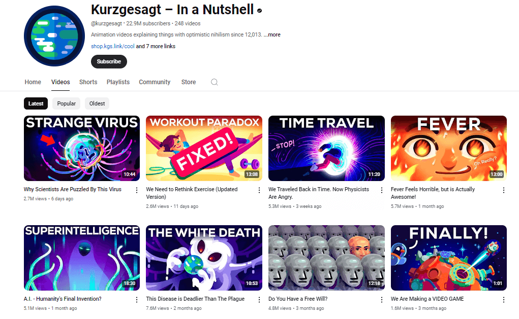
Kurzgesagt – In a Nutshell is an educational YouTube channel known for its visually immersive and informative animations. The YouTube thumbnails on this channel are bold and electrifying.
What truly stands out are the vibrant color palettes that they also use in their videos. If you scroll through the channel you can see that they mostly cover a lot of complex topics. To resonate with these, the thumbnail designs are visually intriguing and carry a lot of complex details.
The approach here contrasts the simple design and direct presentation of details as with most channels. But here, the target audience for the “Kurzgesagt – In a Nutshell” channel are educators, students, and science enthusiasts. In short, this channel is about knowledge seekers looking for cognitive stimulation, and hence the dynamic visuals are highly effective here.
KIMP Tips:
- Identify keyphrases to keep the text in your YouTube thumbnails minimal.
- Use bold fonts that ensure the readability of the text even on small screens.
- The illustration style on the thumbnails of Kurzgesagt – In a Nutshell immediately communicates that these are animated videos. Similarly, use your YouTube thumbnails to reflect the visual style of your videos.
3. Neil Patel
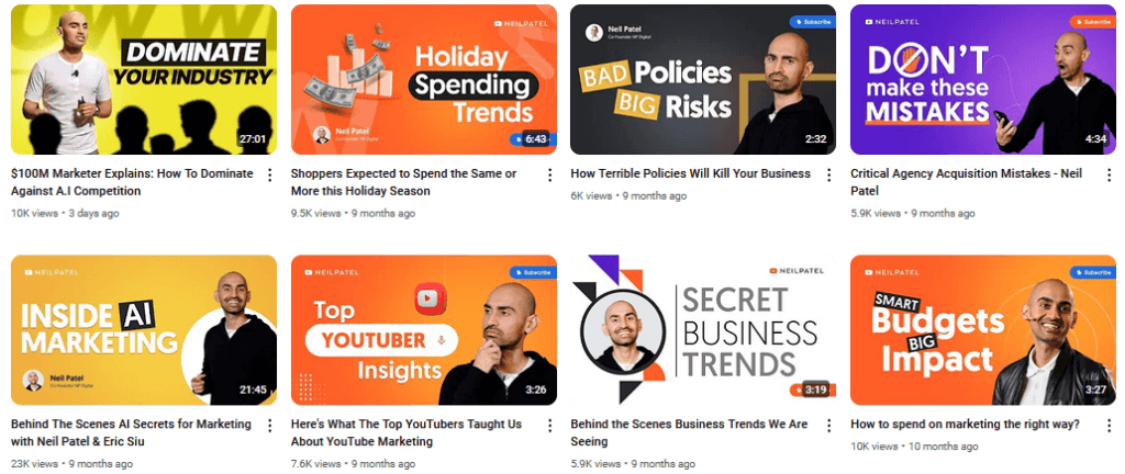
Neil Patel’s YouTube channel is known to be packed with resourceful videos on digital marketing. His strong personal brand and excellent content quality have helped his channel perform consistently. His YouTube thumbnails with their professional tone help reinforce the credibility of his personal brand.
There is a certain visual rhythm to the thumbnails on his channel. They mostly carry a plain background, there is a photo of the presenter which is Neil Patel himself in most cases, and a short text conveying the theme of the video. This structured design creates a sense of familiarity that can be highly effective in engaging existing subscribers.
A notable detail in these thumbnails is the use of expressive stills that evoke an instant emotional response and pique the curiosity of the viewers.
KIMP Tips:
- To let your content shine, use simple backgrounds.
- Incorporate gradients to boost the visual intrigue of your YouTube thumbnails.
- Use designs that evoke emotions.
4. Brand Master Academy
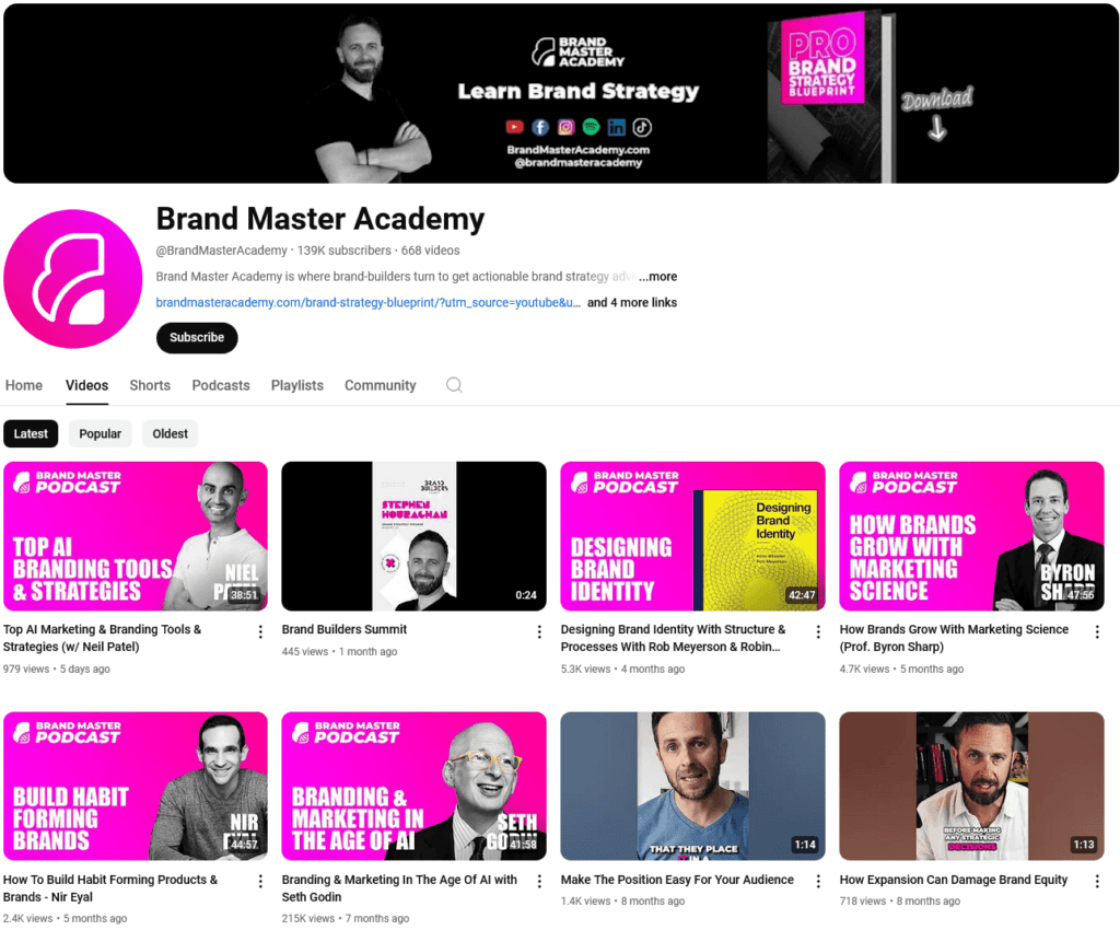
The Brand Master Academy’s YouTube page is a great resource for those looking for marketing and branding tips and updates. Their YouTube thumbnails emphasize the significance of using brand colors in design.
The brand colors appear either as the primary background colors in the thumbnails or in the text. When appearing in the thumbnail backgrounds, they appear as gradients similar to the unique hot pink gradient used in the brand’s logo. This creates a cohesive look for the channel.
Moreover, the channel uses a set of templates for the thumbnails with different templates being consistently used for different series of videos. Like the brand color templates for their Podcast series with the photos of the guests prominently placed on the thumbnails.
In most other thumbnails, you’ll see the photo of Stephen Houraghan, a renowned brand strategist and coach who is the presenter in most videos on the Brand Master Academy page.
KIMP Tips:
- Design thumbnails with faces because people connect with people.
- Deploy clever integration of your brand colors in your YouTube thumbnails to amplify your brand through your channel.
5. Etsy
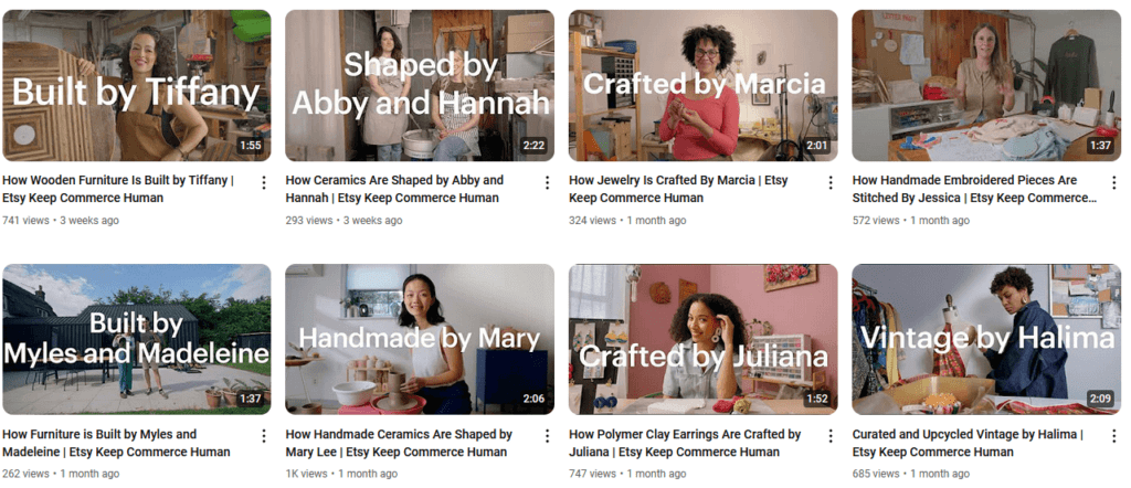
Etsy’s thumbnails also feature real people to instantly make a personal connection with the viewers. It looks a lot like the YouTube thumbnails used by HubSpot and other channels but the key difference is the type of photos used. Or more precisely, the scenes featured.
With Etsy, the focus is on the sellers and their craftsmanship and hence their YouTube thumbnails capture the authenticity of these sellers. Instead of looking staged, the photos used in these thumbnails look natural and authentic by featuring the sellers in their respective workspaces.
Given the diversity in the imagery used in these thumbnails, Etsy uses consistent text placement to create a balanced look.
To maintain a more friendly and mellow tone, the brand uses a slim sans-serif font in sentence case in contrast to the all-uppercase text most channels seem to incorporate into their designs.
KIMP Tips:
- Professional photographs add value to your YouTube thumbnails but do not compromise on the authenticity factor.
- To create a seamless flow in your channel, ensure that there’s cohesiveness not just in your visual themes but also in the copy appearing on your thumbnails.
6. Shopify
Shopify’s YouTube channel has videos spanning a multitude of topics. What we particularly love is their approach when it comes to the YouTube thumbnails used for Shopify Editions, their biannual round-up of insights and updates.
The image here captures the vibrant theme they went with for Shopify Editions Summer ‘24.
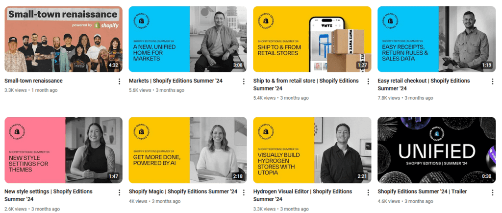
And the next image here is a snapshot of the thumbnails used for Shopify Editions Winter ‘24. While the color palettes reflect the themes for the year, the color-block pattern and the placement of the Shopify Editions logo tie the designs together indicating that they are part of the same series. Moreover, for each edition, there is also consistency in terms of the photo edits like the monochromatic photos for Summer ‘24 and the solid backgrounds for Winter ‘24.
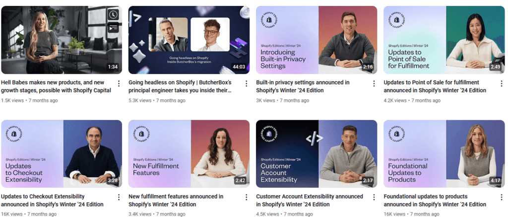
With all these details they manage to ensure consistency across the series while also subtly differentiating one edition from the other.
Moreover, Shopify consistently uses the theme on their other channels like their Instagram post here for the Winter ‘24 Shopofy Editions.
KIMP Tips:
- While consistency across your YouTube thumbnails is good, visual consistency across your designs for diverse channels is even better in branding.
- To leverage your brand’s equity and boost the credibility of your content, ensure optimal placement of your logo in your YouTube thumbnails.
7. Hootsuite
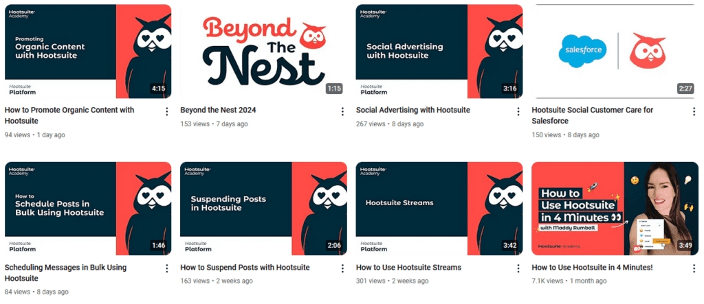
Hootsuite is one of the most popular social media management platforms and their YouTube thumbnails carry valuable lessons in preserving a brand’s identity on YouTube.
The organized layout they use on most of their thumbnails is perhaps the first thing you notice about the channel. This creates a smooth and refined look. Which is very much useful in building credibility for ar a brand that has a strong authority in its industry.
One more point to take away from the YouTube thumbnails of Hoosuite is the effective use of their owl mascot. A mascot, when consistently and relevantly used in your marketing graphics, becomes the familiar face representing your brand. Therefore, placing your mascot on your thumbnails means instantly grabbing attention and evoking brand recognition when your video appears amidst other search results on YouTube.
However, when featuring your mascot in your YouTube thumbnails, ensure that it fits into the theme accurately rather than appearing to be forcefully positioned. From the expressions of your mascot to its costume, every little detail can influence the look and feel of the mascot and its relevance to the theme.
KIMP Tips:
- Brand elements like logos, colors, brand fonts and even mascots can add value to YouTube thumbnails while also enhancing brand recognition.
- Establish a clear hierarchy in your thumbnail designs to ensure that the core message is clear.
8. Netflix
If we had to grant awards to brands with the most cohesive YouTube thumbnail looks, then Netflix would definitely be among the top nominees.
Here’s a snapshot of the thumbnails on their YouTube channel from a few days ago.

This next image is a snapshot of Netflix’s thumbnails from about a year ago.

Despite the rapid evolution of the entertainment industry and the expansion of Netflix, they have managed to stay consistent with their brand identity as well as the brand tone of voice. And this image shows that even their YouTube thumbnails have remained consistent.
The template is the same – a label that indicates what kind of video it is, a clip from the video as the background and the brand name at the top. Unlike other brands that alternate between templates for different series, Netflix brilliantly uses content labels to bring in this differentiation. As you can see in the first image, even for their Geeked Week 2024 lineup they have not drastically altered the thumbnail except for the subtle comic book style detail at the top of the respective thumbnails.
A consistent presentation like this one etches your brand identity in the minds of your viewers and therefore ensures that they recognize your brand and click on your videos even amidst a crowd of new videos flooding their feeds.
KIMP Tips:
- Create templates for your thumbnails to ensure consistency.
- Plan your content ahead and present your videos in a well-organized manner. This helps maintain a structured and smooth-flowing layout on your YouTube channel.
Create Irresistible YouTube Thumbnails With KIMP
Creativity knows no bounds especially when creating YouTube thumbnails. It all boils down to identifying what works for your channel and what resonates with your audience. And then a hint of your personal style will do the trick. Working with a professional design team makes the execution of these strategies so much simpler. Need help designing your YouTube thumbnails and other marketing graphics? Get a KIMP Graphics subscription. Or if you would also like a dedicated design team to work on your short videos including intros and outros for your YouTube channel, then a KIMP Graphics + Video subscription is what you need.
Ready to try out the subscription model for your design workflow? Then sign up today and try our 7-day free trial!