
Designing an Infographic: 3 Easy Steps For Beginners
Are you designing an infographic? Perhaps you have a lot of information you think will excite your target audience but wondering how to nail the design? Wondering how to design an infographic that educates and engages people without overwhelming them? Well, you’re in the right place. We’ve got some of the best tips for designing an infographic right here.

Put simply, an infographic = information + graphics! In other words, the graphical representation of information. Hence it’s a powerful tool to communicate complex information more effectively. When you have a lot of data to present and worry that crucial details might get lost in lengthy text, infographics can save the day.
Infographics have also grown to become valuable assets in marketing. Why? Because businesses need to communicate information to their target audience constantly. Maybe they want to showcase their industry expertise, or shed light on market trends, or visually demonstrate their impact. And for all these data-driven messages, infographics are indispensable tools.
So, are you ready to design an infographic that gets noticed and shared? Let’s break down the process into 3 easy steps.
Step 1: Finding the Perfect Fit: Select the Right Infographic Type for Your Needs
When designing an infographic, the first step is to consider the right infographic type. Because they differ not just in aesthetics but also in their purpose. Therefore, selecting the perfect fit ensures your message resonates with your audience. So, let’s talk about some of the most commonly used types of infographics.
1. Process infographics
As the name indicates, these are infographics designed to provide a visual representation of the steps in a process. So, if you wish to provide a visual breakdown of a complex process, then this is the type of infographic you need.
While process infographics come in handy on various occasions like providing information and instructions to new employees or explaining to investors how your business works, a few possible applications from the marketing perspective will be:
- To demonstrate your workflow to your customers.
- Or perhaps provide step-by-step instructions on how to use a particular product or service.
- To explain how to use your app or specific tasks like placing an order or availing of a discount.
For instance, the below infographic demonstrates how the online guitar program called “Peak Performer” works.

Infographic design by KIMP
KIMP Tips:
- Use appropriate color variations, alignments and object placements to differentiate between steps and emphasize crucial ones.
- Although process flows are typically illustrated from top to bottom or left to right, feel free to get creative. Just remember to incorporate a guiding element, like arrows or color gradients, to ensure a smooth visual flow for the reader. The below design exemplifies this.

Infographic design by KIMP
2. Timeline infographics
When designing an infographic to present information about particular events in chronological order, timeline infographics are just what you need. They display progression to capture milestones or even to depict growth.
So, what are some ways in which you can use timeline infographics in marketing?
- Want to give customers a peek into your organizational history? Timeline infographics are perfect!
- Celebrating an achievement? Highlighting your business’s crucial milestones amplifies the effect. And timeline infographics are great for this.
- When designing an infographic to promote an upcoming event, a timeline format helps present a visual map of the schedule.
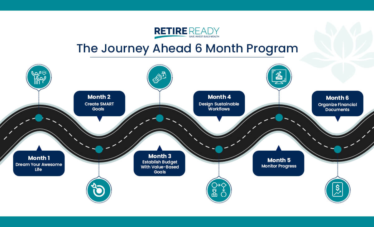
Infographic design by KIMP
KIMP Tips:
- When you have a list of milestones or events to include, shortlist the most important ones rather than including too many that can crowd the design.
- Use visuals like photos to capture the key moments from the highlighted landmarks along the path.
3. Statistical infographics
Businesses sometimes have to present raw information in the form of statistics. This could be to present market data and show their relevance in their industry or even to summarize their observations. When designing an infographic for these applications, a statistical infographic is just what you need.
Infographics are particularly great for presenting statistical data because establishing the correlation between tidbits of information becomes easier with a visual representation. Besides, an infographic helps craft a relatable narrative to interpret the significance of the presented information. In short, by designing an infographic to present statistics you are helping users get the bigger picture.
Infographic design by KIMP
So where can you use statistical infographics in marketing?
- Summarize your research findings.
- Provide consumer insights and show customers that you understand their requirements and shopping behavior.
- Include information about market trends and predictions for the future.
KIMP Tips:
- Double-check the validity and accuracy of the information presented.
- Use legible fonts where both text and numerical characters are easy to read on diverse screen sizes.
- Choose the right data visualization format for representing the relationship between the various attributes presented (more on this a little later in the blog).
4. Comparison infographics
When you have to compare two or more products or services or brands there might be several nuances to talk about. Among the parameters you discuss some of them could be related as well. Therefore the sum total of the impact due to these differences might be big. Comparison infographics help draft a visual representation of the whole story so that these differences and their significance are clear to your customers.
A few marketing applications of comparison infographics include:
- Discussing the features of two or more of your flagship products to help your customers choose the right one.
- Highlighting the updates and new features in a new firmware/software update for your product.
- Comparing your performance or offerings with those of a competitor to show what makes your business different.
The example below highlights the difference between free and staking contests.

Infographic design by KIMP
KIMP Tips:
- For the comparison, choose the criteria that matter the most to your target audience.
- Avoid listing common features and focus on the ones that stand out.
- Add a summary that helps customers grasp the conclusion of the comparison.
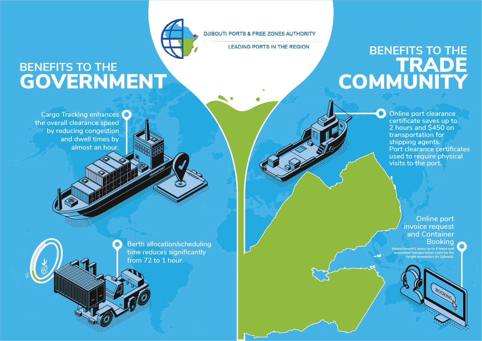
5. Geographical infographics
Another popular type of infographic that is effective in giving a snapshot of geographical data is a geographical infographic. This can be to present information to a specific demographic to show location-based trends or to talk about regional data relevant to them.
This can also be an effective format when designing an infographic to compare some regional trends with global trends to provide customers with a broader perspective.
A few applications of geographical infographics in marketing include:
- Showcasing the widespread presence of your brand is one of the most common uses of this type of infographic.
- You can also highlight nuanced details like where a customer’s product is shipped from and the regions where the products are delivered.
- Use geographical illustrations to indicate the course of action for your business’s future growth – the places you plan to expand to!
- Or even to provide an overview of market trends like the demand for your products across the globe.
Here’s an example:
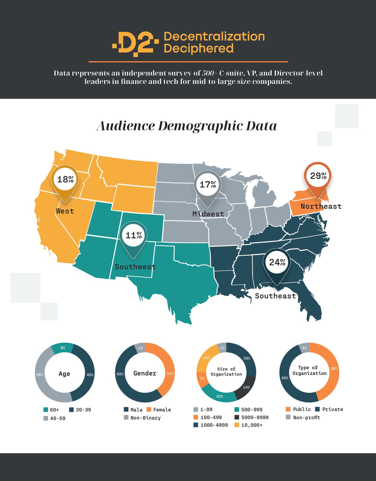
Infographic design by KIMP
KIMP Tips:
- Use color codes and clear legends to present information on a map.
- Highlight relevant data and add more details in legends instead of cluttering the map with too much text.
- Use relevant color contrast to highlight regions in focus.
Step 2: Choosing the Right Data Visualization Format
If there is one thing common among all these infographic types it is the fact that all of them are useful to present larger volumes of data where a typical text post like a blog can be difficult to follow. Therefore, data visualization is a pivotal element in all of these types.
Choosing the right type of data visualization can make a big difference in how effectively your infographic communicates its message.
1. Line graphs
When it comes to designing infographics that show trends, line graphs feel like the most convenient and easily understandable data visualization format to work with.
Here’s a line graph from Statista showing the rise of social networking sites in the U.S.:
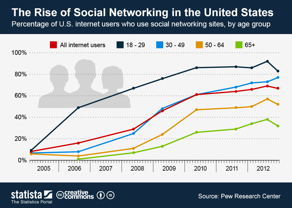
Such instances depicting the progress over a time period can effectively be represented in line graphs. This one works well in timeline, statistical, and comparison infographics where you capture trends and changes over time.
KIMP Tips:
- When there are different variables to capture in different lines, use contrasting colors to avoid confusion. When choosing these colors, align them with the overall color palette chosen for the infographic.
- Avoid crowding with too many lines. As for the fonts on the labels and lines, stick to the font used in the rest of the text on the infographic.
2. Bar charts
Bar charts can capture trends too but are more suitable when there are multiple categories to talk about. Or different changes or trends in different time periods rather than a continuous trend.
Bar charts add value to comparison infographics showing the benchmark results of various products or statistical infographics discussing various demographics as well as geographical infographics.
The infographic below compares the percentage of people using AI/machine learning for various tasks.
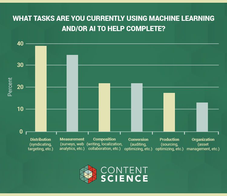
Infographic design by KIMP
KIMP Tips:
- Choose a suitable bar width for clarity.
- Stick to scale to avoid misinterpretation of the presented data.
- Use colors, textures, or patterns to distinguish between bars representing different categories/variables.
- Use 3D bars to add to the visual appeal. Here’s an example:
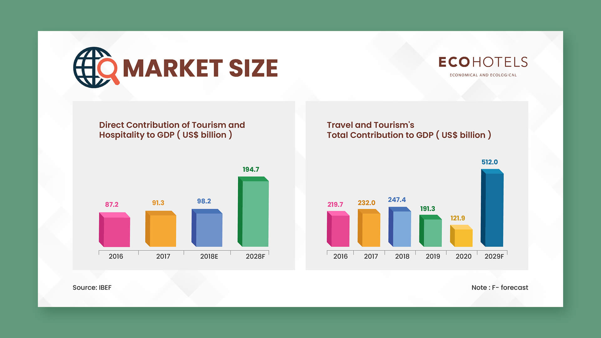
Infographic design by KIMP
3. Scatter plot
If there are comparison infographics or geographical infographics where you wish to capture drastic changes or trends that stand out from the rest of the crowd, then scatter plots can be useful. In short, you can use them to highlight outliers or even demonstrate relationships between variables.
The application of scatter plots and line graphs sounds similar. But the former is useful when you need to highlight specific data points – like specific information in statistical infographics. Whereas line graphs are more suitable when the overall trend and the movement (upward, downward, or stable) matter more than individual data points.

KIMP Tips:
- Unlike line graphs where the movement is often tracked with a single line scatter plots represent individual data points. So avoid comparing more than one variable in one scatter plot.
- Use trend lines to make it easier for users to observe the trend captured.
4. Pie charts
When the compared elements in a graph are proportions of a whole, then use pie charts. They are therefore handy when designing an infographic that showcases market share distribution or the distribution within a specific demographic.
Like categorical data captured in statistical infographics or map-based pie charts in geographical infographics. This could be details like what percentage of the target demographic in a particular region prefers one type of food used in the promotion of a food brand.
Here’s an infographic that uses not one but 3 pie charts side by side. Notice the use of a minimalistic and consistent color palette to create a cohesive overall look.
Infographic design by KIMP
KIMP Tips:
- Pay attention to the basics like the sum of all slices representing the whole dataset.
- To create an element of intrigue or to stay consistent with the rest of your visual identity you can always include three-dimensional pie charts. They add more depth to the infographic design.
Step 3: Piecing Together Your Infographic’s Core Elements
Here’s a quick overview of the core components that every infographic should include, irrespective of the type and goals.
1. Headline
Like all other marketing visuals, headline is one of the most important details when designing an infographic as well. Because a catchy headline is what grabs attention and immediately tells your target audience what your infographic is about. It is that one element that convinces them to stop and take a second look at the data you meticulously put together in the infographic.
The below design incorporates two headlines since this is a comparison infographic. Hence they are formatted consistently but they stand out from the rest of the text to draw attention.
Infographic design by KIMP
KIMP Tips:
- Keep the headline text short and catchy.
- Used bold and aesthetic fonts for the headline.
- Add relevant keywords to pique interest.
2. Copy
The text that covers the rest of the narrative, the copy of your infographic is important because it communicates the intended message. From the wording to the font used, everything about the copy should focus on delivering a smooth experience.
KIMP Tips:
- Use relevant terms that resonate with the target audience while avoiding bewildering jargon.
- While aesthetic fonts look good in headline text, for the rest of the copy, choose simpler and more practical ones that are easy to read.
- Ensure that the text merely complements what the visuals communicate. You do not want a wordy infographic.
- Stay away from using too many font or color variations between text sections. Instead, stick to 2 or 3 variations to establish a clear hierarchy.
3. Data visualization
This is the data visualization format you shortlisted based on Step 2 in our discussion. Here are a few things to keep in mind when comparing your options:
- What message are you trying to convey? Does the chosen format effectively deliver this message?
- Consider the complexity of your data. Some formats are better suited for handling large datasets with many variables, while others excel at presenting simpler information clearly.
- Know your target audience. Will they easily understand the chosen data visualization format?
- Think of the overall aesthetic you want to achieve. Will the chosen data visualization format align with the aesthetic?
- Consider the colors and fonts chosen. Will these be enough to show all the differences on the chart or graph?
4. Other visual elements
In addition to the core data visualization component, there are other elements like icons, illustrations, and images that work together to create a successful infographic. And then there are the design blocks like colors, typography, negative space, hierarchy and visual balance as well.
Good infographic design is one that takes all these into account!
Let’s look at some quick tips:
- Use a limited color palette. Too many colors create confusion and the core message is lost in this chaos.
- The same applies to fonts as well. Too many font styles and variations can make your infographic look unprofessional. Choose fonts that combine well.
- Understand shape psychology when using solid-filled shapes or frames for accent and for visual cues to establish a clear layout.
- Use ample negative spaces to avoid clutter and also to direct attention to the core elements.
- Ensure that the design has a clear visual hierarchy leading to the main message.
- Use icons in flat design or 3D design as required by the infographic aesthetic and the underlying message.
For a detailed discussion on the design elements and other design aspects of an infographic, check out our blog here.
5. CTA
After adding all these fundamental elements in an infographic, if you are not adding a clear CTA, it leads to a missed opportunity. Of course, infographics are inherently meant to be saved and shared. But do you have a campaign it supports or a blog post it summarizes? Or perhaps you want to use an infographic to highlight your company’s progress and use this design in social media ads?
For all these reasons your infographic should include a strong CTA. It tells your customers what you want them to do next, whether it’s visiting your website, subscribing to your newsletter, downloading a report, or engaging with your social media channels.
Bonus Tip: Choose an Unlimited Design Service
While the above steps provide a strong foundation for designing your infographic, don’t hesitate to explore the power of collaboration! Professional designers bring a wealth of experience to the table. They’ve tackled infographic designs across various industries and applications, and their exposure to different design projects allows them to offer fresh perspectives. Therefore, partnering with a skilled designer or design team can elevate your infographic concept, adding a unique visual touch that truly brings your ideas to life.