Exploring Iconic Pizza Logos Around the World
You spot a pizza box on a table or a delivery truck passing by, and instantly, you know—it’s Domino’s, Pizza Hut, or another familiar pizzeria. But how did you recognize it so fast? It’s the colors, the design, and most importantly, the logo. That’s the power of a great pizza logo.
A well-crafted pizza logo does more than just look good. It makes you crave a slice, builds trust in the brand, and tells a story—whether it’s about stone-baked tradition, speedy delivery, or mouthwatering flavors.

Today, we’re diving into some of the most iconic pizza logos from around the world to see what makes them work. Get ready for a huge slice of branding inspiration—let’s dig in!
8 Delicious Pizza Logos + What Makes Them Work

The global pizza industry was valued at USD 197 billion in the year 2024, and it’s no wonder why. From their lightning-fast turnover times to their status as the ultimate comfort food or the go-to party pleaser, pizza has a universal appeal that’s tough to beat.
Pizza logos come in all flavors. Some carry the familiar pizza imagery, while others rely on mascots or unique symbols to tell a story. So, we’ve split our tasty lineup into two categories: logos with pizza and those without. For each, we’ll break down the design and discuss any design or branding lesson it offers.
Pizza Logos With Pizza Imagery
The designs here put pizza front and center, letting the core imagery do the heavy lifting. Showcasing the product in focus is a foolproof recipe for instant recognition. No doubt. But given that most brands in the industry might adopt this approach, how do the popular ones differentiate themselves? Let’s find out.
1. Marco’s Pizza
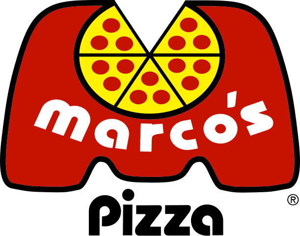
The Marco’s Pizza logo features a large, bubbly “M” that encapsulates the word “Marco’s,” and most notably, a playful depiction of a pizza slice with one piece missing. Beneath the “M,” the word “Pizza” is displayed in a bold sans-serif font. Overall, it creates an inviting and friendly appearance. It’s simple, yet distinctive enough to stand out in a crowded market of pizza chains.
Additionally, Marco’s Pizza uses the right colors. Red and yellow are classic choices for food branding because they evoke energy, warmth, and hunger.
KIMP Tips:
- The Marco’s Pizza logo integrates a pizza slice within the “M”. This demonstrates how you can subtly reinforce the main product without being overly literal.
- By combining the brand initial and pizza imagery in one design, the brand shows that meaningful designs do not have to be complicated.
2. Little Caesars
Little Caesars has one of the liveliest logos in the pizza segment. To begin with, the design is built around the brand’s name and features an illustrated Little Caesar mascot. This helps humanize the brand while the pizza in Little Caesar’s hand reinforces the brand’s core offerings.
Unlike text-based logos, which rely on typography alone, a well-designed character-based logo like this one can become a visual shorthand for the brand. And it makes the brand more memorable.
Additionally, there is the apt choice of visual style – rather than a highly detailed or three-dimensional illustration, the brand uses a rough hand-drawn style. This embodies the brand’s fun and approachable personality.
The brand also uses a warm orange color to tie together all these elements and maintain the cheery vibe of the logo. Moreover, warm colors are known to be relevant to brands focusing on family audiences and those in the food industry, like this one.
Overall, the logo showcases an intuitive use of design elements and colors to encapsulate what the brand is all about.
KIMP Tips:
- If you want your logo to stand out, swap stock imagery and traditional icons with custom illustrations.
- Character logos can add to the emotional depth of your brand’s identity. So choose the core character and its personality wisely.
3. Cicis Pizza
The Cicis Pizza logo is a combination mark that features an abstract symbol. Can you instantly grasp that this logomark is a stylized pizza slice made up of various triangles? This geometric design adds a modern touch to the brand.
Cicis Pizza is particularly known for their all-you-can-eat pizza buffet. Therefore, their logo with a vibrant color palette captures this variety.
In addition to the evident design details, the Cicis Pizza logo also cleverly uses typography. The lowercase typography adds a friendly, casual feel, making the brand appear approachable rather than overly corporate.
KIMP Tips:
- Abstract logos create intrigue, so create custom abstract shapes based on the chosen symbol instead of using cliched imagery.
- Typographic choices can significantly influence the vibe of your logo. So choose the right font and style it correctly.
4. Sbarro
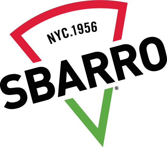
The next pizza logo on our list is all about subtlety. Instead of a detailed pizza symbol or illustration, this one features a minimalistic outline of a pizza slice. This approach of trimming down all the extra details and preserving only the core meaning helps amplify the impact of the logo without complicating the design.
The previous version of the Sbarro logo featured the Italian flag. However, the current version carried forward the colors alone and went with something simpler, more relevant to the core offerings, and memorable too. The choice to retain the colors of the Italian flag reinforces Sbarro’s identity as an Italian-American pizzeria, appealing to those seeking genuine flavors.
To appear bold and to build trust, the brand uses big, bold letters with the brand name in uppercase letters. While making a statement, the font ensures that the text is easily readable too.
Finally, the one unmissable detail in this design is the “NYC 1956″ at the top to proudly reference the brand’s origins in Brooklyn, New York, while emphasizing its long-standing heritage.
KIMP Tips:
- Looking for scalability? Choose a clutter-free, minimalistic design.
- Flat designs are not just in trend but also make your logo timeless.
5. Papa Gino’s
If the Sbarro logo is subtle, then the Papa Gino’s logo takes it one step further. Though the brand does use a direct reference by incorporating a pizza-related symbol, it does not feature something too loud. Instead, it features a large triangular shape representing a pizza slice cleverly used as the apostrophe in “Gino’s.” This creative approach preserves the brand’s core offering while also adding a fun twist to the design.
Good logo design incorporates the right typographic elements into it. And in this case, the playful font style, characterized by rounded edges and a friendly appearance, is designed to appeal to families and casual diners.
KIMP Tips:
- Use the right colors—dig deeper to identify the best options for your industry and the best ones to evoke the right emotional response too.
- The primary symbol in your logo does not always have to scream at your audience. Something more subtle and seamlessly integrated into the design feels natural and adds to the visual intrigue.
All these logos demonstrate how you can infuse creativity to craft something unique, even when leaning on a familiar symbol like a pizza slice, an overused trope in this industry. But what if you want to skip the overused symbol entirely? There are plenty of ways to pack meaning into a logo, transforming it from just a beautiful design into a powerful, relevant ambassador for your brand. Let’s explore a few standout pizza logos that ditch the pizza imagery and still deliver the goods.
Pizza Logos Without Pizza Imagery
6. Chuck E. Cheese
The Chuck E. Cheese logo centers on a cartoon mouse (Chuck E) with wide and cheery eyes and a big, toothy grin. The brand is known as an “entertainment restaurant chain” with not just food but a variety of other entertainment-related offerings. Therefore, maintaining a warm and friendly demeanour is crucial. Featuring a mascot helps achieve this.
Additionally, the brand uses a clearly legible font that features the brand name in uppercase to appear bold and to stand out in a crowded market. But its modern sans-serif style mellows down the vibe and prevents the design from looking too professional.
KIMP Tips:
- The smile on Chuck E’s face adds to the warmth of the logo. Similarly, identify ways to add emotions to your logo.
- Mascots can be valuable additions to your branding. Design a brand mascot if you wish to strengthen your brand’s stance in your industry.
Need help with designing custom mascots? Get a KIMP Graphics subscription.
7. California Pizza Kitchen
The California Pizza Kitchen logo exemplifies the use of logo design to tell a story. Unlike other pizza logos that feature a pizza slice or related imagery, this one features a single palm tree in a yellow diamond shape. This ties back to the origins of the brand in Beverly Hills, California. Besides, the brand also specializes in California-style pizza, and hence the symbol feels relevant and meaningful.
In addition to these references to the place of origin, the palm tree icon instantly evokes California’s laid-back, sunny lifestyle, making the brand feel fresh and inviting. This demonstrates the use of imagery to create a design that has a strong vibe and helps customers visualize the experience.
Finally, there’s the primary brand color-yellow. Yellow is known to evoke excitement and is relevant to food branding.
KIMP Tips:
- The use of a palm tree in this logo is a great example of using a symbol to connect with a specific place or culture. Choose specific elements that hold significance to your target audience.
- Overall, the design looks well-balanced and polished, thus differentiating the brand from most pizza joints. This can be a great way to connect to the chic and relaxed dining space the restaurant offers, in contrast to most fast-food joints serving pizza.
8. Domino’s
Pizza logos without the pizza symbol? Domino’s is definitely one of the first brands you think of. It’s quite surprising how the brand has become one of the well-recognized names in the segment even without the use of the very familiar pizza slice in its visual identity. All credit to their consistent and well-planned branding strategy.
The symbol evidently takes cues from the name of the brand, which in turn was derived from its former name, DomiNick’s Pizza. This is both simple and engaging.
However, there is the question about the use of three dots in particular. Throughout the evolution of the design, the brand has continued to use three dots. Do you know why? According to Donald Jeffrey Meij, former CEO & Managing Director of Domino’s Pizza Enterprises, the three dots in the logo represent the first three stores opened by Domino’s founder Tom Monaghan, which paved the way for the iconic franchise.
KIMP Tips:
- While preserving the clarity of your design, try to squeeze in some details that carry hidden meanings. This helps add more meaning to your logo and keeps the conversations around it alive.
- Even the best-looking logo loses its charm without consistency. So be consistent with your visual style and the use of your visual identity across diverse channels. In short, your brand should look, sound, and feel the same on all touchpoints.
Design Delectable Logos With KIMP
Food branding is a world of its own. There are different quirks and flavors to different types of food brands. Are you all about super-fast food delivery? Or perhaps a warm, fine dining experience? Whatever sets your brand apart needs to be reflected in your brand identity, your logo. Pizza logos are no exception!
Just like every pizzeria has its own specialty, every pizza logo should flaunt what makes the brand unique. Take pride in what sets your pizza brand apart and find a creative way to communicate this through your brand visuals, beginning with your logo.
Whether you choose to incorporate pizza imagery into your logo or not, it is all about finding the right visual language that clicks with your audience and accurately represents your brand.
Not sure where to begin? Take your ideas to a skilled design team and let them work their magic. With an unlimited design service like KIMP, you not only have a dedicated design team working on your projects but also the convenience of unlimited designs and unlimited revisions.
That’s an effortless and productive way to build your brand’s visual identity one design at a time. Ready to take the first step? Register for a free 7-day trial and experience the unlimited design difference!


