
Fast Fashion Brands & Logos: What Keeps Them Relevant?
The fashion industry has undergone a drastic transformation over the past few decades. There have been significant changes in the way fashion is produced, sold, and consumed. At the heart of this revolution lies the rise of fast fashion brands – companies that prioritize speed, affordability, and trends to cater to rapidly changing consumer demands. In this blog post, we’ll dissect how these fast fashion brands use visual identity, particularly logos, to mirror their rapid-paced ethos and connect with a global audience.
Think volatility, fashion is perhaps the first industry that comes to mind. What’s trending today feels outdated tomorrow. For style-conscious consumers, keeping up with this relentless cycle means relying on brands that can quickly translate runway designs into accessible, wallet-friendly pieces. That’s precisely what fast fashion brands are all about.
But their success hinges on more than just speed – it’s also about crafting a brand identity that resonates with the “buy now, wear now” mentality.
This brings us to the critical question of branding in the fast fashion industry. As brands that cater to fleeting trends, they need to craft timeless identities. So today we’ll explore some well-known names in the industry to see how they have aced the art of timeless logos.
Branding From a Fast Fashion Perspective
To appreciate what the fast fashion brands on our list have done differently with their branding, let’s take a moment to understand how branding feels different from a fast fashion perspective.
Firstly, there are three key traits that define the fast fashion niche.
- Urgency
- Affordability
- Adaptability
Therefore, the logos and branding imperatives should encapsulate these traits effectively. From colors to fonts and the overall design, every single detail should align with these traits. In short, simple, adaptable, and agile styles work best for fast fashion logos.
Secondly, there are the factors that are often seen as the downsides of fast fashion:
- Environmental impact – data shows that fast fashion brands contribute to about 10% of the annual carbon footprint worldwide.
- Overconsumption – brands like Zara reportedly bring in new styles about two times a week. Compare this to the regular fashion segment where seasonal trends and seasonal collections cause shifts in what people buy and wear which is much less frequent.
Given downsides like these, fast fashion brands cannot risk greenwashing through their identity. Neither can they risk appearing insincere or inauthentic. Given the notoriety associated with the segment, their identity cannot appear overly idealistic. Instead, it should be more straightforward and no-nonsense without exaggerations.
Let’s now move on to brands that have taken all these little details into account creating simple modern and mostly timeless brand identities.
6 Well-Known Fast Fashion Brands: Their Logos & Branding
Before we get into the list, we would like to point out that most logos in this segment rely on the bare minimum when it comes to design. This makes their identity scalable and adaptable. Therefore, most brands are built on a wordmark logo. What truly shines is how these brands have chosen to use colors and typography, among other things, to distinguish their logo in a crowded market and make their brand memorable.
1. Zara
One of the most popular names in the segment, Zara is one of the pioneers credited with having initiated the fast-fashion trend.
Zara’s logo is truly exemplary of minimalistic and modern designs in branding. It is also one of those logos that prove that simple can often be elegant.
The most distinct aspect of the Zara logo is its custom serif font. Serif fonts are not often used in fast fashion branding. However, Zara makes it work. Zara’s logo font carries the sophistication of serif fonts akin to luxury brands like Dior. In fact, serif fonts are considered classy, and therefore, for fast fashion brands, these can be a great tool to elevate brand perception.
The other aspect that feels fresh and creative is the choice of overlapping letters. While most designers might prefer open designs where there is ample breathing room between letters, Zara opts for a different approach.
Tight kerning can often be seen as a representation of a bold and confident identity which helps add perspective and personality to the Zara brand. On another note, the choice of a typeface with thin and thick high-contrast strokes comes in handy when overlapping letters. The contrast ensures that the design does not look crowded or overwhelm the users.
Finally, the brand uses a simple monochromatic identity which further amplifies the elegance of the identity.
KIMP Tip: Choose the right stroke contrast when choosing typefaces. But remember, high-contrast typefaces might lose their legibility when scaled down.
2. Asos
The Asos logo uses a tight-kerning approach similar to Zara in order to look modern and unique. However, it contrasts with the Zara logo in almost all other typography aspects.
Firstly, it uses all lowercase characters. Using lowercase text in logos makes a brand feel warm and approachable. Moreover, the shape of the letters in the chosen typeface can also affect the mood or vibe of the design. As you know, circles feel friendly and connect easily with the audience. Hence the circular letterforms in the Asos logo work with the lowercase making the identity appear friendly, accessible, and relevant to the young audience it primarily targets.
Secondly, the Asos logo uses a sans-serif font that reinforces the brand’s simplicity. Since there is a monoline font used in this case, non-overlapping letters ensure better readability even with tight kerning.
KIMP Tip: Asos, like Zara, uses a monochromatic color scheme to stay adaptable. A monochromatic palette of the right hue can make your brand appear contemporary and make the identity easily scalable.
3. Urbanic
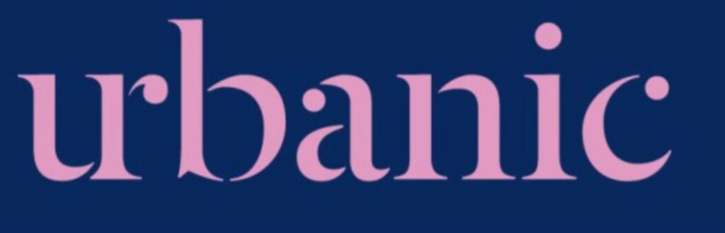
Taking a slightly different approach, Urbanic uses not just a wordmark but also a monogram cleverly built into the design. We discussed earlier that adaptability is a must-have trait when branding fast fashion brands. Urbanic’s approach helps with that.
While Urbanic does use a serif typeface, it features more rounded and softer serifs which create a more mellow vibe instead of the more professional vibe of the Zara logo typeface. These examples show the true diversity of serif fonts and the fact that you’ll find fonts over a wide spectrum of moods within the category.
In this case, the brand does not use a simple black-and-white color palette like Zara and Asos. Instead, a vibrant combination of colors is used to brand Urbanic. Given that the brand distinguishes itself in the space as one that focuses on “balancing creativity and sustainability through the use of advanced technology” colors like purple feel relevant.
Their logo preview video here demonstrates the highlights of the design like the combined vertical strokes of “u” and “r” to create a seamless monogram. And the diverse colors that are part of the new identity as well.
KIMP Tip: When rebranding to adapt to trends or when introducing your new brand’s identity to the market, create teaser videos, logo animations, and other content that help showcase the nuance of your brand identity.
Need help creating short brand videos or logo animations? Get a KIMP Video subscription today.
4. Uniqlo
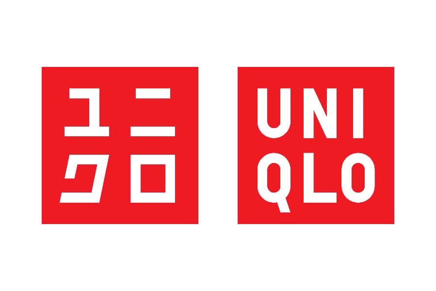
Uniqlo, the Japanese fast fashion giant, takes a distinctive approach to branding that sets it apart from most other Western fast fashion brands. You’ll find consistent-looking Japanese and English versions of the brand name logo.
Firstly, there is the squared-off shape of the logo that makes the design appear more structured and easily scalable. This also ensures that the design works well across digital and physical retail spaces. Which is a must-have trait for fast fashion brands.
Moreover, the high-contrast combination of red and white ensures excellent readability on different scales and on different backgrounds. This highlights the need for identifying the right color combinations for branding. Colors that complement each other and contrast with each other so as to meet both practical and aesthetic requirements.
Also, the color red is a brilliant choice since red is known to capture a sense of urgency and the red and white combination can also be seen as a subtle nod to the brand’s Japanese heritage.
Finally, the choice of typeface – modern serif works well in fast fashion. But that’s not all. The brand is noted for simple and functional fashion and therefore the logo design, the typeface in particular, communicates this. While keeping it simple the brand also infuses a touch of dynamism through the arrangement of the letters in two rows.
KIMP Tip: While a single brand color solves the purpose in most cases, a combination of two colors amplifies the effect. But yes, do not use too many colors that dilute your identity or clash with each other.
To know if the chosen colors work well with each other, check out our blog on the color wheel.
5. Fashion Nova
Fashion Nova is one of those fast fashion brands that intuitively capitalized on the influence of social media in the fashion industry. Influencer collaborations, glamorous events that create media buzz – this brand has it all.
On the whole, the design looks crisp, bold, and professional. Notably, it adds variety and dynamism to the design by adjusting the weight of the fonts rather than choosing different styles. This helps create an eye-grabbing detail (the word NOVA in bold) while also maintaining harmony in the design.
This is not just an aesthetic logo but also a great example of a rebranding success in the fast fashion industry. if you look at the previous version of the Fashion Nova logo it makes you appreciate how much the brand has evolved. The logo now looks more professional and versatile.
Initially, the brand catered to women’s fashion and hence the silhouette of a woman felt like a relevant part of the logo. But when the brand expanded to cater to men’s fashion as well, the symbol was dropped and the logo became more versatile.
Secondly, the font currently in use is a sans-serif font that looks much more professional and elegant. Did you know that Fashion Nova was the most Googled fashion brand in 2018? That level of popularity a few years after the launch meant that the brand had to think about leveling up and they did!
KIMP Tip: When choosing a logomark, a symbol, or a pictorial component for your logo, choose something timeless and scalable to avoid your logo from becoming outdated too soon.
6. Boohoo
At first glance, the Boohoo logo looks a lot like many other logos in the fast fashion segment. However, this one uses a rounded sans-serif font with a hint of playfulness to it. This personality matters because the brand mainly targets customers in their mid-teens to early twenties.
This logo exemplifies the significance of choosing typefaces and other design elements for the logo based on the brand’s target audience. After all, this visual representative of your brand needs to grab the attention of the right target audience and connect with them effectively. That’s why keeping your target audience in mind when making your logo design decisions can be a good move.
In addition to the peppy and youthful font, the brand also uses a fresh blush and concrete color palette. While resonating with the young audience, the colors also elegantly balance each other and are relevant to the niche.
In short, the Boohoo logo and identity together communicate the need to create a wholesome identity paying attention to all the core brand elements like brand colors, fonts, and more.
Design Fashionable Logos With KIMP
In conclusion, the world of design is evolving. Every industry has its own norms and what works in one industry does not always work in another. Therefore, an unlimited design service that offers a flexible, cost-effective solution is one way to elevate your branding without the hassle of traditional hiring methods. With access to a diverse team of professional designers, you can submit as many requests as you need, ensuring that your creative needs are met promptly and efficiently. And that your logo is exactly as you envisioned it.
Ready to transform your brand designs? Sign up for a KIMP subscription. Start your journey by signing up for a 7-day free trial!