
Organic Food Branding: Building Trust in a Green Market
The organic food culture is booming. Consumers are increasingly prioritizing cleaner, natural ingredients and sustainable practices. Therefore there has been a surge in new organic food brands. This increased interest makes effective organic food branding more critical now more than ever. So today we’re exploring the domain of organic food branding and how brands are carving their unique identities in this rapidly evolving market.
We’ll explore some organic food logos and understand how these brands are challenging conventional perceptions of what organic food branding should look like. We’ll also discuss brands that have avoided cliched imagery while still maintaining relevance and effectively communicating their values.
So, if you are looking for fresh inspiration to enhance your branding projects, within the organic food sector or outside, you’ve come to the right place. Let’s explore some innovative organic food brand identities from around the globe and discover how they’re making their mark. Ready? Let’s dive in!
Organic Food Branding: 8 Logos We Love & Why
1. Whole Foods Market
First on our list is one of the most popular names in the organic food space, Whole Foods Market. This is one of those logos that abide by nearly every rule in organic food branding.
One of the most prominent details of any logo is its color. In this case, Whole Foods Market uses a kale green color which perfectly captures the essence of the brand. It aligns with the brand’s values of staying away from artificial colors and ingredients.
Secondly, the font. It’s a classic font with soft serifs that add a touch of traditionality to the logo strengthening the credibility of the brand.
Finally, the creative twist – every logo needs to have at least one distinct visual detail that differentiates it from the other brands. This is where most organic food brands use nature-inspired imagery. Whole Foods Market does this too but with a touch of creativity. The design seamlessly integrates a leaf design into the wordmark. The result? The design is on point but not complicated.
KIMP Tip: The Whole Foods Market logo exemplifies a lot of valuable lessons in organic food branding but particularly highlights the power of simplicity in organic food branding. Simpler logos represent the transparency of organic food brands.
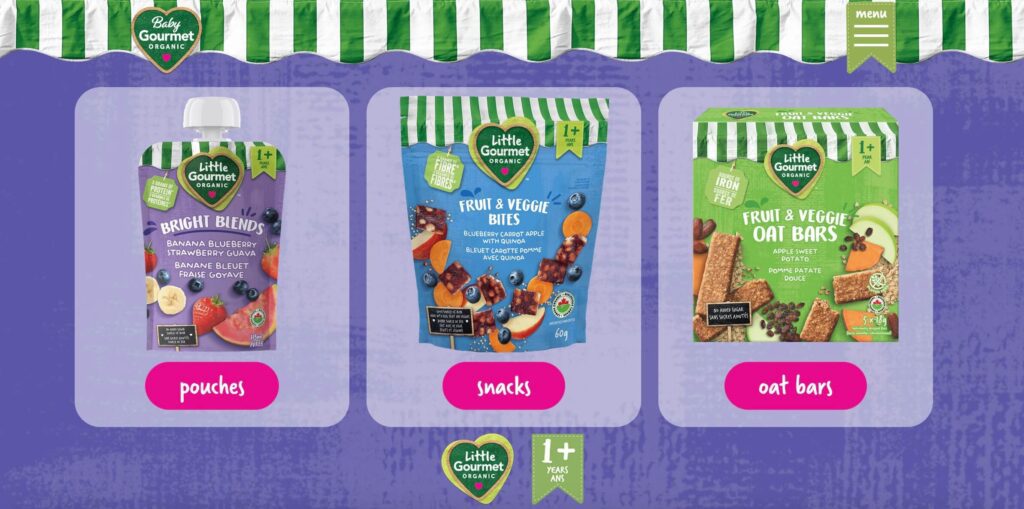
2. Baby Gourmet
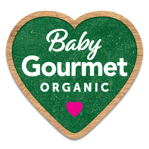
As one of the most trusted brands in the Canadian organic baby food market, Baby Gourmet uses a simple logo built on a heart-shaped emblem.
In logo design, mixing up fonts helps add a dynamic touch and that’s precisely what happens with the this logo as well. The script and sans-serif font together create a lively vibe suitable for a brand built for baby food. The little pink heart adds a vibrant twist to the design to align it with the audience again.
The other notable detail that stands out in this logo is the brilliant use of textures. Not many logos use textures in their design but this one does. And nature-inspired textures like those used in the Baby Gourmet logo are perfect for organic food branding. They tie the design back to nature and evoke a sense of “organic”. This is your reminder to explore if textures work in your logo design!
Finally, organic food branding isn’t just about the logo – there are other brand identity elements that reinforce the message the logo establishes.
In this case, the brand’s packaging and website design feature raw handwritten style fonts. The awning detail is the other notable element accurately representing the brand’s origins as a small store in a farmer’s market. It is also intentionally included to reinforce the fact that the products still start in their kitchen.
KIMP Tip: Define your brand’s USP, the one factor that distinguishes it from the rest of the market. Use your brand elements to represent this and ensure that your logo design seamlessly fits into this narrative.
3. Eden Foods
Looking for some minimalistic logo design inspiration? Then the Michigan-based organic food company, Eden Foods has a memorable one.
With organic food branding establishing credibility is a crucial point and serif fonts work well for this. Accordingly, Eden Foods uses a sleek serif logo for the wordmark. It also helps enhance the readability of the logo.
Additionally, like most organic food logos this one also uses green as the main color to stick to industry norms.
Finally, the unique logomark creates memorability making the logo easier to recognize and remember too. While the story behind the icon and the philosophy behind the design are not very clear, it appears like an abstract representation of crops which is perfect for a brand focused on “macrobiotics” or whole grain foods.
KIMP Tip: A sure-shot way to make your brand logo memorable is to use symbolism and the power of visual storytelling. Either as a vibrant icon or a unique illustration represent your brand’s story or its unique values in your logo.
4. Honest to Goodness
Next up we have an Australian Certified Organic brand based in Sydney, Honest to Goodness. Their logo is a simple and unique wordmark in a personalized script font. The authenticity of handwritten script fonts can be a huge benefit in organic food branding. Particularly for brands that wish to present themselves as proudly local. In such cases, script fonts add warmth and make the brand appear friendly and approachable.
The other core detail of this logo is its monochromatic style. It works because the packaging design for many organic food brands is minimalistic and often uses bio-degradable materials. Therefore, shedding gaudy details and distracting colors ensures that the message takes center stage.
Similarly, for this brand, the monochromatic logo stands out elegantly on their overall minimalistic packaging design.
But to keep things fresh, the brand also uses boho chic style design details on their posts and website and even some of their product packaging designs. In all these diverse applications and designs, their monochromatic minimal logo fits in beautifully.
5. Erio
In organic food branding, there are very few brands that have built their identity around a strong mascot and Erio is one among them. Erio is a Malaysian organic baby food brand known for their preservative-free products free from artificial colors and added sugar.
The name Erio effortlessly encapsulates the brand’s values “Empower, Real, Imaginative and Organic”. Hence the brand name appears as the prominent component of the logo.
The other intriguing element in this organic food logo is the illustrated mascot. The mascot adds a playful twist to the design and injects a unique personality into it thus differentiating the brand’s identity from that of the rest in the segment.
The relevance and significance of a brand mascot in organic food branding depends on how effectively you integrate your mascot into your marketing designs and campaigns. Erio does this effectively by consistently featuring the mascot across social media and other campaigns. Therefore, the brand’s unique and playful logo and mascot stand out as unique representatives making Erio an unforgettable name in the organic food segment.
6. Biona Organic
If you thought all organic food logos were mostly minimalistic, think again! Biona Organic, the UK’s popular organic food brand has a detail-packed logo.
The circular shape that takes center stage is filled with silhouettes of fruits, vegetables, and other natural ingredients to resonate with the fact that the brand takes pride in making organic food more accessible.
This approach is all about telling a story, the story of what your brand is about and what makes it special. It effectively connects with people who appreciate the organic food culture allowing them to instantly grasp the fact that the brand understands organic food.
Another noteworthy design detail here is the use of shape psychology. Accordingly, the circle evokes a sense of community. In this case, a community of like-minded individuals who appreciate the organic food culture.
This design did remind us of the Unilever logo which follows a similar approach packing in a lot of little details to encapsulate the brand’s offerings.
To preserve the significance of the logo, Biona Organic also has cohesive packaging designs that actively incorporate ingredients-focused illustrations into them.

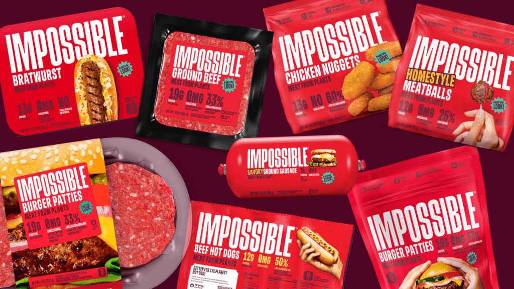
7. Impossible
Okay, this next brand we have on our list has a brand identity that challenges every single notion about organic food branding. To begin with, it’s audacious – since the idea is to represent a brand known for its plant-based meat products, a bold brand appealing to meat eaters and vegans alike.
At the crux of it, there is the bespoke typeface created by the brand called Sans Meat (what better name could there be!). This typeface is loud and vibrant clearly sticking out in a market filled with simple fonts to build credibility. In this case, it’s about making a statement and the logo’s bespoke typeface does just that!
The second noticeable detail that speaks for the brand is its unique red color palette. In a market filled with greens, this logo and identity include diverse shades of red reminiscent of meat since the idea is to appeal not just to organic food lovers but also to meat lovers looking to try something new.
On another note, there’s one other brand identity nuance that we loved about Impossible, a must-have trait in organic food branding – transparency. On the packaging of products from Impossible, you’ll notice the ingredients listed prominently. This is a great decision in food branding, particularly for organic food brands since people choosing them are conscious about what they consume.
8. Bioburger
We have another brand that proves that organic food branding can be delectable and vibrant and not mundane. Bioburger is a French fast-food brand known for its organic burgers. Hence the whole identity is built around burgers. Notice those little burger details in the B’s in the logo? These B’s with the burger icon created in the negative space appear as a lettermark logo or as a part of the brand name wordmark in different scenarios. This demonstrates the adaptability of simple logo designs.
The real impact of a logo is when the brand builds a cohesive brand system around it. In this case, the subtle integration of iconography related to fast food.
The brand uses simple yet relatable details throughout. For instance, take a look at their website. The burger icon for the hamburger menu, the “face savoring food” emoji created within the “R”. These little add-ons might be subtle yet they shape the customer’s perception of a brand. Hence creating a well-organized design system pays off.

On a final note, the brand also uses organic colors like orange and shades of green to stay on theme and to be instantly recognizable, which is a good move to get noticed in a crowded market.
Bioburger exemplifies the approach of paying attention to the little details in order to craft a unique and memorable brand identity that’s hard to ignore. This is in fact a great move not just for organic food branding but for any brand in any industry for that matter.
Elevate Designs for Organic Food Branding With KIMP
From the simple and timeless identity of Whole Foods Market to the bold and loud identity of Impossible and the detail-focused identity of Bioburger, we’ve seen how impactful thoughtful branding can be for organic food brands.
Each brand on our list, through its unique logo, color palettes, typography, and additional design elements, carves out a distinct space in a competitive market, effectively communicating its values and connecting with its target audience.
Building powerful brand identities like these takes time, expertise, and a deep understanding of your market as well. Hence, if you’re looking to elevate your organic food branding and create designs that truly resonate, consider partnering with a professional design service. Like KIMP.
With unlimited design services like KIMP, all your design needs for branding and marketing are taken care of at a flat monthly fee. So, there’s plenty of room to bring your ideas to life and to experiment with new ideas as well.
Ready to give your brand a fresh boost of creativity? Sign up for a KIMP subscription.
Register now for a free 7-day trial!