
Serif Fonts Decoded: The Different Styles and Where They Shine
When your design demands a touch of tradition, one type of font often comes to mind: serif fonts. These fonts, with their classic charm and vintage book print style, have a way of enhancing the aesthetic appeal of designs.
It’s a well-known fact that they exude a sense of elegance, sophistication, and reliability. However, there’s more to serif fonts than a traditional tone. From classic to contemporary, subtle to dramatic, serif typefaces can display a wide range of moods and styles. This makes them one of the most versatile typeface categories to use in marketing and branding designs.
The key lies in selecting the right type of serif font and the right typeface within that category. By the end of this blog, you’ll be equipped to make those choices with confidence.
Ready to dive into the world of serif fonts? Let’s get started.
Serif Fonts: An Introduction
What are serif fonts?
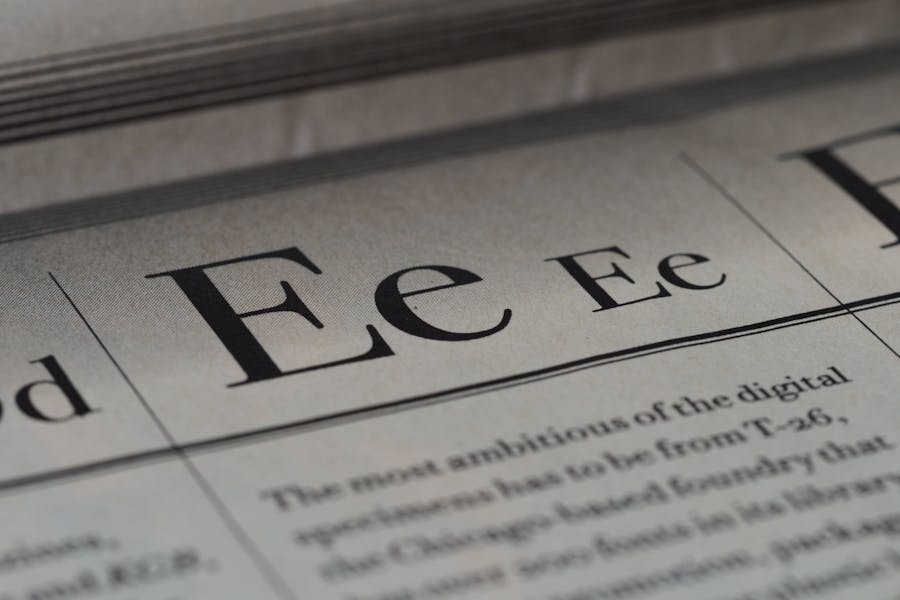
In the logo below, notice the short extensions at the end of letter strokes. These extensions are called “serifs” and fonts with serifs are called serif fonts.
Observe the professional touch the serif font imparts to the design above. This is one of the most common reasons why designers choose serif fonts for logo designs that are supposed to look professional and establish the brand’s credibility.
According to the book, “Typography Workbook: A Real-World Guide to Using Type in Graphic Design” by Timothy Samara, the use of serifs in writing came from the times when stone carvers added these little stroke extensions to give a neat finishing touch to strokes.
Since then serif fonts have evolved a great deal and today we find a wide range of styles and variations.
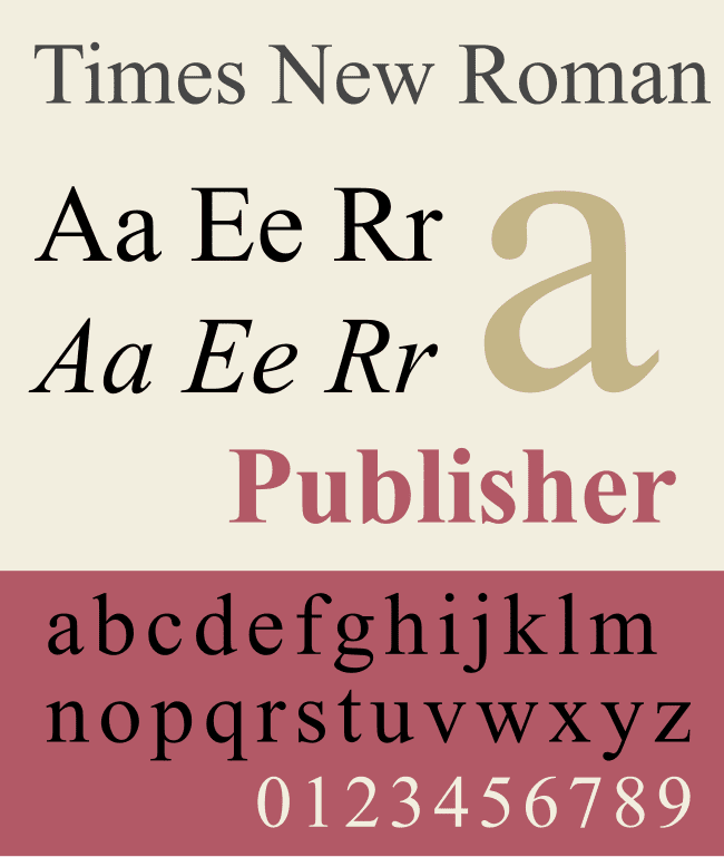
Times New Roman is undoubtedly one of the most popular serif typefaces and also perhaps one of the most commonly used.
Why should you choose serif fonts?
1. Readability
The excellent readability of serif fonts is one of the reasons why they have always held a special place in the world of print. They continue to be among some of the common typefaces used in books because they are easy on the eyes.
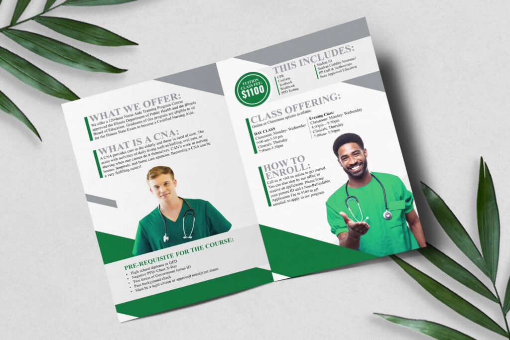
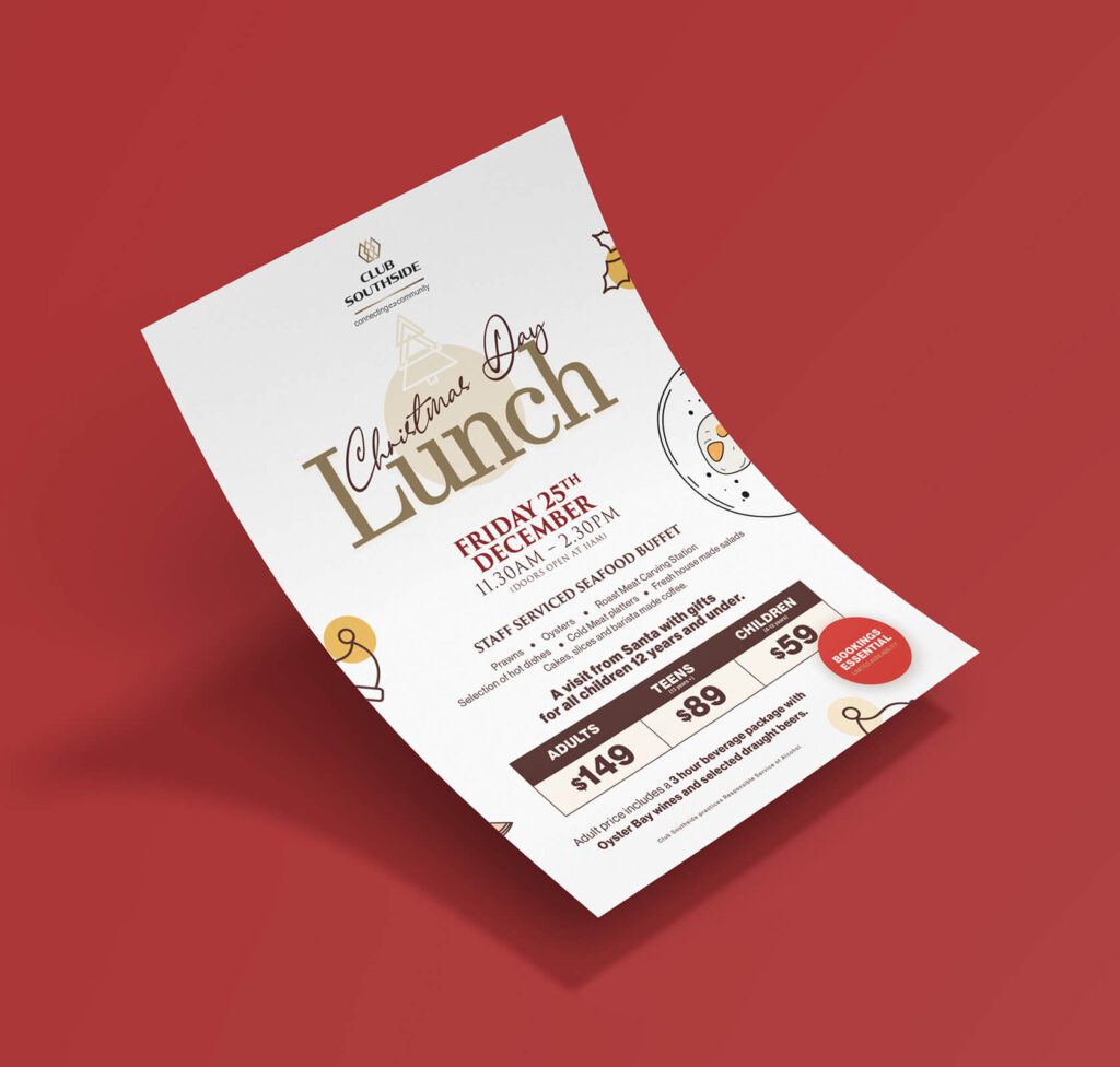
For instance, the brochure below uses serif typefaces for both subheadings and body text. For such designs that call for long lines of text, there are many serif typefaces that can enhance readability.
2. Attention-grabbing
For those places where you need a bold attention-grabbing typeface to emphasize the core message or the headline, then serif typefaces never let you down. They have the power to make the text stand out provided you use them in the right size.
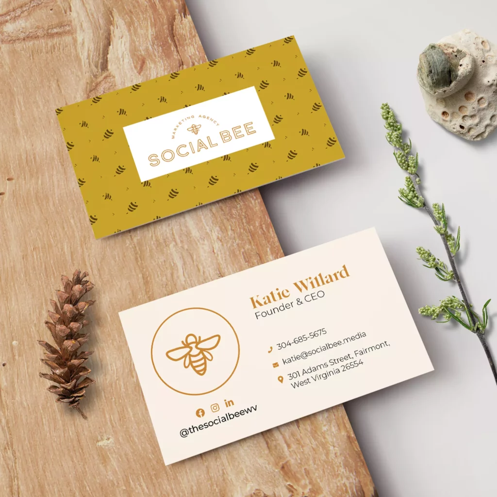
In the business card design featured here, the serif typeface for the name lets the name pop out of the design and adds a beautiful touch.
3. Versatility in style
The serif typeface category consists of diverse styles each of which can influence the mood of the design. Therefore, depending on the purpose of your design, the target audience, and the visual theme, there are serif typefaces for different requirements.
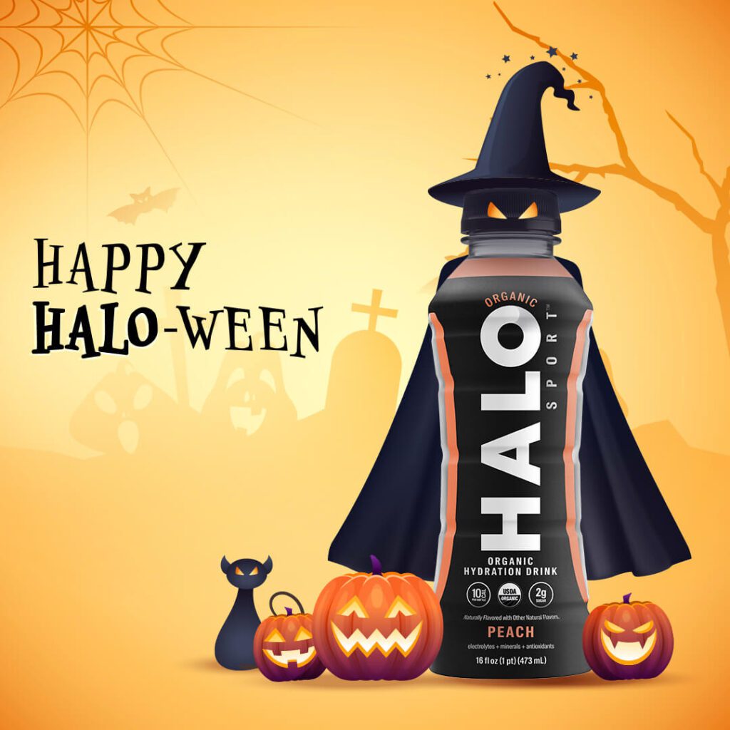
Here’s an example. In the design below, the serif typeface helps designate the spooky Halloween theme required for the design. In contrast, in the designs we explored previously, we have seen serif typefaces that look professional and chic.
4. A blend of elegance and modernity
Serif typefaces are classy and refined and therefore you often see them appearing in high-end branding. So, if you need your text to add a polished look then this typeface category is an aesthetic choice.
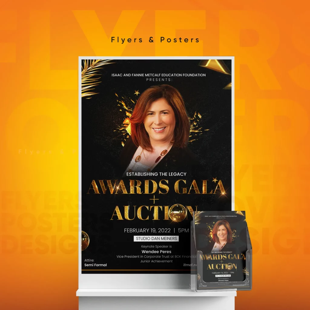
The flyer design below features a serif typeface for the main text. In this case, it adds a chic touch and accents the elegance of the black and gold theme.
Font pairing tips for serif fonts
Serif fonts might have different emotional depths but they are never boring. Most typefaces in this category have a bold and loud tone to them. Therefore, when pairing them with their counterparts like sans-serifs or scripts, you need to understand whether they are meant to balance each other or add a creative twist to the design. Let’s now talk about the two most popular pairing options for serif typefaces.
Serif + script
There are two ways to do this. One is to use serif typefaces to balance the intensity of a bold script font. In this case, the serif option is often chosen to make the key message in the design easy to read. The design below exemplifies this approach.
Secondly, lightweight script fonts can be used to create a harmonious contrast. For instance, in the below design, the slim and sleek script elegantly balances the striking serif font.
Serif + sans-serif
Serif + sans-serif is one of the most commonly used font pairing options. With scripts and serif typefaces, there is the common denominator of both looking slightly traditional. But with sans-serif fonts, there is a modernity that helps balance the conservative style of most serif typefaces.
Here’s an example. The serif typeface in the design below is clearly an attention-grabber. The sans-serif paired with it is gentle nature boosts the visual balance of the design.
Types/Styles of Serif Fonts to Explore
Traditional vs. modern
The fonts below are both serif fonts but can you see how visibly different they are in their style? The first one is the Arno typeface and the second one is Bauer Bodoni both of which are visually appealing serif typefaces.
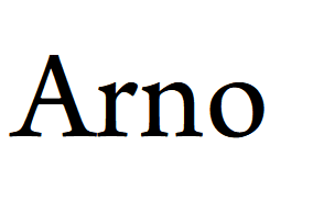

The first one appears traditional whereas the second one looks more modern. One of the most notable differences is that in many traditional-style serif typefaces, the contrast between stroke widths is negligible. In contrast, most modern serif typefaces have clearly visible thin and thick stroke variations.
Garamond, Georgia, Goudy Old Style, and American Typewriter are a few popular traditional-style serif fonts.
Bell MT, Bernhard Modern, Bodoni, and Century Schoolbook are a few popular modern serif typefaces.
Slab serifs
Slab serif typefaces are characterized by chunky, block-like bold serifs. They are known for the drama they bring to the design. They are loud, vibrant, and spectacular. Slab serif typefaces appear muscular and tough and can therefore be useful in designs for brands meant to establish authority or those that are known to break the rules and make a statement.
Clarendon is one of the oldest and also one of the most popular typefaces in this category.

Memphis, Amazing Slab, Arvo, and Roboto Slab are a few more examples of slab serifs.
Didone
This is an evolved version of the modern serif category that gained popularity in the late 18th century. The shape of these is a direct contrast to slab serifs because Didone typefaces are characterized by slim serifs.
Didot is one of the most widely-known typefaces in this style.
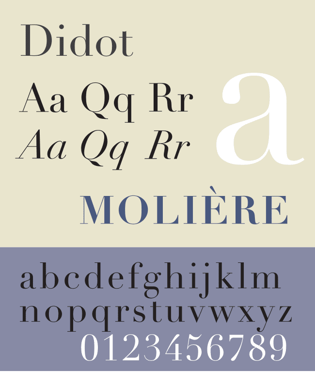
As you can see, Didone typefaces look ultra-modern and chic. The Vogue logo is one of the most popular real-world examples of the elegance of Didone typefaces.
Antic Didone, Empira Serif, Jimbo, and Campaign Serif are a few Didone typefaces to explore.
Having discussed the basics and the diverse styles, let’s now move on to some ideas for serif typefaces. We have a list of typefaces shortlisted from popular font libraries like Adobe Fonts, Google Fonts, and Canva’s font collection.
Adobe Fonts: Beautiful Serif Typefaces to Choose From
Mixta
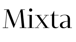
Mixta is a bold and beautiful Didone typeface perfect for modern designs.
One of the main benefits of choosing this font is the diversity of line weights available in it – from ultra-lightweight to heavy variations.
Fleur
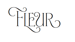
Available in 4 different variations, Fleur is one of the most ornate serif fonts in the Adobe Fonts library. With some traditional slim serifs and some curvy and dynamic serifs, this all-caps font is a statement-maker for designs that call for sophistication.
Artworld MN
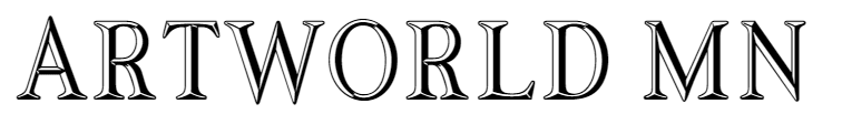
Need an artistic twist to your design? Then Artworld MN is just what you are looking for. On its own, it has a unique retro style that can enhance the aesthetic appeal of your design. But yes, it only comes in the regular style and no other variations.
Ernst
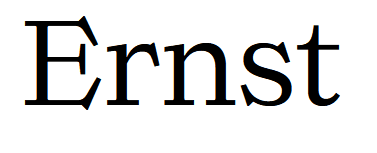
A lightweight monoline font, Ernst has distinct angular serifs. If you want your design to look in vogue, then this font is a delight to work with. No doubt, it has excellent readability to ensure that your message is loud and clear. What’s more? There are plenty of variations to work with, ranging from thin to extra bold.
Rockwell Nova
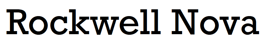
There is something charming about geometric fonts – their symmetry, the visual appeal, and the readability they ensure. Rockwell Nova is an embodiment of all these traits.
Google Fonts
Marcellus
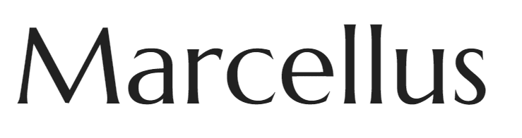
With a hint of classical elegance, Marcellus has flared serifs that are barely noticeable. As the perfect balance between serif typefaces and sans-serif typefaces, this bold font, according to Google, was inspired by classic Roman inscription letterforms.
Merriweather
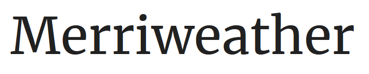
Merriweather is among the most used serif typefaces out there known particularly for its impressive readability across diverse media. The clarity of the letterforms and the diverse variations available are a few reasons why the font is so popular.
Spicy Rice
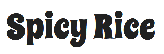
With slightly extended serifs similar to Marcellus, Spicy Rice is proof that serif fonts are not always traditional. This chunky font also has a peppy vibe to it making it suitable for designs that need to look young and fresh.
Zilla Slab
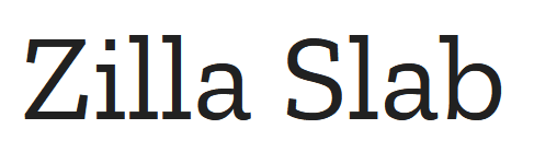
Zilla Slab is a dapper slab serif font that comes in font variations ranging from light to bold. With its streamlined geometric shapes and excellent readability, Zilla Slab is also a versatile choice that works with both traditional and modern designs.
Abril Fatface
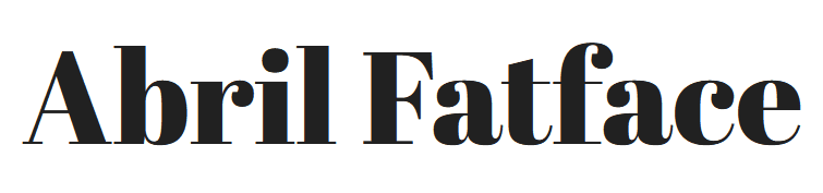
Abril Fatface is a chic contemporary Didone typeface that is part of the huge Abril font family. With dramatic bold strokes, this makes a spectacular choice for titles and other text that needs to draw attention.
Canva
DM Serif Display
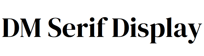
A daring display serif font, DM Serif Display stands out with high-contrast strokes and short flared serifs. Additionally, this is one of those fonts for when your text needs to exude a sense of elegance.
Le Jour Serif
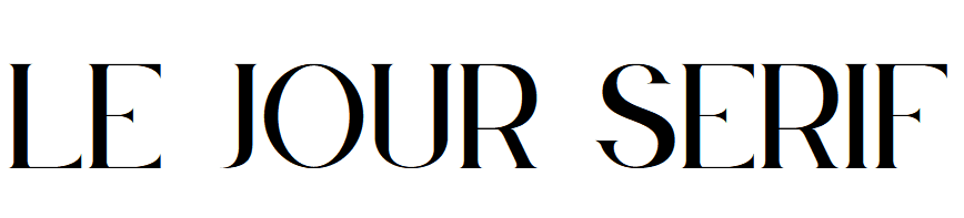
If you need an exquisite typeface to boost the visual appeal of your design, then Le Jour Serif is one of the best you can find on Canva with a free account.
This uppercase typeface has noticeable thin and thick stroke variations and a unique modern appeal perfect for contemporary aesthetics.
Athachantr
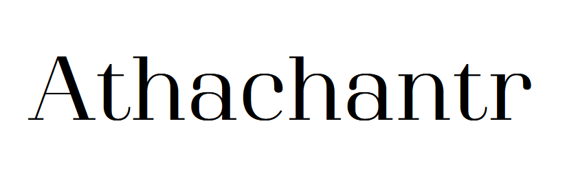
If you are a stickler for rules, then Athachantr is a unique serif font available on Canva. With slim serifs, this chic typeface can instantly make any design look refined.
Safira March
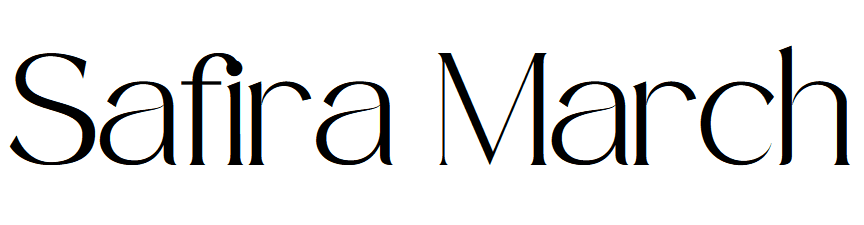
Safira March is one of the most elegant fonts for luxury brands. A unique combination of high-contrast strokes and stylish letterforms, Safira March makes a great title font.
Cormorant Garamond
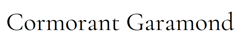
Cormorant Garamond is one of those sleek fonts that you can use in designs meant to be timeless. With a style beyond trends and delicate strokes, this is both practical and visually appealing.
Make Serif Fonts Work in Your Favor With a KIMP Subscription
To sum it all up, serif typefaces have diverse dimensions to them. And there is a lot to explore in terms of style and tone. It all depends on how you apply them to your designs and what typefaces you pair them with. For all these decisions and more, consider working with a professional design team. An unlimited design subscription like KIMP gets you not just a professional design team but also an extensive scope of services covering almost all kinds of branding and marketing designs for your brand.
Register now for a free 7-day trial!