
Logo Design Tips: The Key to Creating a Memorable Brand Identity
You’ve probably heard the statement, “Your logo is the face of your brand”. You’ve probably heard it countless times—and there’s a good reason for that. Your logo isn’t just an aesthetic add-on to your branding.
In fact, it’s a vital piece of your brand’s identity. Therefore, crafting the perfect logo that captures the essence of your business is crucial. But how do you get it right? We’ve got some useful logo design tips to answer this.
Let’s face it, not all logos are created equal. Think about the elements and emotions in a logo. Every detail matters. The trick is to ensure these elements come together to truly represent what your brand does, what it stands for, and how it stands out. It’s indeed surprising how often brands overlook this. This is the reason why some logos that look good fail to make an impact.
Without a doubt, aesthetic appeal is important, but the true power of a logo lies in its ability to convey purpose and meaning. In this blog, we’ll dive into some practical and insightful logo design tips to get there. Ready for a crash course in logo design? Let’s get started!
The Impact of Logos in Numbers
Before we get to our logo design tips, let’s take a moment to explore some useful statistics that emphasize the importance of a logo in branding. Understanding these facts can also provide valuable insights as you work on crafting a stunning logo for your brand.
- Did you know a consistent signature color can increase brand recognition by 80%? This underscores the need for a strong color palette for your logo design.
- Consumers need multiple exposures to truly remember a logo. Studies suggest it can take around 5-7 impressions. And these impressions are better when your design is simpler and easier to remember.
- Believe it or not, 42% of consumers say logos can convey a brand’s personality. So a boring design with cliched elements will only lead to your brand being perceived as just another business in the market.
- About 89% of marketers agree that brand awareness is a top priority. A strong logo is a key player in achieving that goal by fostering instant recognition and building brand equity.
- Over 60% of Fortune 500 companies use combination logos, which often integrate an icon and a wordmark. This shows the power of combining visual elements and text to create a truly memorable brand.
Equipped with these insights, let’s move on to those logo design tips we promised, shall we?
Logo Design Tips: Creating a Powerful Brand Identity
1. Choose the right type of logo
What will be the fundamental blocks in your logo design? Would you like to have a pictorial element, or text, or both? This is essentially the first main decision to make. Based on this parameter, logos are of several types. Here are the most common ones you’ll find.
Wordmark logo
The most straightforward style in logo design is to add your brand’s name and that’s what a wordmark logo is. It takes a simple business name and creates a strong identity out of it etching the name in the minds of the target audience. Think Coca-Cola, Amazon, and Google.
Lettermark logo
Utilizing the brand name initials, these can be simpler and smaller versions or ornate monogram versions. Particularly handy for brands with longer and brand names that are difficult to remember, these are also very common. Think IBM, HBO, and CNN.
Abstract logo
They use abstract symbols that do not essentially relate to the brand name or industry. Abstract logos are mostly about the emotions the brand wishes to evoke or a unique value they stand for. Think Apple, Nike, and Spotify.
Combination logo
They combine text and pictorial elements. The pictorial element in the combination logo could be the brand’s monogram, a representative symbol relevant to the brand, or an abstract symbol. Think Hermès, Burger King, and Lay’s.
Emblem logo
Emblem logos are characterized by a signature badge or crest that forms the central element in the design. Think Porsche, Harley-Davidson, and NFL.
Identify the most suitable type among these for your brand logo. Working with an unlimited design service that supports unlimited designs makes this process so much simpler.
For a more detailed discussion on the different types of logos to explore, check out our blog here.
2. Unlock the essence of your brand
One of the most valuable logo design tips anyone can give is to tackle design only after thoroughly understanding the brand. When we say ‘understanding your brand’, it’s not about scratching the surface, like what you do or where you are located. It is about the essence of your brand.
A few questions to ask yourself will be:
- What was that spark that motivated you to launch your business?
- Are there any strong values you stand for?
- Who is the ideal customer?
- What emotions do you wish to evoke in your customers?
- What unique traits make your brand stand out in a competitive space?
- Are there any specific problems your business is meant to solve?
One way to tackle this would be to visualize this: if your brand were a person, the protagonist in a story you’re writing, what are the nuances that shape this character?
Why is this step more important than other logo design tips? Simply because this is one of the tasks that helps you come up with ideas that set your brand apart – to create a unique logo.
Let’s explain this with the Baskin-Robbins example. To begin with, the brand uses bright colors and a fun font to reflect the joy and excitement associated with ice cream. And then there’s the key detail that you probably have heard about often – the “31” concealed in the logo to represent the 31 signature flavors the brand is known for. Ideas like these are hard to imitate, and hence your logo stands out.
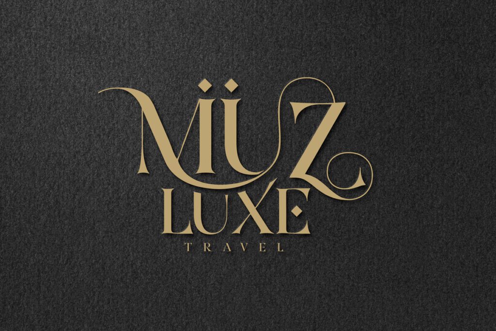
As another example, the logo here carries a luxurious aesthetic to capture the sense of sophistication the brand wishes its audience to feel.
3. Get the core elements right
With the above two steps, your logo ideas start taking shape. You have a preliminary picture of what your logo should look like. Then comes the most crucial part – accumulating the core elements like colors, fonts, and shapes.
Color psychology is of utmost importance in logo design, even when it comes to branding in general. Therefore, understanding colors and what they stand for is one of the most important logo design tips.
For instance, it’s hard to imagine any other color capturing the same excitement and passion that the red of the Coca-Cola logo captures.
Secondly, let’s talk about choosing fonts. Consider the emotions each font style evokes and find the one that resonates best with your audience. As an example, in the design below, the casual and peppy font feels relevant to a young audience.
Finally, there is the language of shapes. Circles effectively capture a sense of community, while triangles appear dynamic and squares feel stable and secure. Hence, incorporate the right shape based on the emotions you wish to communicate through your logo design.
4. Harness the power of cognitive fluency
According to Drake Bennett of The Boston Globe, cognitive fluency determines how easy it is to recall something. And the concept is based on the observation that “people prefer things that are easy to think about to those that are hard.”
So our next tip on this list of logo design tips is to focus on simplicity. Think of the most intricate logo you have encountered – one with plenty of details. Now can you recall every single element in it? Perhaps not. But if we ask you to recall the Nike Swoosh, or the bitten apple logo of Apple or even the 3-striped logo of Adidas, can you instantly recall them? The ease with which you recall them is a live example of the use of cognitive fluency in logo design.
Deploy this idea when you design your logo as well. Keep it simple yet unique, and that’s how you create something memorable.
5. Tap into Gestalt Principles
Gestalt principles are rooted in human perception of designs and elements. Hence these can be a great guide when designing your logo. In fact, the strategic use of these principles might be what takes your logo from just another aesthetic design to a memorable icon.
In the Gestalt theory, there are five concepts you can incorporate in logo design:
Proximity
Elements lying close to each other appear to be related and are perceived as a whole. For instance, the four interlocking rings of the Audi logo accurately capture the “merger” of the 4 automobile manufacturers that resulted in the Audi we know today.

Closure
This concept is about the brain’s innate tendency to fill shapes and complete patterns to interpret designs. The way your brain completes the panda silhouette in the WWF logo is a great example of the closure principle.
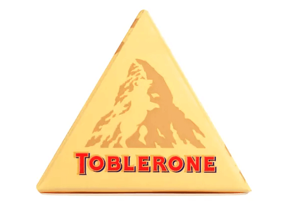
Figure-ground
Similar to the concept of closure, the idea that our brain distinctly distinguishes elements in the foreground from those in the background to decipher different elements in design is what the figure-ground theory is all about. A good example here is how easily we perceive the bear silhouette in the Toblerone logo.
Use Gestalt principles like these to weave a meaningful and memorable story into the fabric of your logo. That’s one way to create something singular.
6. Prioritize timelessness over trends
One of the often overlooked yet crucial among logo design tips is to prioritize timelessness over trends when it comes to designing a logo. Because with trends that come and go and the marketing landscape shifting continuously, your brand needs a constant, an anchor and your logo can be this anchor.
In short, you need a logo that stands the test of time rather than a design that looks outdated in a few years. How do you achieve this?
- Avoid adding trendy elements – instead, choose ones that are most relevant to your brand.
- Do not choose colors merely because they are trending – instead, focus on ones that evoke the right emotions.
Another way to do this is to create a logo that encapsulates your brand’s values or your business origin stories rather than your offerings. Because the scope of your business might change as your business grows but your brand’s values might not change as frequently.
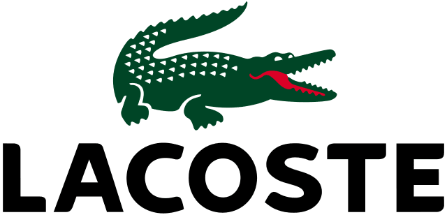
We’ll give you an example. René Lacoste and his tennis coach made a bet over the former winning a tennis match and he was promised a crocodile-skin suitcase if he won it. This led to an American journalist crowning him with the nickname “The Alligator”. This was the reason behind the appearance of a crocodile in the Lacoste logo in 1927. Since then, though the logo has changed slightly the core symbol has remained the same evolving into a timeless representation of the brand.
7. Add an element of intrigue
Most logo design tips covered until now focus on the functionality of the logo. But to help your logo go a little further, to ensure it leaves a lasting impression, there should be an element of intrigue. In other words, find a way to add your creative flair to your logo.
This does not essentially have to be some elaborate design twist but rather simple manipulations of elements or subtle details that pack a punch into your design.
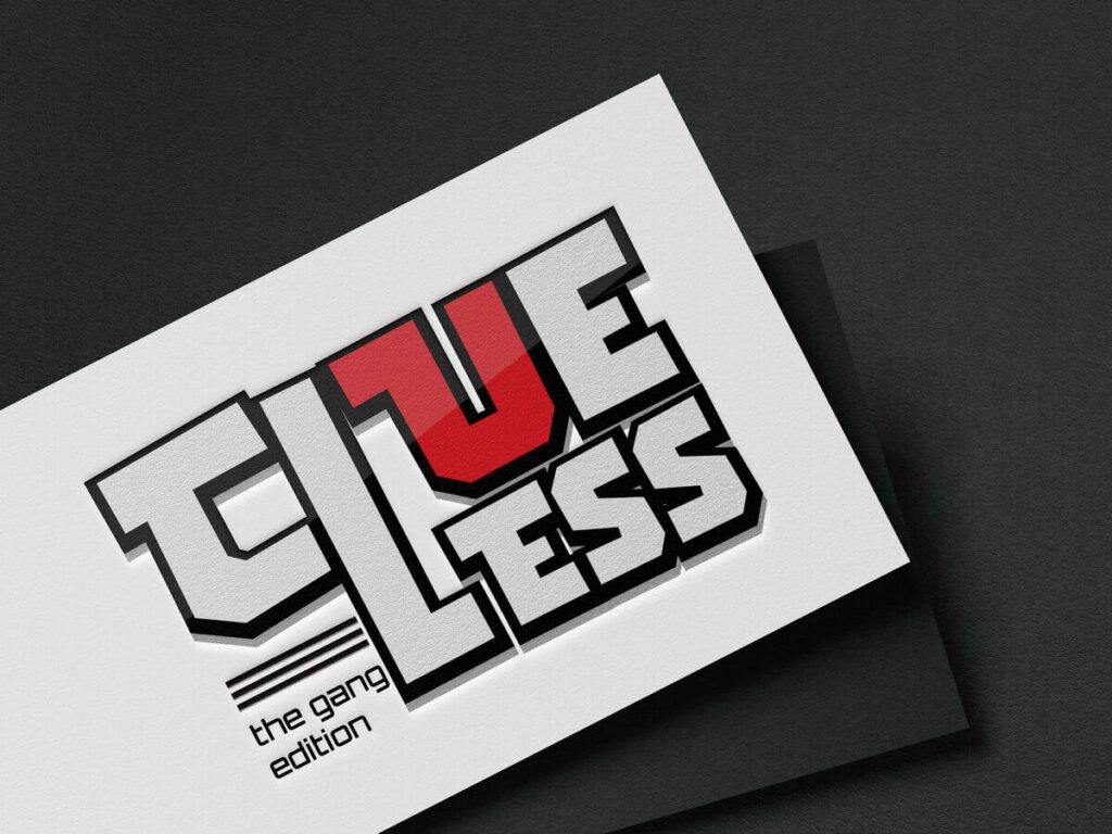
For instance, some logos creatively manipulate the negative space in the design like the counter spaces in characters like “o”. On the other hand, some replace entire letters with symbols that add an extra layer of meaning like the design below.

Alternatively, it could be subtle changes like elongated characters or a shifted baseline or even kerning alternations that add a creative twist.
8. Create something versatile and scalable
One of the most vital logo design tips that you need to double-check before freezing your design is to check for its versatility and scalability.
Firstly – versatility – the adaptability of your logo across various applications. This is about considering the appearance of your logo on various media like websites, ads, and print collateral. Does your design look equally impactful and recognizable regardless of where you use it? Another aspect is to consider how well you can optimize the design for various applications. For example, can you add a seasonal element to your logo while retaining its recognizability?
Secondly – scalability – the ease of resizing your logo without losing its clarity or quality. Simple logos are often easier to scale because complicated details get lost when the design is scaled down.
For example, the simple yet elegant Mercedes-Benz logo. As a tiny favicon on a browser tab or as a large brand identifier on a billboard in a busy area, this logo looks equally stunning in all sizes. Clean lines and simple shapes in logo design help you achieve that.
Design Unique & Memorable Logos With KIMP
We hope that these logo design tips have provided you with a roadmap for logo design. But it’s important to remember that logo design is not a one-shot race to the finish line. It takes time, experimentation, and several iterations until you stumble upon a logo that’s the perfect fit for your brand.
However, for this, traditional design services can be limiting, often restricting the number of concepts or revisions you receive. Therefore, you cannot be really sure if the final design truly reflects your vision.
Here’s where an unlimited design service like KIMP comes in. These services help you explore multiple logo variations and collaborate with designers to refine your ideas until you’re completely satisfied. Hence, no more limitations – you have the freedom to tweak, revise, and perfect your logo until it accurately captures your brand’s personality.
Moreover, many unlimited design services go beyond logos, offering branding materials like packaging, mascots, as well as marketing materials – creating a cohesive brand identity across all touchpoints.
Ready to explore these benefits for your brand? Sign up for a KIMP subscription today and unlock the full potential of your brand identity.