Refresh Your Logo Without Losing Your Audience In 2025
Logo redesign – it can feel like a daunting task, but sometimes it’s a necessity. Maybe your business is expanding and your current logo doesn’t quite capture that growth.
Perhaps the market has evolved, leaving your brand identity feeling a bit outdated. Whatever the reason, a shift in your brand identity might be essential.

But the real question is: how do you execute a logo redesign without losing your audience? After all, the goal is to refresh your brand, not make it unrecognizable to your existing customers.
In this blog, we’ll tackle this challenge head-on. We’ll explore how to approach the logo redesign process with the utmost care, ensuring you can rebrand while keeping your audience firmly on board. Ready to explore those strategies? Let’s go!
Crucial Steps in a Logo Redesign
Before we dive into strategies and inspiring examples of logo redesign, let’s take a moment to lay the groundwork. What are the essential steps involved in the process? Here you go:
1. Clearly define the purpose of the logo redesign
You cannot approach the “how” of your logo redesign without clearly defining the “why”. So, begin by clearly defining the reason behind your decision to rebrand. This clearly defined purpose will lay a strong foundation and also help understand the scope of rebranding. In other words, it helps you understand whether your logo needs a complete overhaul or just a few small changes. It also helps you determine if it’s just the logo you need to change or any other elements of your brand identity as well.
2. Deconstruct your logo’s core DNA
The next step in your logo redesign process is to break down your logo design into its basic components. Go back to your brand style guide and draft an outline of the type of logo used, colors, fonts, symbols, and overall style. Once you have these details, make note of which element resonates the most with your audience.
In other words, what is that one element retaining which will make your logo instantly recognizable? For instance, does the below text instantly make you recall the Disney logo? That’s the effectiveness of a strong signature font and consistent branding.

3. Know your audience inside out
While your logo represents your brand, it’s designed for your audience. It’s meant to be a conversation starter, a visual representation of your brand. Therefore, knowing your audience well ensures you make the right logo redesign decisions.
A few questions to ask yourself:
- What emotions does the current logo evoke?
- What are the target demographics to consider when redesigning your logo?
- How do customers perceive your competitor’s logo? Is there an aspect of this logo they like or dislike?
4. Thoroughly evaluate your market
To successfully redesign your logo, it’s not enough to understand your brand; it’s equally important to understand your industry.
What has changed in your industry since your last logo design? Perhaps something about the perception of certain symbols? Or are there new standards established? Of course, you do not want to be carried away by trends and ephemeral elements because your logo needs to be timeless. But, gauging your competition ensures that you change all the right elements of your logo that help your brand stand out.
5. Go ahead with the redesign process
After this thorough analysis, you are good to go with your logo redesign project. Which means that it’s time to lay down your plan of action. How will you tackle your design workflow? Will you work with a design agency or hire an in-house designer? Or perhaps go with a more convenient option like an unlimited design service?
No matter which approach you choose, we’ve curated a list of ideas to explore based on examples from popular brands that redesigned their logos. Ready to dive into those ideas? Let’s get started
7 Ideas For a Smooth Seamless Logo Redesign Process
Our previous section outlined some tips and steps to execute a logo redesign project. And one of the most important steps we discussed was to identify which elements to retain and which ones to change as part of the redesign process. In fact, this can be one of the most challenging decisions to make. Therefore, in this section, we’ll break down the logo redesign projects of popular brands to understand how each of these brands tackled this challenge.
1. Retaining the logo’s core structure
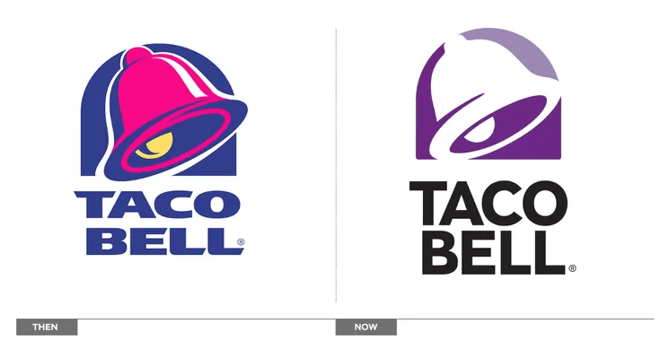
Can you go about with the logo redesign process by preserving the core structure while making just small tweaks to the design? In other words, can you retain a combination of elements – like the shape of your logo and the symbol or the symbol and the font or the color, symbol and shape? If you think it’s difficult to preserve multiple parameters like these and still establish change, take a look at the logo evolution of Taco Bell.
When Taco Bell redesigned their logo less than a decade ago, they chose to retain the overall shape and composition of the logo making only subtle changes. The bell symbol and the placement of the brand name below the logomark were retained in the new logo. The only major difference is that the new logo looks simpler, and cleaner and even flaunts a simpler color palette.
This is one of the safest strategies when redesigning a logo. Because you are breathing new life into your design without losing recognizability. It works particularly well when you have to infuse a touch of modernity into your logo without any other major reasons behind the redesign decision.
2. Preserving the logomark
If you think that retaining too many elements will not bring about a drastic difference but you need one, then retain just the symbol or logomark. You can then experiment with the colors and fonts that combine well with this symbol and also reflect the purpose of the logo redesign.
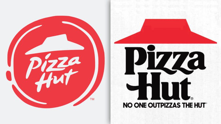
For example, when Pizza Hut recently redesigned their logo, they executed a drastic change.
- The red circle outline was removed.
- The font was updated and its alignment was changed as well.
- Finally, the new logo looks more balanced and refined.
Amidst all these changes, the one element that was retained was the main logomark, the red hat-like symbol inspired by the iconic red roof that was used to distinguish their restaurant from the others. This symbol has been part of the Pizza Hut logo for decades and has grown to become an inseparable element in their branding.
Another notable element here is that this current version of the logo resembles their older versions from the times when the brand was dominating the market. Part of the reason behind this rebrand is to help bring back that classic feel to the brand and give it a push in the competitive space.
Similarly, do you have a logomark or symbol that has stuck to your brand for a long time? One with a rich history and connection to your brand? Place that symbol front and center as you update the colors and fonts to resonate with the new identity.
3. Let your brand colors stay intact
Data shows that colors can help boost brand recognition by about 80%. Naturally, this is one of the most important elements in a logo that customers get attached to. Can you imagine a Tiffany box in any color other than their signature blue? Or Starbucks without their green? That’s the power of building a brand with strong brand colors.
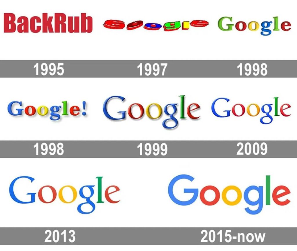
Google is yet another great example to establish the power of retaining brand colors. Their signature 4-color palette has remained the same since 1998. This helps because these colors reflect in Google’s suite of products and their individual brands as well.
The strategy of retaining brand colors works particularly well with simple logos like lettermark logos and wordmark logos. Because there are very few components holding the logo together; you do not want to shake the core by changing them all.
4. Keeping the brand fonts
In most logo redesign projects you might notice the fonts getting updated. Because typography sets the tone of a design project and can effectively capture the brand’s personality as well. Therefore, when it calls for a makeover, this is often the first element that is refreshed.
However, there are some cases where the font holds weight and shapes the character of the logo. Can you imagine the Coca-Cola logo without their classic calligraphy font or the Disney logo without their whimsical font? Probably not!
For such brands where the font happens to be that one element woven firmly into the fabric of branding, you can tweak other aspects like the supporting symbols or the colors.
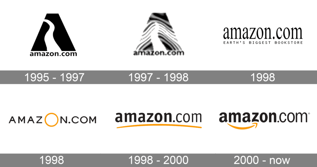
For example, when Amazon introduced a redesigned logo in 2000 refining their previous version, they retained the font and the color too. But this time, the logo had an arrow going from “a” to “z” reflecting the extensive catalog they cater to while also capturing the customer satisfaction they strive toward.
In summary, this approach of keeping the font when redesigning the logo works particularly well when you use a bespoke font that has consistently been appearing in your branding and marketing designs. And this should be a font that has a unique personality that aligns with your brand.
5. Cut back on clutter
One of the best ways to tackle logo redesign is to work toward a clutter-free design. Something simple yet fully resonant with your brand is all you need. Your initial logo probably had a lot of details because you had a lot to communicate to your audience. But you might not need all these details once your brand has established a place for itself in the industry.
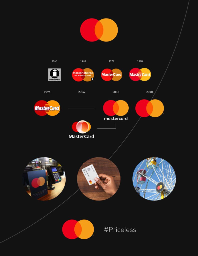
The below image shows the evolution of the Mastercard logo. Notice how the brand has been gradually cutting back on the elements in their logo. (Let’s ignore the failed rebranding in 2016 since the brand switched back to their minimalistic modern style soon after).
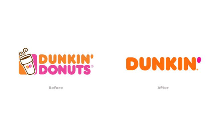
Another great example is the logo redesign of Dunkin’ when the “Donuts” was dropped from the brand name. The purpose of their rebranding was to embrace the wider menu offering and hence the logo also dropped the coffee symbol and switched to something simpler and more versatile.
KIMP Tips:
Cutting back on clutter and switching to a simpler logo design helps when:
- Your business is branching out – so you need a simpler design that transcends geographic boundaries.
- Or your business offerings are expanding – so you need a logo that’s versatile enough to represent a wider range of products/services.
6. Embrace nostalgia
You might be looking for inspiration for your new logo everywhere but sometimes the answer can be found by looking back at the evolution of your brand identity. Sometimes, a retouched version of an old classic is just what it takes to win more hearts and rekindle some lost customer connections as well.
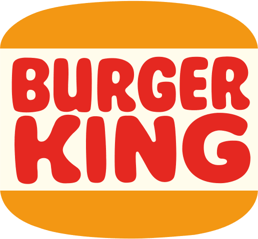
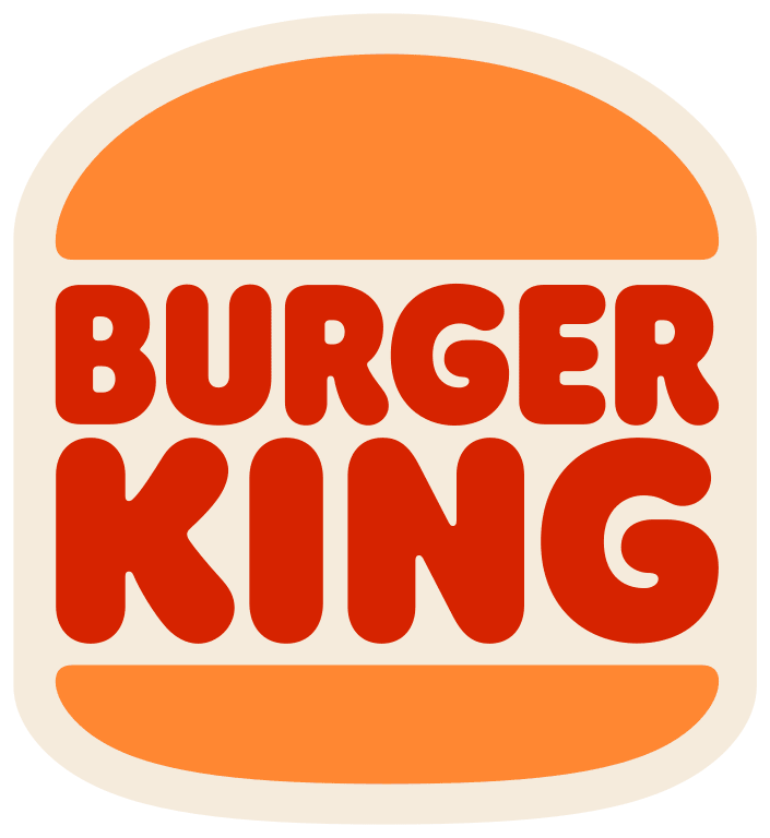
There are two brands that exemplify the effectiveness of this approach with their recent logo redesign projects – Pepsi and Burger King.
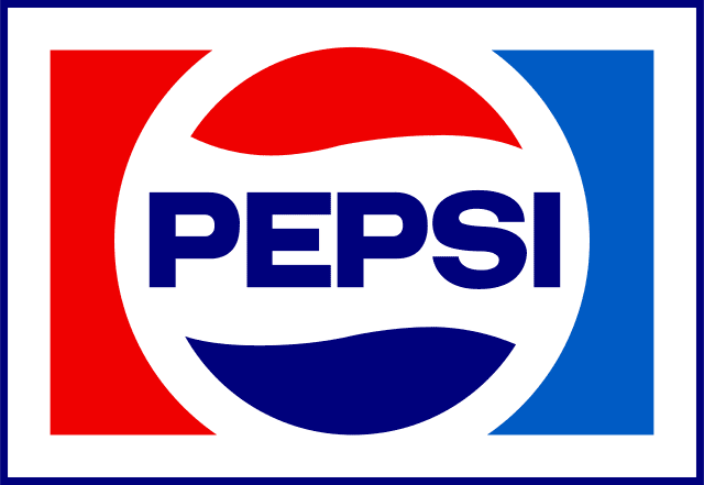
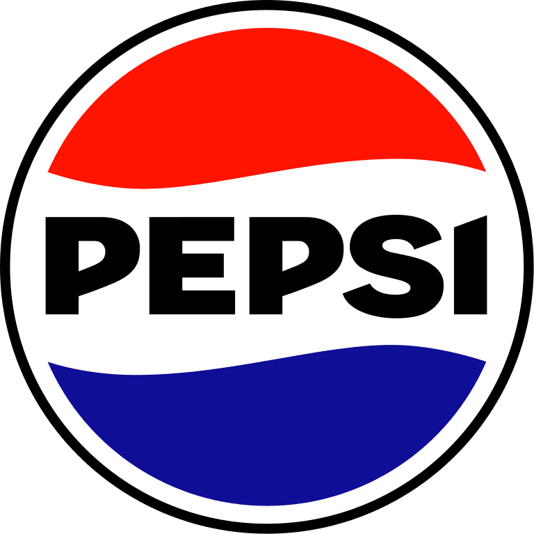
Take a look at the images here. The first one shows the Pepsi logo that was in use from 1973 to 1987. And the second image is the current Pepsi logo. As you can see, the current logo is a refreshed version of an old version with a pinch of modernity injected into it.
Similarly, here’s a comparison of two different versions of the Burger King logo. The first image is the 1969 version of the brand’s logo and the next one is the current logo which was introduced in 2020. The new logo draws inspiration from the older version with a more modern font while still preserving a hint of vintage!
Embracing nostalgia in logo redesign works because:
- Nostalgic elements evoke positive memories and reinforce positive sentiments attached to your brand. Therefore, if your brand had a golden period and if you wish to embrace those days and win back some customers, switching back to an old logo version helps.
- Combining vintage plus modern like the Burger King and Pepsi logos helps provide brand differentiation. In a space filled with modern and trendy logos, yours stands out as a strong design that resonates with diverse demographics.
7. Embrace a contemporary style
While going back in time helps some brands, adopting a future-focused approach seems favorable to others. Particularly if the brand has long been associated with traditions and old-school methods but there is a shift in the target audience. Or even if you have to establish that your brand is evolving and keeping up with the times.
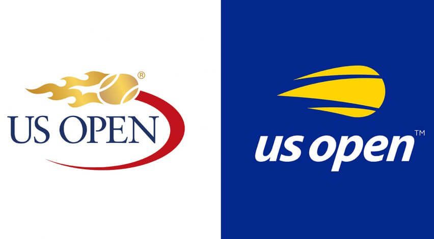
For example, the new logo for the U.S. Open is a modern take on the old one. As you can see, everything about the logo was changed from the font to colors and the representation of the tennis ball. And yet the new design still retains one thing – the dynamism of the logo which is crucial for a sports brand.
Reportedly, the logo redesign was meant to give the brand a fresh and youthful appeal while also preparing it for the digital age.
The idea of embracing a modern tone might not work with all types of brands especially those that thrive on nostalgic vibes and vintage connections. Or if the aim is to emphasize the brand’s heritage. But if you think your brand is evolving to keep up with the ever-changing market and if you think that your customers are craving something fresh and contemporary, then switching to a simpler and more modern design or a flat design is the way to go.
Streamline Your Logo Redesign Process With KIMP
To conclude, a logo redesign can be a visual marker of a major milestone for the brand or a major milestone in itself. The key is to tweak the right elements and preserve the right ones so that your customers still recognize you while also grasping that something is changing.
Now that you have gathered insights and real-world examples, you likely have a bunch of ideas for your own logo redesign. But translating those ideas into reality can be another hurdle. That’s where unlimited design services like KIMP make a difference.
Unlimited design services support unlimited design requests for a flat monthly fee. So, experiment with multiple iterations of your logo, exploring different design directions until you find the perfect fit. Unlimited revisions ensure you’re completely satisfied with the final product.
Finally, your subscription goes beyond logo design. KIMP can help you create a cohesive brand experience by delivering almost all types of branding and marketing designs. With this, you can tease your upcoming logo redesign, engage your audience with its story, and ensure a smooth transition.
Ready to take the first step toward a successful logo redesign? Get KIMP!

