
The Psychology of Bird Logos: What They Symbolize & How to Use Them
What’s the first thing that comes to mind when you think of a brand logo? Is it the text, or the visual element? We guess it’s the latter. That’s because visuals add depth, emotion, and memorability to a logo. Among the most commonly used symbols in branding, animals, and birds hold a special place. And today, we’re focusing on bird logos.
Birds carry positive connotations and evoke strong emotional connections, making them a powerful choice for logos. But the key lies in how you use them. In how you weave their symbolism into your brand’s identity and bring the imagery to life in a way that’s uniquely yours.
In this blog, we’ll dive into the world of bird logos, exploring inspiring examples and tips on how you can harness the power of bird imagery to create a logo that’s not only engaging but also unforgettable.
- Designing Bird Logos: 10 Tips to Soar Above the Rest
- 1. Choose the right bird for the job
- 2. Let the bird’s personality shine
- 3. Add more details to reinforce your bird’s character
- 4. Tell a relatable story
- 5. Master the art of negative space
- 6. Make your logos unique with abstract shapes
- 7. When type meets symbol
- 8. Focus on versatility
- 9. Capture the spirit of your brand
- 10. Pick the perfect visual style for your logo
- Ready to Let Your Brand Take Flight? Get KIMP!
Designing Bird Logos: 10 Tips to Soar Above the Rest
Bird logos are popular choices across industries and they are timeless too. From minimalist designs to intricately detailed renditions, you’ll find bird imagery being embraced in numerous ways. So, the possibilities are endless. Hence it all boils down to figuring out how to infuse your design with creativity. For that, let’s now analyze some well-crafted bird logos.
1. Choose the right bird for the job
The first crucial tip is to choose the right bird for your brand. It should be a bird that reflects your brand’s values. So choose a bird whose traits resonate with specific traits of your brand that you wish to highlight. This makes the bird imagery relevant and impactful.
For instance, take Hootsuite’s friendly owl logo. First came the owl mascot Owly which was chosen to symbolize a wise owl that guides brands in their social media marketing efforts. The brand was initially called BrightKit and the success and familiarity of the owl mascot eventually led to the name Hootsuite taking cues from the “hoot” of an owl.
So, taking cues from Hootsuite’s bird logo:
- Identify the right bird that reflects your brand’s values.
- Simplify the key features and choose a visual style that best suits your brand identity.
2. Let the bird’s personality shine
So, you have chosen a bird, the next step is to inject some character into your design. After all, who wants a bland cliched bird logo when there are a lot of them already on the market?
The key is to give life to the bird in your logo. Not just about adding a visually appealing element but about adding some emotions. To explain this better, let’s consider the Duolingo logo. Who doesn’t love the quirky owl mascot Duo?
The brand’s approach here works because they cohesively use their owl mascot and a consistent tone of voice to amplify the owl’s personality. This is what helps distinguish Duolingo’s owl logo from the many other owl logos.
Similarly, take time to build the character of the bird in your logo. What personality would you like for it? Will it be a symbol of strength or a representation of a warm and friendly personality? This depends on how you want your customers to see your brand as well.
3. Add more details to reinforce your bird’s character
Once you know what emotions you wish to communicate through the bird in your logo, it’s time to solidify the concept. To achieve this, add a few extra details to reinforce the character of the chosen bird symbol. It’s these little details that help tie back to your brand as well.
For instance, an owl with a graduation cap works for educational institutions. Whereas, an owl with a scarf looks cool and friendlier. For instance, the books and the tie in the bird logo below make it look professional.
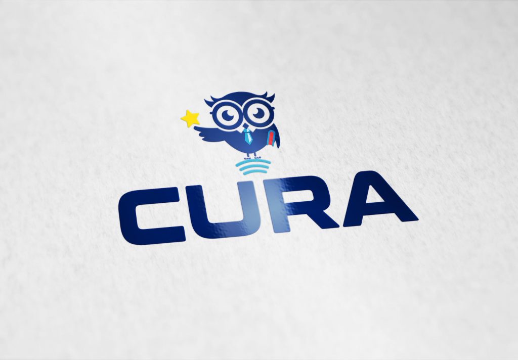
On the other hand, the toothbrush that the owl holds in the below design establishes its relevance to the brand it represents. See what we mean? This is the kind of difference a dedicated design team working on custom designs for your brand can bring in.
4. Tell a relatable story
Want to make your bird logo more relatable? Craft a visual narrative that sticks. For instance, consider the Nestlé logo. It’s not just any bird symbol but one where the warm embrace of a mother bird’s love is beautifully illustrated. Firstly it relates to the name of the brand which means “nest”. Secondly, this is a descriptive visual representation of the concept of nourishment and care, the traits that the brand and its products are all about.
Similarly, once you identify the right bird to represent your brand, use custom illustrations to draft a visual narrative that’s both easy to understand and relatable.
Is there a message you think will strike the right chord with your customers? Or your brand’s origin story that’s intriguing? Perhaps even a sentimental narrative that demonstrates the values your brand stands for? Identify such a narrative and use clear bird-focused visuals and you have a bird logo that’s hard to forget.
5. Master the art of negative space
You have so much to communicate through your bird logo but you need to deliver this message without complicating the design or taking up too much space. Now how do you do that? Negative space is the design principle you need to master.
Negative space is the empty space in design, space that’s added for functional and aesthetic purposes. When utilized well, negative space can add depth, intrigue, and allure to your logo.
The NBC logo is a classic example of using negative space effectively. The peacock’s colorful feathers are arranged in a circular shape, with the bird’s body and head subtly implied through the negative space between the feathers. Overall, the design also looks symmetrical and well-balanced. The clutter-free layout with the clever use of negative space makes this happen.
KIMP Tip: Ensure that the use of negative space in your logo feels natural and not forced. The idea is to add a layer of discovery for the viewer. With that in mind, also integrate these details without complicating or cluttering the design.
6. Make your logos unique with abstract shapes
Looking to incorporate bird imagery into your design without making it look banal? How about creating abstract shapes to represent the chosen bird symbol?
Abstract logos have their way of grabbing attention. A great example of a logo using an abstract bird shape is the American Airlines logo. Look closely and you’ll notice that the unique abstract shape combines the letter “A” and an eagle symbol and it looks like an airplane wing as well.
Another great example is the Turkish Airlines logo.

In both these cases, birds are relevant and instantly recognizable symbols in the aviation industry. Hence one of the most commonly used as well. Therefore, abstract versions of these symbols make the bird logos fresh and memorable.
KIMP Tips:
Looking for some ideas to mimic this approach?
- Break down the chosen bird’s form into basic geometric shapes.
- Use symmetry and balance to create a harmonious design.
- Experiment with bold, clean lines and minimal details for a contemporary look.
7. When type meets symbol
For a logo to work, typography and imagery should work harmoniously. Custom typography paired with a bird logo can create a cohesive and distinctive brand identity. When the text and symbol work together seamlessly, they reinforce your brand’s personality and make your logo instantly recognizable.
To explain this better, there’s the Chick-fil-A logo. The Chick-fil-A logo combines custom typography with a playful chicken symbol. The chicken, shaped like the letter “C,” is integrated into the wordmark, creating a cohesive and memorable design.
Taking cues from this approach, create custom typography where the characters are crafted to let you integrate the desired bird imagery into the wordmark effortlessly. This adds a playful touch to your design. No matter how you want your logo to be – elegant or playful or professional, custom typography helps you streamline the aesthetics.
8. Focus on versatility
Given that brands now have to have a balanced approach when it comes to choosing digital and offline channels for marketing, branding in the digital age needs to be versatile.
So, when you design bird logos, prioritize versatility so that the significance of the bird imagery stays intact no matter where the logo appears and on what scale. To achieve this consider how your design looks:
- When scaled up and down
- In monochrome and color
- And access different backgrounds
Consider the Tripadvisor logo for instance. Yes, that’s another owl logo on our list. And this one does look different from the others with just a sleek silhouette of the owl face integrated into the design. Looking perfectly balanced, and with a contrasting green circle background, this logo pops out no matter what the background looks like.
9. Capture the spirit of your brand
Is there a bird that ties back to your brand in a unique and emotional way? Then you have the perfect ingredient for your logo. Perhaps a bird that holds cultural significance in your target market or one that is native to the place of origin of your brand. Choosing such a bird means that you effortlessly communicate your brand’s history through your logo preserving its heritage.
Besides, such representations can also give your target audience one more reason to love your brand!
The BACARDÍ logo is an apt example of this. Do you know the story behind the bat in the BACARDÍ logo? According to BACARDÍ, Don Facundo, the wife of the brand’s founder, came across a colony of bats in the rafters of the company’s first distillery. Given the fact that bats are considered to be symbols of good fortune and unity, the bird was chosen to represent the brand.
Due to this special connection with the brand’s origins, the bat has always remained a part of the brand’s identity.
10. Pick the perfect visual style for your logo
Once you have the bird, the story behind it, the extra details you would like to add and other information, the final choice is about the visual style.
- Do you think a custom illustration will work or an icon style?
- How about raw hand-drawn styles?
- What about the details? Will a flat design be more impactful or do you need a skeuomorphic design to suit your brand?
- How about choosing between retro styles and contemporary ones?
Recall all the bird logos we discussed so far – each flaunts a different look. Beyond colors and fonts, there is the visual style that ties back to the respective brand. You need that for your brand as well.
For example, consider the below logo. Yes, it’s a bird logo and it’s pretty evident. But the style isn’t commonplace. By incorporating geometric shapes and a captivating balance, the logo looks fresh and modern.
To make the right decision here
- Consider what style works best for your brand.
- Explore the styles popular in your industry.
- Find what works for your target audience.
- Stay away from short-lived trends and focus on a timeless style.
Ready to Let Your Brand Take Flight? Get KIMP!
In conclusion, bird logos can be more than just visually appealing brand symbols. They can be powerful brand identifiers that tell the brand’s story and foster deep connections with the audience. But crafting the perfect bird logo, which not only looks good but also stands out from the many others on the market, is not always easy. It takes creativity, strategy, and expertise to bring your vision to life. That’s where an unlimited design service like KIMP comes in.
With a dedicated design team working on your brand, crafting the perfect logo and brand designs becomes so much simpler.
Why wait? Unlock unlimited design possibilities with a free 7-day trial – register now!