
Graphic Design Styles: Choosing the Perfect One for Your Project
So, you’ve got a great business idea brewing and you’re ready to make your mark. But how do you stand out in a sea of brands? The answer lies in your brand’s visual identity – and that’s where graphic design comes in. With countless graphic design styles to choose from, it can be overwhelming. We get it!

Fear not! This blog is your handy guide to navigating the world of graphic design styles. We’ll break down the most popular ones, explore their unique characteristics, and show you how to pick the perfect style to represent your brand. Let’s get this show on the road!
6 Popular Graphic Design Styles: A Quick Overview
1. Swiss Style
Born in the era between the 1950s and 1960s, Swiss Style revolutionized modern graphic design with its focus on clean lines, minimalism, and functionality. As one of the most popular graphic design styles, this one continues to captivate audiences even today.
Popularized by Ernst Keller and his student Josef Müller-Brockmann, Swiss Style wasn’t just a trend; it was a philosophy. The idea behind the movement was to focus on clear communication and better visual organization in design.
Influenced by other movements like the International Typographic Style, the Swiss Style is characterized by asymmetrical layouts. Hence text and visuals are arranged off-center, creating a sense of tension and visual interest.
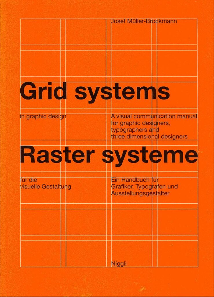
Also, this is one of the most popular graphic design styles to have embraced grid styles. Here’s the cover design of the book Grid Systems in Graphic Design by Josef Müller-Brockmann. The vibrant design here is a classic example of Swiss Style in graphic design.
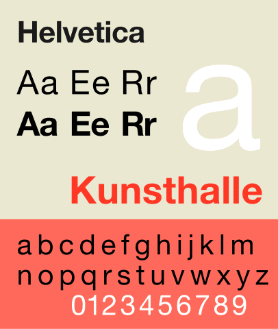
Another notable factor here is that this is one of the graphic design styles where sans serifs reign supreme. The style leverages the clean lines of sans-serif fonts, like the ever-popular Helvetica.
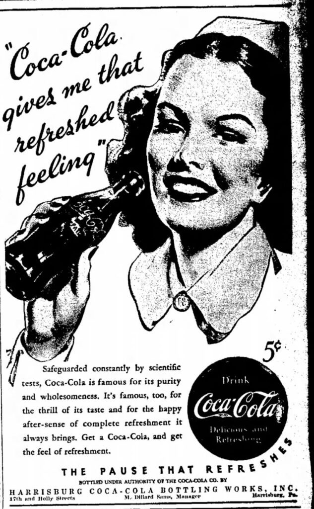
Finally, the Swiss Style was a stark contrast to the designs that existed in the 1940s like the ad in the image below. Instead of the heavy and crowded layouts that were often used, the Swiss Style embraced a more modern and minimalistic style.
So, what kinds of brands can benefit from Swiss Style in branding? Modern technology companies, financial institutions looking to keep it clean and clutter-free, and government agencies that want to convey information clearly and objectively.
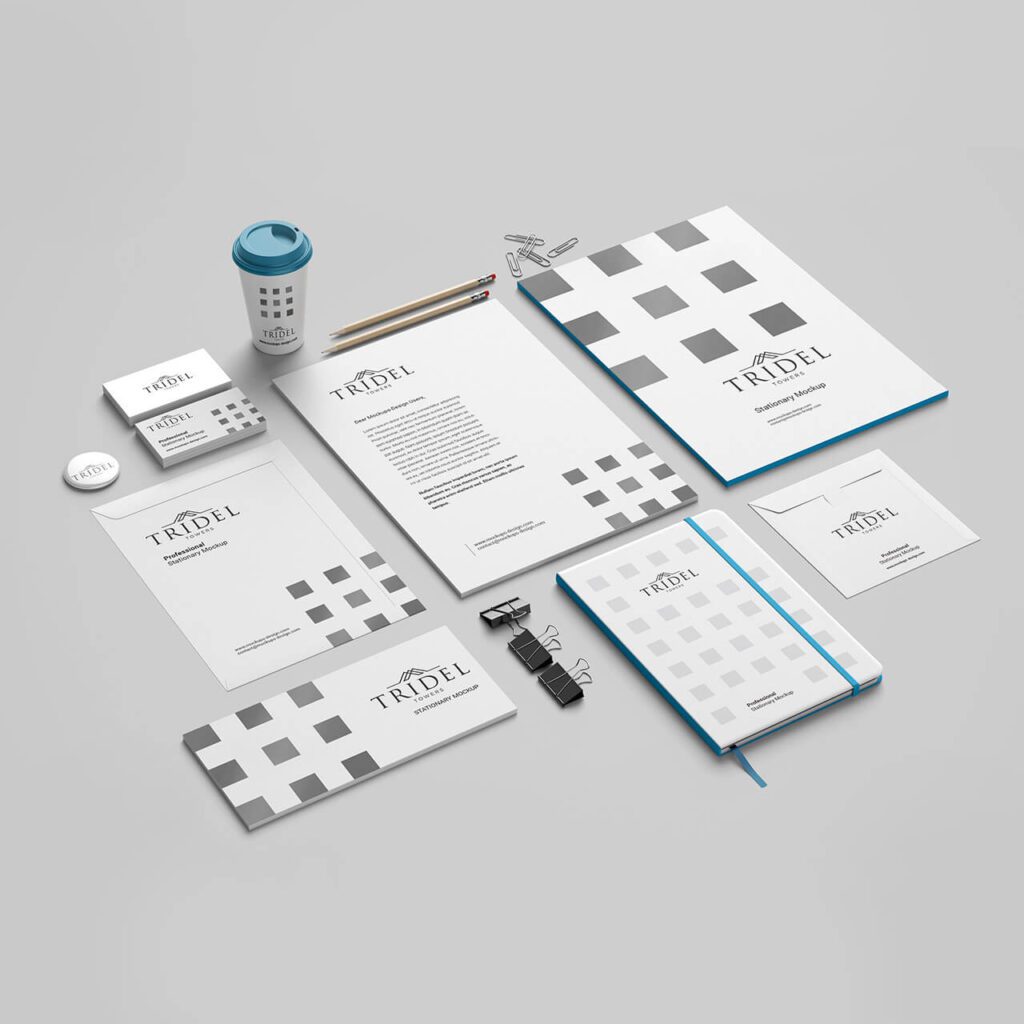
Additionally, this style looks great on corporate presentations, reports, branded stationery, app designs, and websites for organizations looking for a contemporary and straightforward approach.
2. Art Nouveau
Emerging in the late 1800s, Art Nouveau (French for “new art”) stood in contrast to the harsh realities of the Industrial Revolution. As factories spewed smoke and machines dominated the landscape, Art Nouveau offered a whimsical escape, a return to nature’s beauty. Therefore, the style was introduced with a lot of nature-inspired and organic elements.
Even the most mundane things like railings and lamp posts started featuring blooming flowers and leaves when the Art Nouveau movement started penetrating the architectural realm. That’s the essence of Art Nouveau – the beauty in the ordinary.
Art Nouveau is one of the most distinct graphic design styles that immediately reflects a vintage charm. It does so by incorporating organic shapes, flowing lines, and elaborate floral motifs. Think vintage botanical illustrations brought to life, with whiplash curves and flourishes adding a touch of drama.
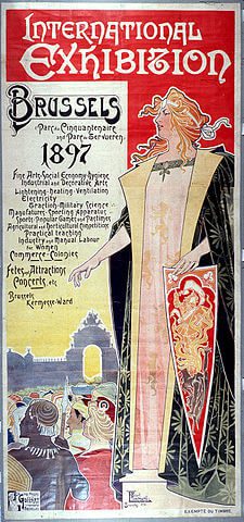
The poster design created for The Brussels International Exposition is one of the earliest known examples of Art Nouveau in marketing.
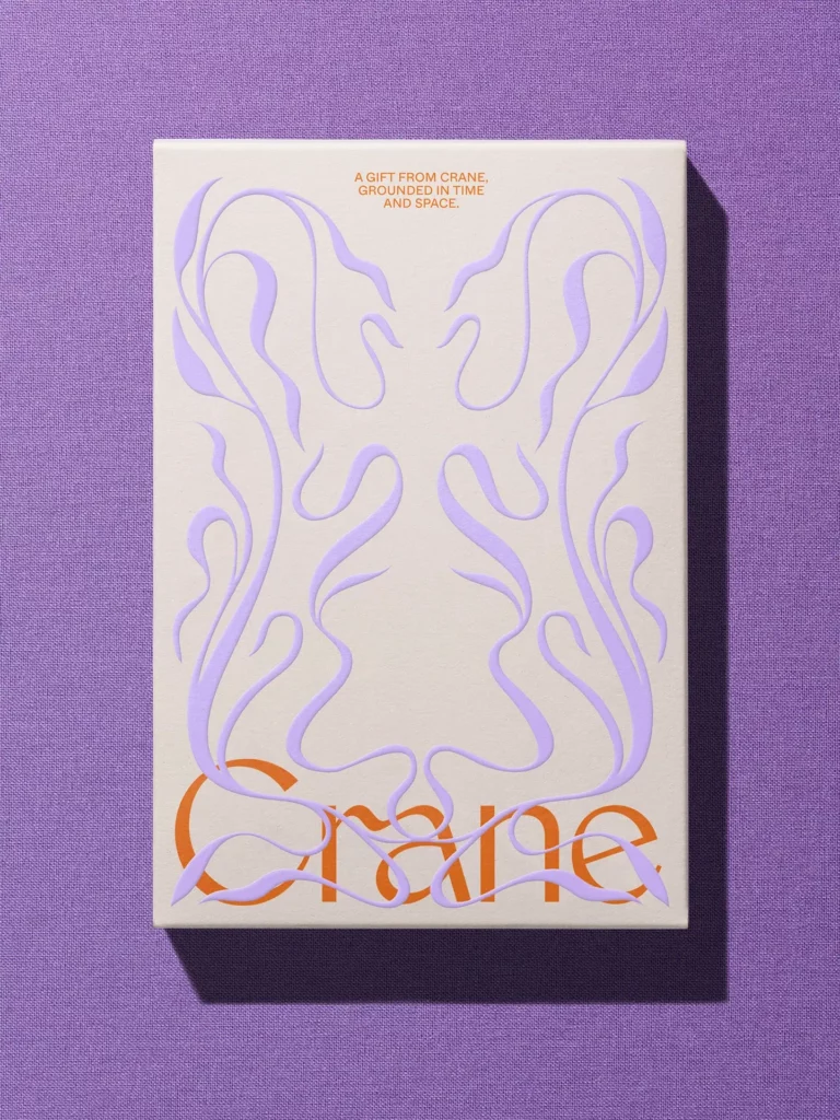
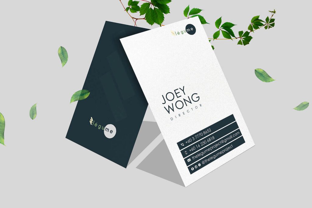
The branding project featured below is another good example of adopting this style in branding. Notice the sophistication that the elegant curves bring into the design.
Highly detailed and with hardly any empty space in the design, Art Nouveau designs often feature saturated tones, both warm and cool. This creates a sense of richness and vibrancy.
Naturally, Art Nouveau can be a great choice for luxury brands, gourmet brands or even beauty brands looking to add a hint of nostalgia to their designs.
To be more precise, this is one of the best graphic design styles to use in branding designs or marketing designs targeting consumers who seek elegance, craftsmanship or even those who enjoy vintage styles.
3. Art Deco
As a strong successor of Art Nouveau, this graphic design style became popular in the 1920s and 1930s.
Challenging the fluid organic curves of the Art Nouveau movement, this one is characterized by non-organic elements and industrial shapes.
The name of the style itself was derived from the word Arts décoratifs meaning Decorative Arts in French. While the style itself differs from the Art Nouveau style in many ways, there is one similarity – the focus on luxury and ornamentation. Before we proceed, we’ll look at an example to understand this style better.
Recall the aesthetics of the promotional graphics of the popular movie The Great Gatsby. Here’s an example. This luxuriant design follows the Art Deco style.
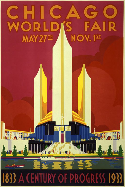
One of the popular historic examples of this graphic design style being used in marketing is the poster created for the Century of Progress International Exposition of 1933.
Now about the differences and traits that set Art Deco apart from other graphic design styles. Geometric shapes like bold triangles and zigzags often form ornate patterns.
The numerous complicated details here also contrast the minimalism of the Swiss Style. Moreover, when it comes to colors, the Art Deco style goes bold with vibrant palettes that make a statement.
Sometimes you will also notice traces of Cubism in some of the Art Deco style. Hence multiple perspectives might be introduced into the design.
So, what kinds of brands can tap into the Art Deco style in their marketing and branding designs? Premium automobile brands that wish to convey refinement with a touch of robustness, luxury hospitality brands and even glamorous fashion brands.
4. Psychedelic Style
Psychedelic style is characterized by mesmerizing designs that are visually stimulating like the effects of psychedelic drugs. They are also known for their swirly patterns, big bold details and loud colors.
The style was quite popular in the 1960s and it was heavily influenced by the counterculture movement of the period.
In short, this style is best described as “rebellious”. To achieve this effect, the designs that follow this style often adopt abstract forms and quirky shapes. Additionally, the lettering used is often distorted and not very legible in most cases. So, yes, this might not be the best of graphic design styles to experiment with when you have a strong message to communicate.
In fact, this is a style that is more relevant to applications that call for expression, an emotional connection rather than message delivery.
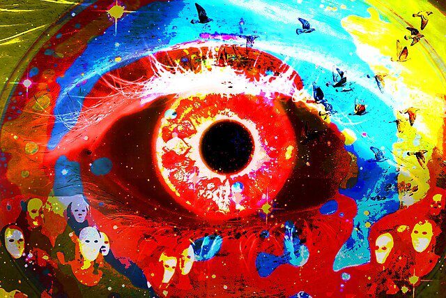
Like the poster in the below image, Psychedelic style is often associated with hippie aesthetics with colors bleeding into each other, bold curvy fonts running all over the design. That is, a combination of surrealism and bold expression.
A point to note here is that it takes a lot of creativity to create meaningful Psychedelic style designs that align with your idea. Therefore, by adopting this style you are creating something that is hard to mimic.
So, what kinds of brands and designs benefit from this graphic design style? Naturally, music branding especially for a hippie music brand can be taken up a notch by creatively adopting this style. Other than this, brands focusing on rebellious youngsters and teens and those known to challenge the norms and stay loud and expressive can easily differentiate their brands with this style.
It also makes a great choice as visual themes for music festivals, social media campaigns focusing on making noise.
5. Minimalism
Minimalism has steadily evolved to become more than just a graphic design style. It has become a crucial design philosophy for several brands around the world.
Minimalism is all about embracing clarity and simplicity. While the Swiss Style shares some of the philosophies of minimalism, this is not the only style under this umbrella.
One of the main characteristics of minimalism is that it prioritizes functionality over ornamentation. In other words, the designs are practical and efficient. Hence this style directly contrasts what other graphic design styles like Psychedelic style, Art Deco, and Art Nouveau are about.
There is generous use of negative space in minimalism. Like the design here. Notice how the large white spaces direct attention to the core elements and allow them to breathe freely. The airiness in minimalistic designs also creates a sense of balance that is visually appealing.
Moreover, minimalism is known to favor simple and limited color palettes. Most brands choose to use muted hues for minimalistic styles but that’s not your only option. Even with a bright and lively color, you can go the minimalist way by sticking to monochromatic palettes with grays, blacks, and other neutrals to balance the effect of bright shades.
Apple is one of the most popular brands known to adopt this graphic design style in their branding and marketing graphics. The Ordinary is another brand that has continued to win hearts through the efficient use of minimalism their brand identity.

Minimalism works well in most corporate graphics, educational materials as well as in-app designs. It is particularly for brands looking to evoke a sense of modernity.
For more tips on how to adopt this graphic design style, check out our blog on minimalism.
6. Flat Design
Another crucial graphic design style that gathered momentum in the 1950s and 1960s is the flat style design. The flat style is heavily influenced by the Swiss Style but doesn’t always have to be minimalistic.
Flat design has grown to become a timeless graphic design style mainly because of its adaptability. In other words, the ease at which this style can be recreated for diverse digital channels and print designs as well.
The flat style in graphic design is all about keeping the design flat or two-dimensional without complicated details that add depth. To achieve this, designers use simple color palettes and easy shapes and little to no shadows and highlights.
Part of the reason why this style became popular in the 1960s was the resemblance of this style to the simple and sleek computer interfaces back then. Going along the same lines this style was considered more refined and modern. These perceptions have remained more or less the same and to date, flat styles are considered to be modern and elegant.
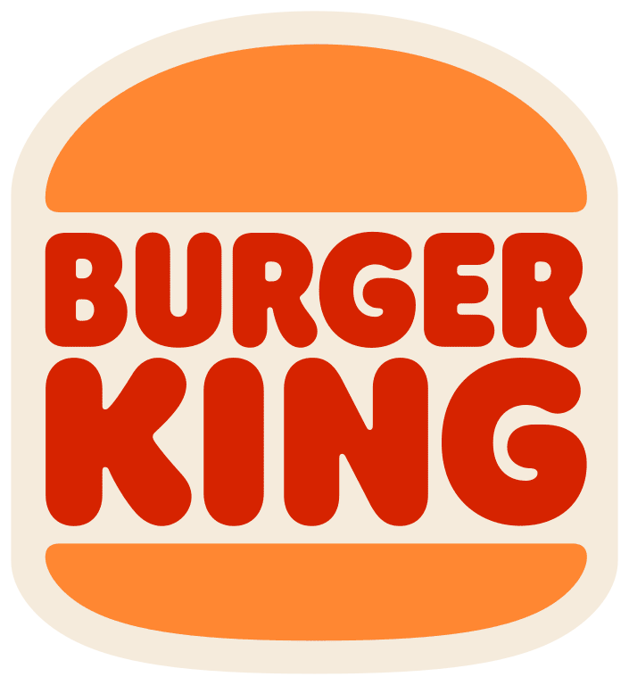
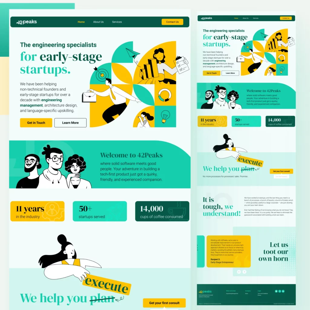
No wonder, brands like Nissan, BMW, Volkswagen, and Burger King have all switched to flat styles for their logos. And the best part is that the flat style works both in branding and marketing. Extending the flat style of your logo you can easily create stunning flat-style websites like the one featured here:
To learn more about this graphic design style, read our blog on flat design.
Graphic Design Styles: Find Your Perfect Match With KIMP
With so many graphic design styles to choose from, it can be overwhelming to decide which one is right for your brand. The key is to consider your target audience, brand values, and marketing goals. By understanding the strengths and weaknesses of each style, you can make an informed decision and create a visual identity that resonates with your audience.
Ready to elevate your brand with the perfect graphic design style? Choose a KIMP subscription and bring your ideas to life. Register now for a free 7-day trial!