Fast Food Logos: How to Create Visuals That Sizzle
In a world that never slows down, fast food chains need to perfect the art of communicating with their audience—quickly and effectively. In the hustle of fast culture, convenience is king and time is short. Therefore, a brand that wishes to leave a lasting impression needs an identity that speaks volumes. And at the heart of that identity? The logo.
Fast food logos aren’t just aesthetic designs. They need to be designed to communicate speed, satisfaction, and familiarity—all within a glance. In a market where consumers are always on the lookout for the next best option, a logo must stand out, resonate, and stick. Given that the fast food market is crowded and there’s an ever-growing competition, fast food logos need to instantly attract the attention of busy consumers.
In today’s blog, we’re hacking into the art and strategy behind designing fast food logos that not only catch the eye but hold the attention of consumers. Whether you’re a designer or a brand strategist, this blog is your crash course to creating fast food logos that truly deliver.
Let’s begin with a quick overview of some critical fast food industry insights to help you better understand the role of branding in this industry.
Fast Food Industry: Key Insights
- The global fast food industry is estimated to grow to USD 750.08 billion by the year 2031. This underscores the immense competition brands will face in the future. In this booming market, a strong, recognizable logo and cohesive branding are essential for standing out.
- About 40% of American consumers interact with fast food brands through drive-thrus. This means that in the fast-food market, it’s all about high-speed, low-contact interaction. Therefore you need a strong, instantly recognizable brand identity to reinforce customer trust.
- With 65% of people consuming fast food at least once a week, fast food brands are part of consumers’ habitual routines. In an industry where customers are making frequent purchases, a memorable brand fosters customer affinity.
- Gen Z and millennials are the most frequent fast food consumers. Consequently, fast food brands must tailor their logos and overall branding strategies to appeal to these younger generations by being bold, engaging, and resonant with modern values.
- While convenience and speed are crucial, data shows that quality is the most influential factor for consumer behavior in the fast food industry. Hence good fast food logos should reflect the promise of quality.
With these factors at play, how can you design a fast food logo that truly stands out? Let’s take a closer look at successful fast food chains from around the globe and uncover the secrets behind their iconic logos.
8 Fast Food Logos: Lessons to Take Away From Them
1. Tim Hortons
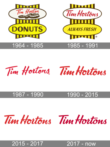
The first one on our list is Canada’s beloved fast food chain Tim Hortons. A simple wordmark logo but in a well-recognized script font, the Tim Hortons logo has remained largely unchanged since its inception, except for the fact that the word “Donuts” and the yellow color scheme were dropped.
The red in the Tim Hortons logo seamlessly ties back to the red of the Canadian flag preserving the brand’s origin. Moreover, red also evokes a sense of urgency which feels apt for the fast-food industry.
KIMP Tips:
If there is one thing to take away from the Tim Hortons logo, it is the power of consistency in branding for fast food brands. The image below highlights the evolution of the Tim Hortons logo demonstrating how the core element, the logotype in script font has not changed since the inception of the brand.
Secondly, the logo also proves the point that simple fast food logos without complicated details turn out to be memorable brand representatives.
To learn more about the Tim Hortons logo, check out our blog on Tim Hortons’ branding.
2. Chipotle Mexican Grill
The renowned American fast food chain Chipotle has carved a niche for itself in an ever-evolving industry.
Chipotle is smoke-dried chili pepper which is a major ingredient in Mexican cuisines. Hence a visual representation of this forms the core element of the Chipotle logo. The color brown at the center is also a direct connection to the ingredient, chipotle. This simple yet meaningful symbol not only adorns the logo but also boosts brand recognition.
Both the name and the symbol in this design aid visual storytelling communicating what the fast-food chain specializes in.
KIMP Tips:
- Leverage symbolism if you wish to create fast food logos that provide your brand with a competitive edge. You cannot go wrong with symbols or illustrations that communicate your core offerings.
- A simple and clutter-free design ensures that the story in your fast food logo remains crystal clear.
3. Sukiya
Japan’s popular fast food chain Sukiya has a unique illustrative logo that instantly communicates the brand’s USP (unique selling proposition).
While the restaurant caters to a variety of dishes, their main specialty is Gyudon (traditional Japanese beef bowl). Hence the bowl in the logo makes perfect sense. The combination of Japanese characters along with the brand name in English helps preserve the brand’s origins while also carving its global identity.
KIMP Tips:
- Identify what sets your brand apart in a crowded fast food market. This could be the authentic native recipes you serve (as in the case of Sukiya) or the ambiance in your fast food restaurants. Use a clear visual representation of this unique trait to create a unique fast food logo.
- Make the most of color psychology. In this case, Sukiya uses red and yellow which continue to be among the top choices for fast food logos. Because both these colors effectively communicate urgency and the energy of the fast food industry.
4. Jollibee
The Filipino fast food chain Jollibee has a fun and friendly logo featuring a unique mascot. There are many layers to this logo and together they make this one of the most vibrant fast food logos out there.
The brand name itself reportedly was crafted inspired by the hard-working nature of bees and the prefix “jolly” to represent the joy the fast food chain aims to bring to its consumers. This story paints a rough picture of the brand’s personality, doesn’t it? Now going back to the logo, do you think the design reflects this personality effectively? It definitely does, right?
KIMP Tips:
- Crafting aesthetically appealing fast food logos is easy and most brands do. But designing something that is an accurate representation of your brand’s unique personality is the way to make your brand cut through the noise.
- In the Jollibee logo, the colors, style of illustration, and friendly sans-serif fonts all work in unison to create the warm aesthetic intended. Similarly, put together all the right elements to evoke the right emotional response from your audience.
5. Fairwood
Fairwood is one of the most popular names in the Chinese fast food industry. Their signature “jumping man” logo is another example of creating designs that resonate with the brand’s personality, similar to the Jollibee logo we discussed recently.
According to the company, the symbol was integrated into the design in order to capture the “irrepressible joy and liveliness” the brand wishes to be associated with.
Instead of cliched human silhouettes, the Fairwood logo uses a distinct abstract illustration. This underscores the value of custom illustrations in branding designs like logos. Additionally, the use of orange gives the logo a unique twist. Orange is associated with youthful energy and is seen as a fun color. Hence it makes a wonderful addition to the design.
KIMP Tips:
- To ensure that your logo is unique, use abstract symbols instead of overused designs and illustrations.
- Choose colors that complement your design.
6. Dodo Pizza
Next on our list is the popular Russian fast food chain Dodo Pizza. The brand’s logo features a simple illustration of the dodo bird within a “D” silhouette. This illustrated mascot appears across the brand’s marketing designs like their packaging.
On the whole, the logo is sleek and has a rhythmic geometry to it. This makes the overall design visually appealing.
KIMP Tips:
- The Dodo Pizza logo highlights the relevance of flat designs in the modern-day fast food market. Flat designs also bring in the benefit of scalability which is a handy trait for fast food brands with their omni-channel marketing approach.
- The branding approach of Dodo Pizza shows that creating a simple and friendly mascot can elevate your fast food chain’s presence in the market. Through this mascot you are putting a friendly face at the forefront of your marketing strategies and to coherently carry your marketing campaigns forward.
Need help designing a mascot for your fast food brand? Get KIMP!
7. Nando’s
The well-known South African fast-food chain Nando’s is another brand that uses a mascot logo. Over the years, their cockerel mascot Barci has become an inseparable part of their brand identity.
In this case, their use of a cockerel mascot also exemplifies the integration of cultural elements in design. Because, despite being a South African brand, they proudly flaunt their Portuguese roots. They achieve this by crafting a design that draws inspiration from the Rooster of Barcelos one of the most commonly recognized symbols of Portugal.
KIMP Tips:
- In addition to the use of the rooster symbol, the details within the rooster illustration as well as the textures and patterns appearing on the brand’s marketing graphics draw inspiration from African culture. This shows how a clearly defined brand style guide with details about the visual representation of your brand can aid consistency in your branding and marketing.
- The font used in the logo is as unique as the logomark itself. This helps add a unique personality to the design demonstrating the significance of typography in fast food logo design.
8. Red Rooster
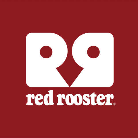
The Australian fast food company Red Rooster depicts how even with simple monogram details you can create a visually intriguing logo.
The brand’s logo and branding designs reflect their laid-back, Aussie vibe and commitment to providing affordable, satisfying meals.
The image below shows the old logo of the brand. Observe how much the logo has changed recently.
The recent rebranding visibly simplified the logo and trimmed down the details in it. This creates more space and allows the design to breathe and enhances the design’s memorability as well.
KIMP Tips:
- Red Rooster’s recent logo and their design evolution depict the need for keeping fast food logos clean and simple. Overcomplicating the design can obscure the core message.
- The intuitively balanced monogram of the brand adds an interesting twist emphasizing the need for including a little extra something to your design. An element of visual interest to convince people to stop and take a second look at your logo!
Summarizing the Best Practices for Fast Food Logos
Based on the designs of the 8 fast food logos we discussed until now and based on the timeless trends that have ruled the fast food industry, we’re going to summarize a few best practices to remember when designing your own. Here you go:
- Focus on the visual depth of your design – through mascots, illustrations, symbols, or even shapes, your fast food logo needs to incorporate relevant representations. These could be your core offerings, your brand values, or even your origin story.
- Leverage color psychology – colors have moods and are known to evoke specific emotional responses. Brands around the world tap into color psychology to add more depth to their branding and so should you. Warm yellows and appetite-inducing reds are often the most common colors used in food branding.
- Keep it simple and versatile – in a world where drive-thrus and online ordering dominate the fast-food industry, your logo and other brand elements appear on diverse print and digital designs. Therefore, a simple and easily scalable logo is a must-have.
Create Delectable Fast Food Logos With KIMP
Based on all these popular fast food logos it’s clear that to create truly stunning designs here’s the ingredient mix you need – a little attention to detail, clear goals, and an understanding of the target audience. Along with these a sprinkle of creativity goes a long way and that’s where the assistance of a professional design team comes in handy. With an unlimited design service like KIMP, you get a dedicated design team to handle all your branding and marketing designs.
Register now for a free 7-day trial!


