
Logistics Logos: Breaking Down the Branding of Supply Chain Titans
The logistics industry is highly competitive. After all, in the business of global connectivity, it is all about speed and reliability. Therefore, a logistics logo is more than a visual element. It becomes a symbol of trust. A visual representation of the company and its commitment to efficiency.
So, if you are someone in the logistics business looking to boost your brand identity or a marketer working on a logistics logo, then this blog is for you.
Get ready to explore the logos of renowned logistics companies and learn how to apply their design principles to your own brand.
The Weight of Branding in the Logistics Industry
As always, let’s begin by quickly grasping the significance of branding in the logistics industry. This gives you an idea about what to expect from the industry you are competing in.
First things first, did you know that the global logistics industry is estimated to reach 14.08 trillion U.S dollars by the year 2028? This comes from thousands of companies small and big worldwide. In fact, this is considered to be one of the fastest growing sectors. Therefore, a strong, distinctive logistics logo helps logistics firms differentiate themselves in this crowded space.
The explosive growth of the e-commerce industry has driven unprecedented demand for logistics and delivery services. Hence a recognizable and reliable brand is essential to secure partnerships with online retailers and gain customer trust in the “last mile” delivery space.
A majority of logistics companies are fighting for attention in the B2B space. A well-designed logo and cohesive brand identity can position a logistics company as a trusted partner in supply chain operations. Moreover, it gives a glimpse of the kind of company you are and the kinds of businesses that will benefit from working with your logistics company.
With these key insights in mind, let’s take a closer look at some of the most iconic logistics logos and analyze what makes them effective.
7 Logistics Logos + Design Lessons
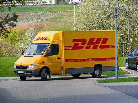
1. DHL
This iconic wordmark logo is one of the most popular logistics logos. On the whole, it is simple, scalable, and memorable too.
Red has always been the primary color of the brand and yellow became an integral part of their identity ever since they took over Deutsche Post. today, the combination of yellow and red captures the dynamism of the brand.
Moreover, the DHL logo shows that typography in logo design can be used to communicate different emotions. In this case, the slightly slanted forward characters in the logo combined with the horizontal stripes represent movement which is one of the most distinguishable traits to convey in the logistics industry.
The minimalistic yet distinctive design is versatile, maintaining clarity and impact whether it’s displayed on a truck, app, or shipping label.
KIMP Tips:
- Incorporate design elements, such as lines or arrows, that suggest speed and efficiency to align with logistics’ fast-paced nature.
- A clean, uncomplicated design ensures your logo works on everything from mobile screens to large trucks and packaging boxes.
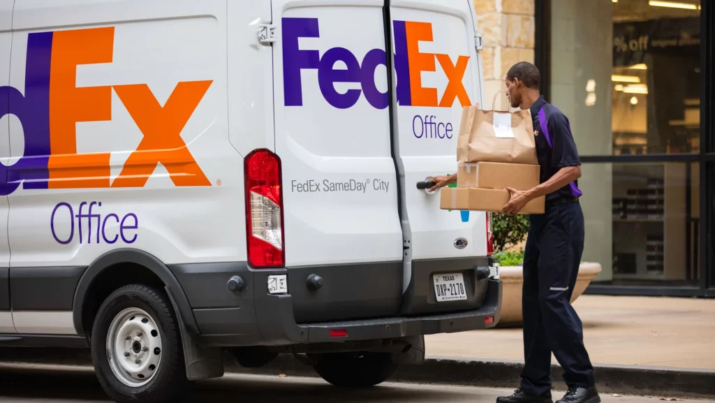
2. FedEx
FedEx has one of the most intriguing logistics logos. While it looks like a simple wordmark at first glance, the arrow concealed in the design between the “E” and the “x” is what adds a creative twist. The arrow here can be seen as a symbol of precision and movement both of which are relevant to the logistics segment.
The clutter-free design of the FedEx logo makes it easily adaptable. This idea works particularly for brands looking to apply their logo to their various sub-brands. In this case, the wordmark seamlessly fits into the logos of their various units like FedEx Ground, FedEx Express, FedEx Office, FedEx Custom Critical, and others.
By simply adding the service name below or after “FedEx,” they maintain brand cohesion while clearly distinguishing between services. This approach is both practical and efficient for branding across multiple operational units.
KIMP Tips:
- Make the most of negative space in design to add an extra layer of meaning to your logo without complicating it.
- To understand what to include in your logo and how to trim it down, be clear about the various applications of your logo.
3. Kuehne+Nagel
The Switzerland-based logistics firm Kuehne+Nagel has a combination logo with a modern and minimalist design.
The typography of a logo helps shape its personality. For instance, bold fonts can convey a sense of strength and authority. Accordingly, Kuehne+Nagel employs a bold, sans-serif typeface that strikes the perfect balance between modernity and elegance.
This choice not only reflects the brand’s professional and progressive ethos but also preserves its heritage by emphasizing the legacy behind the name (derived from its founders, August Kühne and Friedrich Nagel).
The other standout factor, a design tip to take away from this logistics logo is the use of symbolism to amplify the meaning of the logo. Here the use of the anchor symbol ties back to the brand’s shipping business. From another perspective, the anchor can also be viewed as a visual representation of “stability” which is a crucial attribute for any logistics firm.
Finally, this logistics logo also demonstrates the brilliant use of color psychology. Blue, especially deeper shades like the one used here, reflect reliability and trust. Hence, Kuehne + Nagel uses blue not just in their logo but also across various brand designs including the color of their trucks.

KIMP Tips:
- Tap into symbolism to add more value to your logo. Visual storytelling goes a long way in helping your brand stand out in a crowd. Moreover, symbolic representations make it easier for your consumers to grab the message and therefore makes your logistics logo easier to connect with.
- Use colors strategically to evoke the values and trust that clients seek in logistics providers.
4. Linfox
Renowned Australian logistics company Linfox has one of the most vibrant logistics logos. The bright yellow of the logo captures the energy of the segment.
While the logo is built on a vibrant yellow, the brand also utilizes a combination of red and yellow which can instantly grab attention. Moreover red color can also evoke images of shipping containers and therefore feels relevant to the logistics industry.
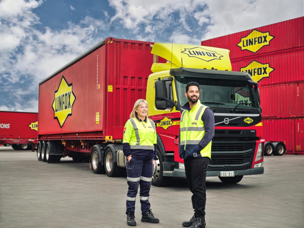
In addition to the attention-grabbing color, the logo also stands out with its use of all-caps logotype. This reflects the brand’s strength and stance in the market thus demonstrating how in addition to the choice of typefaces, nuances of typography like the character case, kerning and others can help build on the impact.
Finally, placing the logotype on a solid filled shape ensures excellent readability of the brand name no matter where the logo appears. This helps separate the brand name from the rest of the design irrespective of the scale.
KIMP Tips:
- Use bold, contrasting colors like yellow and red to create an eye-catching and energetic logo that captures the attention of your audience in the competitive logistics industry.
- Pay attention to the little details in typography to communicate your brand’s unique personality.
5. InPost
InPost is a Polist logistics firm with a logo that feels like a fresh deviation from other logistics logos. This combination mark design features an abstract shape representing the sun.
Yes, this logomark does add a lively twist to the design and makes the logo stand out in the logistics industry. However, it’s not just about the visual intrigue. InPost strives to be an “environment-friendly” e-commerce logistics company. Therefore, the inclusion of a nature-inspired element feels relevant to the design.
This depicts how simple details like adding a subtle abstract element to your logo can help differentiate from your competitors. It helps tell the story of what makes your brand unique and what you stand for.
While incorporating extra design details, the InPost logo still preserves a minimalist theme. This helps ensure that the logo can be scaled up or down without the fear of the design losing its impact. And the clear legible font ensures that the brand name is easy to grasp on all designs.
KIMP Tips:
- Aim for a clean and timeless look. Businesses often choose to stick to a logistics partner for a long term. You cannot risk your logo becoming outdated or irrelevant over time, as this may impact brand trust and recognition.
- When choosing symbols and shapes to adorn your logo, do not just look at the common symbols associated with your industry. Look for a symbolic representation of your brand’s unique values. This creates something unique and instantly recognizable.
6. DSV
Danish logistics company DSV has a sleek wordmark logo which relies solely on typography to create something unique and modern.
The sans-serif font with rounded edges gives the logo a contemporary twist. Moreover, the visual intrigue here is merely from the altered strokes and kerning in the letters. From the discontinued stroke in the “D” to the extended stroke of the “S” seamlessly blending with the “V” the overall design appears unique, anchoring merely on the manipulation of the fonts.
On the whole, this design approach creates a fluid and agile design which summarizes the brand’s aim to “keep supply chains flowing in a world of change”.
Additionally, there is also the use of the color blue to establish credibility and professionalism. On the whole the design combines different ideas to create a logo that appeals to both B2B and B2C audiences that the brand caters to.
KIMP Tips:
- For brands with international reach, design a logo that feels universal and professional. To achieve this, avoid niche or overly localized symbols that might not resonate with a global audience.
- To make the chosen logo font work harder, include minor manipulations like adjusting the slant, extending or trimming down the strokes of specific characters. This results in a logo that’s one-of-a-kind.
7. CEVA Logistics
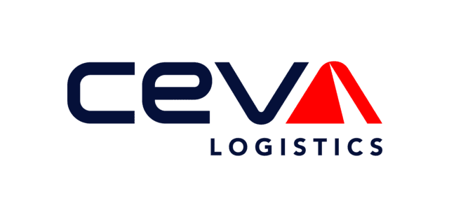
CEVA Logistics is an excellent example of adding an extra layer of meaning to logistics logos without complicating the design.
The design here adds a fresh twist to wordmark design by seamlessly incorporating a red triangular shape into the design, in place of the letter “A”. It does so without compromising the readability of the logo.
Moreover, the logo’s minimalistic design ensures that it is versatile and adaptable across cultures, languages, and markets, which is crucial for a global brand. It also does not use any cliched visual references. Instead it relies on the use of shapes, like the upward triangle here which can be a symbol of precision, progress and growth all of which are great traits to represent a logistics brand.
In addition to this, the brand also combines the colors blue and red to collectively represent trust and speed.
KIMP Tips:
- Adding or creating shapes and symbols within the negative space in your logo or manipulating specific characters to communicate a message is a great idea. However, ensure that this decision does not make your logo difficult to read.
- Leverage shape psychology by understanding the emotions each shape can evoke. This helps enhance the impact of your logo.
Design Impactful Logistics Logos With KIMP
From color psychology and typography to symbolism and overall aesthetics, these logistics logos demonstrate the importance of creating a visual identity that is not only memorable and visually appealing but also effectively communicates your brand’s values. These designs reiterate the need to create something that represents your logistics company’s strengths and unique personality.
To create such designs that cut through the clutter and establish your company strongly in the competitive logistics landscape, partner with an unlimited design service, like KIMP! This helps you focus on other crucial aspects of branding while your dedicated design team brings your brand designs to life.
Register now for a free trial to experience the KIMP difference!