
Telecom Logos: The Art of Representing Global Connectivity
We’re all undeniably connected in today’s hyper-connected world, thanks to the incredible advancements in the telecom industry. From staying in touch with loved ones across continents to exploring the vast digital landscape, our lives are intricately woven with the services provided by telecom companies. This makes telecom logos more than just visual markers of a brand. They stand as symbols of connectivity, trust, speed, and innovation.
So, today, we’re going to examine the logos of some of the most well-known telecom brands around the world. Through this we’ll uncover how these designs resonate with global audiences and reflect the unique expectations of the industry.
Whether your business operates within the telecom space or you’re in a completely different sector these telecom logos and the design choices behind them can provide you with valuable insights into logo design. Into branding on the whole!
So, are you ready to dive in? Let’s go logo hunting!
Branding in the Telecom Sector: Understanding the Nuances
Before we talk about famous telecom logos, let’s take a moment to understand how branding is different in the telecom sector.
- The telecom industry and telecommunication technology are constantly evolving. Therefore a telecom brand’s identity needs to effectively capture the dynamism of the brand and its ability to stay agile.
- Telecom services play an essential role in everyday lives. Unlike many industries, telecom branding must represent a constant, dependable presence in people’s daily routines.
- Telecom companies often cater to both B2B and B2C audiences. Therefore they need a versatile brand identity that resonates with diverse segments.
- Unlike physical products, telecom companies cater to non-tangible yet extremely crucial services. Therefore the brand identity becomes one of the most important reminders of the brand itself.
In addition to these there is another aspect to factor in. The infographic below shows the percentage of Americans who were estimated to switch carriers within the next 12 months after the survey.
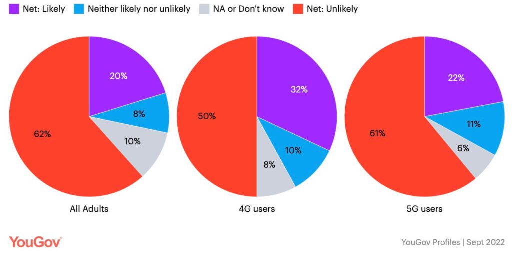
As you can see, the telecom companies have two kinds of audiences to think about. Meeting the expectations of the 62% of adults who are likely to stick around and fostering loyalty in the 20% of adults who are likely to switch carriers.
8 Telecom Logos – What Makes Them Unique
1. AT&T
The AT&T logo is one of the most recognized corporate identities, a timeless design that has been revered for its simplicity and versatility.
Talking about the design details, the curved white strokes within the blue circle don’t just add an element of allure but also help add a three-dimensional twist to the design. This design stands as proof that negative space can be used to add interesting details (like the strokes in this case) to telecom logos. Moreover, the AT&T logo is also the perfect example of flat design suitable for diverse digital and print designs.
As for the symbolism in the design, the spherical logomark represents the global therefore representing the scale of the brand.
Moreover, AT&T has stuck with the globe concept for decades, tweaking it over time to remain contemporary. The image below shows the original globe logo designed by design legend Saul Bass. The evolution of the AT&T logo reiterates the need for consistency in telecom branding.
2. Sprint
Sprint’s logo is a standout example of minimalism in telecom logos. Additionally, the design also depicts motion by adding a yellow stylized logomark which looks like a pinwheel or a wave formed by curved lines. The design of this logomark suggest speed, energy, and forward momentum. All of these are valuable traits to represent a telecom brand. This logo therefore exemplifies the use of abstract logos to tell a story.
The accompanying bold, black sans-serif typography balances the playful emblem, creating a modern and professional aesthetic. The font here also ensures exceptional readability which is a must in logo design.
In addition to these details, the use of color yellow in the Sprint logo represents the impact of color psychology. Yellow is not a common color in the telecom sector therefore the use of this color makes the Sprint logo memorable and unique.
3. Telus
This Canadian telecom brand has a unique logo unlike no other in the industry. It is a combination mark consisting of a simple wordmark logo in purple and a stylized monogram in green and purple. The stylized “t” is undoubtedly one of the unique traits of the design.
The brand strives “to make the future friendly”. Hence the casual aesthetic does the job well.
Considering the environmental impact, telecom brands need to be cautious about the use of colors like green in their logo.
In this case, Telus is known for its sustainable processes and has been recognized as the Greenest Employers of Canada in 2023. Hence the use of the color green in the logo feels accurate and not a mere greenwashing effect.
Though the color green provides a fresh twist to the design, Telus’s decision to go with a minimal scalable design ensures that the logo is recognizable with and without the signature colors.
4. British Telecom (BT)
The current BT logo is a simple and memorable design featuring the letters “BT” enclosed within a circular frame. This logo demonstrates the use of shape psychology in telecom logos. Here the circular element can be viewed as a representation of elements like connectivity, community and global reach, core aspects of the company’s business.
Talking about the color used in the design, purple is often seen as a color of creativity. Deep purples like the one used in BT’s logo are often seen as elegant and authoritative. Hence the color suits a brand that has a strong command over the market. Taking cues from this, choose brand colors that don’t just feel relevant to your industry but also resonate well with your target audience and capture the essence of your brand’s personality.
Moreover, this is one of those telecom brands catering to the needs of both business users and everyday consumers. Therefore, a simple logo can easily be adapted to suit both consumer-focused and business-focused designs.
5. Everything Everywhere (EE)
Popular British telecom company Everything Everywhere, which is yet another brand under the umbrella of brands belonging to BT Group (including BT) has a simple and interesting logo.
Unlike traditional monograms, this one stacks the letters in the logo vertically to create something tall and elegant. Therefore the design does make the brand stand tall and stand out among all telecom logos.
Given that the EE brand was created after the merger of T-Mobile UK and Orange UK, the two overlapping circles can also be seen as a merger of two entities in this case. This is one way to blend elements to create something visually unique and loaded with meaning.
Considering that EE focuses more on everyday consumer, the brand uses a friendly teal which also looks unique and fresh in the industry.
So, what are a few ideas to take away from the EE logo?
When designing monograms, experiment with the placement of character. Something as simple as switching to vertical alignment instead of horizontal can make the design interesting.
Your brand font can become a distinct visual identifier when you choose something extra-ordinary and consistently use it in various brand designs. In this case, you’ll find variations of the font made up of connected dots being used in many places on the website as well.
6. O2
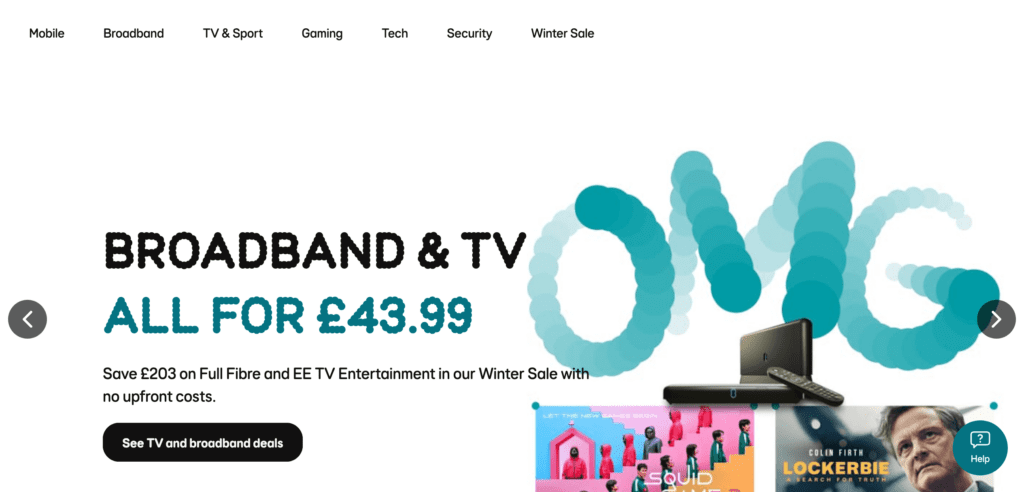
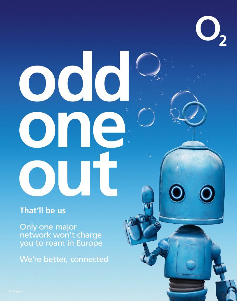
Telefonica UK which is known by its commercial name O2 in the telecom sector has a creative logo. The O2 logo is a simple yet effective design featuring the text “O2”. The “2” in the logo is slightly subscripted, mimicking the chemical symbol for oxygen. This design choice conveys the idea that O2’s services are as essential to life as oxygen.
Telecom logos are merely the starting points. There are many more brand elements that go into shaping a telecom brand and the O2 brand identity reminds this. While the sleek logo is popular, the brand also has a whole design system built on bubble imagery. This appears as subtle bubble details on the website, ads and more.
The first image here is a snapshot from the O2 website and the one after that is an ad from the brand both of which feature bubbles reminding the brand’s unique identity and the O in the O2 logo as well.
7. TPG Telecom
TPG Telecom (previously Vodafone Hutchison Australia) has a corporate logo that accurately captures the scale of the telecom companies.
There are some telecom brands that have grown over the years and branched out into diverse streams in the technology realm. Therefore, a broader representation is essential to carry the identity of the brand. In other words, for such brands, the font, logomark and colors cannot be restricted to tight niches.
In this case, the colors in the TPG Telecom logo give a sneak peak into the brands that belong to the company. You’ll see these colors appearing in the logos of their brands like Vodafone Australia, iiNet and others.
TPG Telecom uses the distinct colored circles across their brand graphics similar to the use of bubbles in the O2 identity. This helps create a cohesive system that builds familiarity and establishes the brand’s identity.
The website snapshot below shows one such instance of the multicolored circles being used in the brand’s designs.

KIMP Tip: Evidently, the use of multiple colors feels relevant in this scenario. But in most other cases, telecom logos or logos of other brands benefit from a simple and limited color palette of two or three colors. Because too many colors can dilute the identity or confuse the audience.
8. Telekom Malaysia
Telekom Malaysia flaunts a modern combination logo with an abstract logomark that grabs attention.
As a unique diversion from the traditional muted blues most technology companies use, Telekom Malaysia uses a vivid blue that gives the brand a bold look.
In addition to the lettermark, there is a unique shape that gives the logo a creative twist. According to TM, this shape is a representation of a “soaring bird”. Therefore, the metaphorical representation here captures the progressive nature of the brand establishing it as a leader in the market, one that is always soaring high and exploring new technologies.
KIMP Tip: Brands that use the same hue can still give off different vibes depending on the shade or tint used. Brighter versions make the brand look young and ready to evolve whereas muted hues often establish a sense of command. Telekom Malaysia’s logo belongs to the former category. Keeping this in mind, choose the right shade or tint to communicate your message in your logo.
Quick Takeaways From These Telecom Logos
- Simplicity reigns supreme. While most logos in the telecom sector differ from each other in the use of colors and fonts to represent what makes their brand unique, they achieve this without complicating the logo. Evidently, simple logos are in trend across diverse industries.
- Design systems add cohesion. Despite the fact that most of these telecom companies do not cater to physical products carrying the brand’s logo, they have built a whole design system to represent the brand. These systems come in handy when creating promotional graphics as well as branding designs to represent the brand at various touchpoints.
- Typography is a deciding factor. The choice of font can significantly impact the logo’s overall look and feel. Consider using fonts that are legible, modern, and convey your brand’s personality.
- Adaptability is a must-have in logo design. Logos need to be adaptable to various applications, from websites and billboards to social media and mobile devices.
- Make the most of shape psychology to add more meaning to your logo, like the use of circular symbols to represent a global scale or a sense of community.

Design Unique Logos With KIMP
Drawing inspiration from these telecom logos are you ready to execute your vision for your brand identity? All you need is a dedicated design team that can bring your ideas to life. To make this decision a more comprehensive one, it helps if the dedicated design team takes care of not just logo design but also other brand graphics like social media, ads, and more. Those are just a few perks that unlimited design services like KIMP bring to the table.
Curious about design subscriptions? Schedule a call with our team. Or register now for a free 7-day trial!