“Do You Sell Cars?” New Jaguar Logo and Rebrand Declared A Disaster
Rebranding can be a double-edged sword. Done right, it can uplift a brand and help it bounce back from the biggest disaster. But a misstep can lead to a huge decline in brand perception. The new Jaguar logo is a prime example of the latter, sparking widespread criticism and raising questions about the future direction of the iconic luxury car brand.
Here’s the rebranding video Jaguar released. What did you think about it?
When you look at it as a generic video it’s not the worst you’ll come across. There’s energy. There are colors. The ad looks vibrant and fresh. But there’s one major flaw – there’s no message clarity in the video. There are no cars!
That’s not all. People have been scrutinizing the video itself and the overall rebranding from diverse perspectives. And there’s one common sentiment that’s observed so far- disappointment.
So, why did the new design meet with such harsh criticism? What is Jaguar’s response for the same? Let’s discuss that in today’s blog.
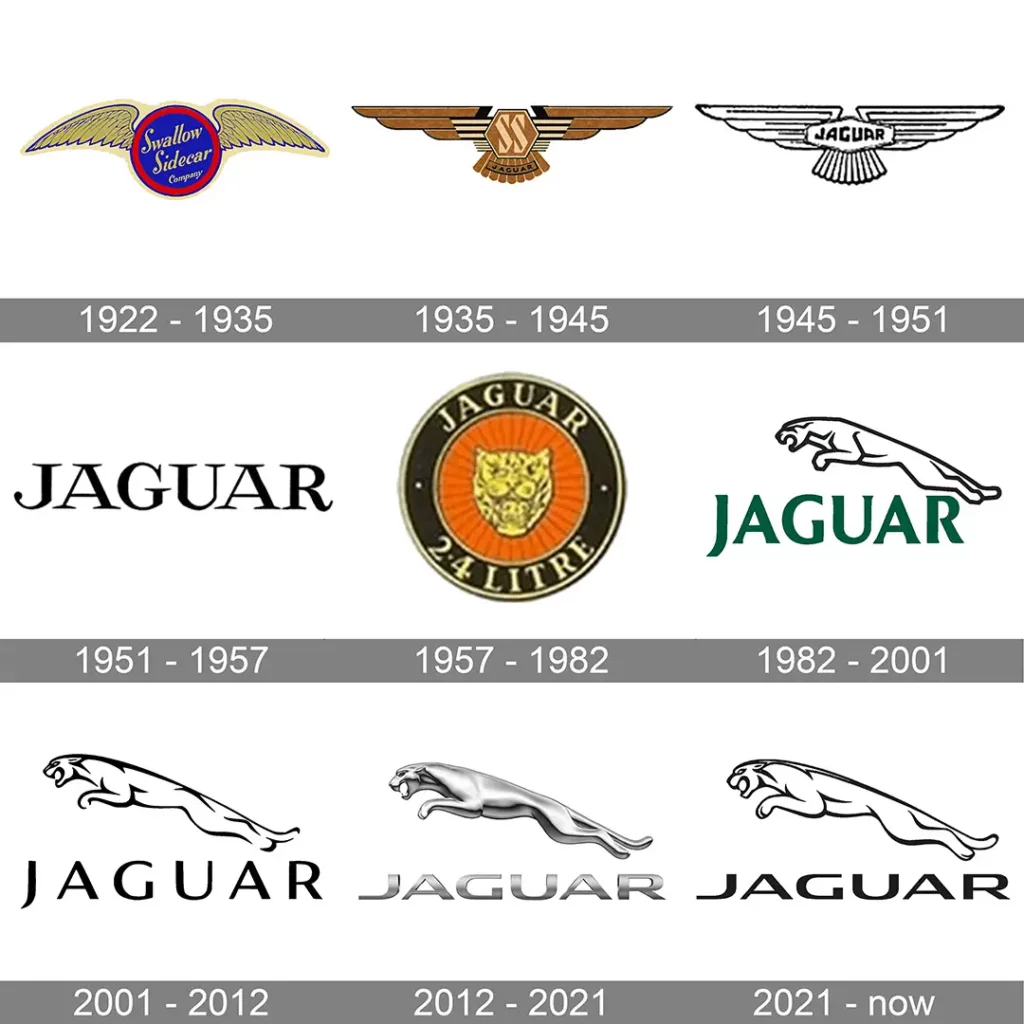
Jaguar Logo: The Evolution of an Icon in the Automotive Industry
From the roaring Jaguar in 1957 to the fierce leaping Jaguar that was in use until a few days ago, every single iteration of the logo has represented great power and authority. From the brand name to logos, car brands look for metaphorical representations that better establish their unique personality in the segment. In the case of Jaguar, the brand has always associated itself with the power, speed, and grandeur of the majestic jaguar.
Naturally, a leaping jaguar turned out to be one of the best ways to represent the brand! The past few iterations of the logo included subtle tweaks to the design but the overall theme and the core identity remained more or less the same.
The New Jaguar Logo: What Went Wrong?
The philosophy behind the new identity – according to Jaguar
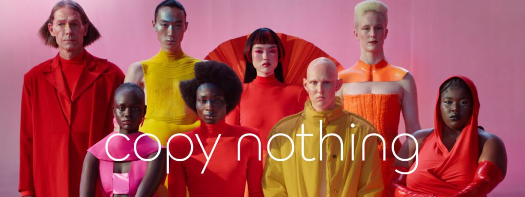
According to Jaguar, the new identity is crafted to align with the core ethos of the brand and the words of its founder, Sir William Lyons. Accordingly, the redesign has been constructed on the concept “Copy Nothing”.
Revealed on November 19, 2024, this fresh new take on the Jaguar identity is supposedly built on the Exuberant Modernism style. The idea here is to capture the fact that the brand is evolving and rapidly progressing toward an all-electric future.
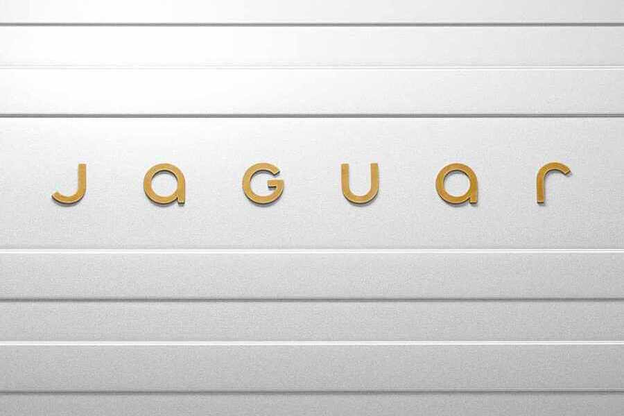
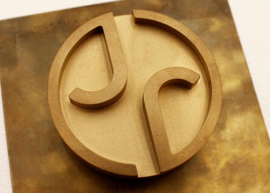
Consequently, here’s the new logo and monogram Jaguar unveiled.
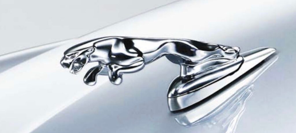
The commanding presence of the old Jaguar logo
The Spirit of Ecstasy hood ornament of Rolls Royce and the leaping Jaguar hood ornament on Jaguar cars have been some of the best things about the luxury car segment. (though the brand did discontinue their hood ornaments a couple of decades ago). So imagine the dismay of the audience when Jaguar announced their rebranding. Revealing an identity that looks like a highly diluted version of the brand that once was!
The new logo and monogram are not bad designs per se. However, it is the strength of the old logo and how “weak” and “banal” the new design looks in comparison that has led to the uproar against it.
Jaguar’s revered brand image
While most brands analyze tangible metrics non-tangible ones like brand image often matter more than you think. It is how customers have learned to perceive your brand over the years. Do they see your brand as a symbol of status? Or perhaps as a friendly face? Knowing this difference can make a huge difference when planning your brand strategies.
In the case of Jaguar, the brand has established itself as a symbol of sophistication. It has a reputation for introducing some of the most elegant and chic cars in the world. Enzo Ferrari called Jaguar E-Type, “the most beautiful car ever made”. That’s the kind of reputation the brand has built for itself over the years.
For a brand of this stature, the new identity truly misses the mark. Nothing in the new identity represents the brand’s elegance except for the choice of the color “gold”.
Moreover, people online have been comparing the most recent rebranding video to some old Jaguar ads to discuss how the recent one does no justice to the brand’s unique and powerful personality.
This was a Jaguar ad 12 years ago. How did they end up taking the bud light route 😭 pic.twitter.com/ISByL3ex7m
— Today 𝕏 🦅 (@Todaymeans_) November 20, 2024
This response is a clear example of what happens to a brand when it fails to gauge customer sentiments and the existing brand image before a big move, like rebranding.
The promotional video that bears zero clarity
To emphasize the brand’s seismic shift, Jaguar has gone wild in its artistic expression and created a video that features androgynous models in bizarre costumes.
If this was an announcement of a new seasonal collection from a fashion brand known for its eclectic styles, then it would have made absolute sense. However, that’s the problem here. This is not an ad for a fashion brand. There are no cars featured in the whole video. Hence several users who are unaware of the brand’s decision to rebrand might end up scratching their heads trying to figure out what the video is all about and what Jaguar actually does.
Here’s a response from Elon Musk that encapsulates the sentiments of the masses.
The so-called “woke” approach
One thing that most people have been highlighting is how the brand has tried to forcefully infuse the concept of “progressiveness” or “inclusivity” or what the social media labels as being “WOKE”. The brand’s decision to feature androgynous models and a rainbow of colors to supposedly capture this idea of inclusivity did not sit well with the audience.
In fact, some people have been recalling a recent video featuring Jaguar’s head of brand strategy discussing the brand’s commitment to fostering diversity. And how the recent video seems to just shove this idea down the audience’s throat.
This is the new head of brand strategy at Jaguar. Not looking good for them at all. https://t.co/eeOXvpxeaJ pic.twitter.com/DbQkwRh8A2
— JIM BURGESS (@HeyJimBurgess) November 19, 2024
Here’s a witty response from a user extrapolating this unwanted “WOKE” representation for an imaginary social network brand. Responses like these exemplify the effect of causewashing in marketing.
I made a commercial for that other social network where everyone goes to cry.
— Ben Nash (@bennash) November 20, 2024
It fits to use the now-infamous woke-brand style & approach of the relaunched @jaguar
Presenting "BlueCry Forever" pic.twitter.com/8hq0FmvnTY
The next “Bud Light Moment”?
Some are calling the new Jaguar logo reveal disaster the next “Bud Light Moment”.
For a quick background, here’s a campaign where Bud Light partnered with transgender influencer Dylan Mulvaney.
This turned out to be one of those ads that damage a brand leaving a scar that hardly fades. From plummeting sales to audience uproar on social media, this turned out to be one of the biggest marketing disasters of 2023.
People are now labeling Jaguar’s rebranding to be the Bud Light moment of 2024.
Jaguar must have hired the Bud Light marketing team. pic.twitter.com/EEj7vVv7mQ
— The Rubin Report (@RubinReportShow) November 20, 2024
Audience Responses to the New Jaguar Logo
Let’s talk about a few responses from users and brands on social media to understand how big a disaster the new Jaguar logo has turned out to be.
Is all publicity good publicity?
To begin with, the promotional video on X amassed over 163.4 million views in just a few days since posting. The Instagram version has over 6.6 million views and on YouTube, it currently stands at 1.9 million views.
Undoubtedly, this is the most that people have discussed Jaguar in recent times, as popular YouTuber Marques Brownlee pointed out in his Tweet.
This is horrible
— Marques Brownlee (@MKBHD) November 20, 2024
It's also the most anybody has talked about Jaguar in 50 years https://t.co/Pmk3IOKlbv
Fake commercials
One of the most interesting takes has been a slew of fake commercials spreading online. Like the one here:
These fake Jaguar commercials are better than the real thing pic.twitter.com/B3G6xEeu0L
— SlightlyOffensive (@SlightlyOffens) November 23, 2024
Some have also shared what looks like an AI-generated version of the second part of the promotional video released by Jaguar.
It all makes sense now @Jaguar!
— @jason (@Jason) November 23, 2024
You make a woke ad to troll us, and now you’re having actual 🐆 jaguars eat the actors! pic.twitter.com/qO7jEoJUPG
These are clear indicators that people are rooting for the brand to rethink their move and consider switching back to their old elegant design.
Did the new design really stand by the idea “Copy Nothing”?
A few users on social media have compared how there’s nothing “original” or “unique” about the new Jaguar ad itself or the logo. And how this ironically contradicts the rebranding theme “Copy Nothing”.
For instance, here’s a still from the recent Jaguar ad.
Is it just us or does this remind you of the iconic 1984 Apple ad promoting Macintosh? The concept of being a rebel, breaking moulds isn’t exactly new after all!
Well, it’s not just about the ad. Take a look at the logo of a popular stationery brand called Pentonic. Now go back to the new Jaguar logo and see if you can tell the difference.
KIMP Tips:
- When redesigning a logo, preserve the iconic elements of your old design, ones that are irreplaceable and instantly recognizable by your customers.
- In wordmark logos, typography does the heavy lifting. Therefore, choose fonts that are unique to your brand. Stay away from lackluster typefaces that do not accurately summarize your brand’s personality.
Nothing’s witty response
The popular phone brand Nothing has made the best use of the opportunity and piggybacked on the controversy surrounding Jaguar’s rebranding. And this has got to do with the new tagline for the rebranding.
Here’s a witty response they posted soon after the discussions about the new Jaguar logo started breaking the internet. That’s a brilliant example of trendjacking!
im just a chill admin pic.twitter.com/c9MqF3RlkD
— Nothing (@nothing) November 21, 2024
Will Jaguar go bust?
Nigel Paul Farage, a renowned British politician and broadcaster shared a video expressing his concern about the future of advertising. He pointed out how some brands like Jaguar seem to be missing the mark in efforts to embrace modern advertising.
Mark my words, Jaguar will go bust. pic.twitter.com/DP5zUL0Y7B
— Nigel Farage MP (@Nigel_Farage) November 20, 2024
The pitfalls of oversimplification
Simple logos work exceptionally well, in most cases. However, oversimplification can backfire and the new Jaguar logo is the perfect example of that.
Popular optical retail chain Specsavers shared the below Tweet reimagining an oversimplified and crude version of their logo taking a jab at the recent Jaguar logo.
New logo just dropped https://t.co/hKLXzcbFcc pic.twitter.com/0AsjsnhagR
— Specsavers (@Specsavers) November 20, 2024
And here’s another similar version shared by the popular tech company Razer where they leave out their iconic logomark and use an oversimplified logotype.
Following recent industry trends, we have also decided to rebrand. https://t.co/1yEf3Gadzk pic.twitter.com/IG4t9sNkdV
— R Λ Z Ξ R (@Razer) November 21, 2024
A few more responses
The one-line response from Aldi is gold!
You sound like our legal team pic.twitter.com/NYu2HCZrmn
— Aldi Stores UK (@AldiUK) November 21, 2024
We also came across a few funny memes roasting Jaguar’s rebranding strategy like this one:
A car ad without cars. Hmm. https://t.co/W4Ymeqp1xO pic.twitter.com/lrVDwnk8Jd
— Jeff Barrett (@BarrettAll) November 19, 2024
And some parodies like the one from the popular media company Morning Brew.
Jaguar speaks out on their rebrand
— Morning Brew ☕️ (@MorningBrew) November 22, 2024
ft. @macyagilliam pic.twitter.com/hhksFOr4tw
The harsh comments were not just on X but also on Instagram and YouTube.
Jaguar’s Response to the Backlash
With all the negative responses piling up for the new Jaguar logo, how has the brand responded? If there’s one thing we’ve seen in this rebranding debacle, it’s the fact that Jaguar has been quick to respond to comments. Let’s now talk about their responses and what these say about what more to expect from this rebranding.
Jaguar’s response to Elon Musk’s comment is a reminder that the brand’s whole design vision concept is to be unveiled at the Miami Art Week on December 2.
Yes.
— Jaguar (@Jaguar) November 19, 2024
We'd love to show you. Join us for a cuppa in Miami on 2nd December?
Warmest regards,
Jaguar
And when users asked about the plight of the legendary Jaguar logomark, the brand responded that it would continue to be part of their identity.

Here’s a glimpse of the leaping Jaguar they introduced in the new identity.
When people called this rebranding a downfall of the brand, Jaguar called it a “renaissance”. From this, it appears like the brand has big plans for transformation with respect to their new identity and their branding on the whole.
The New Jaguar Logo Disaster: Lessons to Take Away
Every rebranding project brings valuable lessons with it. Some about what to do when rebranding or branding a new business. And some about what not to do. Clearly, in Jaguar’s case, it’s the latter. So, here are some lessons to take away from what appears to be one of the biggest branding disasters of this year.
- Honor your brand legacy when evolving. While continuous innovation and progress are important, preserving your brand’s heritage is not something you can ignore. In this case, the finesse of the old Jaguar logo and identity was not exactly carried forward into the new design. And this left fans disappointed.
- Focus on clarity in messaging. One of the biggest turn-offs for people who encountered the Jaguar rebranding video has been the lack of clear messaging in the video. From not featuring cars to not establishing the reason for this transformation, the promotional video failed in many ways.
- Stay authentic. Just because every brand is talking about sustainability or a major cause, your brand cannot unless that cause aligns with your ethos and your processes. Jaguar’s promotional video appearing blatantly Woke is one of the biggest issues highlighted by the audience.
Want to Give Your Logo & Brand Identity a Makeover? Get KIMP!
Once you have completed the groundwork, analyzed your audience sentiments, and clearly laid down the goals of your rebranding, a professional design team can help take your vision forward. With unlimited design services like KIMP, you get a professional design team and the option to get all your branding designs and marketing designs crafted by the same team. This helps ensure consistency. And it also makes it easier to market test before a big launch. It gives you the option to create designs and tweak them any number of times based on audience feedback.
So, what are you waiting for? Register now for KIMP’s 7-day free trial!

