
Top Logo Fonts: Ideas From Iconic Brands & Logos
When you see a logo, what’s the first thing that happens? Without even realizing it, you start forming opinions about the brand. Even if it’s a name you’ve never heard before, the logo design communicates key details about the brand and its identity. Hints about the brand’s personality and values. That’s the magic of a brand logo. And at the core of this? Logo fonts.
As you know, fonts play a pivotal role in logo design. For example, in a wordmark logo, the font is the design, carrying the brand’s essence entirely. In combination logos, the font sets the mood, acting as the cornerstone tying everything together for a harmonious design. In short, no matter the type of logo, choosing the right logo fonts is non-negotiable.
With so much riding on this one design element, it’s no wonder choosing the right logo font feels daunting. After all, it isn’t just about aesthetics – it’s about selecting something that encapsulates what your brand is all about. But don’t worry, we’re here to help. This blog will take some of the pressure off by exploring how iconic brands have used logo fonts effectively.
Now, a quick heads-up: most of these brands rely on custom-designed fonts that aren’t directly accessible. However, we cannot deny that their choices are packed with logo design lessons. The psychology behind their font decisions, and the way they use typography to connect with their audience – these are insights you can apply to your own logo.
So, let’s dive in and decode the fascinating world of logo fonts.
7 Popular Logos + Lessons in Choosing Logo Fonts
Before we dive deeper check out our blog on typography terms for a crash course on the jargon. This way, when we say serifs, scripts, kerning, and strokes, you’ll know exactly what they mean.
Now, logo fonts. So, what are the fonts used in popular logos, and what typography tips can we take away from them? Let’s go:
1. Coca-Cola
In terms of brand awareness in the soft drinks brand segment, Coca-Cola tops the chart with about 95% of consumers in the U.S. recognizing the brand and its logo. This recognition has been possible due to the timeless design of the Coca-Cola logo and the iconic font it uses.
Frank Mason Robinson designed the Coca-Cola logo with a font based on the Spencerian Script in 1886 and the swirls and final shape of the logo were added a few years later.
On the whole, the choice of a script font here was owing to the popularity of this style back when the logo was designed. And the idea was to make Coca-Cola a friendly name and position the brand in a wide market of diverse audience demographics. Therefore, going with a well-known typography trend made perfect sense.
However, the real impact of the brand’s logo comes from their consistent use of the logo and their signature red brand color. Therefore, to date this font stands as a testament to the brand’s heritage with its nostalgic aesthetic.
So, what tips can you take away from the Coca-Cola logo with respect to choosing logo fonts?
- Script fonts add a touch of personalization. Therefore, they work well for consumer brands looking to maintain a human touch.
- The fluid nature of the font here also aligns with the feelings of joy and celebration that the brand associates with.
- Even with the swirls, the text in the Coca-Cola logo is easy to read. This emphasizes the need to choose legible fonts.
What other script fonts capture the same joyful vibe as the Spencerian Script version in the Coca-Cola logo? Pacifico, Sacramento, Great Vibes, Edwardian Scrip and Allura to name a few!
2. Mercedes-Benz
The next example we have exemplifies the use of logo fonts in the serif category. The sense of sophistication conveyed by the Mercedes-Benz logo needs no introduction. And this elegance comes mainly from the sleek serif font used.
The design uses a custom typeface similar to the Corporate A Light font. The font here makes the logo and the brand look authoritative and modern as well. In fact, this design is proof that not all serif logo fonts give the design a traditional or vintage look.
The brand consistently uses the primary serif brand font combined with a complementary sans-serif one in their ads and social media designs alike. Here’s an ad that demonstrates the use of the classic combination of serif + sans-serif font in design. With the former used to draw attention and the latter to enhance readability.

The regular or light versions in the font families like Garamond, Playfair Display, Noto Serif, Avril Serif are a few options that work similar to the Mercedes-Benz logo font. These are both modern and elegant along with the added benefit of easy readability.
KIMP Tip: The Mercedes-Benz logo is a combination logo which uses both a logomark and logotype. In this case, the elegance of the serif font resonates well with the simplicity of the 3-pointed star logomark. Similarly, the logo fonts you choose should not just look aesthetically appealing but also complement the overall design.
3. ESPN
The ESPN logo uses a distinct sans-serif font. The brand name’s initials were abbreviated as ESPN (Entertainment and Sports Programming Network) to make the brand name more memorable and easier to use. Therefore a lettermark logo makes perfect sense.
Considering the sports segment that the brand belongs to, the dynamic font and the vibrant red color go perfectly well.
Hence the ESPN logo exemplifies the option of choosing logo fonts that align with your brand’s unique personality.
If you are looking for fonts similar to the bold and energetic custom font of the ESPN logo, then SF Sports Night, ESP, Eurostile Bold and Scottsdale Italic are a few options.
KIMP Tip: Fonts with additional details like the in-line negative space line or the split effect used in the ESPN logo are attention-grabbers. No doubt! However, they are not the best options in terms of legibility. Moreover they can be overwhelming when used a lot. Therefore, when you choose such heavy logo fonts, pair them with a simple and easy font to use in the rest of your marketing designs.
4. Vogue
Serif fonts are some of the most popular choices of logo fonts for brands looking to convey a sense of luxury and class. The Didone style in particular is one of the most effective especially for brands that need to communicate a sense of modernity as well. The Vogue logo is one of the classic examples of the use of Didone serif fonts in logo design.
The Vogue brand has been associated with luxury and boldness. Accordingly, the serif font used in their logo looks powerful and chic. Moreover, for a magazine legibility is a must-have and the logo font in the Vogue logo fulfills that requirement as well. It looks stunning and is easy to read on their magazine covers and digital ads alike.
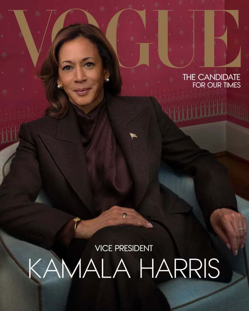
To conclude from this example – choose logo fonts that make sense for your brand. Because not all fonts are built the same and hence something that works for one brand does not always work for another. For instance, Didone fonts like the one used here work well for brands that wish to carry a high-end vibe. Identify something similar that looks and feels like your brand.
Now, coming to fonts similar to the one used by Vogue and those that carry a similar elegance, try Didot, MADE Canvas, Domani, Goldoni or Troye.
5. The New York Times
Designed by Ed Benguiat, The New York Times logo features a vintage font that feels irreplaceable. Traditional fonts like this one have a special place for themselves in the world of graphic design and not all brands can pull off something like this. The font captures the unwavering authority the brand has established in more than 173 years since inception.
But, yes, keeping up with the digital side of the magazine and newspaper segment, the brand also adopts minimalistic sans-serif fonts and easy-to-read serif fonts on their social media posts and ads.
Now, let’s talk about fonts that look exactly similar to The New York Times logo font and those with a similar vintage charm. Engravers’ Old English BT, Ye Old Shire, Vorname, Holy Union and Beckett are a few options.
6. Disney
Another example of bespoke script font for the logo will be the Disney logo font. The Walt Disney logo uses a font that’s full of life. Did you know that the logo’s font was inspired by Walt Disney’s signature?

The Disney logo also demonstrates how script fonts can infuse a unique personality into your logo design. Hence, if you want your logo to stand out, if you wish to create something truly spectacular then a script font works. Moreover, script fonts add a personal touch which can help capture the essence of your brand.
Again, like the Coca-Cola logo and the ESPN logo, the Disney logo font can also weigh down the readability especially when scaled down. And can appear too heavy or clutter the design when used in excess. Therefore, you need a serif or sans-serif font high on the legibility aspect to communicate your message through your branding and marketing designs.
Waltograph is one font that looks very close to the bespoke Disney font. Other than this, Walt Melody, Madrigal, Crows Ink and Walter are a few more options.
KIMP Tip: Since the font itself has a strong whimsical trait, the logo does not adopt any strong colors. Instead, it goes with a monochromatic design. This makes the Disney logo versatile and easily adaptable. Take cues from this and choose logo colors such that they do not distract customers away from the core message and those that do not clash with your logo fonts.
7. Casio
Casio – a name that makes you think of wristwatches and calculators. A brand that’s all about precision and the charm of analog and core electronics. Accordingly, their logo uses a geometric typeface which is easy on the eyes and has a professional tone as well.
In addition to all this, durability and reliability have been the most important traits associated with the brand. The structured letterforms of geometric forms and the order they infuse into the design accurately represent these traits.
There’s one big hint to take away from the Casio logo – when choosing logo fonts, think of all the descriptors that you think will summarize what your brand is about. What are those words you want your customers to associate with your brand? What are the emotions you wish to evoke? These cues come in handy when choosing the right fonts to use in your logo and as your brand fonts.
Font libraries like Google Fonts allow you to compare and shortlist fonts based on the emotions they evoke.
We all know fonts can be serif or sans-serif… but did you know fonts can also be Happy, Wacky, or Awkward too?
— Google Fonts (@googlefonts) October 16, 2024
Today we're launching a new tag and category filter UI on https://t.co/afFMTLBZSL
Every font family has been evaluated for every tag and given a score from 0 to 100 pic.twitter.com/GtGr2aRtZn
Now, if you are looking for a few geometric fonts that stand for precision and order like the Casio logo font, then consider Eurostile, Orbitron, Jura, or Microgramma.
Design the Perfect Logos With the Right Logo Fonts
To conclude, choosing the right logo fonts is more than just a design decision – it is a powerful move that decides how your brand is perceived by your audience. In short, the logo font you choose is the backbone of your brand identity. Think you could use some design expertise in that area? Work with a dedicated team of designers by choosing an unlimited design service like KIMP.
Register now for a free 7-day trial!