
10 Creative Ads That Captivated the World (And What You Can Learn From Them)
Advertising is a tough nut to crack with countless brands fighting for attention. Amidst this, there are ads that people scroll by or walk past. And then there are ads that make people stop the scroll. Ads that break the norms and set new trends. Welcome to the world of creative advertising. Today we’re exploring creative ads that made history. Ads that made customers fall in love with the brand.
Why focus on creative ads now? Because understanding the genius behind these campaigns isn’t just about admiration; it’s about inspiration. We’re here to dissect the thought processes behind these ads, analyze the reception, and learn from the creative visuals that brought these ideas to life. With that you’ll be left with creative ideas of your own – to create ads that capture attention – and maybe even go viral (here’s hoping!)
So, without further ado, let’s dive in.
- Creative Ads That Set New Standards in Advertising
- 1. IKEA’s campaign promoting Frakta
- 2. De Beers “A diamond is forever”
- 3. Volkswagen’s “Think Small”
- 4. Coca-Cola’s “Share a Coke”
- 5. Apple’s “1984”
- 6. Absolut Vodka’s print ad brilliance
- 7. Dove’s “Real Beauty”
- 8. Faber Castell’s “True Colors”
- 9. Sony Bravia’s “Colour like no other”
- 10. Metro Trains, Melbourne – “Dumb Ways to Die”
- Design Creative Ads for Your Brand With KIMP
Creative Ads That Set New Standards in Advertising
1. IKEA’s campaign promoting Frakta
Frakta (aka IKEA’s blue bag) is perhaps the most popular grocery tote in the world. One of the main reasons behind this is IKEA’s timely and witty response to a social media buzz about a new Balenciaga bag. For context, the below image from the Elle magazine compares the bags in the conversation.
The one on the right is from Balenciaga, a designer bag retailing for $2,145 whereas its doppleganger from IKEA costs a mere 99 cents.

Soon after Balenciaga announced their blue shopper tote, people started pointing out how it looks so much like the 99-cent Frakta bag from IKEA. Like this hearty discussion on Today.
IKEA was quick to respond to the trend with a print ad highlighting the difference between both bags.

This campaign was a big hit and the Frakta bag soon became an internet sensation. IKEA even backed up this response with a dedicated film celebrating Frakta which again created a lot of buzz.
IKEA utilized multiple channels, from print to video, to ensure the message resonated across different audience touchpoints. Their ability to amplify the buzz through strategic media placements was key to the campaign’s success.
From the product placement to the clever use of copy, the IKEA print ad exemplifies simplicity in advertising. Moreover, this ad aligns with IKEA’s signature print ad format making the design not just attention-grabbing but also unmistakably theirs. This highlights the need for creating visuals that consistently resonate with your brand.
So what was the secret formula that made this campaign click? Timely response to trends + creative use of multi-channel marketing + witty tone.
2. De Beers “A diamond is forever”
If there is one brand that demonstrated the influence of advertising on culture, it’s De Beers. Their “A Dimond is Forever” campaign, first launched in 1948 can be credited for initiating the trend of proposing with a diamond ring.

While the tagline did not make the brand an overnight sensation, the consistent use of this tagline and the unique messaging has helped De Beers stand out in a competitive market.
Over the years, the brand has continued to find creative ways to build on this tagline and preserve the magic their 1948 ad sparked. Here’s an example of a recent campaign that combines the holiday theme with the signature tagline to creat something on-brand and memorable.
So what was the secret formula that made this campaign click? Unique messaging + consistent use of brand elements (tagline).
3. Volkswagen’s “Think Small”
What if we told you that a well-crafted print ad can drastically change a brand’s image and allow the brand to cut through the competition and win hearts? That’s exactly what the “Think Small” campaign did to Volkswagen.
Known to be one of the most creative ads in history, Volkswagen’s “Think Small” campaign was also one of the strong reasons behind the popularity of the Volkswagen Beetle.

The ad was a hit due to two main reasons. Firstly, there was the unique messaging that grabbed attention. Since brands often talk about thinking big, the tagline “Think Small” stood out.
Secondly, the design. This was the time when most brands made the most of color printing to create vibrant ads but Volkswagen chose a retro grayscale design.
But that’s not all – notice the product placement. In contrast to ads where brands blow up their product images to fill the space, the Volkswagen Beetle was scaled down and placed in one corner to indicate one of the biggest strengths of the car – it’s small size and how it was the right fit for crowded urban settings.
The use of ample white space draws attention to the car and makes it hard to miss. Moreover, the design also uses the concept of leading lines by alining the car so that the viewer’s gaze is naturally drawn toward the text in the ad. Together this brilliant design captivated viewers and to date, it remains one of the exemplary executions in print advertising.
So what was the secret formula that made this campaign click? Clarity in messaging + unique design + decision to go against the norms.
4. Coca-Cola’s “Share a Coke”
The Coca-Cola brand, had a unique challenge in hand: how to reignite consumer excitement for a product as ubiquitous as soda? One that has been selling for decades? Their answer? A revolutionary shift in focus, moving away from the product itself and towards the human connections it fostered.
Enter: Share a Coke campaign! This is definitely one of the most creative ads about fostering customer engagement. In fact, it is one of those campaigns that ended up converting casual consumers into fans.
For a little background, according to Oglivy, the creative genius behind the Share a Coke campaign, the brand observed that about 50% of teens hadn’t tasted a Coke the previous month. The brand wanted to do something out of the box to grab attention and engage with the young audience. Hence they came up with this creative campaign.
The campaign did not change the product. It merely changed the packaging, or rather personalized it to connect better with the audience. And the brand did this without drastically altering the signature packaging.
In addition to this, the brand also invested in extensive outdoor advertising and the campaign ended up creating a lot of buzz. People were happy to see their names on a Coca-Cola bottle and therefore readily shared their experience on social media and this in turn increased the brand’s reach and mentions.
So what was the secret formula that made this campaign click? Personalization + decision to move away from traditional marketing ideas.
5. Apple’s “1984”
Apple’s first commercial to introduce the Macintosh computers to the world became as iconic as the product itself. In fact, this one challenged the status quo of the entire industry.
Back then, advertisements had a set pattern. Particularly in the tech sector, most brands chose to stick to traditional formats and professional messaging. Then came the 1984 commercial with its dystopian style visuals and a hard-to-ignore theme.
The ad was about breaking conventions and the visuals communicated this accurately and effectively.
Moreover, the execution was both cinematic and sensational. Unlike the typical tech ads of the era, which were often dry and product-focused, this commercial was a short film with a message. It aired once during the Super Bowl, yet its impact was monumental due to the buzz it created, leading to widespread media coverage and public discussion.
So what was the secret formula that made this campaign click? A compelling story + bold statement.
6. Absolut Vodka’s print ad brilliance
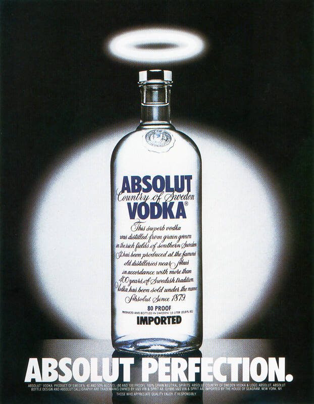
This seemingly simple ad kickstarted a movement that created some of the most creative ads in print advertising. One that eventually led to a dedicated book analyzing the advertising expertise of Absolut.
For this ad, the brand chose a central idea, the Absolut Vodka bottle which has carved a special place for itself and become one of the strongest brand identifiers over the years.
Taking cues from the popularity of the bottle, the brand created a campaign where over the years, they juxtaposed the iconic bottle shape into various settings for creative storytelling.
From ads celebrating different cities to cultural moments, the campaign evolved into a cultural phenomenon. Reportedly, there are over 1500 ads in this campaign making it one of the most influential and creative ads in the print category.

So what was the secret formula that made this campaign click? Consistent visual anchor (the Absolut Vodka bottle) + adaptable and timeless theme.
7. Dove’s “Real Beauty”
The power of creative ads is that they don’t just shape a brand’s image but can initiate cultural movements. The Real Beauty campaign by Dove is the perfect example. The campaign transformed the way people perceive the brand itself and also initiated conversations about unrealistic beauty standards.
The campaign also led to a global conversation about body positivity, and self-esteem.
Dove came up with a variety of promotional content like the Dove Evolution film, featured below. This was a bold departure from the industry norm of using retouched images and idealized models.
In addition to commercials and outdoor campaigns, the brand also launched school workshops to empower little girls with realistic views about beauty and to boost their confidence.
Their multichannel approach and initiatives proved that this was not yet another causewashing campaign. Over the years the campaign created a lot of buzz and elevated the brand’s image.
So what was the secret formula that made this campaign click? Authentic representation + emotional storytelling + use of relevant visuals.
8. Faber Castell’s “True Colors”
The True Colors campaign is proof that creative ads do not always have to be elaborate or complicated. The designs created for the campaign were catchy and made the idea easy to grasp.
First, there is the ingenious concept. Faber-Castell’s creative ads for this campaign featured their colored pencils seamlessly blending into real objects of matching color, a dachshund, a fire truck, an eggplant, and a shark. The visual play in these ads was to demonstrate how their colors are accurately close to nature.
Moreover, the ads were clutter-free and minimalistic. Plenty of negative space and minimal text in the design all ensure that the viewer’s attention is wholly directed toward the main message.
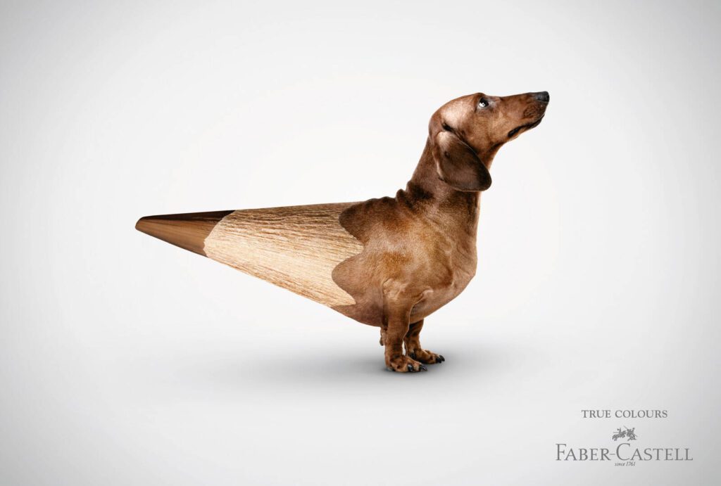
Evidently, the designs in these ads are their strongest trait. Given that the brand is associated with creativity, a visually creative concept like this one feels relevant.
So what was the secret formula that made this campaign click? Simplicity + relevance to the brand + creative design.
9. Sony Bravia’s “Colour like no other”
To promote their Bravia TVs, Sony chose to focus on one area where these televisions excel – color reproduction. For this, they created a set of commercials for the campaign “Colour like no other” to make customers fall in love with color in such a way that it becomes synonymous with the brand itself.
To complement the lively commercial featuring thousands of bouncing balls painting the town in vibrant colors, the brand also executed a host of outdoor ads. From ad placement to the choice of channels and memorable visuals, the brand created the perfect mix for an impactful introduction to their new range of televisions.
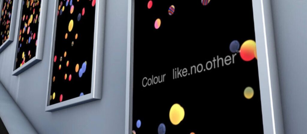
So what was the secret formula that made this campaign click? Highlighting a single standout trait (color reproduction) + clarity of messaging + vibrant cohesive designs for diverse channels.
10. Metro Trains, Melbourne – “Dumb Ways to Die”
The below video proved that even public awareness campaigns can be made engaging and memorable with the right idea and creative execution. This campaign was released by Metro Trains, Melbourne to raise awareness but it was so engaging, humorous, and memorable that it also became a global meme.
In this case, instead of the traditional, often grim, safety messages, this campaign used dark humor to illustrate various absurd ways one could die, with the punchline being that dying on a train platform is among the silliest. Evidently, the catchy tune and lovable bean-shaped characters dying in comical scenarios made the message both digestible and shareable.
The virality of the campaign released on social media eventually led to the development of an app and the team also tapped into print and outdoor channels to expand the reach of the campaign and raise awareness on a larger scale.
On the whole, the ingenious idea became a big hit and ensured the effective delivery of the intended message.
So what was the secret formula that made this campaign click? Use of adorable characters for effective storytelling + use of humor to make the message more memorable.
Design Creative Ads for Your Brand With KIMP
In conclusion, creative ads are composed of creative ideas, clear messaging, and intriguing visuals. Once you take care of the idea and message, the KIMP team is here to bring them to life. Whether it is a simple static ad or an immersive and engaging carousel or a short video ad, there is a KIMP subscription for all of your design needs.
Why wait? Sign up now and start your free 7-day trial!