The Power of Branded Icons: Why They Matter in Modern Marketing
Humans have been communicating through symbols for thousands of years. From ancient hieroglyphics to modern-day emojis. This innate human tendency to understand and interpret visual cues has made icons indispensable in today’s digital age. And today we’re discussing branded icons in particular.
Consider this: when you see the below symbol on any gadget, what do you make of it? You immediately recognize it as a USB port. That’s the power of icons—they convey meaning quickly and universally, making them indispensable in effective communication.
Thus, icons play a crucial role in communication, and brand messaging is no exception. But what if you could add a unique twist to make these icons unmistakably yours? By incorporating your brand’s colors, visual style, or a combination of both, you can create icons that are not just functional but also aligned with your brand identity. Imagine a call icon, but in your brand’s signature colors and style! The impact it can create in your brand messaging is huge indeed.
In this blog, we’ll explore the significance of branded icons, along with some quick tips on how to design a set that represents your brand accurately.
The Power of Branded Icons: 7 Reasons to Invest in Them
Sure, branded icons include your app icon and favicon, but they’re just the tip of the iceberg! We’re talking about a complete icon system.
Branded icons are the visual cues that appear on your website, within your apps, and throughout your user interface. They make navigation intuitive while maintaining a consistent brand presence, ensuring that every interaction feels on-brand.
Let’s illustrate this with a few examples:
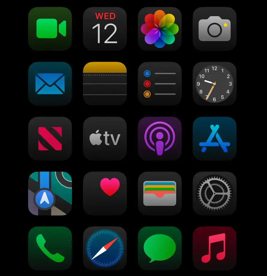
Do these icons look familiar? They have become synonymous with iOS, instantly reminding users of Apple’s design language.
Now take a look at these:
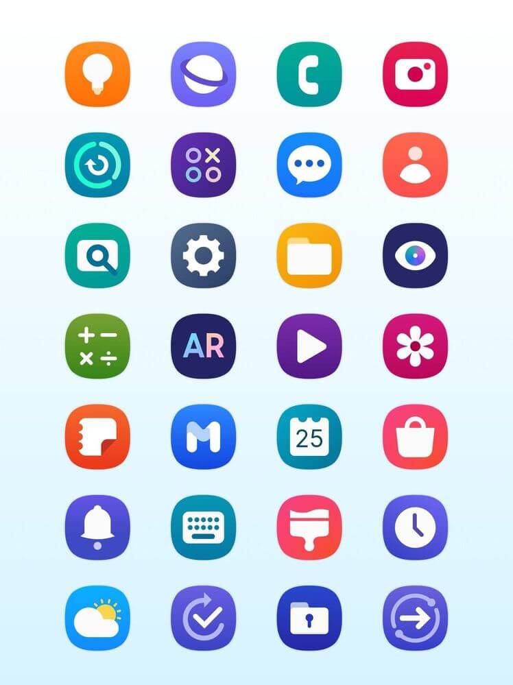
That’s right—they’re from Samsung’s One UI.
These examples show how effectively icons can establish brand identity. The distinct visual style of each set makes them instantly recognizable, showcasing the power of branded icons to communicate and reinforce brand identity.
Other than these, what are the biggest benefits of investing in branded icons? Let’s find out:
1. Clear communication
Icons are essential on various channels. Because they help deliver the message easily and instantly. Unlike text, which requires reading and comprehension, icons can instantly communicate a concept, and drive action.
For instance, a simple call icon displayed at the bottom of the screen can indicate that it’s where the user can click to get in touch with the team, regardless of language.
Hence, by investing in branded icons, you can ensure that your visual cues are clear making it easier for users to understand and interact with your products or services across channels.
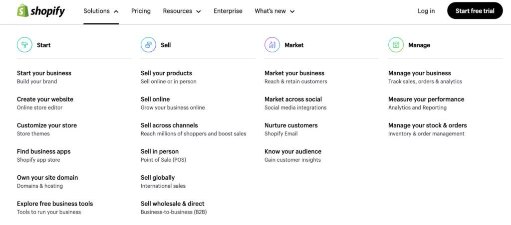
Here’s a snapshot of how Shopify uses icons to simplify the menu on their website.
2. Boosted brand identity
One of the biggest perks of getting a custom icon pack designed for your brand is that these icons help reinforce your brand identity. They act as visual signatures that your users recognize across various platforms, from websites to mobile apps and printed materials.
And this happens particularly when you create branded icons that resonate with your brand’s unique style and consistently use them in diverse kinds of designs representing your brand.
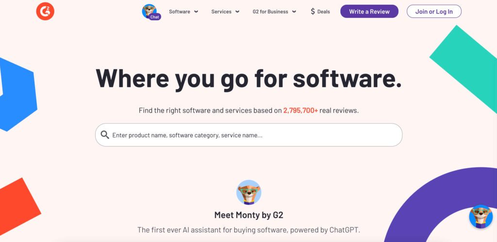
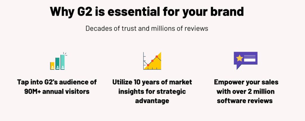
For instance, the popular software marketplace, G2 has a distinct vibrant identity and includes a bunch of brand colors that appear consistently on their website and social media designs. Therefore, the icons used on their website also follow a similar vibrant theme.
3. Improved user experience
With well-designed branded icons, you enhance user experience by making navigation simpler. They can help enhance the content on your website and simplify the message.
Moreover, they also help break down the monotony and organize text and other elements in a visually harmonious layout. Like the example here where the icons enhance the visual appeal and instantly communicate what the text is about. This makes it easier for users to consume the information presented.

4. Enhances the brand’s credibility
Having a set of custom branded icons can help boost your brand’s image. These icons used consistently in your designs make your brand look more professional and well-put-together.
On the other hand, generic icons or inconsistent ones make your brand look less authentic. When you have a branded icon library, you are showing your customers that you pay attention to the details and this helps build your brand’s credibility.
5. Comes in handy when creating content
Branded icons are versatile assets that can be used across various forms of content. They can simplify the message on your infographics or create a cohesive look for your social media posts. They can even make navigation through your marketing emails simpler.
Here’s an example of branded icons used as cover images in the Instagram Story Highlights section.
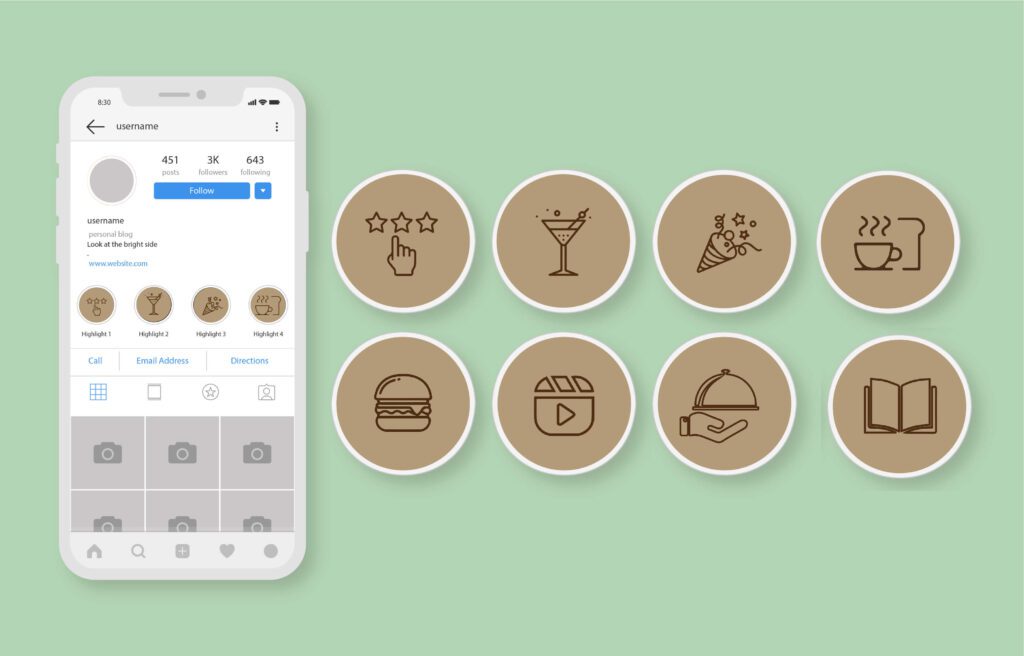
Thus there are diverse applications for branded icons and they add value to your content.
6. They give your brand a competitive advantage
Branded icons can seamlessly fit into your brand design and help communicate to your audience what makes your brand unique. This can give your brand a competitive edge.
They give your customers one extra reason to take your brand more seriously. Moreover, well-crafted icons establish strong brand association and help your customers recall your brand more easily in the future. This familiarity can be a powerful motivator when they are faced with choices in a crowded marketplace.
7. Branded icons cater to your brand’s unique requirements
With most standard icon packs you get the basic representations like icons for home, settings, search, etc. But what if you would like to visually represent specific functions within your app or website?
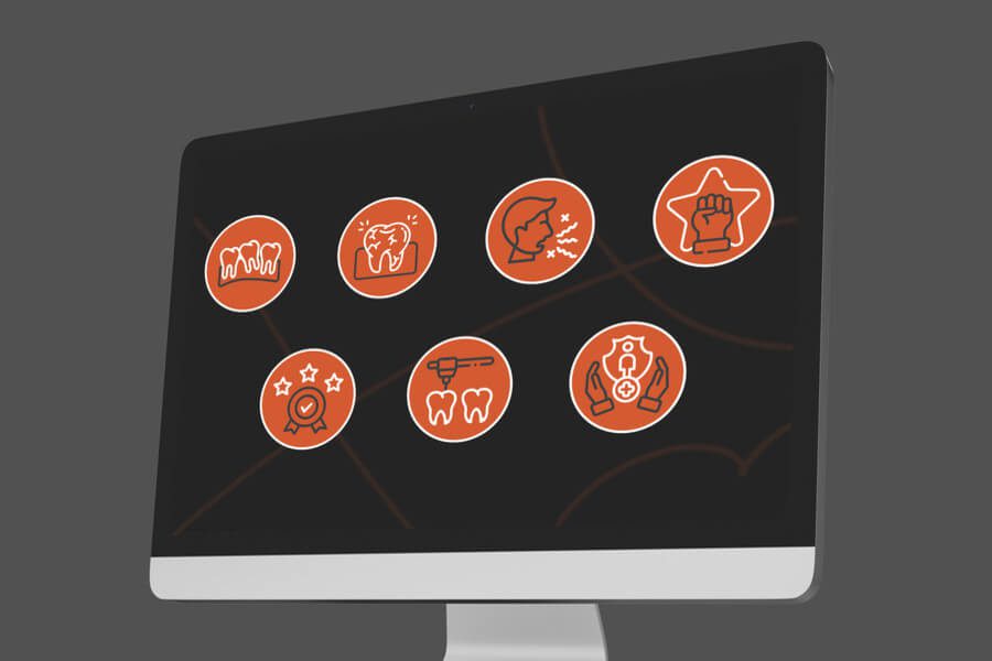
For instance, a fitness brand’s app might require simple yet relatable icons to represent specific workout categories like cardio, HIIT, weightlifting, etc. Or an ecommerce retailer with an extensive catalog might require icons to represent and segregate categories like jewelry, clothing, and footwear.
On all such instances, it is a good idea to work with a design team to get custom branded icons created for your brand. For example, can you tell that the below icons are for a sports & fitness brand?
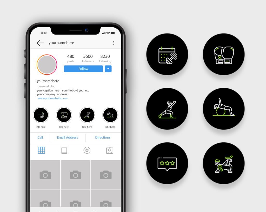
Need help designing such custom branded icons for your unique requirements? Get a KIMP Graphics subscription.
Now let’s move on to the question of how to create branded icons that help you reap these benefits.
5 Ideas & Strategies to Design Memorable Branded Icons
Outlined icons when you want to keep them simple & scalable
The easiest way to keep your icons simple and scalable is to choose a sleek outlined style. Like the ones you’ll see on our website.
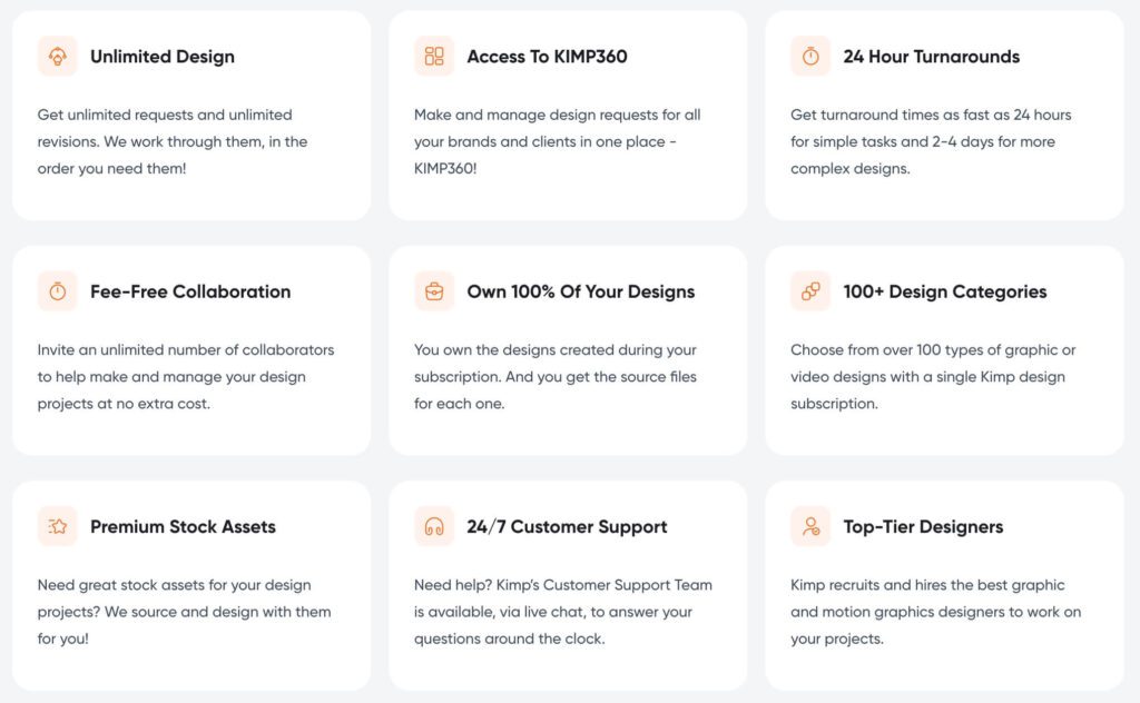
This style is modern, and versatile and can easily be scaled up or down to suit various platforms. As an added benefit, this simple outlined style is also easy to view and comprehend on smaller screens like in the mobile-optimized view.
Moreover, outlined icons are minimalistic and therefore do not interfere with the aesthetics of the UI or design where you place them. This makes them suitable for diverse applications.
Finally, one of the biggest benefits of choosing simple outlined icons is that they are equally impactful in different colors and on different backgrounds. For instance, the icons on our website align with our brand colors.
Filled icons add to the character of the UI
If outlined icons seem too simple for your applications, then explore filled icons. These are solid-filled shapes that appear more dominant.
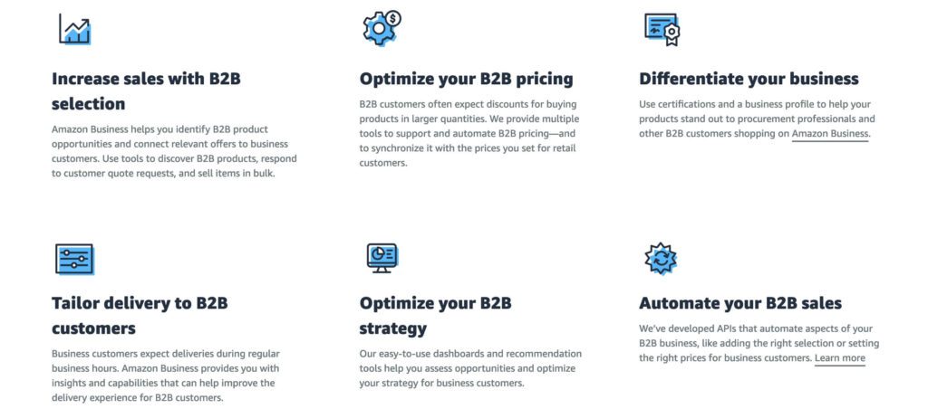
The snapshot here is from the Amazon website. The icons are filled and they use the signature brand color – Alexa Blue. This exemplifies how filled icons help reinforce brand colors.
Filled icons like these are effective in instantly attracting attention to crucial sections of your website. Moreover, they also look good on smaller screens.
A word of caution: filled icons appear strong and loud in most cases. So, if you are aiming for a simple and clean aesthetic, then outline icons might work better than filled ones. Moreover, when a design calls for the use of several icons, too many filled icons appearing close to each other might make the design look cluttered.
Colored flat icons
Combining the perks of different icon styles, flat color icons are just that – flat. These are not stripped down to the bare minimum as with most outlined branded icons. They carry more details and can therefore be used to represent complicated processes and nuanced representations.
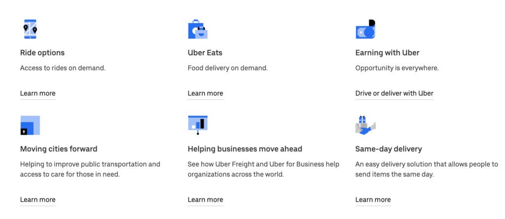
Here’s a snapshot of colored flat icons used by Uber on their website. Despite carrying additional details to establish the meaning the icons use a monochromatic color palette. And there are no shadows/highlights and other effects that cause clutter.
Optimize for interactive feedback
This is particularly applicable to icons created for the UI design. If there are icons meant to represent different items/categories on your menu if there tends to be some form of interaction between the user and these icons, then consider optimizing them for interaction-based feedback. For instance, think of those icons that display subtle animations or those that change color when you hover over or click on the respective option.
Take a look at the set of icons displayed on the Sephora website for instance. The first image shows the default state where the icons appear as simple outlined designs. The second image shows the partially filled versions of these icons that appear when you hover over an icon.
Explore 3D icons if they suit your style
The next idea to explore when creating branded icons is the 3D style or skeuomorphic style. The three-dimensional details you add to your icons add depth to the design and make them pop.
One of the main reasons some brands use 3D-style icons is that they create a more realistic feel and enhance the vibrance of the overall design. Therefore, if you are looking to appear bold and loud, 3D icons might work.
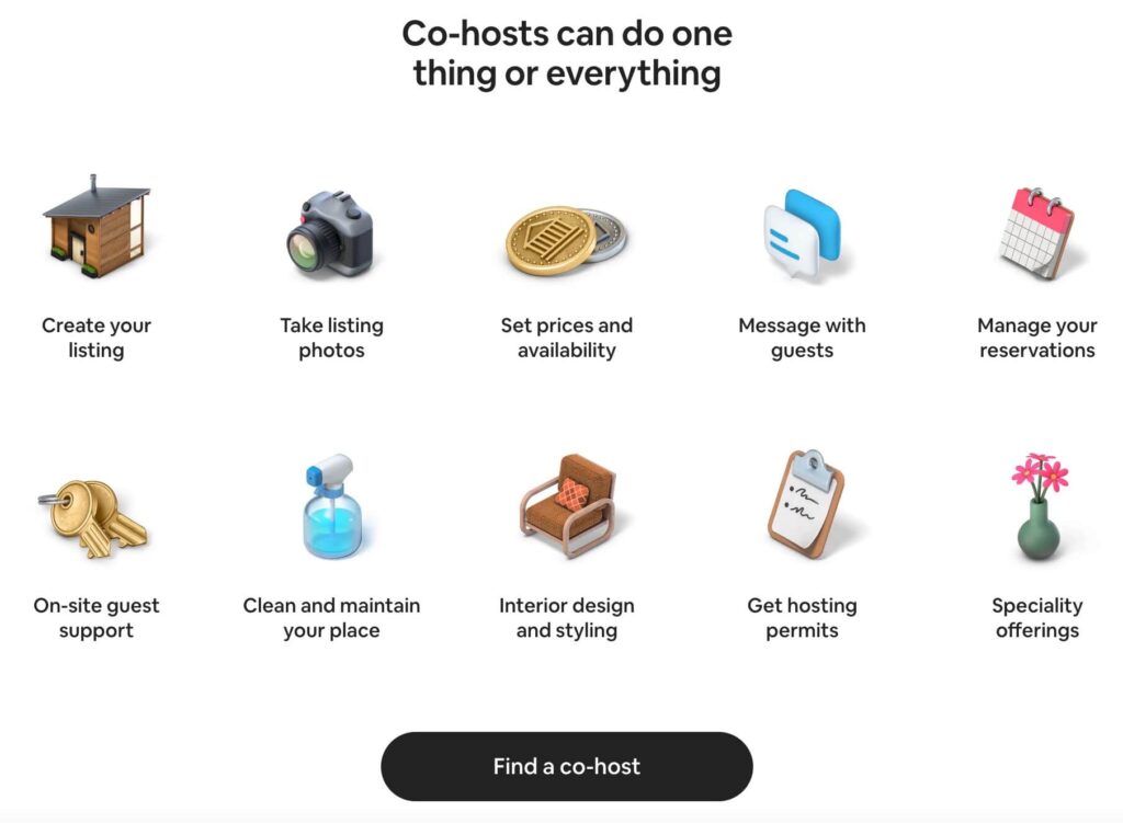
For instance, here’s a snapshot of 3D icons used in one section of the Airbnb website. As can be seen here, the icons look playful and make the overall content look fun to interact with.
One of the major benefits of using 3D icons is that they are easy to animate. Therefore, they make wonderful additions to app UIs if they suit your brand’s style. But remember, given the strong tone of 3D icons they might not be the best choices for brands looking to maintain a chic minimalistic aesthetic.
Similar to filled icons and colored flat icons, 3D icons too can end up overwhelming users when used heavily. Therefore use them in moderation and only in places where you find them to be the most suitable option. Accordingly, the Airbnb website uses simpler outline icons on the main menu, instead of 3D icons, to avoid overwhelming users at first glance.
Design Scroll-Stopping Branded Icons With KIMP
In conclusion, branded icons are valuable assets in marketing. From reinforcing the brand’s identity to giving a taste of the brand’s unique personality, simplifying brand communication and fostering a polished reputation for the brand, branded icons offer numerous benefits.
Therefore, a well-designed branded icon library is a great investment to boost your brand’s visual communication.
Ready to take your brand’s visual identity to the next level? Sign up for a KIMP subscription and unlock unlimited design services, including custom icon creation. Let our expert designers bring your brand’s vision to life.
Register now for a free 7-day trial!


