
Sans-Serif Fonts 101: The Go-To Typefaces for Modern Brands
Clean, minimalist, and versatile, sans-serif fonts have become a staple of contemporary design. From sleek tech logos to bold headlines, they offer a timeless and practical aesthetic for various applications.
Originally favored for their readability on digital screens, sans-serif fonts have expanded their reach to dominate branding and marketing materials. So much so, that even brands traditionally associated with serif typefaces are incorporating sans-serif fonts in various designs for their versatility and impact.
In fact, data reveals that over 70% of Fortune 500 companies have embraced sans-serif fonts in their logos. This highlights the popularity of this typeface category.
While the category itself may seem straightforward, sans-serif fonts come in all shapes and sizes. Therefore, no matter who your target audiences are and no matter the visual theme of your design you are sure to find a sans-serif typeface to suit your style.
In this blog post, we’ll be discussing sans-serif fonts in detail, exploring different types, popular choices, and unique options to help you elevate your design projects.
Sans-Serif Fonts: An Introduction
What are sans-serif fonts?
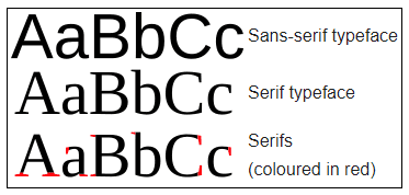
Some fonts feature small extensions or “feet” at the ends of strokes. These extensions are called “serifs”. Therefore, fonts without these serifs are called sans-serif fonts. They are characterized by their clean, unadorned lines. This simplicity and lack of ornamentation contribute to their modern and minimalist aesthetic.
Sans-serif typefaces are often favored for their readability, especially on digital screens. This makes them a popular choice for web design and other applications where clarity is essential. Their clutter-free and contemporary appearance makes them a go-to option for designs that aim to convey a sense of modernity, simplicity, and professionalism.
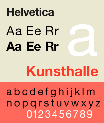
Helvetica is probably one of the most commonly used sans-serif typefaces known mainly for its simple and fuss-free style.
Now, let’s address one of the biggest questions you probably have in your mind – what advantages do sans-serif fonts bring with them?
Why should you choose sans-serif fonts?
Readability
Even the most direct message does not make the intended impact if the text is not easy to read. Yes, digital screens provide the convenience of zooming in and out and trying to figure out what’s on the screen but you cannot always expect your customers to go the distance to grab the message. Therefore, choosing an easily readable font is the need of the hour and this is where sans-serif typefaces never let you down.
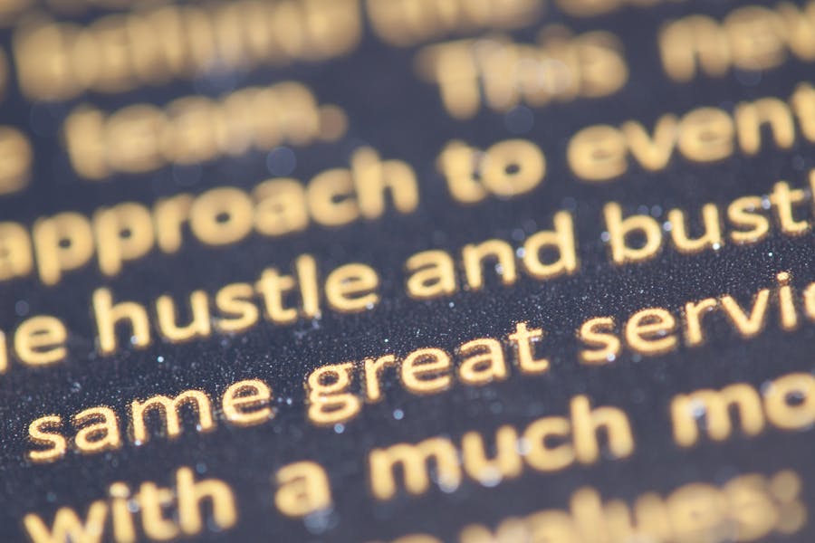
There are two ways to explain this. Firstly, given the lack of decorative details in most sans-serif typefaces, they stand out clearly in most busy designs. For example, in the design below, the text is easy to read even amidst the other lively design elements.
Secondly, most sans-serif typefaces are easy on the eyes even in small font sizes. So, when you have to scale down the text to establish hierarchy, you are still preserving the readability of your design. For example, observe the text in the design below. The text in smaller fonts is as easy to read as the one in the larger font size.

Versatility
Without too many complicated details and without a very dominant or loud character, most sans-serif typefaces are easy to work with. In addition to deploying them in diverse contexts and visual themes, you’ll also find that they are convenient to combine with other typeface categories. All this can happen without hampering the readability of the text!
For example, the below design incorporates a combination of font styling like the italicized text with shadow details at the top, the fading effect in the middle, and the outline effect on the text in the foreground. The versatility of sans-serif fonts make a combination of such diverse styles possible.

Professionalism
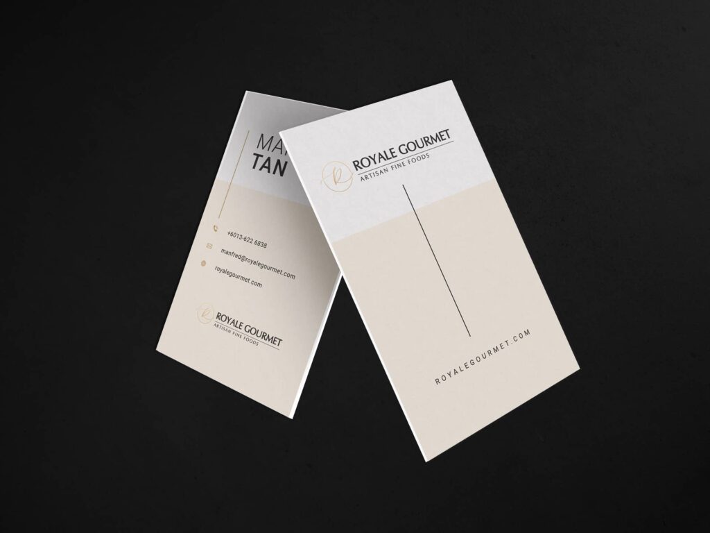
The sleek and simple style of sans-serif typefaces also makes them appear professional. There is a visible structure and polished appearance to most fonts in this category making them popular in branding designs like logos.
For example, the design below looks refined and balanced. The sans-serif typeface used in this design definitely has a big role to play in this aesthetic.
Minimalism
If minimalism is your style, then sans-serif fonts are your best bet. Yes, there are some simple and chic serif fonts and script fonts that can work as well but sans-serif typefaces are perhaps the ones you might end up using in most places.
One of the reasons for this is that when using sans-serif fonts, you shift the focus of your design to the content rather than the typography. The other is that sans0-serif options are often timeless.
The design here demonstrates that a combination of sans-serif typefaces and mellow colors makes it easier to achieve a minimalistic aesthetic for brands.
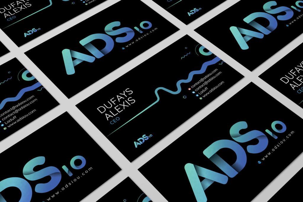
Modernity
Sans-serif typefaces are the best options for brands that wish to represent themselves as fresh, modern and future-focused. In fact, if you look at some of the most popular rebranding projects of recent times most switched from serif fonts to sans-serif options. Google’s 2015 rebranding is the perfect example of this.
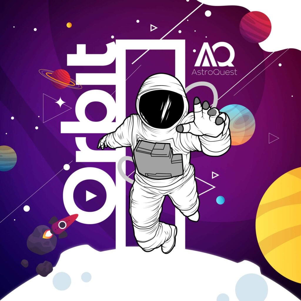
Here’s another design that exemplifies the modernity of sans-serif typefaces. From the use of black as one of the main colors to the choice of gradients, several aspects of this design look cool and contemporary. The use of a sans-serif typeface accents this effect.
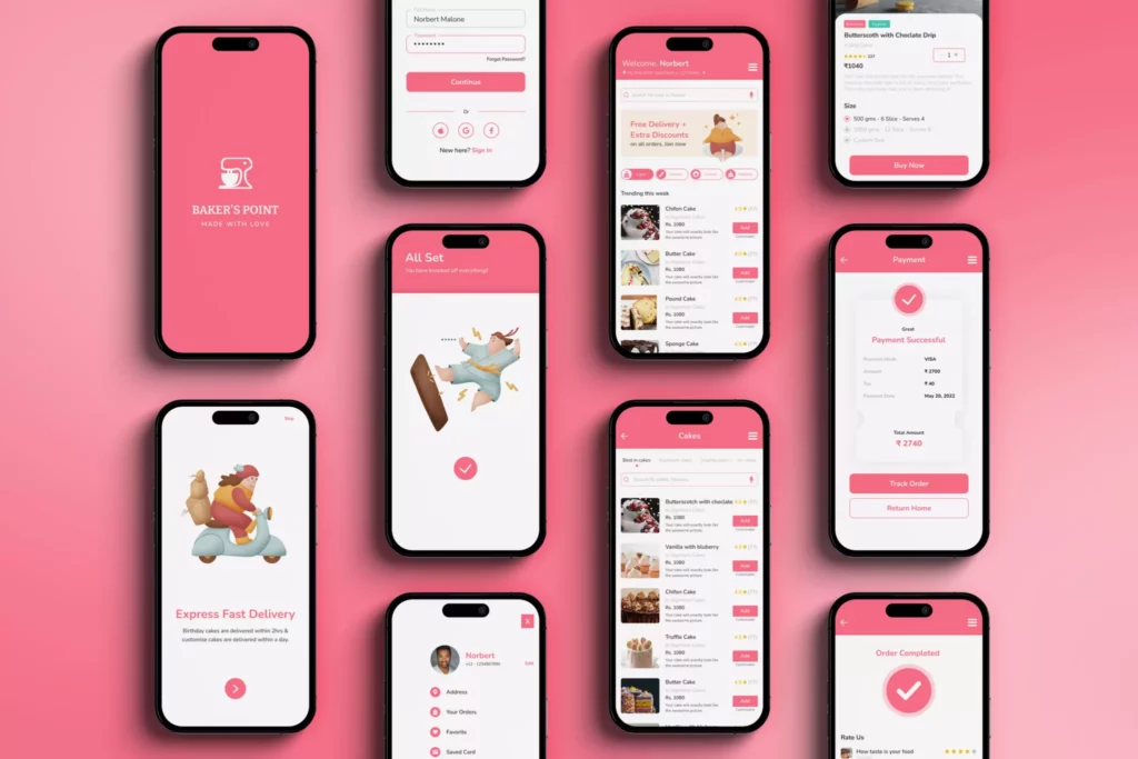
Mobile-friendliness
Sans-serif typefaces are generally more legible on smaller screens, making them ideal for mobile-first designs like app interface designs. This is mainly because the design of sans-serif fonts ensures their scalability across different screen sizes.
In the app design here, you will see text in various sizes, colors, and transparencies. And yet all of them are easy to read even on small screens. That’s the power of modern sans-serif typefaces.
Font pairing tips for sans-serif fonts
As we observed earlier, sans-serifs can easily be paired with a wide range of font styles. They often help balance the strong character of other typeface categories. Let’s talk about the two most popular combinations for sans-serifs.
Sans-serif + script
Script fonts look aesthetically appealing and can be used to evoke a strong emotional response. However, there is one area where they fall short and that is the readability aspect. When scaled down, script fonts can put a lot of strain on the reader’s eyes. Additionally, even in the right font size, long lines of text in script font can look and feel overwhelming.
Therefore, sans-serif typefaces can give the much-needed break from the monotony and ensure clarity of the message. The aesthetic combination of script and sans-serif typefaces in the logo design below is a good example.
Sans-serif + serif
Serif fonts often evoke a strong emotional response. In this case, the right sans-serif font can help preserve the traits of the chosen serif fonts without letting them lose their shine. In other words, sans-serif typefaces do not interfere with the visual style you are aiming to establish with the chosen serif font.
For instance, consider the web design here. Sans-serif fonts help create bold visual hooks in the form of titles and subheadings in the design. However, to ensure easy readability in a smaller font size the design uses a sans-serif typeface.
Types/Styles of Sans-Serif Fonts to Explore
Grotesque
Grotesque is the oldest style in the sans-serif typeface category. They are characterized by their somewhat quirky appearance and geometric letterforms which gives them a clean and modern feel. Another notable detail is the barely noticeable stroke contrast. This style works particularly well in designs that call for a raw and industrial feel.
The more modern versions of this style feature polished and more uniform and regular shapes in letterforms. These are categorized as neo-grotesque styles.
Both grotesque and neo-grotesque styles in this typeface category are known for their vibrant personality and hence challenge the idea that sans-serif fonts are often bland.
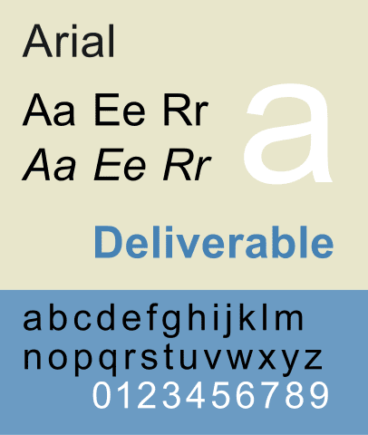
Arial is one of the most popular neo-grotesque typefaces used in various applications.
Bell Gothic, Franklin Gothic, Monotype Grotesque, and Benton Sans are some of the well-known grotesque typefaces.
Folio, Geneva, Helvetica, and Roboto are some of the most popular neo-grotesque styles.
Evidently, most fonts in these categories are based on ellipse as their core shape.
Geometric
In contrast with the elliptical letterforms in most grotesque typefaces, geometric sans-serif fonts are based on circles or squares. Therefore they are visually pleasing and some of them are quite unique in their character.
Given the clearly defined shapes in letterforms, fonts in this typeface category can be visibly rigid or extremely fluid and elegant.
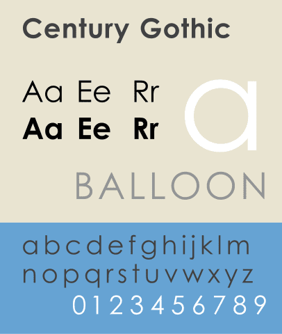
Century Gothic is one of the most commonly used geometric style sans-serif typefaces.
Agency FB, Bank Gothic, Futura, and Montserrat are some of the well-known options in the geometric sans-serif style.
Humanist
If you are looking for sans-serif fonts that feel gentler and more organic with friendlier letterforms and traditional shapes, then humanist styles are for you. They have their way of bringing warmth into your designs and therefore are suitable for brands looking to target diverse audiences, especially in the consumer industry.
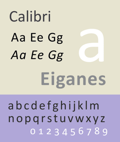
The highly popular font in the digital space, Calibri belongs to this category.
Gill Sans, Open Sans, Lato, and Verdana are among the other popular humanist sans-serif typefaces.
Having tackled the brass tacks, let’s now move on to those sans-serif font ideas we promised you. And to ensure variety we have curated a list from various well-known font libraries like Google Fonts, Adobe Fonts, and Canva’s font library.
Google Fonts: Unique Sans-Serif Fonts to Explore
Work Sans
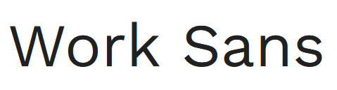
Work Sans can be described as a neo-grotesque style font. This is one of the perfect examples to demonstrate that sans-serif styles work well on both web and print applications.
One of the notable benefits is that this font is easy to read in small print as well. In short, it’s simple, fuss-free, and a great choice for beginners who are looking for convenient and practical fonts for their designs.
Sen
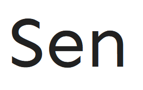
If the friendly nature of geometric sans-serifs appeals to you then Sen is one of the easiest options to go with. Moreover, the open apertures and rounded letterforms make this an aesthetically stunning choice to use in designs that call for a contemporary style.
PT Sans
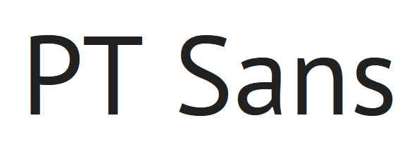
With 4 different styles to choose from, PT Sans is a modern and simple sans-serif typeface with no frills. This belongs to the humanist category of sans-serifs and scales up and down beautifully in all types of designs and applications.
Nova Square
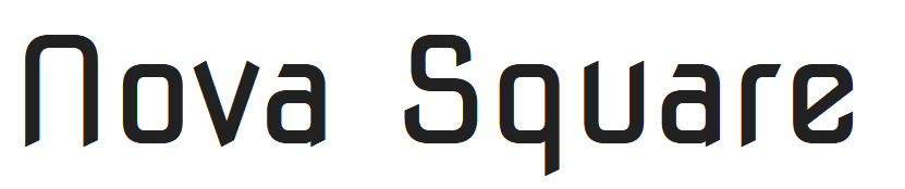
This geometric style sans-serif is based on square as the core shape and therefore looks visually intriguing. Moreover, with the right colors and styling it can also look futuristic.
Since there is only one font weight available most customization needs to happen with the application of colors and textures to the text.
Archivo Narrow
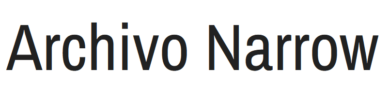
With distinct condensed letterforms, Archivo Narrow is a compact and elegant font for modern designs. But this narrow structure also means a compromise on readability in small font sizes. But their clean lines make them suitable for minimalistic themes.
Adobe Fonts: Sans-Serif Fonts For Diverse Applications
Ruddy
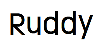
Ruddy is the kind of fresh and dynamic font for brands that love to bend the rules a little. They are informal and playful without compromising on readability. It looks energetic and fun when combined with a vibrant color palette. Moreover, Ruddy is available in a variety of stroke weights.
Fairwater Sans
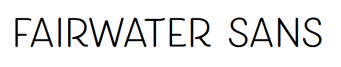
Available as an all-caps typeface, this one comes with visibly fluid strokes. In addition to this, there is also a hint of hand-written style which gives this typeface a unique personality. Its bold nature makes it more suitable for title text and subheadings rather than body text.
Natom Pro
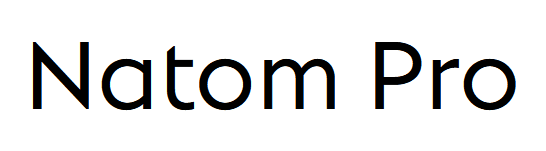
With clear and super-legible letters Natom Pro is a geometric sans-serif option. Besides, the wide range of line weights and variations available makes this typeface a versatile choice for modern designs. There are even distinct bold uppercase versions available for titles in particular.
Portofino
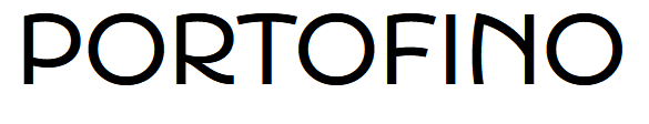
This is another uppercase sans-serif typeface on our list known for its short x-height and modern aesthetic. This typeface is fairly readable and looks sleek even in small font sizes. Finally, in terms of its overall style, it’s more modern than traditional.
Quiverleaf CF
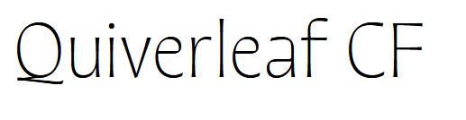
A dash of nostalgia combined with unparalleled elegance, the Quiverleaf CF font makes a brilliant option for luxury brands. However, even the highest line width available is on the slim side. Therefore, avoid placing this font on crowded backgrounds where the text might become indiscernible.
Canva: Sans-Serif Fonts You Cannot Miss
Varela Round
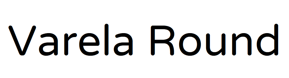
With round-tipped strokes and rounded letterforms, Varela Round is a visually appealing typeface. To sum up its traits, it’s friendly, modern and gentle. Therefore, it works well for brands looking to establish a mellow and delicate brand identity.
Bebas Neue
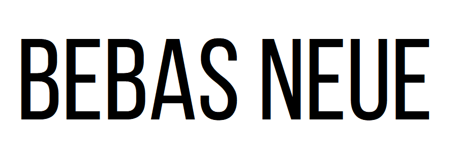
A well-known display font, Bebas Neue is a dapper contemporary font that can make the headlines and hero text in your designs pop. It is visibly modern and bold. Since this font comes off as a loud and daring choice, avoid using it in body text since that might create a visually overwhelming result.
Peace Sans
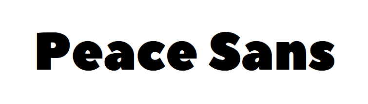
For your designs on Canva if you need a sans-serif font that creates a visual hook and instantly draws attention to your design, then you might like Peace Sans. However, with its chunky strokes, the readability of this font drops down when you reduce the font size.
Tenor Sans
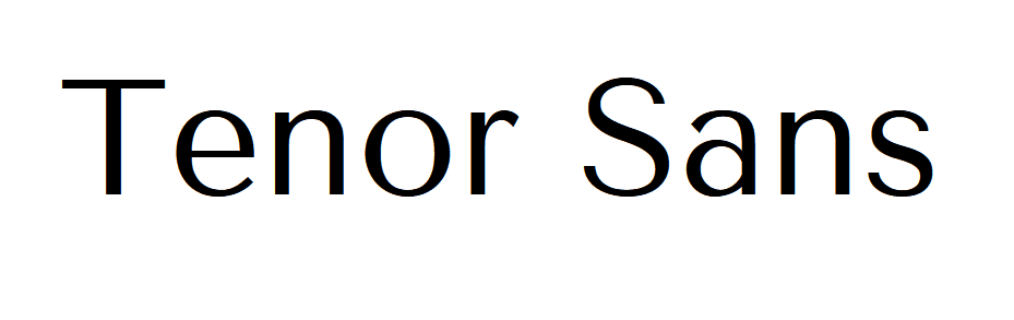
Tenor Sans is one of the few sans-serif typefaces that carry a touch of sophistication. Additionally, the geometric letterforms also ensure readability no matter where the font is applied. The consistent stroke width and precise shapes give the typeface a balanced and polished look.
Boho Sans
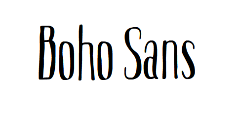
With a hint of handwritten script and an informal style, Boho Sans is a fun and vibrant sans-serif typeface to work with on Canva. Its distinct laid-back style is one of its notable traits.
Create Magic With Sans-Serif Fonts
With all these ideas to explore and the diverse styles to experiment with, sans-serif fonts truly are delightful to choose for modern designs. To tap into the many dimensions of this typeface category and make the most of it in your designs, consider working with a professional design team that knows the ins and outs of typography and type choices. With a KIMP subscription, you get the perks of such an experienced design team along with the benefit of covering all your marketing and branding graphics at a fixed monthly fee.
Ready to experience the KIMP difference for your designs? Register now for a free 7-day trial!