
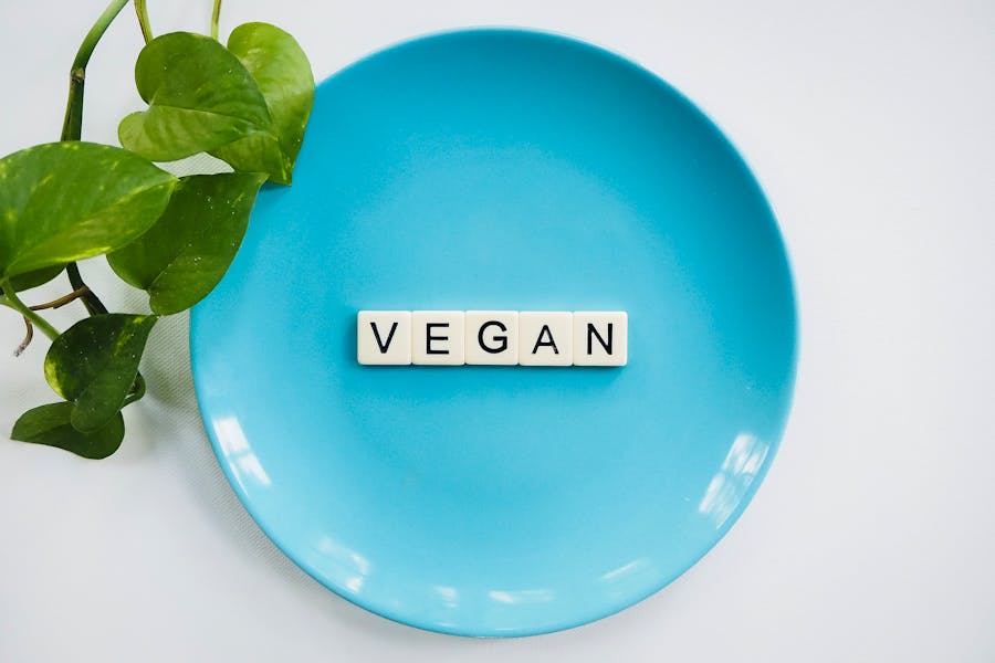
6 Vegan Brands & Their Logos: Key Takeaways for Ethical Branding
Branding for a vegan brand is not just about slapping a green leaf onto the logo. It is about creating something meaningful that resonates with a unique community united by their shared lifestyle and ethical values. After all, vegan brands are not just about the products but more about their brand stories.
Think about it: vegan consumers are constantly making a conscious choice. A choice based on their strong values. Therefore they are on the lookout for a brand that shares their values. Therefore ethical branding is about authentically representing your brand story, thus winning hearts and loyalty.
So, how do you design vegan brand logos that do not just look good but also feel good? We’ll crack that code in this blog.
Branding for Vegan Brands: Understanding the Challenges
Vegan brands no longer belong to a small “niche market”. The industry is booming! The global vegan market is projected to hit a staggering USD 103 billion by 2032 at an impressive CAGR of 13.51%. This translates to fierce competition. So, how does a vegan brand stand out in this crowded field? Here’s where branding becomes crucial.
Unlike traditional brands targeting a more general audience, vegan brands need to connect on a deeper level. Veganism isn’t just a dietary choice; it’s a lifestyle shift. Consumers are making a conscious decision, and they’re looking for brands that understand them and their choices. Forget flashy, attention-grabbing tactics – authenticity and connection are king.
This means that logos for vegan brands need to explore beyond a stereotypical green leaf. Of course, there’s room for both rule-followers and rule-breakers in the vegan branding game. We’ll explore innovative brands that have adopted unexpected imagery while staying true to the core principles of veganism.
Ready to create a brand that resonates with the passionate vegan community? Let’s dive in and get inspired!
6 Logos of Vegan Brands + Lessons to Take Away
1. Beyond Meat
We’re beginning our list with one of the pioneers in the vegan market – Beyond Meat. The brand caters to exactly what the name communicates – thinking beyond meat. They are known for their plant-based products that taste like meat and thus provide a convenient replacement for those who choose to switch to the vegan lifestyle.
Beyond Meat has a simple yet visually intriguing logo. What’s unique about it is the fact that this is perhaps the only logo in the vegan market that features an animal symbol in it. However, to differentiate the idea the bull in the logo wears a cape taking on a super-hero like role.
This symbolism itself sets the logo apart as it breaks free of cliched imagery associated with the industry.
However, to ensure that the message is still intact, the brand taps into color psychology and uses a green circle which can instantly be seen as a symbol of good health and nature. A color easily associated with veganism and therefore a suitable one for vegan brands!
KIMP Tips:
- Think outside the box when choosing imagery for your vegan brand.
- Add subtle details that communicate a clear story – like the cape worn by the bull in the Beyond Meat logo.
- Considering the need for multi-channel marketing in the modern world, adopt clean and flat designs like the clutter-free logo of Beyond Meat.
2. No Evil Foods
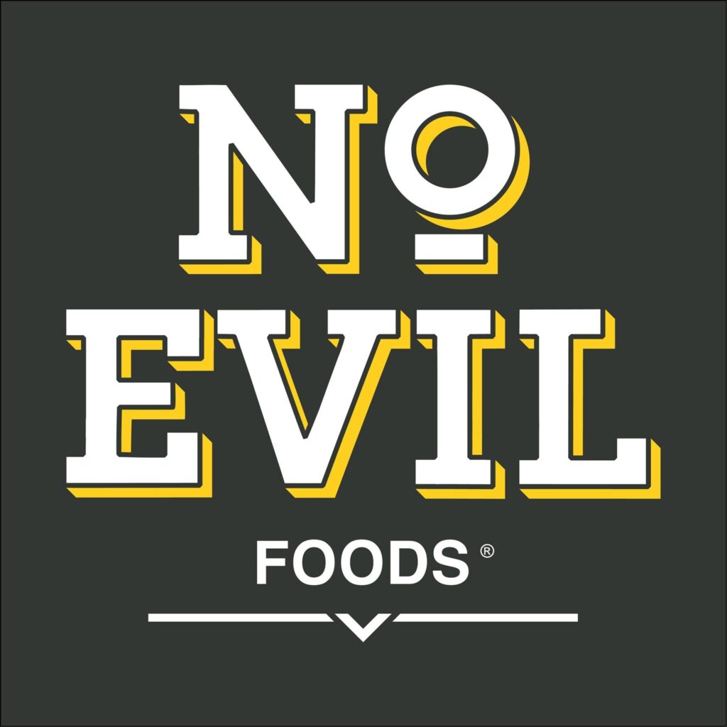
No Evil Foods is also on the list of vegan brands that chose to steer clear of overused visual representations in the vegan industry. In fact, the brand’s identity makes veganism appear more fun and invites more people to try the lifestyle change.
What makes their fun and dynamic logo work is that the brand has a clear no-fuss personality which is reflected in every single element of their brand identity.
For instance, the bold color palettes and copy in their ad designs like the one here:
Then there is the unique and artistic comic-book illustration style designs for their packaging. Their packaging design proves that sustainable packaging does not always have to be plain, brown, and boring!

In short, No Evil Foods highlights the need for a well-defined cohesive brand identity for vegan brands and their logos to work.
KIMP Tips:
- In the No Evil Foods branding, from the chosen font to the textures and colors in the designs, every single aspect reflects the subtle nostalgic comic-book feel that the brand is known for. Similarly, aim for a holistic visual identity where all the elements together communicate the intended theme.
- No Evil Foods was about embracing change and challenging the norms. Their logo design and overall identity stand as a testament to this. Similarly, create a brand identity that reflects your brand’s unique personality and what you stand for.
3. Oatly
Since we are talking about vegan brands that are anything but boring, how could we not bring up Oatly? This is another statement-maker, rule-breaker, similar to No Evil Foods. And yes, their distinct visual identity, their quirky fonts, and the not-so-conventional tone of voice all have a role to play.
Take a look at one of their billboards for instance. Now go back to the dynamic logo of Oatly. Don’t you think the rule-defying design perfectly resonates with the brand’s unique personality?

Now let’s go back to the design. It looks like a simple wordmark logo at first glance. But what makes it special? Of course, we have to begin with the font! Who says sans-serif fonts are simple and plain? Just look at the peppy and raw sans-serif the brand has incorporated – the subtle bounce to the letters adds the perfect finishing touch!
Then there is the color variation to highlight the key ingredient in the plant-based milk that Oatly is known for, “oats”. Finally, the symbol intuitively included in the negative space. Together the design looks fun and engaging – not something that people ignore.
KIMP Tips:
- Similar to the design details in the Oatly logo, identify ways to pack in elements of intrigue into your vegan brand logo, without complicating the design.
- Typography can make or break a brand’s visual identity. In the case of Oatly, the typefaces and font styles used in the rest of their designs like packaging, ads, and more carry similar quirks as the logo font. Such cohesive font choices are essential to make your logo and your overall visual identity work.

4. Brave GentleMan
Brave GentleMan is one of the most popular names in the vegan luxury fashion segment. Everything from the name of the brand to the logo design goes against the stereotypical associations with vegan brands.
To begin with, this design proves that wordmark logos can be iconic. In other words, you can choose the no-frills approach in logo design and still stand out. The brand fonts used by Brave GentleMan have a strong role to play in this. The big bold all-caps letters immediately communicate the fact that the brand is designed to stand out and not fit in.
Secondly, the harmonious design also demonstrates the beauty of aesthetic font pairings. This one goes with the classic serif + script font pairing. While there are many ways to do it, the chosen combination symbolizes the grandeur and elegance that the brand stands for.
From their social media posts to marketing graphics, the brand uses classy aesthetics to represent their identity. Here’s an example. From the textures and imagery to the choice of fonts, everything looks refined in the post here.
KIMP Tips:
- Break the mold when it comes to designing for vegan brands. Instead of opting for common vegan visuals, Brave GentleMan relies on typography and messaging to communicate their values. This is a strategic move that appeals to an audience looking for ethical products that don’t sacrifice style or luxury.
- Optimize your designs for your target audience. In this case, the name “Brave GentleMan” and the luxurious visual identity of the brand speak directly to the brand’s target audience—those who value compassion, refinement, and boldness in their choices.
5. Dear Diary Coffee
Dear Diary Coffee is a vegan coffee shop in Austin. The brand possesses a truly unique identity, not something typical of vegan brands or even something typical of coffee brands.
Dear Diary Coffee uses a combination logo with a unique hand-drawn illustration for a logomark and a peppy chunky sans-serif font logotype. Together there is a fresh energetic vibe to the design.
The brand’s aesthetic is perfect to capture its friendly neighborhood coffee shop vibe. To preserve this theme the brand uses the signature hand-written notes style typography throughout – on their website, social media, and other marketing designs.
The coffee shop is also known for its teeming creative community and the unique logomark used aligns with this artistic side of the brand. It appears on the takeaway containers and other designs representing the brand.
KIMP Tips:
- One of the main attributes of the Dear Diary Coffee logo is its overall happy and approachable vibe. This is in sync with the brand’s vibe and the warm and welcoming ambiance of the coffee shop as well. Similarly, ensure that your store ambiance, product packaging, and brand messaging are all aligned with a central theme.
- The smile-like curve in the logomark also appears in the logotype of the Dear Diary Coffee logo. This depicts how paying attention to the details can help amplify the effectiveness of your logo and make it visually intriguing and memorable.
6. Milk Makeup
The thing about branding for vegan brands in the beauty segment is that you need to meet the expectations of a beauty brand’s identity and still appear relevant to the “vegan” label. Milk Makeup, a New York-based cosmetics brand is one of the vegan beauty brands that does this beautifully.
The clean design sans embellishments aligns with the brand’s focus on “clean beauty” without frills. Their simplified contemporary aesthetic also elegantly captures the forward-thinking values.
Moreover, Milk Makeup prioritizes self-expression at the core of their identity. Accordingly, they use a scaled-up version of the logo in most of their designs including packaging. This is how you take a simple logo and make a bold statement with it.

Also to note, the brand’s website is their online store and is at the crux of their retail model. Therefore, this virtual storefront also reflects the hyper-clean aesthetic of the brand’s identity. In conclusion, these designs work in unison creating a wholesome unique aesthetic to represent the brand.
KIMP Tips:
- The rendition of the minimalistic logo here further amplifies the fact that irrespective of the design of a logo for a brand, its interpretation and the impact it makes all depend on how the brand deploys the logo in the design. And how they build the rest of the branding and marketing graphics around this logo design.
- Make the most of typography to reflect your brand values in your logo design. In this case, the slim and tall font and the tight kerning add to the elegance of the Milk Makeup logo.
Elevate Your Vegan Brand’s Identity With Designs by KIMP
In conclusion, designing for vegan brands is more than just creating a visually appealing logo. It’s about understanding your brand’s unique values, the emotions you want to evoke, and the target audience you want to reach. By considering these factors, you can create a brand identity that breaks free from the common vegan clichés and truly resonates with your customers.
Ready to bring your vegan brand to life with a captivating logo and brand identity? Sign up for a KIMP Graphics subscription and collaborate with our talented design team.
Register now for a free 7-day trial!