
Coffee Logos to Savor: Design Insights from Iconic Brands
Tired of the same old coffee bean cliché dominating every coffee logo design? It’s time to brew up something fresh. A truly memorable coffee logo isn’t just about a symbol; it’s about crafting a visual identity that resonates with your brand’s unique essence. In this blog post, we’ll delve into the world of coffee logos, exploring successful strategies and iconic designs from brands around the globe.

From minimalist masterpieces to bold, attention-grabbing statements, we’ll uncover the secrets behind creating coffee logos that stand out from the crowd. Whether you’re a budding entrepreneur or an established coffee connoisseur, this guide will provide valuable insights and inspiration. So, let’s pour over the details and discover how to elevate your coffee brand through exceptional coffee logo design.
6 Delectable Coffee Logos: A Deep Dive
Coffee is one of the most consumed beverages in the world. Did you know that 2.25 billion cups are consumed around the globe on a daily basis? In fact, the coffee market is projected to grow at a CAGR (compound annual growth rate) of 5.4% from 2024 to 2030.
And when it comes to consumption, there are those that cannot start their day without a visit to their neighborhood coffee shop. A vast majority also prefer instant coffee drinks or devote a considerable amount of time to coffee brewing every single day.
Additionally, a survey in 2020 found that about 49% of American coffee drinkers show interest in gourmet coffee.
Here are a few things to infer from all of these facts put together:
- There are significant opportunities for coffee brands in the growing coffee market.
- Moreover, coffee brands need to be ready to cater to diverse preferences,
- from convenience to specialty. Or better yet, they need to differentiate themselves and establish themselves as experts in one of these domains.
- Creating a unique brand identity through exceptional coffee and coffee logos is essential to stand out in a competitive market.
Taking all these aspects into consideration, let’s crack the code of designing coffee logos, from our curated list of coffee brands around the world.
1. Nescafé
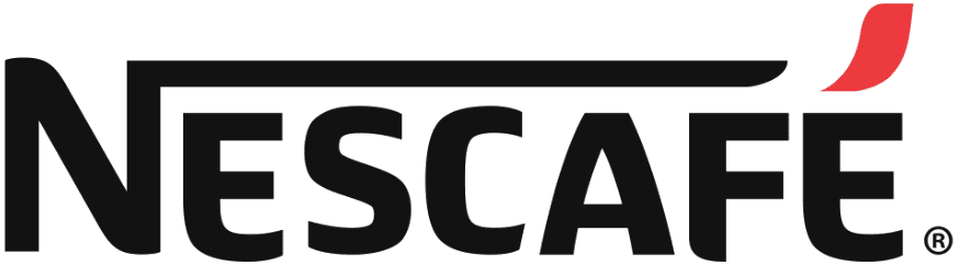
Over the years the Nescafé logo has evolved but without any drastic changes. A notable detail here is that throughout its history the brand has used a wordmark logo.
The Nescafé brand name is an amalgamation of the name of the parent company “Nestlé” and the word “café”. Therefore, the brand name is the element of focus. Hence a wordmark feels most relevant to the brand.
They have built a logo and brand identity focusing on brand name recognition rather than relying heavily on coffee-related imagery like most other coffee logos. This has helped the brand expand globally and resonate with diverse audience demographics.
Finally, just because it is a wordmark logo, it is not without interesting details. From the extended horizontal serif of “N” to the red accent above “E” there are subtle details that make the design more engaging.
KIMP Tips:
- Choose every little detail about your logo right from the type of logo design to the elements in the design, based on what works for your brand and not simply based on the industry norms.
- Even if you wish to create a minimalistic design, find a way to add your creative flair to make the design unique and intriguing.
2. ZUS Coffee
The popular Malaysian coffee brand Zus Coffee has an intriguing logo with a story behind it.
Reportedly, the imagery in the logo was included as a nod to the goat herder Kalki who is attributed to have discovered coffee. And the brand name itself comes from the combination of “zeal” and “us” to indicate the zealous pursuit of coffee.
Firstly, the logomark in the ZUS Coffee logo is unique and hence helps the brand cut through the noise. Secondly, despite using an intricate illustration, the brand opts for a clean flat design to ensure versatility and scalability of the design across marketing applications.
KIMP Tips:
- Starbucks and ZUS Coffee are among the brands that use intriguing imagery in their design. While this is a great idea to create something unique, it’s imperative to explain to your customers, the story behind it. Otherwise, it leads to misinterpretations and controversies like the one that ZUS Coffee got into (when the mascot in the logo was misinterpreted to be derived from the Greek god Zeus).
- Given the historical inspiration for the logo, the brand also combines the design with classic serif fonts to maintain the elegance of the design. Similarly, choose fonts that seamlessly fit into your logo’s theme.
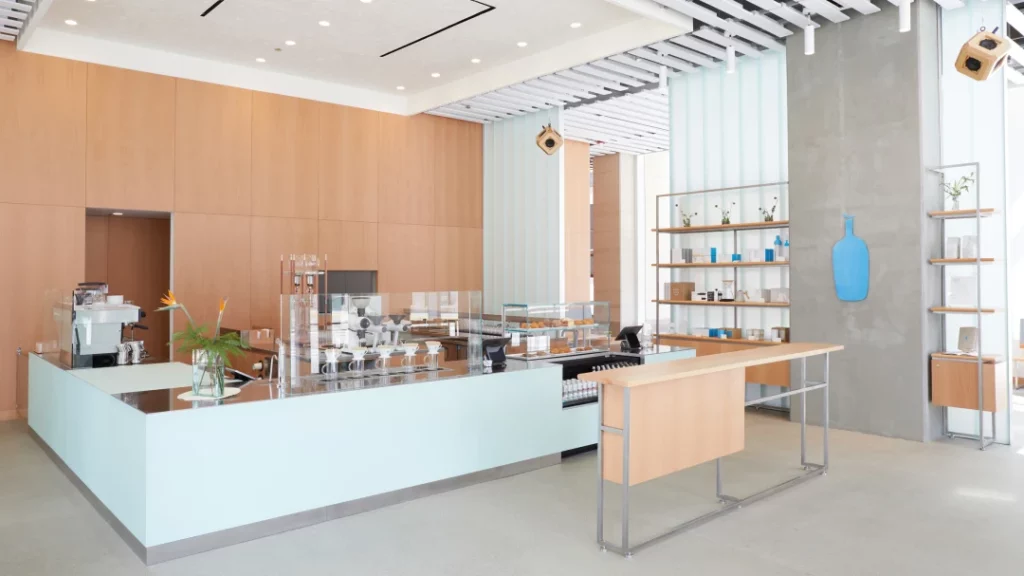
3. Blue Bottle
Blue Bottle is a popular coffee retailer headquartered in Oakland, California. The name of the brand itself was reportedly inspired by the first coffee house in Vienna named “The Blue Bottle Coffee House”.
Like the Nescafé logo, this one is created with the brand name as the central element. However, in this case, the design uses a simple visual representation of the name making the design memorable.
Additionally, a lot of inspiration for the brand also came from Café Bach, a Kissaten (a Japanese-style tearoom) in Tokyo. Therefore, the clean minimalistic style signature to Japanese culture works well in the design.
No doubt, Blue Bottle has one of the most appealing designs among coffee logos. But it’s not just about the logo, it’s about how the brand extends this minimalistic aesthetic to the rest of their designs like their cafe aesthetics for instance. A typical Blue Bottle cafe is characterized by clean minimalistic ambiance with their signature blue bottle logomark and sparingly used blue accents being the only pops of color.
KIMP Tips:
- For coffee logos to work, the logo design and overall identity need to be on the same page. If your logo is minimalistic and your store aesthetics are bold and busy, it can end up confusing your customers.
- Leverage color psychology to create stunning coffee logos. In the case of Blue Bottle, the vibrant blue of the brand works beautifully on the rest of the clean palette in their designs. For instance, it pops out on their sustainable brown packaging and also in their cafés filled mostly with muted earthy tones.
4. Tchibo
The popular German coffee chain Tchibo has a combination logo with a novel pictorial element in it.
The pictorial element in this logo is a coffee bean and not just any coffee bean but a roasting bean – the curvy smoke symbol emanating from the bean captures this representation.
While the symbol itself is relevant to the brand, the reason behind choosing it comes from the meaning of the brand name. According to Tchibo, the name is a combination of the founder’s name, “Carl Tchiling Hiryan“ and the word “Bohne” meaning “bean”. Therefore, the symbol in the logo makes even better sense.
Besides the relevance of the symbol itself, it’s how the brand has chosen to combine the typographic element and the symbol is what amplifies the beauty of it. The design seamlessly integrates the idea within the “O” in the chosen font. Similarly, aim for a harmonious blend of logomark and logotype to make your combination logo work.
KIMP Tips:
- Experiment with layered meanings to amplify the impact of coffee logos. For instance, use an icon that tells a story and typography that adds to this interpretation so that together they have an immersive story to tell.
- Even if you choose to use common references like coffee beans or coffee cups in coffee logos, come up with creative interpretations of these symbols or custom illustrations that combine these symbols with your brand name or monogram. This helps retain the relevance of your logo while also ensuring that it’s unique.
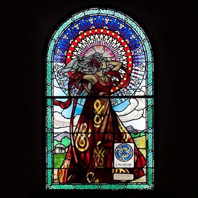
5. Bewley’s
Founded in 1840, Bewley’s is one of the oldest coffee brands in Ireland. This brand has a special place in our list of iconic coffee logos not just because of the logo design but also because of the way the brand creatively weaves it into a vibrant identity.
The logo itself is simple and straightforward. It uses a classic script logo which is perfect to capture the heritage of the brand. Whereas to blend old plus new, the brand has a peppy and colorful visual identity. The sleek and minimalistic wordmark logo effortlessly fits into every single one of their vibrant designs.
Here’s a snapshot from the brand’s Instagram page giving a glimpse of what their brand aesthetic looks like.
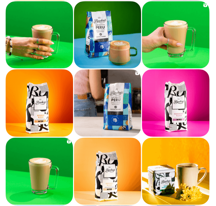
The standout factor here is the reason behind the brand’s use of these lively colors. The colors were incorporated into their identity as a nod to the artistic stained glass windows in Bewley’s Grafton Street Café whose facade has become a landmark in Dublin’s Grafton Street.
KIMP Tips:
- Understand font psychology to create alluring coffee logos. Script fonts, sans-serif fonts and serif fonts each have their own strengths. Compare your options and find the right ones to carry your brand’s personality forward.
- Remember that branding for a coffee brand is not just about logo design. From your brand colors to fonts and imagery, every detail influences how customers perceive your brand.
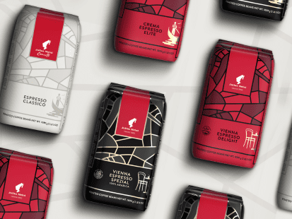
6. Julius Meinl
Julius Meinl is another one among the popular coffee logos with an interesting story to tell. What started out as a family business in Austria now stands as one of the top premium brands of coffee in the world.
One of the highlights of the brand is their traditional coffee roasting methods and their prioritization of Viennese coffee culture. Accordingly, they have a logo that goes back to traditions, particularly the story behind how Zur blauen Flasche, the first ever Viennese coffee house came into existence.
Preserving the story and the role played by Georg Franz Kolschitzky, a messenger who is said to have brought the first coffee sacks for this coffee shop, the logo of Julius Meinl features a young man wearing a “fez” (a Turkish hat).
However, the design here keeps it simple to let the story itself shine rather than complicating the representation with too many details. This design, like most other coffee logos, adopts a flat style to ensure versatility.
Consequently, the design appears modern while keeping the brand’s traditional style intact.
KIMP Tips:
- Sometimes your logo does not have to be too direct. By adding a story and crafting a visual narrative you pique your target audience’s curiosity and invite them to engage with your brand designs starting with your logo.
- Vibrant colors like red often give a brand a contemporary and young feel. However, in this case, Julius Meinl brilliantly leverages reds in predominantly monochromatic palettes to keep up the premium look and feel of the brand. This shows the strength of monochromatic palettes in branding.
Design Captivating Coffee Logos With KIMP
To sum it up in simple words, there are many ways to approach a coffee logo. However, it all boils down to how you want your brand to be perceived and how you wish to differentiate yourself from other coffee brands and coffee logos out there.
Crafting an engaging story is one way to do it. Through that, you are making the first move and initiating a conversation with your customers. Julius Meinl, ZUS Coffee and even major players in the game, like Starbucks have had success with this approach.
However, if you do choose to stick to the norms and use traditional well-recognized coffee references, then add your creative flair to make the representation unique, like the Tchibo logo.
Whatever approach you choose, having a professional design team to work on your branding designs makes it easier to bring your ideas to life and establish a solid connection with your target audience. An unlimited design service like KIMP can give you that advantage.
Not sure if you are ready to bring that change into your design workflow? Sign up today for a free 7-day trial.