
The New Fanta Logo: Rebranding Lessons From the Vibrant New Identity
Not all brands that rebrand are welcomed with a warm response. Creating a fresh new identity and yet preserving the brand equity is no easy feat after all. Today we’re talking about one such brand that managed to achieve it recently. Yes, as evident from the title, we’re discussing the new Fanta logo and brand identity in this blog.
When you have a well-established place in your industry, choosing to rebrand can be a big decision. Fanta truly did tackle this challenge smoothly. To summarize their rebranding – the brand gave a whole new meaning to “making the logo pop”. So, what can brands learn from the successful rebranding of Fanta? Let’s dive in.
But first, let’s begin with an overview of the evolution of the Fanta brand and logo.
- Fanta Logo & Brand Over The Years
- Rebranding & Logo Redesign Tips From Fanta’s Rebranding
- Create an identity that captures the spirit of your brand
- Choose colors and fonts that deliver your message clearly
- Seeing flat designs from a fresh perspective
- Busy vs uncluttered design
- Going back to the grassroots makes sense
- Prioritize versatility
- Multi-dimensional marketing to introduce the new identity
- Rebrand Confidently With KIMP
Fanta Logo & Brand Over The Years
The first Fanta logo
Can you believe that this is what the first Fanta logo looked like back in 1940? From the font to the colors, the overall aesthetic and tone of the first logo were drastically different from the current version. After all, the brand has evolved and established its strong personality over the years and their logo designs have managed to capture this evolution accurately.
The vibrant versions
If Fanta’s brand identity has to be described in one word, it will be “vibrance”. And this vibrant combination of the signature orange and peppy blue and a bubbly font first appeared in 1997. Since then there have been a few iterations of the design but the combination in some form has appeared in Fanta’s brand identity.
Here’s the more recent version that was in use over the past decade. As you can see in the image below, this is a more refined and simpler version of the previously introduced design.
Given that the brand is known for its “orangey” tasting beverage, the bubbly font captured the fizzy experience of the beverage. In short, this design stuck to the brand and worked in its favor.
However, the brand wanted to keep up with the modern trends and create something more versatile and appealing to diverse demographics. Hence they introduced the trimmed-down version with a sans-serif font in 2016.
Now going back to the new Fanta logo, do you notice the difference? The brand removed all the additional details and switched to a simpler yet bolder and more easily adaptable version of the logo. Let’s now break down the design of the new Fanta logo and understand the branding lessons to take away from it.
Rebranding & Logo Redesign Tips From Fanta’s Rebranding
Create an identity that captures the spirit of your brand
The new Fanta logo and the most recent brand identity were introduced in 2023 and designed by the creative agency, Jones Knowles Ritchie. According to them, the idea was to create a “Pop of Funta” and the playful and energetic new design captures this perfectly.
The ideology behind the refreshed identity was to tackle the “this-world-is-boring-itis” problem. Therefore, the brand introduced an identity that breaks most traditional rules associated with brand identity design. From a loud and unconventional typeface to a wide range of colors, the new identity has a distinct personality that’s hard to ignore.
This clearly defined personality for the brand is what makes the identity work. This definitely justifies the choice of every single design element in the new Fanta logo and brand identity making it a truly inspirational project for creatives around the world to explore.
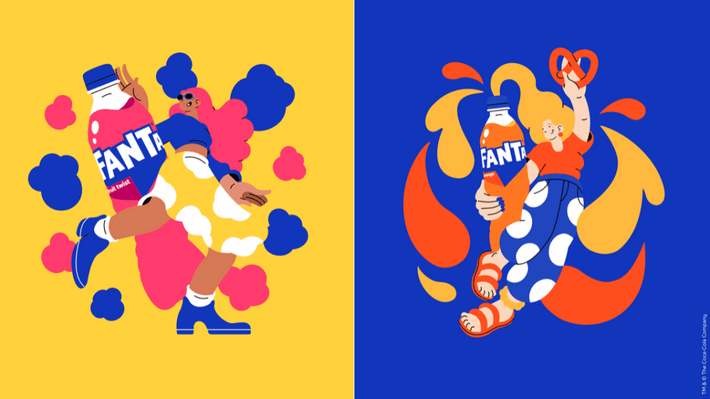
But this works only because the rest of their marketing graphics align with this quirky and super-fun personality their brand identity represents. Here’s a post on their social media page that portrays their unique personality:
Their Instagram page is filled with such engaging posts with a hint of humor and witty tone.
Choose colors and fonts that deliver your message clearly
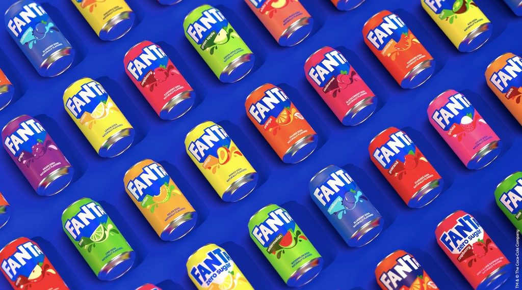
A notable detail in the new Fanta logo is that it is now monochromatic. The orange circle and green leaf have been removed from the design to let the bright blue color carry the brand’s identity. This change is to represent the diversity of the brand and their venturing into more fun flavors.
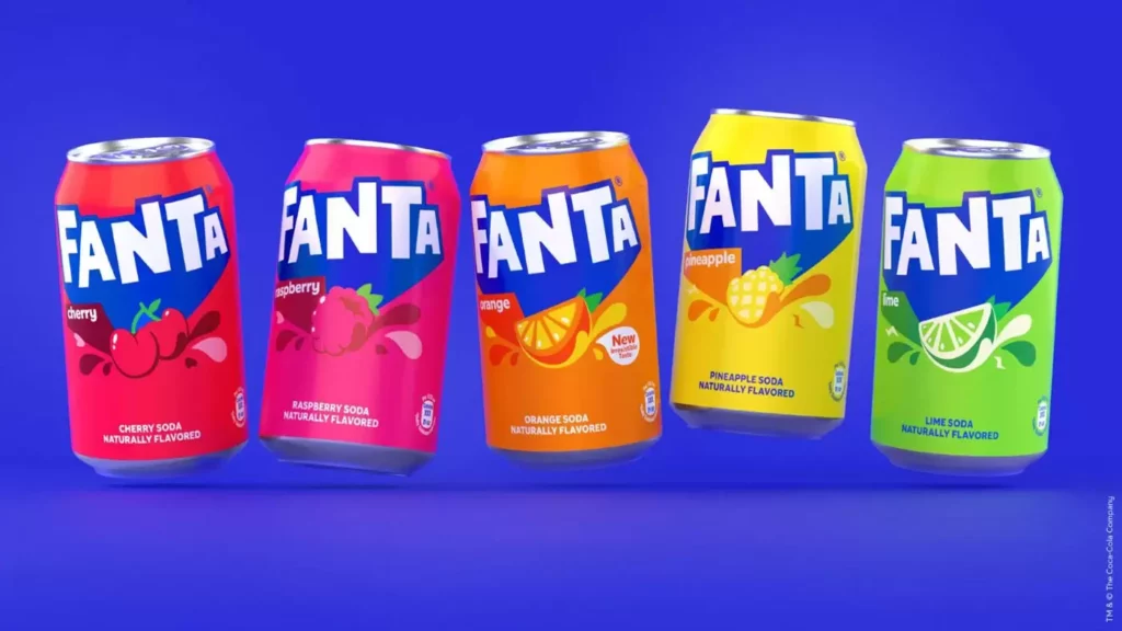
Instead of the illustration of the orange that was earlier part of the design, the respective fruit is now added to the packaging design. This shows that keeping your brand color palette minimal allows for easy scaling.
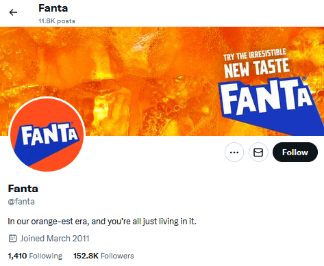
Then comes the typography which is indeed an eye-grabber in the new Fanta logo. The sans-serif font with its retro-esque shadow effect adds to the dynamism of the logo. The brand incorporates creative interpretations of the shadow element to suit the application. For instance, observe the change in the direction of the shadow on the cover image of Fanta’s X page.
Additionally, the current brand identity retains the playful bespoke font that was created for Fanta’s brand identity by Colophon Foundry in 2017.
)
Seeing flat designs from a fresh perspective
When you think of flat design, what do you visualize? Something minimalistic? Maybe something professional? Well, the new Fanta logo and brand identity breaks all these stereotypical associations. It shows that flat designs can be so much more. It shows that flat designs can be fun. They can be maximalistic too!
Flat design can be that much-needed change for brands with physical products. Imagine crafting a skeuomorphic logo with effects that represent a glow effect. Such a design when placed on a can with a sheen might end up clashing against the background resulting in a not-so-pleasant effect. The same happens even when the design appears on a huge billboard with spotlights adding a subtle glare.
However, a flat design effortlessly adapts to the background and the surface on which you place the design. In short, whether it is a physical printed piece like a packaging label or a huge billboard or a digital design like a web ad, flat designs appear impactful irrespective of where it is used.
Busy vs uncluttered design
To instantly grasp the point we are trying to convey, here are three images comparing the current and recent past versions of the logos on beverage cans.


One thing you probably noticed immediately is that the old Fanta logo, despite being fun and vibrant, appears busy. The new version removes all the unwanted details and sports a cleaner and more memorable look. This lets the design stand out on shelves when appearing amidst other beverages.
So, what does this transformation tell us about redesigning a logo? Eliminating clutter can be a valid motivator for brands to decide to rebrand.
Designs with intricate details like the old Fanta logo, with its orange in the background and the loud curvy font, appear aesthetic and peppy on their own. However, when applied to other designs like the beverage can packaging, puts a lot of restrictions on the overall design. If the rest of the design is also busy and has too many design accents, it ends up overwhelming users.
However, with a clutter-free design that has minimalistic and merely essential details, the logo becomes versatile and can easily be applied to diverse backgrounds. In short, such a design seamlessly blends into your marketing designs for various platforms and campaigns. For instance, take a look at the Fanta cans launched for Halloween.
The logo easily works on the new template and appears lively even with the new filters applied to resonate with the chosen spooky theme.
Going back to the grassroots makes sense
When redesigning a logo, brands choose to update the visible elements like colors, fonts, or shapes. In most cases, they do not go for a complete overhaul. Changing all these elements means the risk of making your brand unrecognizable to your existing customers.
Therefore, a good idea is to stick to the core elements that have become strong brand identifiers. In this case, the signature blue of the new Fanta logo draws inspiration from the old versions that sported a bright blue color as you can see in the image below.
Taking cues from this decision of Fanta, identify the core elements of your brand identity. Through thorough market research and surveys, know what your customers love about your brand identity. Does your brand color evoke a strong emotional response? Or perhaps your logomark? Retain this element to ensure that customers can still connect with your brand identity.
In this case, Fanta went back to their grassroots. The new Fanta logo is a blend of vintage vibes and contemporary styles. As a result, it does not just preserve the connection the brand shares with their old customers but also sets the stage for the connection with new customers. In short, the design is such that it appeals to both the young and old.
Prioritize versatility
The new Fanta logo is designed with versatility in mind and is adaptable across a wide range of designs. Branding and marketing go beyond a few digital and print ads. There are several places where the logo has to appear scaled down or scaled up to effortlessly represent the brand and strengthen the brand’s memorability.
The simple design and color palette let the other marketing designs shine. For instance, take a look at the promotional merchandise bundle created for Fanta. The products all flaunt the new Fanta logo.
The designs leverage the custom brand font and the logo design appears in various scales. Together the combinations here appear cohesive and connected. This shows that a versatile logo helps preserve your brand’s consistent representation across various touchpoints.
Multi-dimensional marketing to introduce the new identity
One of the biggest challenges that brands face when it comes to rebranding is easing their customers into the new phase. Making it easier for them to accept the change when they have gotten familiar with the old identity – the old look and feel of the brand.
Fanta did an excellent job at this as well. To introduce the new Fanta logo and identity, they chose a multi-dimensional approach to reach a wider audience in a short period.
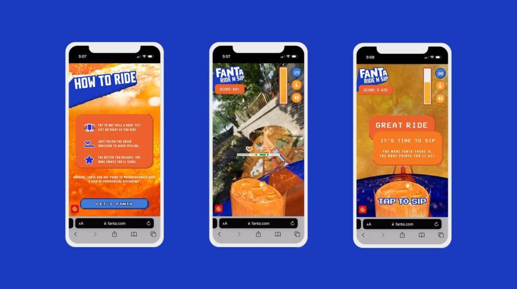
On the digital front, they introduced a mobile game called “Fanta Ride N Sip” which required the players to try and balance a chilled Fanta glass on a roller coaster. The fun and interactive game was introduced in addition to campaigns on other channels.
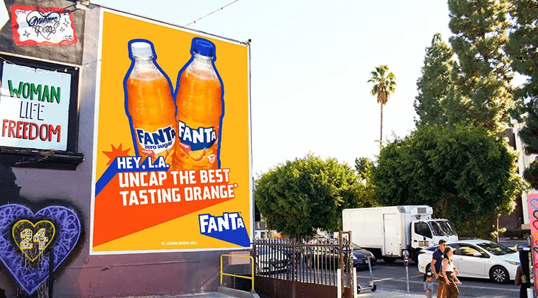
On the local marketing front, the brand introduced immersive scented murals in Los Angeles, Atlanta, and Toronto making the surroundings smell like Fanta. Using sensory cues of various kinds is one of the most exciting ways to leave a lasting impression on your audience.
Such multi-faceted campaigns help familiarize your target customers with the new brand identity and communicate to them the reason behind the update.
Rebrand Confidently With KIMP
From observing Fanta’s rebranding project, it’s evident that a lot of planning and design go into rebranding. In addition to giving the brand’s logo a makeover, the supporting design elements like the brand fonts, colors, and visual style need to be updated accordingly. You need a refreshed set of brand guidelines and promotional graphics that relay the essence of these new guidelines. A dedicated design team can make this happen. With unlimited design services like KIMP, you enjoy the perks of a dedicated design team at a flat monthly rate.
So, what are you waiting for? If you have a rebranding project lined up, now is a good time to try out unlimited design. Register now for a free 7-day trial.