
The Art of Food Branding: What Famous Food Logos Teach About Design
A food brand without a strong brand identity feels like a kitchen without a chef. Food branding often feels like a heavy load to carry. Whether you’re serving up sizzling steaks or selling shelf-stable snacks, or even packaged beverages or dairy products – creating a brand that resonates with your audience is no easy feat. We get it.
But today, let’s change that. This blog is your quick guide to food branding. We’ll explore the art and science of designing logos and identities for food brands that stand the test of time.
How will we do this? By diving into essential tips and design rules, and showcasing inspiring food brands from around the globe.
Ready for a food branding crash course? Let’s get started!
The Blueprint for Successful Food Branding
It begins with a great food logo, no doubt. However, there’s more to branding than a good logo design. Let’s talk about a few quick tips to build the foundation of food branding.
Define your target audience
When we say target demographics for food branding, we do not just mean common factors like age and gender. You need to dig deeper. Sketch a clear character to define your ideal customer persona.
Is your focus on the health-conscious foodies or families seeking convenience? Or perhaps parents looking for nothing but the best and cleanest ingredients for their kids? Maybe even vegans who have clear diet choices? Pinpointing your target audience will help you tailor your brand messaging and offerings to resonate with them.
For example, La Vie is a UK-based brand specializing in plant-based meat replacements. They have clearly defined their target audience as vegans looking for delicious options. Here’s a post that communicates the same.
Let your brand values shine
Okay, so you have defined who your audiences are. Now it’s time to define who you are. Not what you sell or the services you offer but who you are beyond what’s visible on the outside.
To be more precise, define what you stand for. Are you a champion of sustainability? Or particular about community involvement? Perhaps you strongly believe in locally sourced ingredients? Define this USP (unique selling proposition) and you have ample scope to carve an identity that sets you apart.
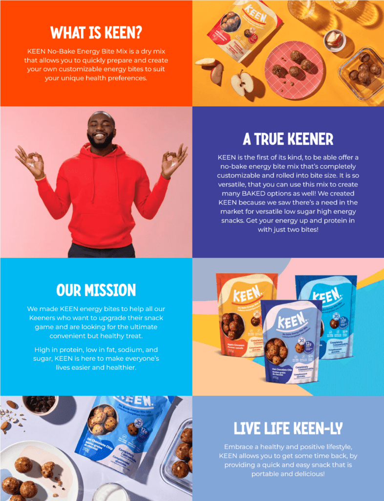
For instance, in a market flooded with healthy snack brands, Keen Energy differentiates itself by offering fully customizable snacks. Here’s a snapshot of how they define themselves on their “About Us” page.
To know more about crafting engaging About Us pages, check out our blog here.
Design a delicious logo
Once you define who you are and who your target audiences are, you need an accurate visual representation of your brand. This visual identity begins with a memorable logo. Additionally, it should be relevant to your niche and to your target audience. Consider using colors, shapes, and typography that complement your offerings and create a lasting impression.
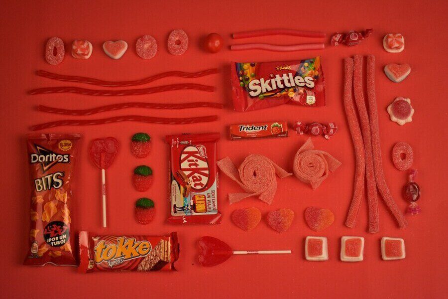
Yes, there are certain norms often associated with food brands like greens for healthy and organic ingredients or even vegan products, red and yellow for fast food brands and so on. Adopting such well-recognized color palettes is one of the safest ways to do it. But there are some brands that defy the rules and still make an impact. We’ll discuss a few such brands a little later.
Craft a wholesome brand identity
In addition to your logo, your brand identity consists of your brand colors, fonts, and any signature imagery or icons you use across all your marketing designs. Consistent use of these elements helps shape a clear brand identity which is crucial in
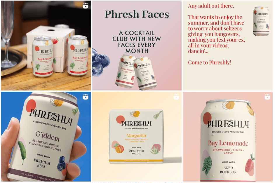
For instance, Phreshly is a brand known for canned cocktails. The brand mostly adopts boho-chic aesthetics with a lot of minimalistic organic elements. You’ll find these on their packaging design and website as well. Besides, the fonts used in their social media posts and other designs elegantly resonate with this aesthetic.
Similarly, craft a unique visual style that resonates with your brand and gets your products off of the store shelves.
Ensure a clear tone of voice
Once your brand is all dressed up, it’s all about the conversations. Even the best-looking food brand will not make the intended impact if there is no unique and consistent tone of voice. Therefore tone of voice is one of the pivotal elements in food branding. This influences how your customers perceive your brand and interact with it.
For example, a burger joint focusing on the younger crowd can use a casual, fun tone, while a fine dining establishment should opt for a more formal approach.
With the blueprint for food branding laid out, it’s time for some inspiration. Let’s talk about some unique brands that have incorporated these strategies to create something special and to stand out in a highly competitive market. We’re leaving out the big names in the food industry and focusing on the less-talked-about ones with awe-inspiring brand identities.
Food Branding Done Right: Inspiration from Leading Brands
Tony’s Chocolonely
The unique wordmark logo of the popular Dutch chocolate brand, Tony’s Chocolonely, puts the brand name front and center but also features a badge that represents the brand’s mission to eradicate exploitation in the chocolate industry.
So, there is a clear communication of the brand’s values and the funky font makes a bold statement. This identity works only because the brand cohesively uses similar big funky fonts on their packaging and website as well. Together they appear playful and vibrant.
Innocent Drinks
Innocent Drinks, a well-known smoothie brand in the European market has a simple and adorable logo that takes cues from the name of the brand. The pictorial element in the logo is a crude interpretation of the “innocent” emoji – a face with a halo above it.
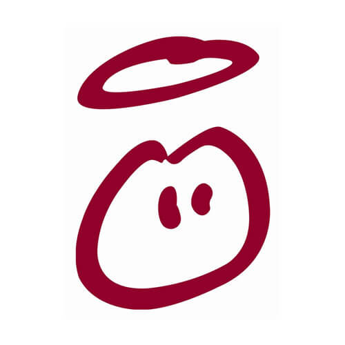
Given that this food brand mainly focuses on the young audience, this representation feels relevant. Moreover, this design helps capture the quirky personality of the brand emphasizing the need for aligning food branding strategies with the brand’s unique traits.
Le Pain Quotidien
The popular French baked goods brand Le Pain Quotidien has a unique logo that has a story to tell. The design is a crude hand-drawn style sketch of a stone-lined bread-baking hearth. The reference to traditional bread-making practices captures the bakery’s passion for creating rustic bread and the antique homely vibes that the brand is known for.
However, the colors, the fonts used and the unique alignment of the text in the logo together keep it fresh and modern. In short, the design blends the charm of old and the allure of the new to appeal to diverse demographics.
Little Caesars
As a rapidly growing American pizza chain. Little Caesars has a warm and fun brand identity beginning with the friendly face on their logo. The cartoonish mascot gobbling up a pizza slice adds a fresh twist to the design and strengthens its emotional depth. Finally, the use of orange color also encapsulates the excitement and energy the brand wishes to communicate.
Shake Shack
The logo design of the popular American fast casual restaurant Shake Shack shows how you can use commonly recognized symbols and yet create something unique.
In this case, the brand uses a simple burger imagery but the flat line-drawn style combined with the sleek sans-serif font in uppercase together evoke a sense of credibility while keeping it casual.
In addition to the other aspects, the perfect visual balance in the Shake Shack logo is a notable element in the design since this boosts the visual appeal of the design.
Dirty Vegan
If we had to name one brand that defies all rules and stereotypical representations related to a niche, then it had to be Dirty Vegan, a brand that’s all about “vegan junk food”. From the refreshing color palette to the nostalgic comic-book-style illustrations used on their website, everything is against the typical image of a vegan restaurant.
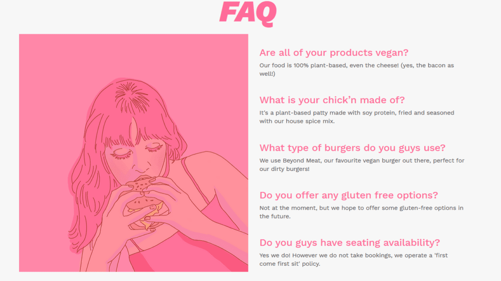
While the brand identity of Dirty Vegan bends the rules for vegan branding, it stays true to the brand’s distinct personality. This shows how some creative flair gets your brand noticed.
For more insights into food branding in the vegan industry, check out our blog on vegan brands and logos.
As you can see, a catchy and unique logo is a must-have in food branding. And most of these brands have nailed that. So, how do you design yours to ensure your brand stands out? Here are a few creative tips to incorporate.
Tips to Make Food Logos Sizzle
Get creative with symbolism
Adding symbols definitely takes your food logo up a notch and boosts its relevance. So, why not do it with an innovative twist? Take the logo below for instance. Notice the coffee bean seamlessly embedded into the “O” in the wordmark? That’s one way to keep the design simple yet stunning.
Similarly, when using symbols commonly used in food logos like utensils (forks and spoons), fruits & vegetables, leaves, grains, or even chef hats, identify creative ways to add them to your design.
Experiment with different styles of illustration
Custom illustrations can significantly amplify the impact of your brand identity. But several brands use them. Therefore, the key is to experiment with diverse styles to identify what works for your brand.
For instance, the design here uses the most relevant symbol, ice cubes. However, the polyart illustration style creates a unique twist.
To learn more about the different styles of illustrations and tips to use them, check out our blog on custom illustrations in marketing.
Need help with designing custom illustrations for your brand? Get a KIMP Graphics subscription.
Put a friendly face on your logo
Your logo can be an effective tool to humanize your brand. Add a friendly face to it – your brand mascot or a character that makes your brand more approachable and easier to engage with.
The logo here shows how you can add a mascot to your food logo while also retaining its relevance.
Tell a story
If you wish to add a pictorial element to your logo but do not want to appear cliched then combining two or more symbols to tell a story is one way to do it. This helps amplify your food branding strategy.
For example, the logo concept here combines nature-inspired elements with symbols related to maps and map pins to create a deeper meaning therefore communicating the brand’s story.
Manipulate negative spaces to create intrigue
What if you want to include relevant symbols/imagery in your food logos without making the design big or complicated? That’s where creative manipulation of negative space in your design can be a game changer.
The design here exemplifies this approach.
Elevate Your Food Branding Efforts With a KIMP Subscription
To conclude, food branding has various dimensions. It is about creating a brand identity that consistently represents your brand on diverse channels. An unlimited design service like KIMP can make a huge difference in this process. Because at a flat monthly fee, you work with a dedicated design team that handles all your design requirements ensuring unlimited design workloads and design consistency.
Want to take design subscriptions for a trial run? Register now for our free 7-day trial!