
Redesigning Beauty Logos: What the Rebranding of Popular Brands Teach Us
Crafting beauty logos is an art. It’s about shaping the identity of a brand that defines beauty standards. It’s about an industry where aesthetics are paramount.
Over time, these logos become the cornerstone of how customers connect with these beauty brands. Hence, when it’s time for a redesign, there are several things to consider. Are you a beauty business owner looking to give your brand a makeover? Or a marketer looking tp revamp your client’s beauty logo? Then this blog is for you.
Rebranding is no small feat, and we get it. That’s why it’s helpful to draw inspiration from brands that have nailed it. Therefore, in today’s blog, we’re diving into the world of beauty logo redesigns. And for this, we’ll explore successful rebrands from popular beauty brands. We’ll see why they rebranded and how they transformed their identity and design to achieve the intended results.
Ready to pick up some quick beauty rebranding tips? Let’s go!
Beauty Logos: Why Beauty Brands Need Strong Logos
Logos are important, period! But let’s talk about why they hold even more prominence in the beauty industry.
- Data shows that about 39% of consumers consider brand logos to be important indicators of brand quality. And quality is undoubtedly one of the top metrics that consumers look for when purchasing beauty products. In fact, quality is also an influencer of brand loyalty in the beauty industry.
- Moreover, with the endless options consumers get in the beauty segment, standing out from your competitors is something to work on from day one. Did you know that nearly 88% of consumers choose brands that they are familiar with? A strong beauty logo used consistently in branding is what helps a beauty brand stand out in a crowded space.
For these and many more reasons, beauty logos are a big deal. And so, redesigning them is a job that needs to be done with great caution. But do you really have to rebrand? Well, according to about 72% of consumers, redesigning a brand’s logo is an indicator of how committed the business is to staying ahead, innovating and continuously improving. So, if you want to stand out as a beauty brand that’s always improving and always moving forward, then perhaps a logo redesign will help.
But yes, as we explore the examples on our list you’ll better understand what reasons drove the respective brands to redesign their beauty logos and how they tackled the job at hand. So, without further ado, let’s talk about beauty logos that have undergone transformations in the past.
5 Beauty Logos That Were Redesign + Rebranding Lessons From Them
1. Revlon
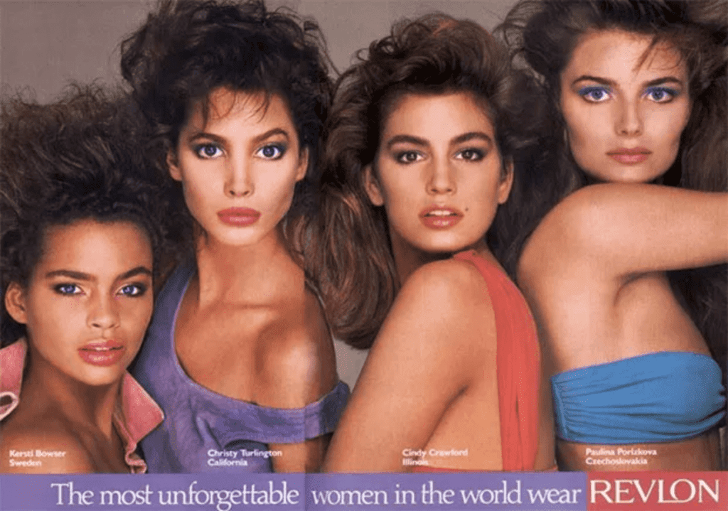
Revlon has one of the sleekest and most modern-looking beauty logos. But did you know that their current version draws inspiration from the logo that they introduced in the late 1970s? Here’s a glimpse of their iconic, “The most unforgettable women in the world” campaign from the 1980s featuring the logo that looks a lot like the current Revlon logo.
The first-ever logo of the brand was quite different from the current version featuring a customized script font as you can see in an old Revlon ad here.
So, what has changed and why?
Revlon’s logo redesign resulted in a fresh and contemporary identity for the brand. This was a much needed lift especially when the beauty industry started expanding explosively. Therefore, a more modern serif font works well for the brand.
In addition to the change in typeface, the brand also switched to the color black from red to make the design more versatile. Moreover, black is a color that can work effortlessly well on diverse backgrounds. Therefore it fits well into the brand’s extensive catalogue.
Similarly, when choosing fresh colors when redesigning beauty logos, choose colors with a clear purpose.
KIMP Tip: To ensure that even with a simple wordmark the logo does not look ordinary, the design features an extended stroke for the “L” which seamlessly connects with the “O” in the brand name. This adds an intriguing and fresh twist to the simple wordmark design.
Taking cues from this design adding subtle yet noticeable tweaks gives a fresh take on wordmark logos. Need help designing unique wordmark logos? Get KIMP!
2. Olay
To understand what has changed in the Olay logo with their rebranding over the years, here’s a look at their first logo (in the first image) and their current logo (in the second image).
Evidently, there has been a drastic transformation. Such major changes in the design of beauty logos usually stem out of a brand’s decision to shift their approach. Same was the case with Olay as well.
Their first logo was a combination mark with an intricate emblem as a part of it. However, the current version is more future-focused, adaptable and simple.
The problem with large logos is that they take up a lot of space when scaled up and can lose their impact when scaled down. In fact, intricate emblems like the one featured in the Olay logo become indistinguishable when minimized for use on social media designs and beauty packaging. Not to forget, most beauty products are small and hence the packaging design often spares very little real estate for the beauty logo.
Considering all these factors, a simple and clutter-free design works best for beauty logos. So, if your brand has a detailed logo that you think might look hard to distinguish when scaled down, that gives you a reason to redesign it.
Additionally, the current Olay logo without the face and without a distinct color for the face emblem appears more inclusive. Which is a strong trait for beauty logos.
3. Avon
Another example of a beauty logo that has undergone major changes over the years is Avon. This design also stands as an example of beauty logos that have trimmed down complicated details for a fuss-free scalable design.
The image below shows what one of the first visual representations of the Avon brand identity looked like. While the design has a lot of interesting details, it might not essential work well on multiple channels and marketing design formats. Hence the brand’s decision to switch to something cleaner has been a good one.
Moreover, the new design with the bright bold color palette was created to reflect the brand’s revised identity and their theme “Embrace Your Power”. This demonstrates how a shift in your brand’s purpose or values gives a good reason to rebrand.
If you have a small portfolio and if you think a detailed logo is what works well to capture your heritage and your story, then there’s absolutely no reason to give up on your ideas. You can always complement your emblem or logomark with a chic logotype that replicates the mood and represents your brand on digital spaces where you need simpler versions of your logo. However, if you do think a simple option will not hurt your brand story, then now is a good time to make the switch.
Beauty branding is tough and competitive. Therefore, an omnichannel approach is non-negotiable. The simpler the logo, the easier it is to use it on diverse channels. Besides, simpler beauty logos are easier to remember as well.
4. Nivea
All the beauty logos we’ve seen so far went from an elaborate design to a simpler one. But there are a few that chose to add extra details to the logo to make it more impactful – like Nivea for instance.
Here’s an old poster from the 1930’s featuring Nivea’s old wordmark logo.
The current version and one of the most popular designs among beauty logos is Nivea’s distinct wordmark in a blue circle. This design was introduced as a part of the brand’s 100th year anniversary and it did undergo a subtle change in color a few years ago. The packaging design currently in use by Nivea features their new logo.
The new design features the brand’s iconic blue tin. Considering the rebranding aligned with a major brand milestone, the design took cues from a product that established the brand firmly in the skincare and beauty segment.
Taking cues from the evolution of the Nivea brand, position your rebranding or announcement of the refreshed brand identity to align with a major brand milestone. It could be an anniversary like Nivea’s or the expansion into a new market or even the introduction of a whole new product line. During such instances, if you think that a refreshed logo will boost the impact, then come up with a design that resonates with this decision.
KIMP Tip: Irrespective of the reason behind the redesign of beauty logos, it is important to create clear visual narratives to introduce the fresh design to your customers. Use teasers to short videos capturing the transformation and the reason behind the change. This eases your customers into the new identity and also convinces them that it was a valid move.
5. Huda Beauty
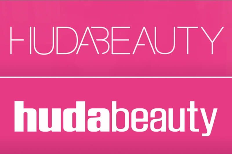
In the above image, the version at the top is the old Huda Beauty logo and the one at the bottom is the new and current version. Again, like most beauty logos we’ve seen in this blog, there hasn’t been a substantial change in the design. Yes, it’s still a wordmark but a lot has changed in terms of the typography choices in the new logo. Since this is a relatively new decision, the brand is slowly facing out the old logo and replacing the design in their product packaging.
To begin with, the bold “huda” followed by the sleek “beauty” together create a balanced “bold but approachable” look. The idea was to capture the vibe of the brand and look unique and the new design does exactly that.
Secondly, the industry is filled with beauty logos featuring all uppercase letters where Huda Beauty with all lowercase letters stands out as a warm and friendly brand. Their vibrant and unique brand color also amplifies this effect.
Finally, there are the rounded counters and uniquely shaped letterforms that add to the beauty of the Huda Beauty wordmark logo.
On the whole, the redesigned version of the Huda Beauty logo shows how various typography choices can significantly impact the effectiveness of your new logo design.
KIMP Tip: Huda Beauty added the below video to give customers a sneak peek into the process and efforts that went into designing the new logo. From the time it took to the number of iterations until the final design was frozen, the whole video takes a creative approach to explaining what works for the brand and what doesn’t.
Similarly, add videos and blog posts delving into the backstage activities of your rebranding project to engage your audience better.
A Quick Summary
Taking notes from all these beauty logos that changed over the years here are a few quick tips to tackle a beauty brand rebranding:
- Rebrand to transform an outdated design. As the industry evolves and your target audience’s perception of beauty evolves, your beauty logo needs to keep up too.
- Consider design nuances that help differentiate your brand from your competitors. While taking cues from the industry norms is a good idea, you need powerful design details that set your brand apart. The overall design should be a summary of what makes your beauty brand unique.
- Ensure that your new logo is designed for a digital-first approach. Because social media and other digital channels are indispensable in marketing in the digital age.
- Tweak your other brand designs like packaging to resonate with the new logo. However, avoid drastic changes that make your products unrecognizable.
- Create content that highlights the organizational changes and other reasons behind the rebranding decision and how the rebranding affects customer interactions with your brand.
Give Your Beauty Brand’s Logo a Makeover With a KIMP Subscription
Redesigning beauty logos often takes multiple iterations until you find the one that reflects your intentions and message. In addition to this, you also need supporting designs to promote the rebranding. Times like these call for an unlimited design service like KIMP, where all your design needs are covered at a flat monthly fee.
To get a taste of what an unlimited design subscription brings to your marketing workflow, register now for a free 7-day trial!