
Coffee Shop Logos: Brewing the Perfect Visual Identity
To some, a coffee shop is their escape from the daily grind. To others, coffee shops are creativity hotspots. So, yes, coffee shops mean different things to different people. And as they say, designing a good logo is all about communicating what your brand is about and how you want customers to feel about you. Putting all this together, it’s pretty evident that designing coffee shop logos is an interesting challenge at hand. And this blog is all about tackling that challenge!
For this, we’ll be looking at some famous coffee shop logos. Their design and how they have seamlessly integrated the logo into their branding to make it work for them. So, if you are a coffee shop owner looking to elevate your visual identity or a marketer working on a coffee shop’s branding, then this blog is for you.
So, let’s brew up some ideas!
10 Coffee Shop Logos + Lessons to Take Away From Them
Let’s be clear. Designing coffee shop logos can be slightly different from other coffee branding designs – like logos created for brands selling coffee-related products and merchandise, coffee machines, etc. While they seem to fall under the same umbrella, the focus is going to be on very different aspects in these cases.
For instance, coffee brands selling coffee products tend to be product-focused. Whereas with cafes, it is all about experiences. While some cafes do sell their branded merchandise, their priority is often on non-tangible elements like the ambiance and the experience.
Additionally, several coffee brands might not even have direct customer touchpoints. Because their distribution might be through retailers online and offline. However, with coffee shops, there is a whole ecosystem of baristas and other customer interaction personnel involved.
Accordingly, the elements that are to be highlighted and the mood to be set in coffee shop logos tend to be different from those for other coffee brand logos.
With all the facts laid out, let’s explore some coffee shop logos now.
1. Starbucks
Let’s begin our list with one of the most popular coffee shop logos, the Starbucks logo. The signature green color and the siren have become indispensable assets of the brand.
Here’s a comparison of what the first Starbucks logo looked like against the current version.
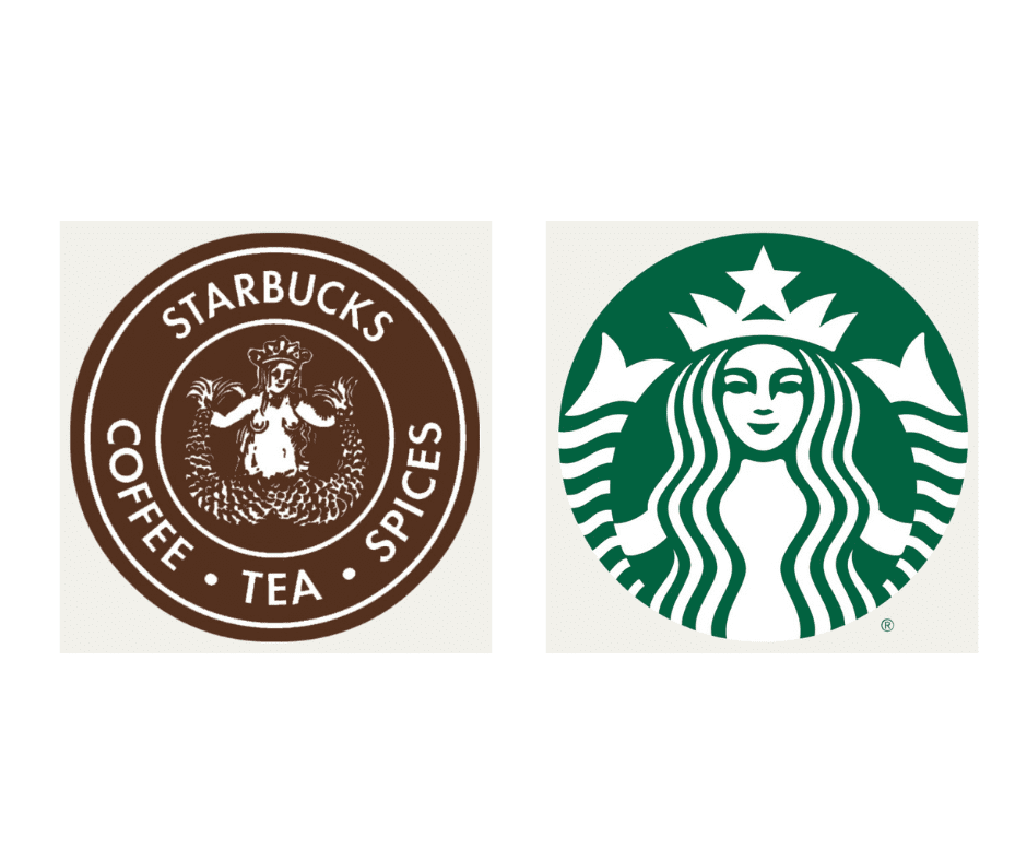
Can you see how much the brand has cleared up the design and made it sleeker and more memorable? From trimming down the extra details to adding a subtle visual symmetry, the brand has refined the logo design in many ways.
But why the siren? According to Terry Heckler, the designer of the Starbucks logo, “It’s a metaphor for the allure of caffeine, the sirens who drew sailors into the rocks.”
KIMP Tips:
So, what can you take away from the Starbucks logo?
- Similar to the metaphorical use of the siren in the Starbucks logo, identify a story to capture when designing coffee shop logos. This adds more depth to your design.
- The Starbucks logo has evolved into a sleek and timeless design which is also adaptable. Similarly, create a design that looks good on your coffee shop menu, signage and other print designs as well as digital graphics.
2. 5 to go
“5 to go” is one of the most popular coffee shop chains in Romania. Their logo exemplifies the power of simplicity in coffee shop logos.
The bold design features the number 5 prominently because the coffee chain started with a menu offering items at a flat rate of 5 RON. This also aligns with their motto of offering “More Coffee, Less Bucks”.
The monochromatic design within the solid black circle also ensures that the logo pops out against all kinds of backgrounds. This helps the logo work across various platforms and customer touchpoints.
KIMP Tips:
- The logo of “5 to go” built around the number 5 proves the need for highlighting your brand values and your USP (unique selling proposition) through your logo design.
- The “5 to go” logo also demonstrates the impact of a simple readable font in logo design and how this can make a coffee shop logo adaptable.
3. % Arabica
One of the most popular Japanese coffee shop chains, % Arabica has a minimalistic and elegant logo.
The minimalism in the design here is a reflection of the minimalistic aesthetics and ambience signature to % Arabica coffee shops. For example, here is a sneak peek into their store at Xiamen featuring their distinct minimalist modern interiors.
Nonetheless, the simple design still packs a punch in terms of messaging. According to the brand, the “%” in their name is a visual representation of coffee beans. Here’s an image that tells the whole story.

KIMP Tips:
- % Arabica is a specialty coffee shop that resonates with customers who love a chic minimalistic ambiance to escape the everyday chaos. Their logo is an accurate representation of this. Similarly, identify a visual style that works with your audience.
- Symbolism like the one used in this logo can add so much value to coffee shop logos.
4. Café Amazon
When it comes to coffee shop logos, Café Amazon has one of the most unique designs. It is a distinct nature-inspired design that draws inspiration from the theme of the brand, their motto of delivering a “Taste of Nature”.
Additionally, the logo feels like a slice of nature with the macaw and the greenery capturing the essence of the Amazon rainforest and the nature-themed ambiance in most of their coffee shops.
To preserve this, they maintain the green theme across other store graphics like their menu and more.

KIMP Tips:
- The whole brand identity including the logo of Café Amazon is built around the “nature” theme. Similarly, identify a core theme; then building your brand identity on it becomes simpler.
- A coffee shop logo holds no prominence if the rest of the marketing graphics and designs across customer touch points do not resonate with the logo. So, design a logo whose elements can easily be integrated into other marketing graphics for consistency.
5. Café Coffee Day (CCD)
How do you design coffee shop logos that communicate the gist of your brand? About the experiences you wish to create through your coffee shops? The Café Coffee Day logo demonstrates how you can capture the narrative through visuals. Café Coffee Day is one of the most prominent players in the Indian coffee shop market.
The dialogue box symbol in the logo is an interesting representation of the coffee and conversations that CCD is all about.
To amplify the role played by the symbol and make it easily recognizable you’ll see the brand using it across their social media designs, takeaway packaging and so on.

KIMP Tips:
- To create memorable coffee shop logos, identify a single meaningful and versatile visual element that can be used cohesively in your marketing efforts. Like the dialogue box element in the CCD logo.
- Pay attention to your brand colors. In this case, the red used by CCD captures the excitement and energy of coffee.
6. Compose Coffee
The South Korean coffee shop Compose Coffee has a vibrant logo quite distinct from the norms of the industry.
The C in the logo evidently represents the brand name. Secondly, the compass symbol here stands for the brand’s sense of “direction”. Finally, did you also notice the coffee cup shape formed in the counter of the “C”? This ties the design back to the crux of the brand.
This logo exemplifies how you can layer multiple meanings into a coffee shop logo design without compromising its clarity or simplicity.
In addition to all these aspects, the vibrant yellow color of the logo aligns well with the peppy personality of the brand.
KIMP Tips:
- Find brand colors that accurately capture your brand’s unique personality.
- When you have hidden messages in your logo, a story to communicate, use images and videos to communicate these messages/stories. Logo animations highlighting these elements are one way to do it.
Need help designing coffee shop logos that pack a punch? Get a KIMP subscription.
7. Coffee Beanery
The nearly half-a-century-old American coffee shop chain, Coffee Beanery has a sleek and modern logo.
This is another example proving the strength of simplicity in coffee shop logos. Featuring a monochromatic design like the “5 to go” logo, Coffee Beanery uses a visually intriguing monogram. And the brand name appears in lowercase letters preserving the simplicity of the brand and keeping it approachable and friendly.
Furthermore, the chosen fonts and the shape of the monogram all prioritize geometric shapes. Hence the logo looks organized and balanced. In other words, the overall brand identity creates a sense of order and calm which is useful when setting up a coffee shop ambiance.
KIMP Tips:
- Coffee shops should be seen as a space where people can unwind and socialize. Therefore, a sense of warmth expressed through design goes a long way in coffee shop logos. Accordingly, choose the element of your logo such that they do not look too professional or serious.
- Combination logos like the one used by Coffee Beanery can be handy especially since there are various scales and placements intended for a coffee shop logo.
8. Aida
Pink isn’t a common color in the coffee shop segment. But in the case of the popular Viennese coffee shop, Aida, the color holds prominence mainly because of the brand’s origins as a pastry shop. Over the years the pastry shop evolved and introduced the Italian-fame “fast coffee and cake” trend in Vienna.
From the furniture to the store awning every little detail preserves the pink aesthetic unique to the brand thus establishing the brand color as one of the strong identifiers.
KIMP Tips:
- Fonts have moods and therefore typography is a critical component in the design of coffee shop logos. In this case, the use of an elegant script font resonates with the chic ambiance and sophistication the brand is known for.
- Your brand’s origin story is one of the most reliable sources of inspiration when designing your coffee shop logo.
9. Scooter’s Coffee
Scooter’s Coffee, a popular coffeehouse chain based in Bellevue, Nebraska specializes as a drive-through coffee shop. Hence the road sign style design is a clever choice.
Additionally, the logo also mentions the year of establishment giving the brand a subtle nostalgic elegance. This is in line with the refined quality and premium coffee experience that the brand is associated with.
Finally, the Scooter’s Coffee logo uses a simple color palette and incorporates excellent contrast. This allows for easy readability which is essential considering the on-the-go audience the brand caters to.
KIMP Tips:
- The best kinds of coffee shop logos are those that are designed with the audience in mind. Like the high-contrast design of the Scooter’s Coffee logo.
- From the character case to the fonts, every typography detail in the logo should resonate with what makes the brand special. In this case, the uppercase letters and the serif font together reflect the unmatched quality that Scooter’s Coffee promises.
10. Coffee Island
We reserved the best for the last. The Coffee Island has one of the most interesting coffee shop logos you’ll ever come across. It is one that depicts the art of telling a clear story through the simplest symbolic elements.
Yes, you might immediately notice the coffee bean and the flower imagery in the design. But what other elements can you grasp from it? According to Coffee Island, the design was carefully crafted to clearly represent the “bean to cup” authenticity of the brand and their process.
Accordingly, the logomark creatively packs the symbols of “the bean, the plant, the voyage, the flame, the drop, and the cup”.
KIMP Tips:
- To enhance the memorability of coffee shop logos, use symbolism to tell a story.
- Consider combining elements like the clever use of negative space and manipulation of flower petal shapes into the coffee bean and flame in the Coffee Island logo.
Ready to Brew the Perfect Coffee Shop Logo?
Having explored all these ideas, are you ready to design unique coffee shop logos? Working with a professional design team makes this much simpler. And on choosing an unlimited design service like KIMP, you get a dedicated design team and unlimited designs. This makes it more convenient to shape your brand identity from scratch and cohesively build it across diverse channels.
Ready to experience the benefits of unlimited design services in coffee shop branding? Book a demo call today to understand how this works.
Or sign up now for a 7-day free trial.